Brand development of the SLOY
chain of bakeries
chain of bakeries
The core idea of the SLOY corporate identity is that life is multi-layered. It is performed
in the essence of the brand and its name.
in the essence of the brand and its name.
SLOY is a bakery chain that adds to everyday life and reveals the complexity of life.
The chain united a team of enthusiasts. They strive to find the best recipes and technologies to create a new taste for the usual pastry.
The chain united a team of enthusiasts. They strive to find the best recipes and technologies to create a new taste for the usual pastry.
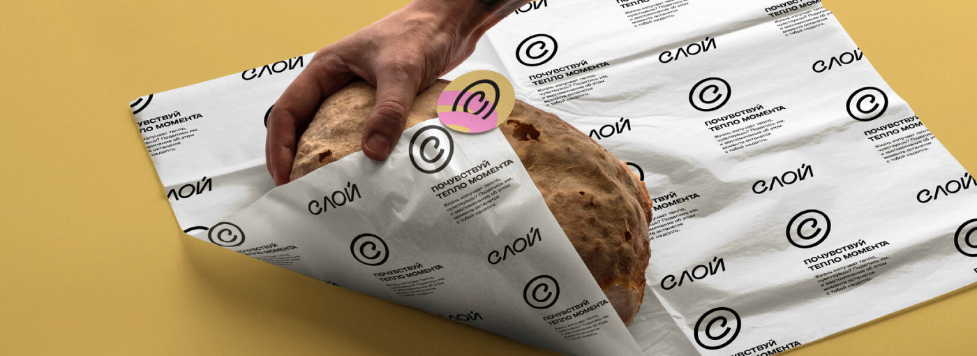
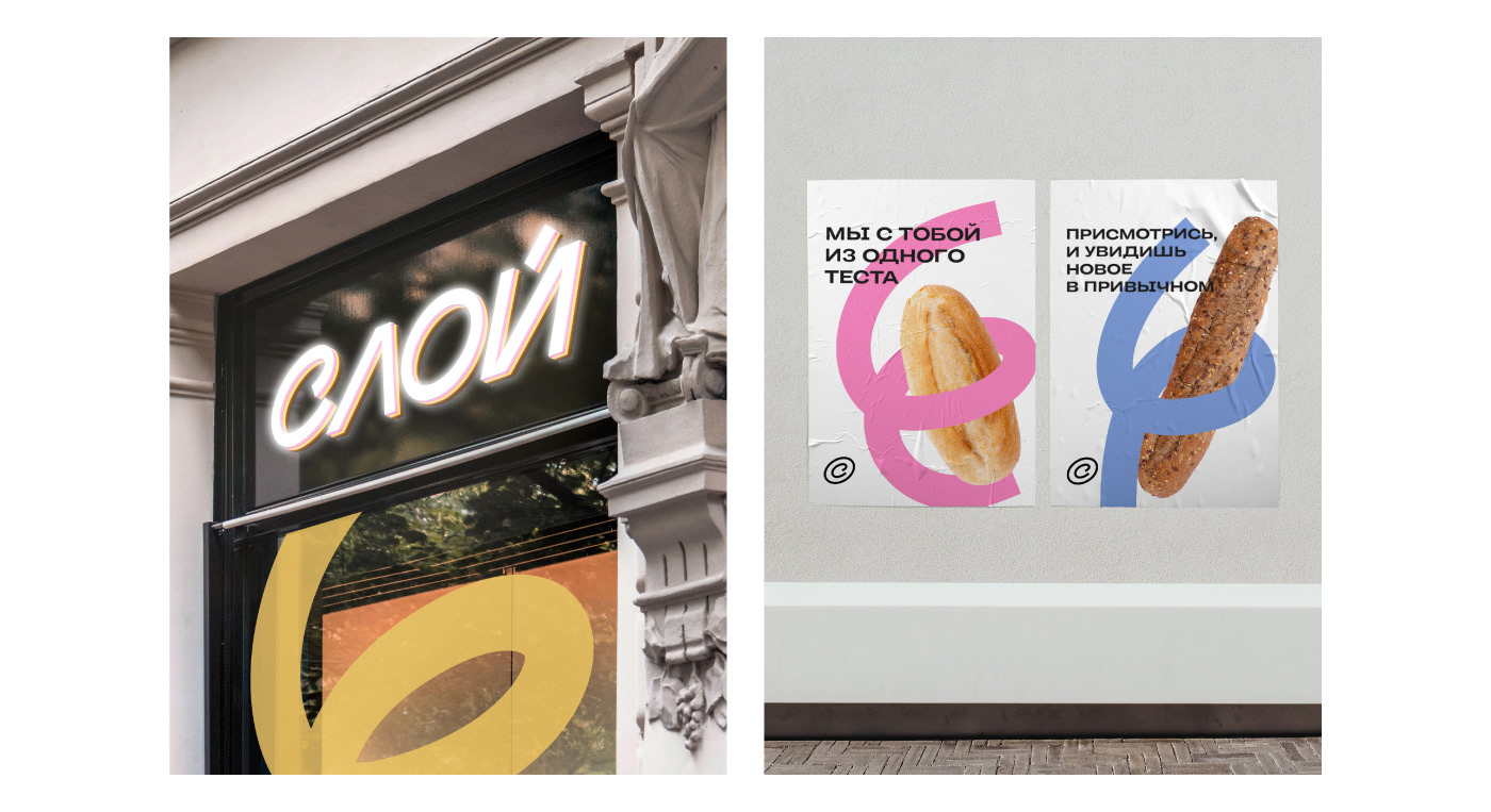
Boldness and dynamics of the logo
We developed a daring and a little bold logo. It ideally reflects the character of the brand. The logo’s dynamics and movement show constant perfection.
The brand mark resembles both a copyright sign and a croissant in a cut. It expresses
the author's approach and the unique experience of enjoying the pastry.
the author's approach and the unique experience of enjoying the pastry.

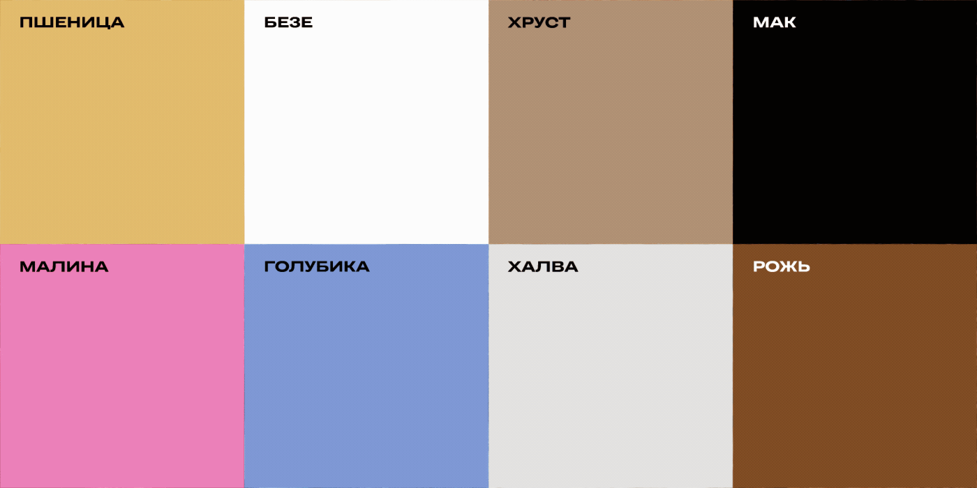
Friendly and tasty color palette
The corporate color palette is based on culinary decisions. Each color represents
the filling of croissants, eclairs, and other pastries.
the filling of croissants, eclairs, and other pastries.
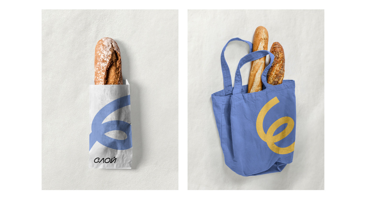
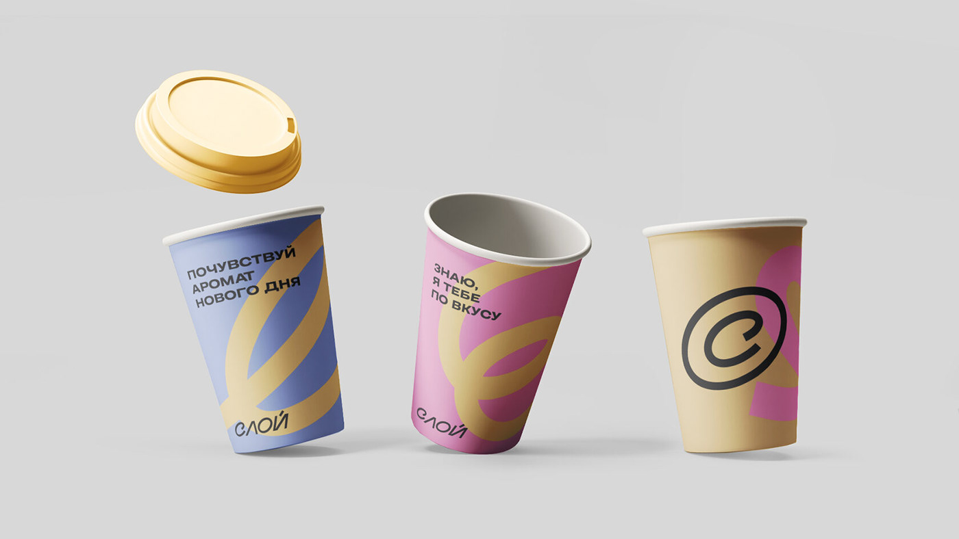
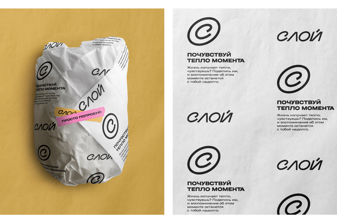
Upgrading of packaging
A curl has become the main graphic element. It is a metaphor for kneading
dough and rolling croissants.
dough and rolling croissants.


Stylish icons
The icons which are used for navigation add to the metaphor of the modern
and slightly bold brand. The line which shapes the icons has a recognizable
curl and dynamic character.
and slightly bold brand. The line which shapes the icons has a recognizable
curl and dynamic character.