


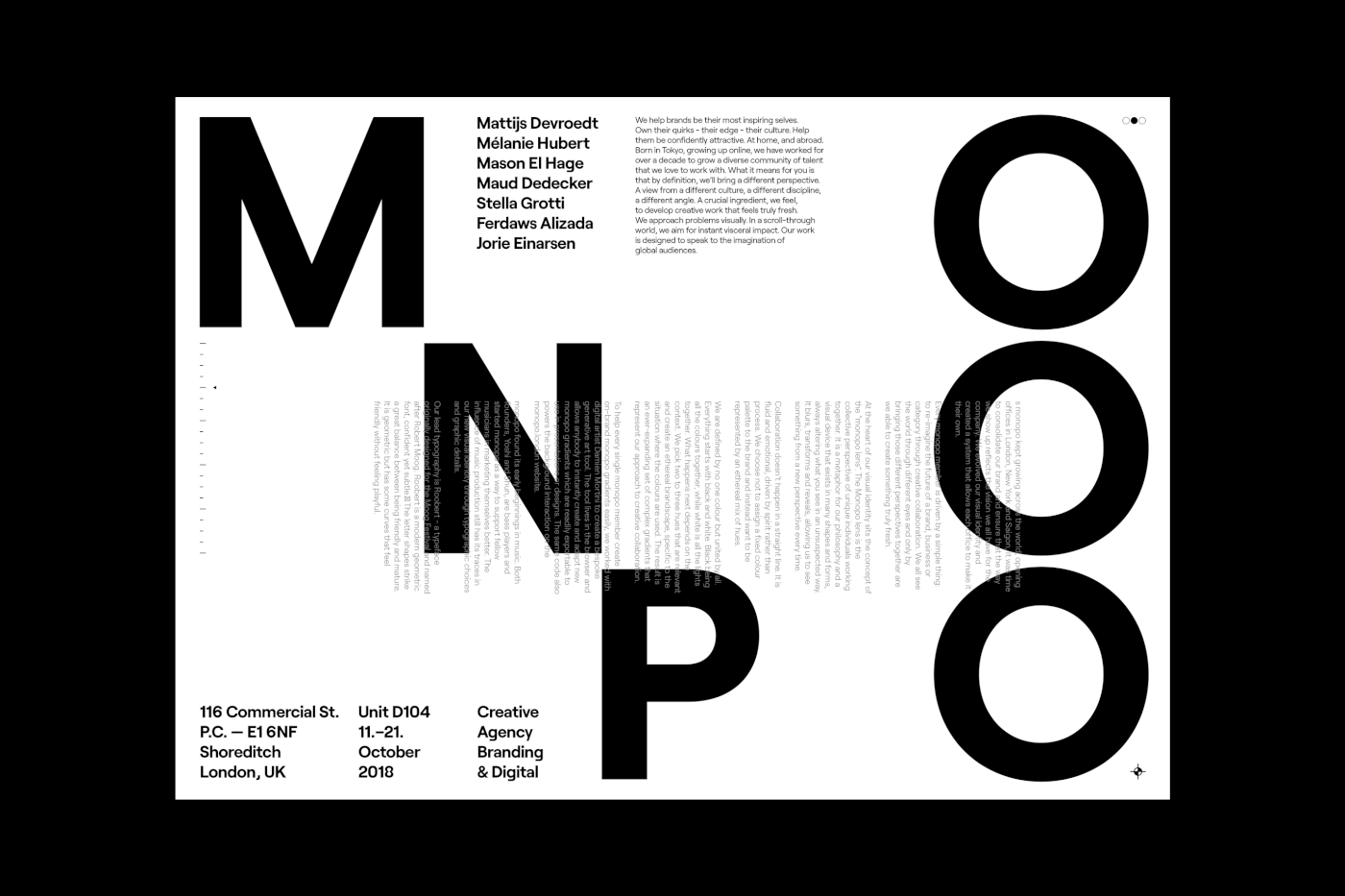
monopo
—
branding & visual identity
monopo has always had a certain mysterious, dreamy, ethereal and intangible image for reasons we struggled to explain.
When the company started to grow and expand into new offices, it became crucial to re-think our branding and ensure the monopo "spirit" would remain consistent throughout the network and communications. The challenge for us was to keep our initial intangible aesthetic, build on it to bring it to the next level and, most importantly, find a system that would allow the individuality of each office to shine through.

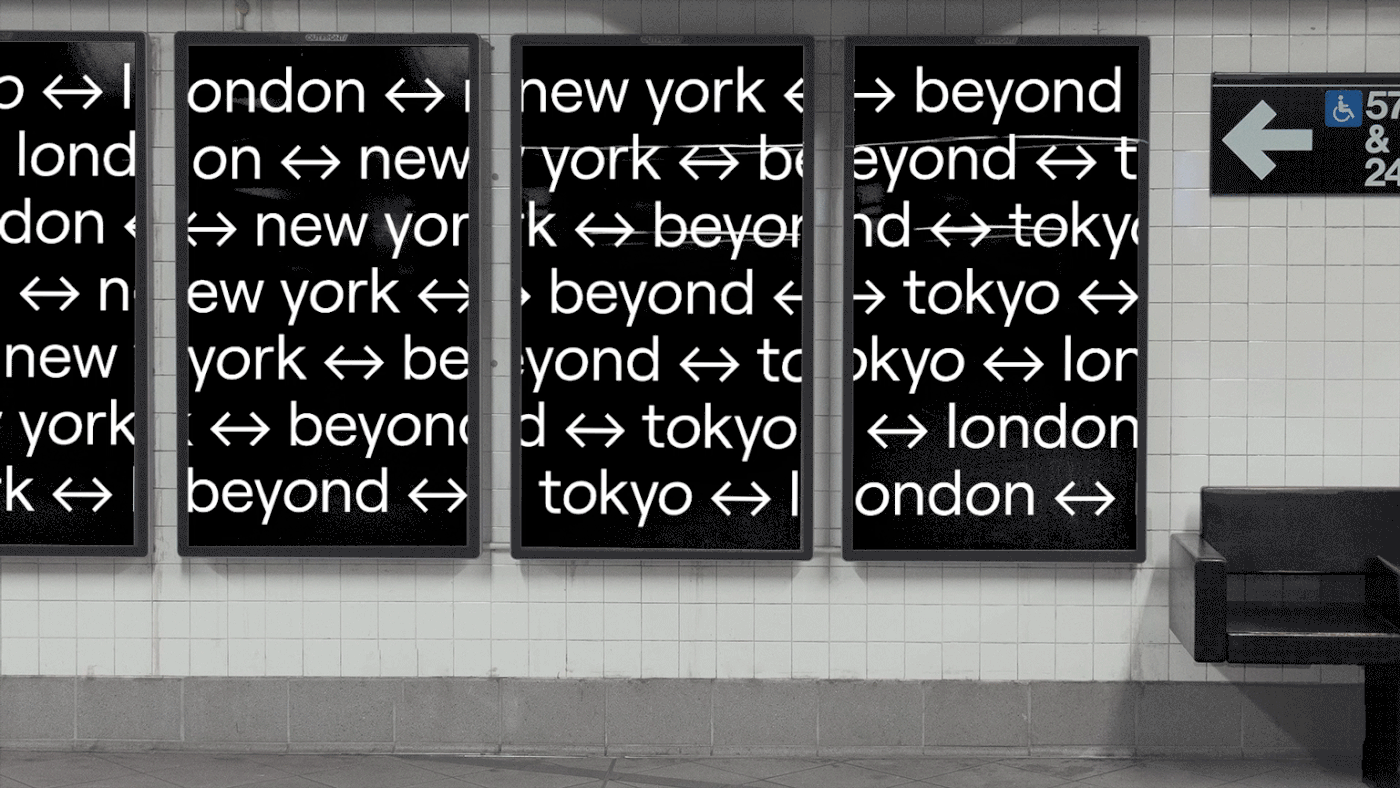
Originally founded in Tokyo in 2011,
monopo opened a new office in London in 2019, New York in 2021 and Saigon in 2022.
monopo opened a new office in London in 2019, New York in 2021 and Saigon in 2022.


The 'monopo lens'
Every monopo member is driven by a simple thing: to re-imagine the future of a brand, business or category through creative collaboration. We all see the world through different eyes and only by bringing those different perspectives together are we able to create something truly fresh.
At the heart of our visual identity sits the concept of the “monopo lens”. The Monopo lens is the collective perspective of unique individuals working together. It is a metaphor for our philosophy and a visual device that exists in many shapes and forms, always altering what you see in an unsuspecting way. It blurs, transforms and reveals, allowing us to see something from a new perspective every time.


Ethereal colour gradients
Collaboration doesn’t happen in a straight line. It is fluid and emotional, driven by spirit rather than process. We choose not to assign a fixed colour palette to the brand and instead want to be represented by an ethereal mix of hues.
Collaboration doesn’t happen in a straight line. It is fluid and emotional, driven by spirit rather than process. We choose not to assign a fixed colour palette to the brand and instead want to be represented by an ethereal mix of hues.
We are defined by no one colour but united by all. Everything starts with black and white. Black being all the colours together, while white is all the lights together. What happens next depends on the context. We pick two to three hues that are relevant and create an ethereal brandscape, specific to the situation where the colours are used. The result is an ever-expanding set of complex gradients that represent our approach to creative collaboration.


Typography and visual details inspired by music production
monopo found its early beginnings in music. Both founders, Yoshi and Shun, are bass players and started monopo as a way to support fellow musicians in marketing themselves better. The influence of music production still has its traces in our new visual identity through typographic choices and graphic details.
Our lead typography is Roobert - a typeface originally designed for the Moog Festival and named after Robert Moog. Roobert is a modern geometric font, confident yet subtle. The letter shapes strike a great balance between being friendly and mature. It is geometric but has some curves that feel friendly without feeling playful. In order to add further personality, we bring in the use of italics alongside non-italicised weights on specific letters.


Spirit portraits
We wanted our portraits to be an extension of our brand: ethereal, creative, mysterious, inspired by the concept of the lens and photographically bringing our colour gradient aesthetic. Working with photographer Fred Mouniguet, we created a series of ethereal portraits playing with projections of coloured lights and in-lens camera effects.


Generative art tool
To help every single monopo member create on-brand monopo gradients easily, we worked with digital artist Damien Mortini to create a bespoke generative art tool. The tool lives in the browser and allows anybody to instantly create and adapt new monopo gradients which are readily exportable to use in presentations or designs. The same code also powers the background interaction on the monopo.london website.
To help every single monopo member create on-brand monopo gradients easily, we worked with digital artist Damien Mortini to create a bespoke generative art tool. The tool lives in the browser and allows anybody to instantly create and adapt new monopo gradients which are readily exportable to use in presentations or designs. The same code also powers the background interaction on the monopo.london website.


Thanks for watching!


