


[EN]
OBA FLATBREAD CRACKERS
Year: 2021
Category: Food
3D: Diego Maricato
Context
Inspired by Italian cuisine, Oba Flatbread Crackers always come in handy and can be consumed at any time. The packaging had to be appetizing and casual but limited to a two-color printing process.
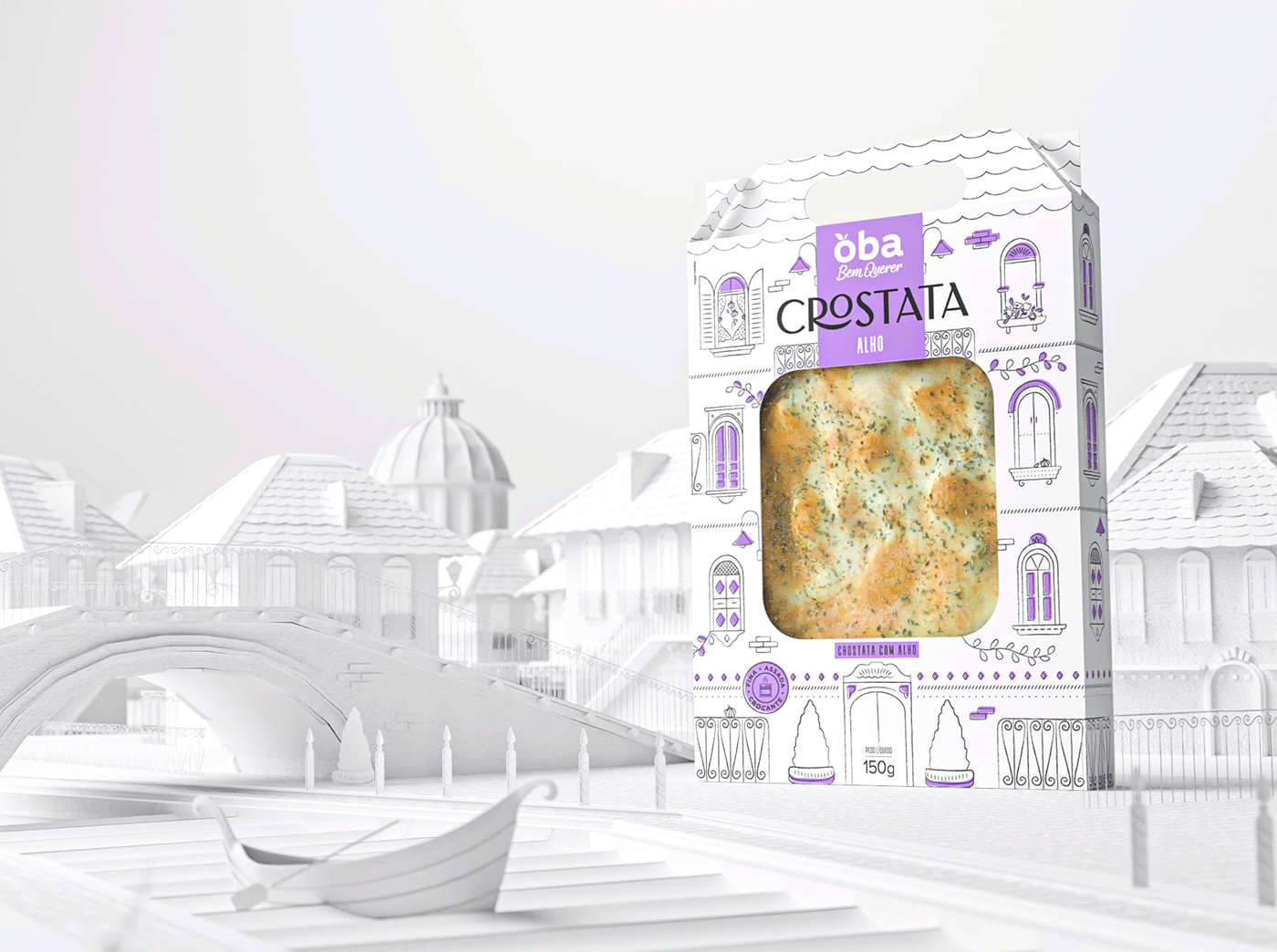
The dieline, previously defined by the supplier, got a makeover and its shape was turned into traditional charming Italian houses, full of details, bringing to life a lovely Italian scene.
What we did in this project
Packaging design.
Development
The first challenge we've faced in this project was the two-color limit for printing each package. To build the visual identity system, black was kept on the whole packaging line, and a second color was used as a highlight, while also making a reference to each product’s main ingredient.
Besides, the dieline had been previously defined and no changes were allowed to be made in it.
In order to design an appealing packaging that would stand out at the point of sale, we’ve created a visual storytelling using Italy’s architectural style, visually taking the customer on a trip through the flavors of Italy, and therefore turning the challenges we’ve faced into opportunities.
We’ve included a few “easter eggs” – the main ingredients of each product are hidden in the illustrations –, which made the Italian scenes even more charming and boosted the fun factor for the consumer.
The packages we’ve designed do not only protect the products, they are appealing, easy to carry and stand out at the point of sale. Their design motivates the consumer to buy more products, since they can be used by the whole family to play with. That way, they are given a second life, being reused instead of thrown away.
[PT]
CROSTATAS OBA
Ano: 2021
Setor: Alimentação
3D: Diego Maricato
Contexto
Inspirada na gastronomia italiana, as Crostatas Oba Bem Querer são super versáteis, podem ser consumidas a qualquer momento do dia e pediam por embalagens leves e descontraídas, mas que respeitassem a limitação de duas cores de impressão.
A faca já existente, definida previamente pelo fornecedor, ganhou nova roupagem e se transformou em charmosos edifícios italianos, cheios de detalhes, que juntos dão vida a um cenário encantador
O que fizemos?
Design de embalagem.
Desenvolvimento
O primeiro desafio encontrado no projeto foi a limitação de apenas duas cores para a impressão em cada um dos produtos da linha. Para construir o sistema de identidade, o preto foi mantido em todas as embalagens e a outra cor foi utilizada como destaque e faz conexão com o ingrediente principal do produto.
A faca especial já existia e não possibilitava mudanças em sua estrutura.
Pensando em desenvolver uma embalagem atraente e que se destacasse no ponto de venda, criamos uma narrativa baseada em cenários inspirados no estilo arquitetônico italiano, convidando o consumidor a viajar pelos sabores, revertendo os obstáculos em pontos positivos.
Os easter eggs com ingredientes de cada uma das embalagens conferem um charme a mais em toda a ambientação e trazem uma atmosfera divertida.
Além de proteger os produtos, as embalagens são fáceis de serem transportadas, atraentes e se destacam no ponto de venda. O design convida os consumidores a adquirirem outros sabores da linha, já que as caixas podem se transformar em brincadeiras para toda a família, conferindo uma segunda vida à estrutura de papel que seria descartada.


Conceito e direção criativa: Juliana Zarattini, Marjorye Cavazotto e Raquel Silveira
Layout: Juliana Zarattini, Marjorye Cavazotto, Raquel Silveira e Rodrigo Lourenti
Ilustração: Raquel Silveira
Finalização: Rodrigo Lourenti e Cláudio Ramos
Apresentação: Camila Ragghianti e Victor Mozetto
3D: Diego Maricato
Atendimento: Rita Fernandes


