The Queue
Brand Redesign
________________
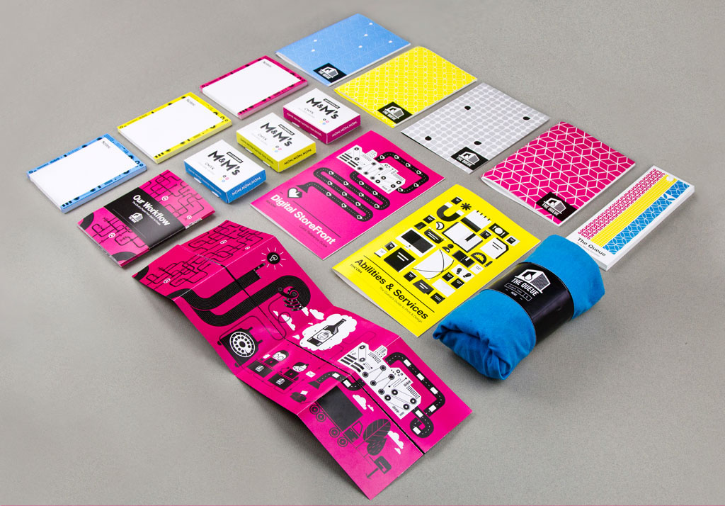
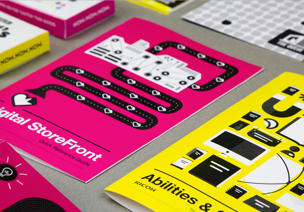
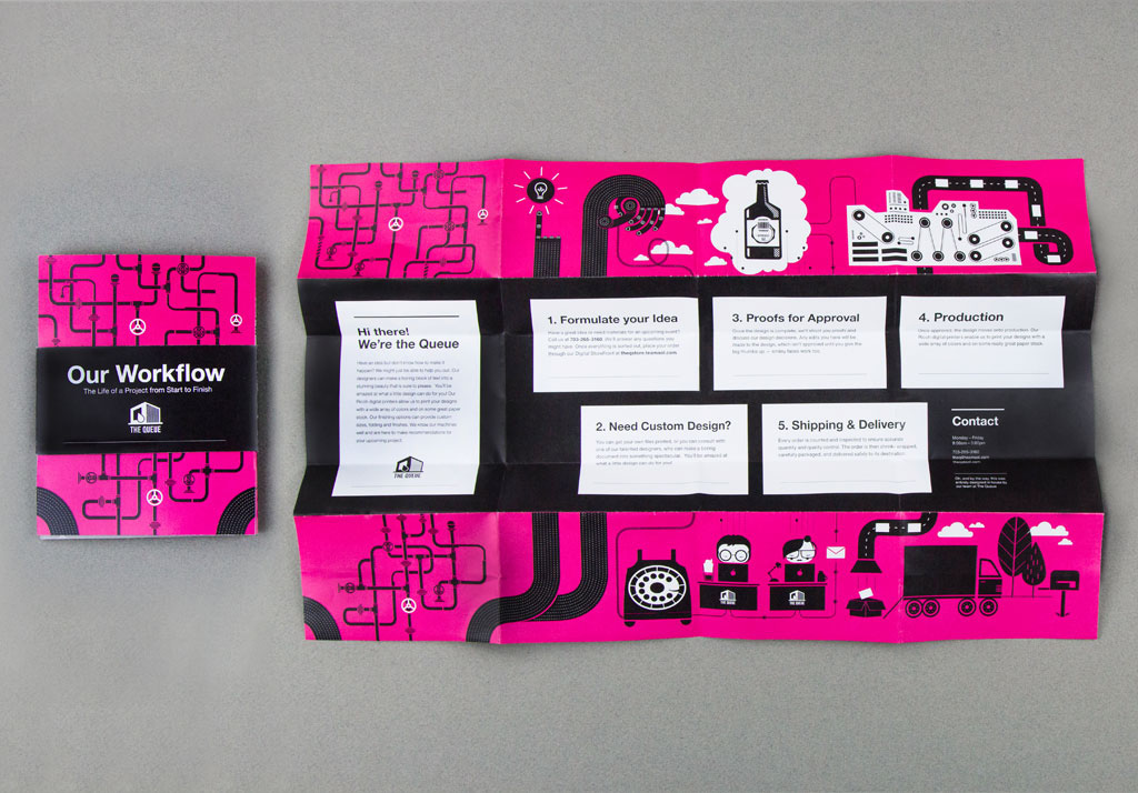
The Queue is a team of creatives, artists, and production specialists committed to quality and visual design. The Queue works on site at the AOL campus in Dulles, Virginia and provides design and print support to AOL and all of its brands. When given the task of rebranding The Queue, I was asked to keep the already existing logo and stick to their colors: Cyan, Magenta, Yellow and Black. With these parameters, I developed an illustration based aesthetic that is clean, meticulous, and fun to reflect the The Queue's persona. The redesign included concept development, illustration, iconography and supporting promotional materials.
________________


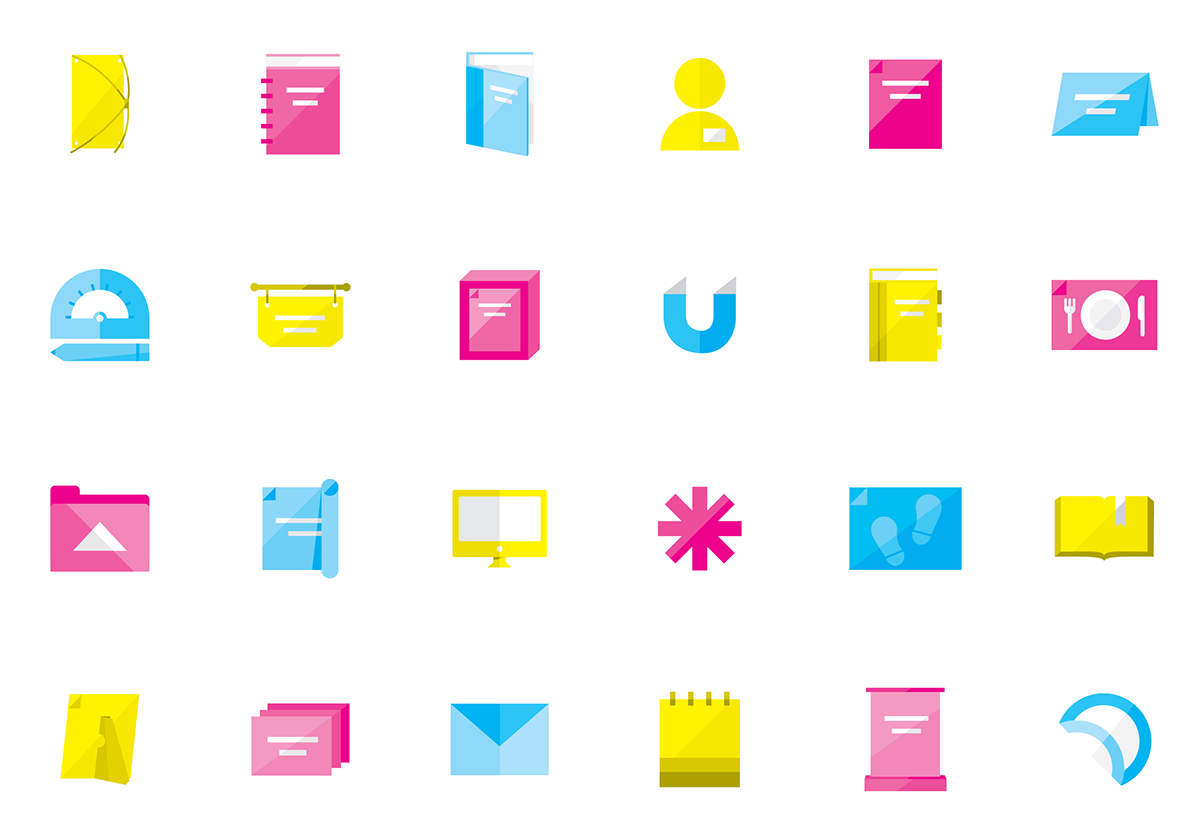
Iconography