Rebranding of the Dostaevsky food
delivery service
delivery service
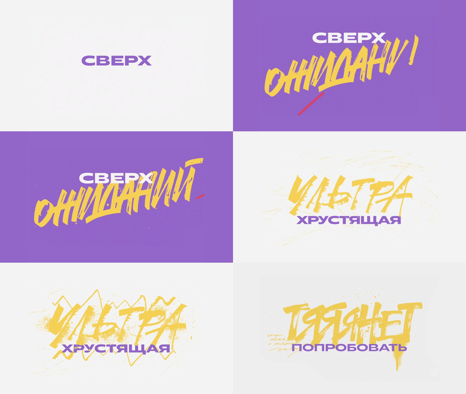
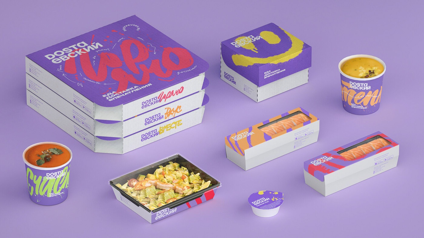
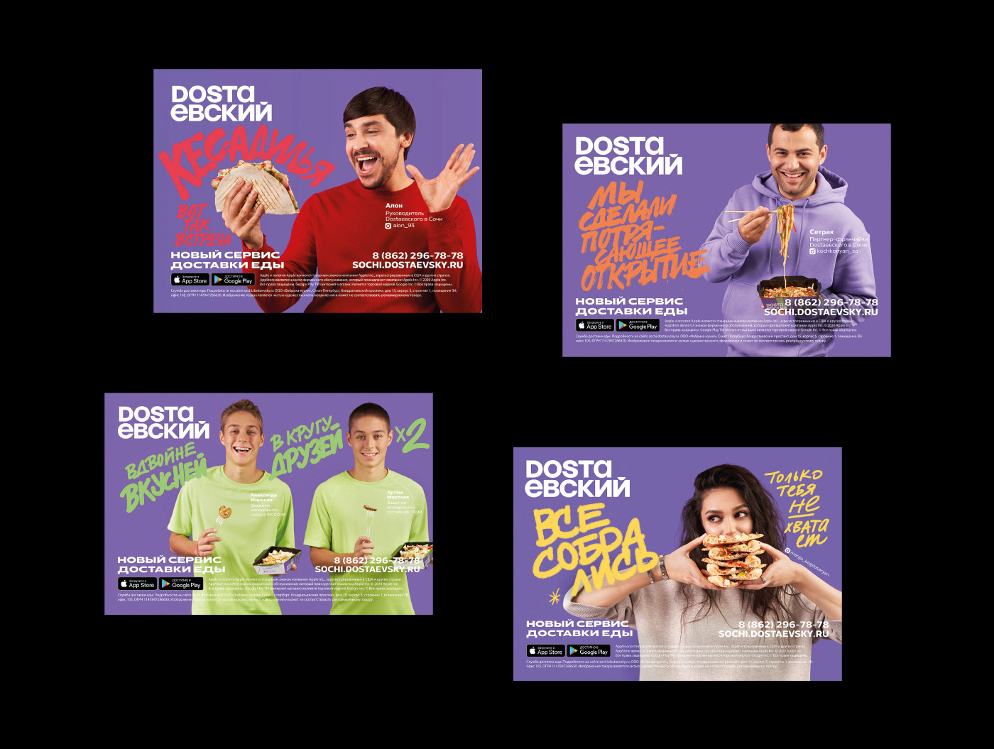
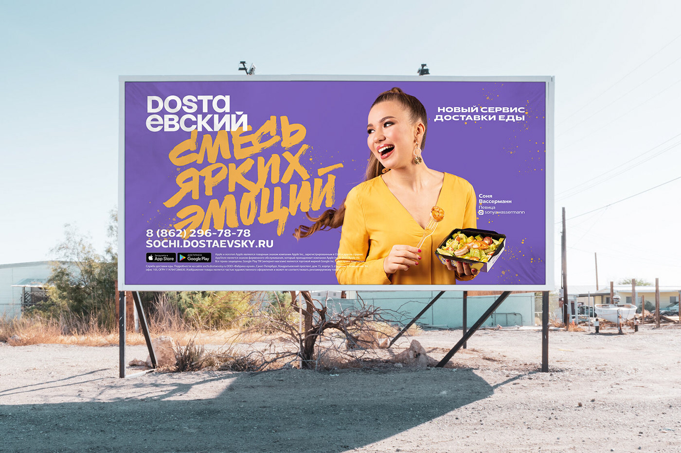
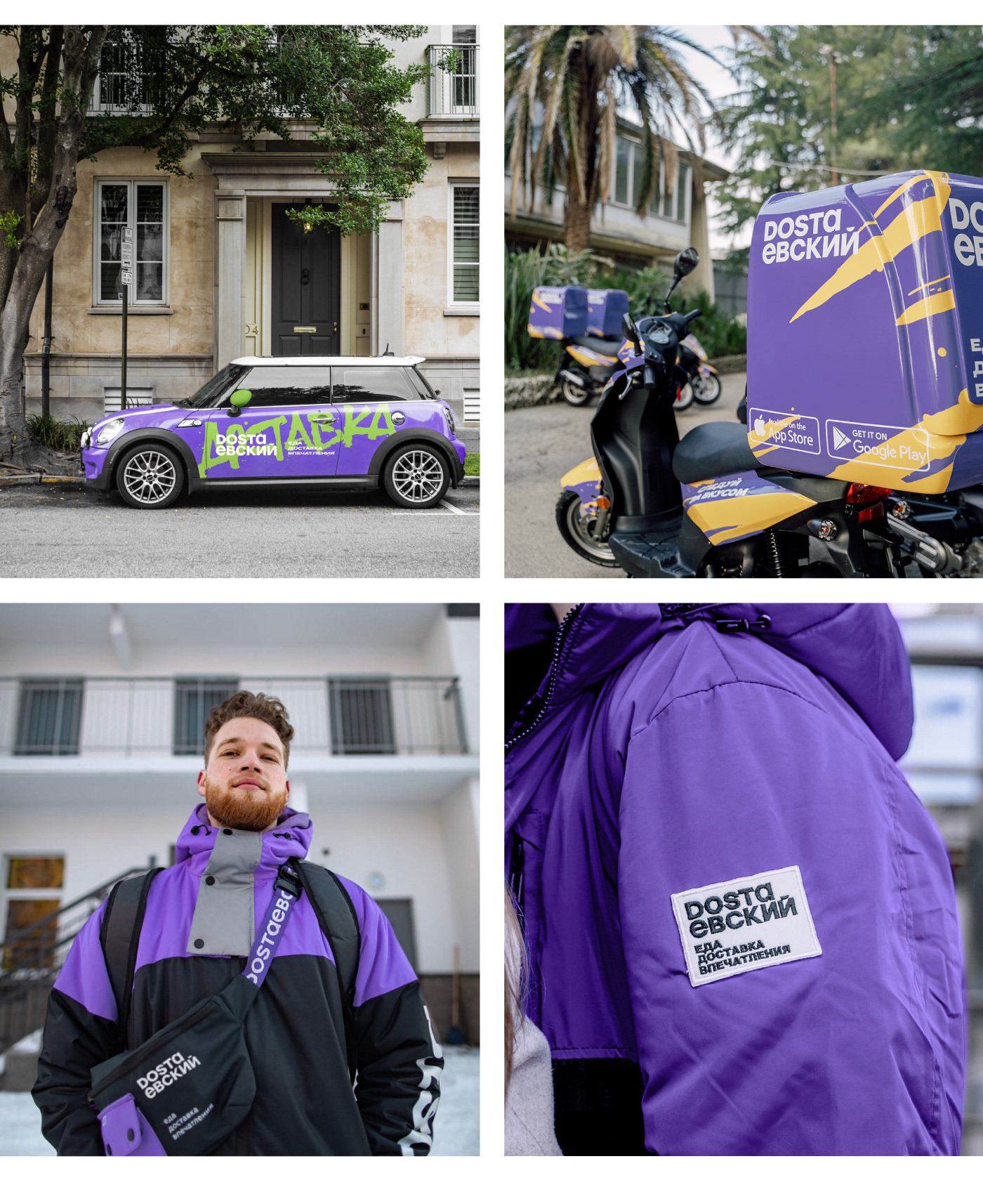
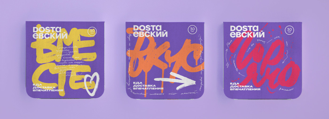
Dostaevsky combines delicious food and an active city lifestyle. It opens up new flavors, formats, and experiences. We use a novel corporate identity of the brand,an updated logo, and spectacular calligraphy.
Calligraphic fonts are energetic and emotional. Every food delivery turns into a real feast and brings vivid impressions even on an ordinary day.
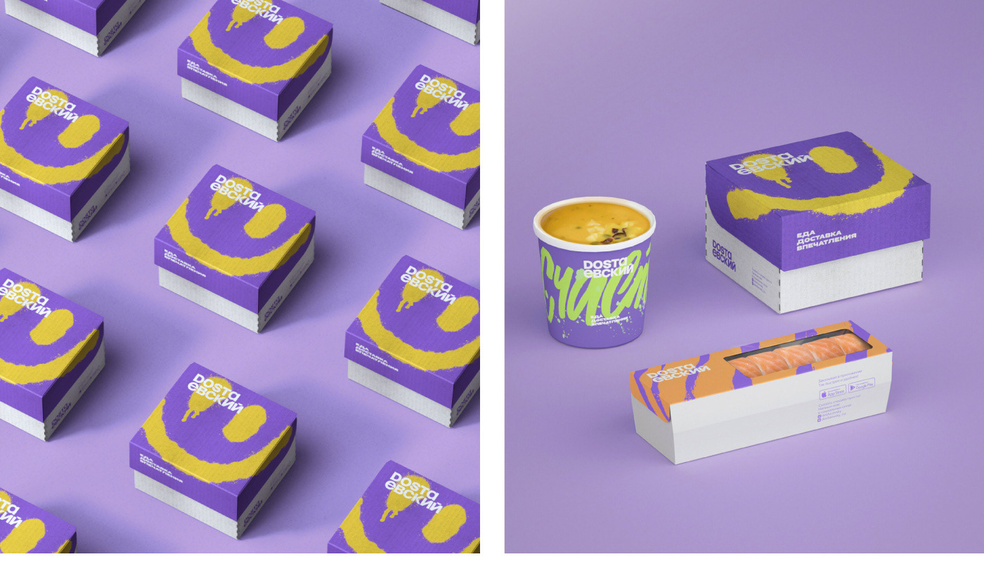
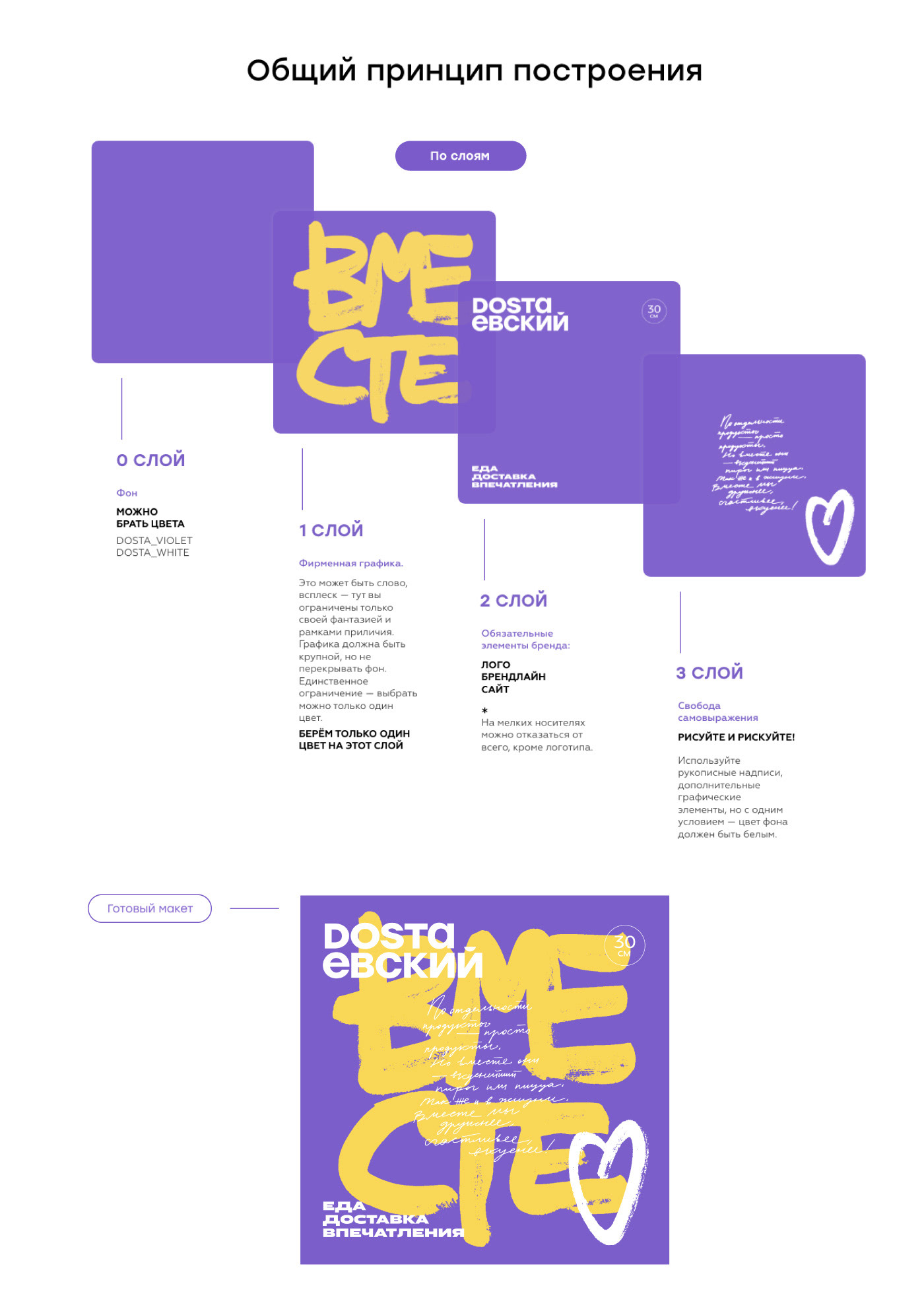
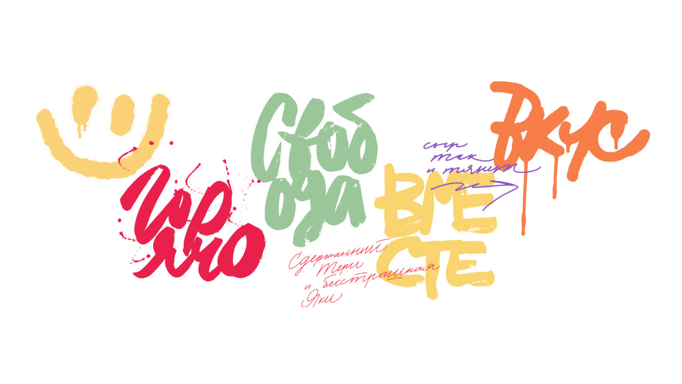
Dostaevsky's new corporate identity contains three main graphic elements: large
splatter calligraphy, small pictures and a technical layer (logo and additional information).
The graphics encourages creativity and allows to match elements differently in various media.
splatter calligraphy, small pictures and a technical layer (logo and additional information).
The graphics encourages creativity and allows to match elements differently in various media.
Impressions without borders
Communication with the audience is changing rapidly, so brands have to be flexible
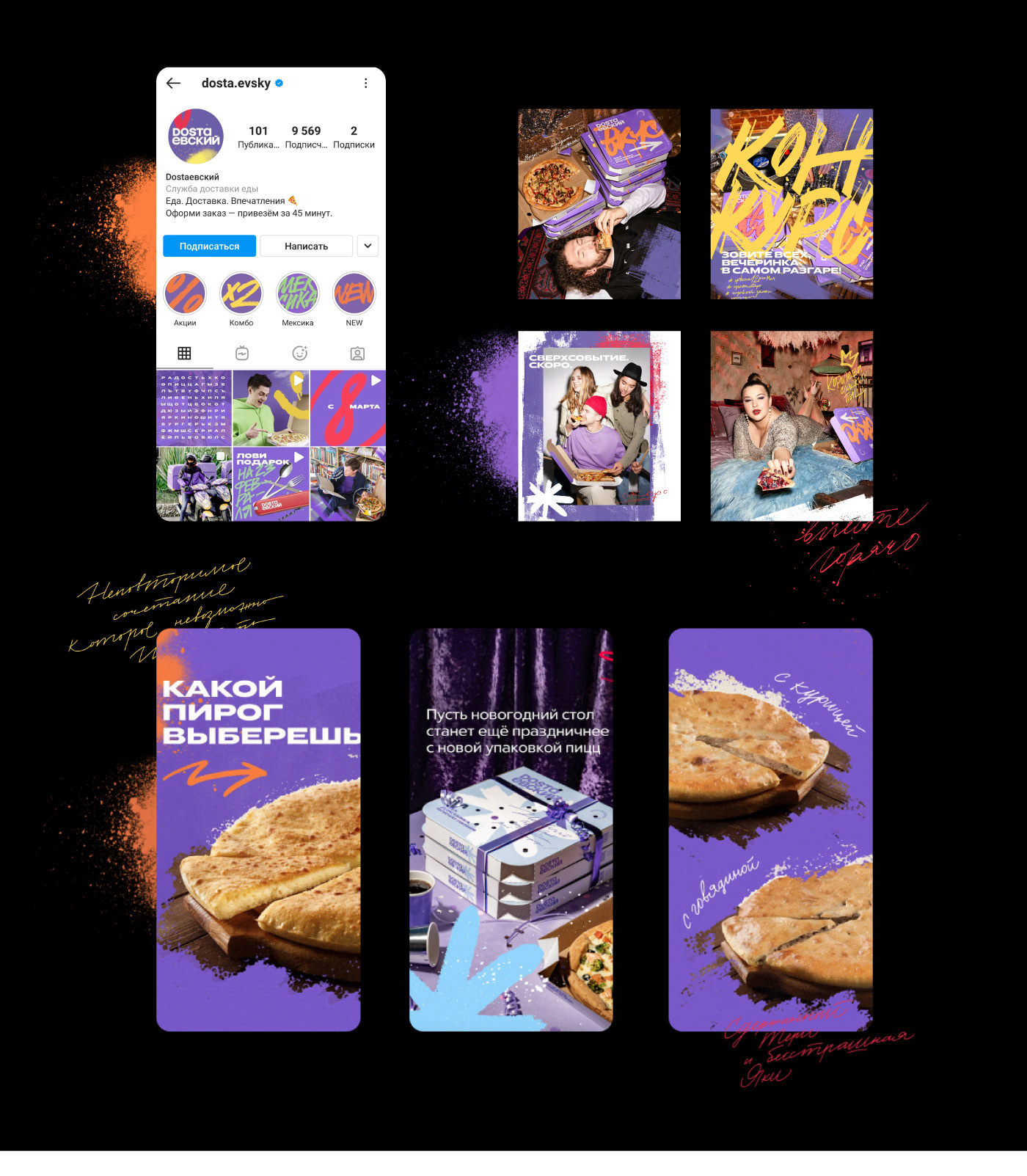
and adapt to consumer needs. Dostaevsky's new corporate identity meets these requirements. It operates perfectly offline and online. Calligraphy has become a part
of the brand on the Internet and is a recognizable feature of the company's social networks.
and adapt to consumer needs. Dostaevsky's new corporate identity meets these requirements. It operates perfectly offline and online. Calligraphy has become a part
of the brand on the Internet and is a recognizable feature of the company's social networks.
