PULP
Pulp is a brand new wine pop up store located in Valby, Copenhagen, Denmark.
Behind this store, is an accomplished sommelier with great experience and a positive attitude. Having worked at Relæ, Noma and Vivino, Russell, the owner of the shop, now dreams of a space to host all about wine.
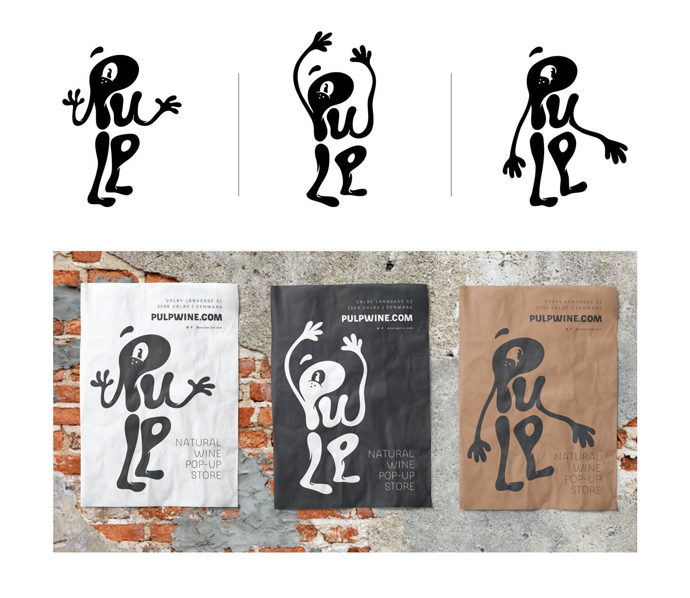
We were asked to create a character-based identity with a warm, funny feeling. We started with character illustrations inspired by the cartoons of the 20s and 30s and went on to fuse this look with the typography of the logo.
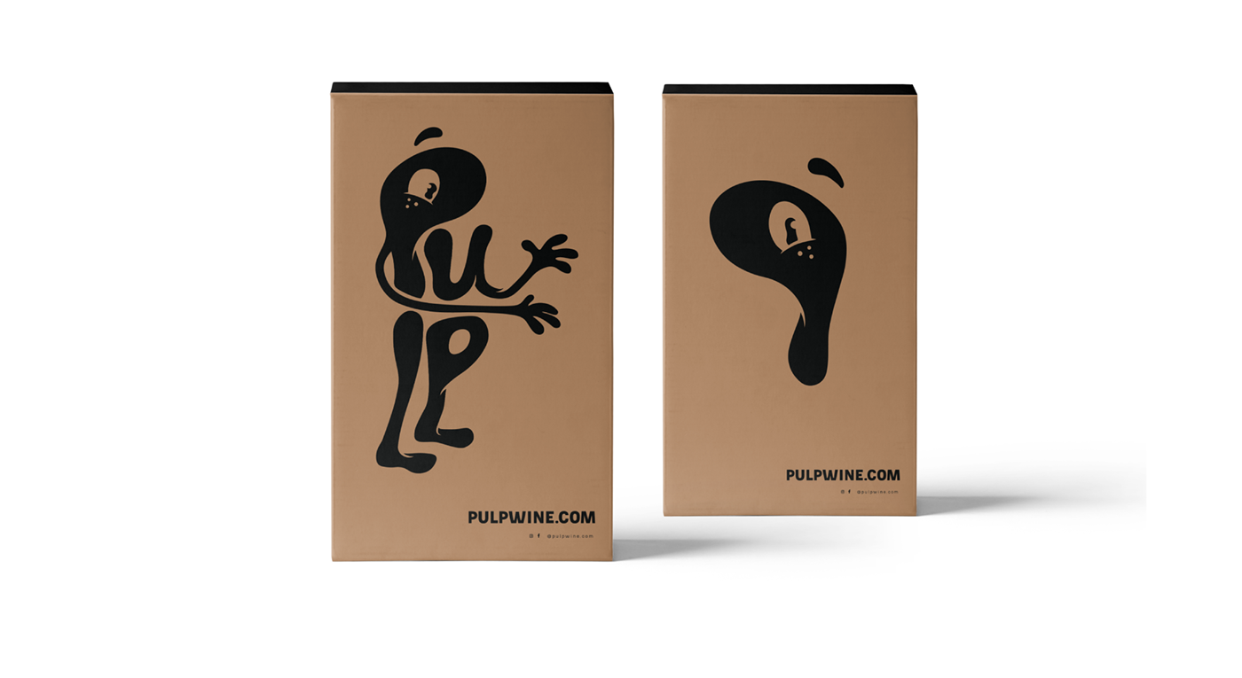
Since pulp is a soft, shapeless mass of material, we decided to provide our character with the same feeling in terms of movement and form. Not only did we give our character a distinct look that way, but we also employed the squash and stretch movement that is very common in cartoons.
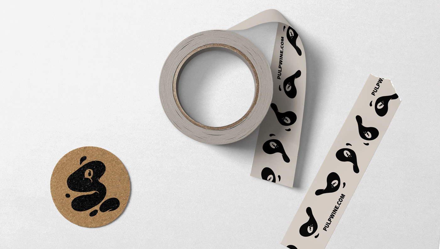
We wanted to keep the colour palette simple, using the classic black and white with the earthy colour of craft paper, wood, or other material used as a background.
Trine Rask’s typeface Slik was used for all related applications.
The identity includes the creation of logo, printed material, wine boxes, wrapping paper, stickers and more as the brand evolves.
Since pulp is a soft, shapeless mass of material, we decided to provide our character with the same feeling in terms of movement and form. Not only did we give our character a distinct look that way, but we also employed the squash and stretch movement that is very common in cartoons.
We wanted to keep the colour palette simple, using the classic black and white with the earthy colour of craft paper, wood, or other material used as a background.
Trine Rask’s typeface Slik was used for all related applications.
The identity includes the creation of logo, printed material, wine boxes, wrapping paper, stickers and more as the brand evolves.