The national brand, the history of which began a long time ago, back in the 90s, has its own connoisseurs. It's all because the products contain only high-quality flour, water and care. The brand's main philosophy consists in love for the native land, for the best wheat in the world and for its people.
We started with logo redesigning. To create it, we used the main advantage of the brand — its naturalness. We added wheat spikelets to the laconic, hand-drawn lettering. This is how we got a minimalistic and interesting logo.
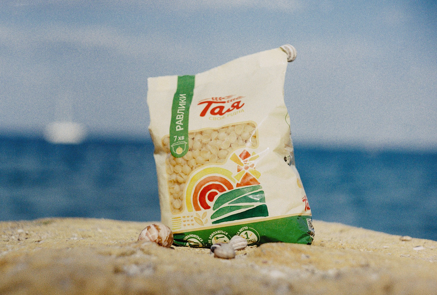
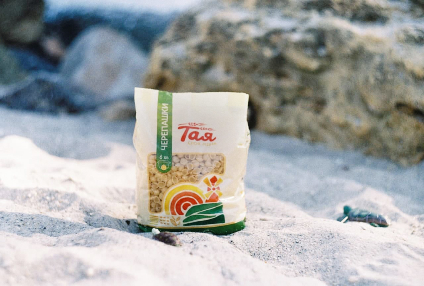
A watercolor illustration in the naive style emphasizes the purity and simplicity of the product recipe.
The chosen concept is also followed in the color scheme: soft yellow resembles a shade of young wheat ears, green symbolizes the land fertility and emphasizes the naturalness of the product. Pasta "Taya" is not just pasta, it is horns, spirals, curls, shells, tubes, and even more.


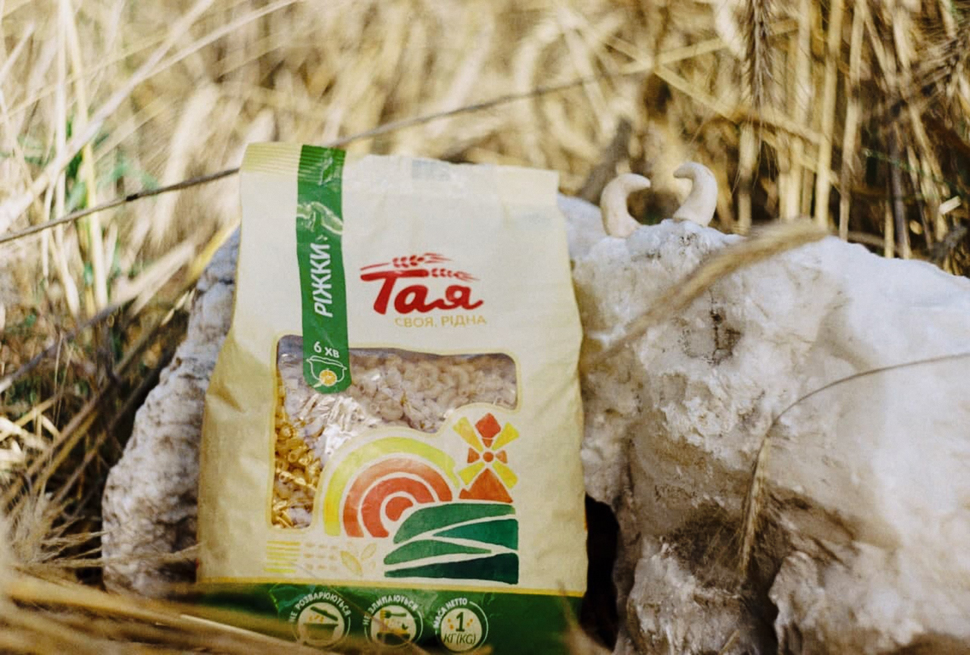


The theme of simplicity, nature and favorite retro is also followed in the packaging photographs. Therefore, they were shot at the wheat field (and later on the Black Sea coast), using a Zenit camera originally from the 90s. We chose textured stone and unbleached linen as props, and we also decided to play up unusual names of the brand's products by translating them from Ukrainian. So we got cobwebs, horns, tubes, feathers, snails, shells, turtles. Also, “spaghetti”, translated from Italian, means little ropes.