Introduction
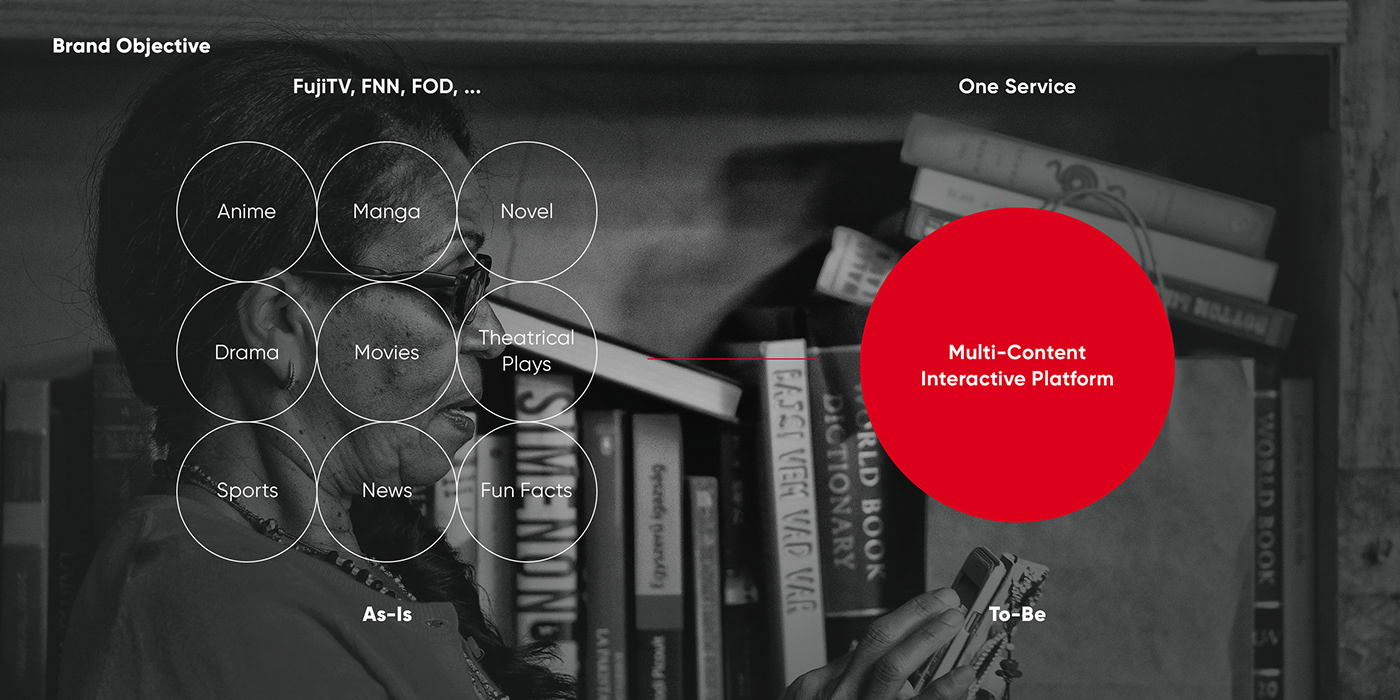
Coming into 2021, online streaming and broadcasting have become one of the major forms of entertainment and media publishing. The rise of Netflix over the years is one of the most concrete pieces of evidence for this shift in the broadcasting industry. To counter Netflix’s expansion, in 2012, Fuji Television Network (FujiTV), one of the major television networks in Japan, launched a new service named FujiTV On Demand (FOD). Over the years, FOD has evolved to become one of the major platforms in Japan, monopolizing the Japanese market. With the addition of FOD Premium in 2019, FujiTV is set on its way to becoming the largest broadcasting network in Japan and in Asia.
To commemorate FOD’s ten years in service and to further evolve the platform, Fuji Television Network kickstarted project Fuji+, a conceptual project to build the foundation for FOD’s future and FujiTV’s shift toward online services.
Branding Strategy
Mission, Vision, and Positioning
Defining the mission and vision for FujiTV’s new service and finding the correct positioning for the project is a crucial step that could make or break the project’s success. Together with the project team at FujiTV, LNM Production conducted intensive research in addition to holding interviews and workshops with staff and managers at FujiTV to discover the stakeholders’ goals, challenges, and visions. The results from this process became the foundation for building the initial concepts of the service, which is employed for agile prototyping and validating.

Service Naming
Based on the defined concept, the project team proceeded to craft a new name for the service. Paying tribute to FujiTV’s history and its current range of services and sub-networks such as FOD (FujiTV On Demand), FNN (Fuji News Network), etc. LNM Production chose to keep the word “Fuji” as the core service name while adding “+” after the word “Fuji,” creating the final service name “Fuji+.”


Service Slogan
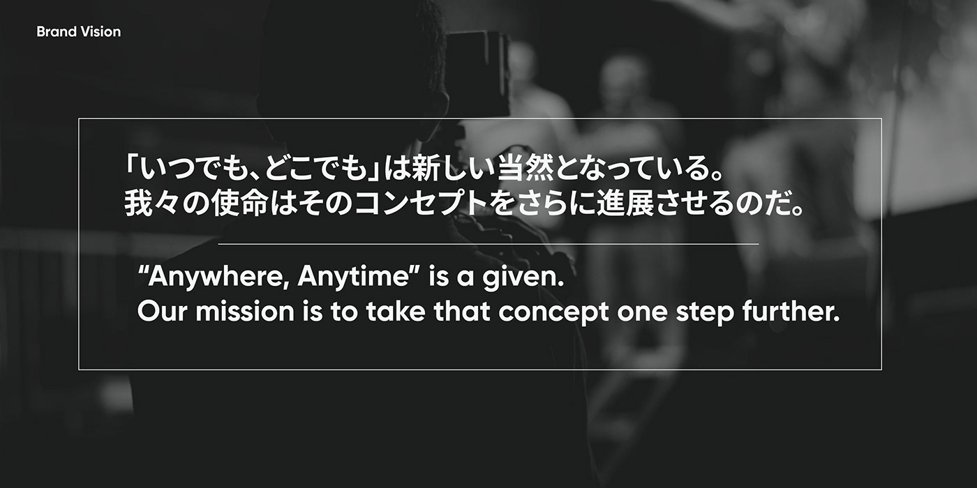
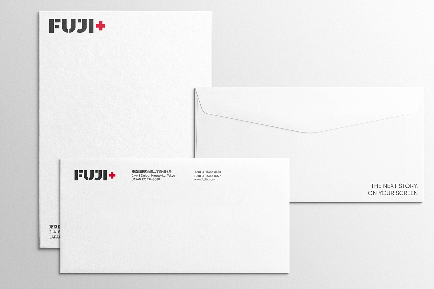
To complement and support the service’s vision and to create cohesive communication with users, the project team set out to create a slogan for Fuji+. The slogan must be short, memorable, and able to convey its meaning accurately when written in English and Japanese. What’s more, the created slogan must also effectively differentiate Fuji+ from similar businesses. Through repeated drafts and debates, the team landed on the answer: The Next Story, On Your Screen (Japanese: 次の物語を、あなたの画面で).


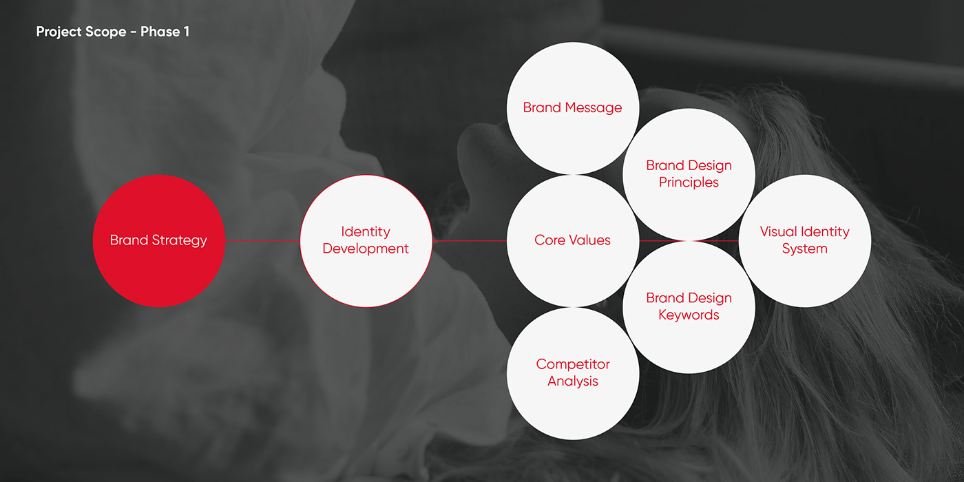
Identity Development
Brand Core Values & Design Principles
To define the brand design principles for Fuji+, the project team must first determine the core values that Fuji+ is offering. Through interviews and workshops with the primary stakeholders at FujiTV, our team was able to define the three brand core values which Fuji+ is offering: Adaptive, Principled, and Leading. Base on these three core values, the project team also defined the three brand design principles for Fuji+: Simple, Modern, and Opened.

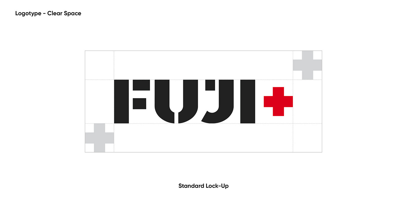
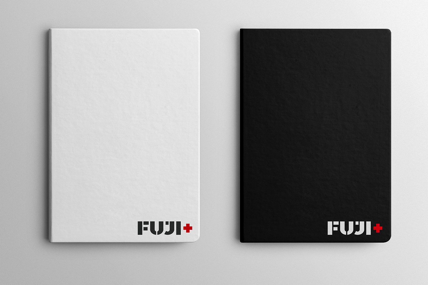
The Logotype
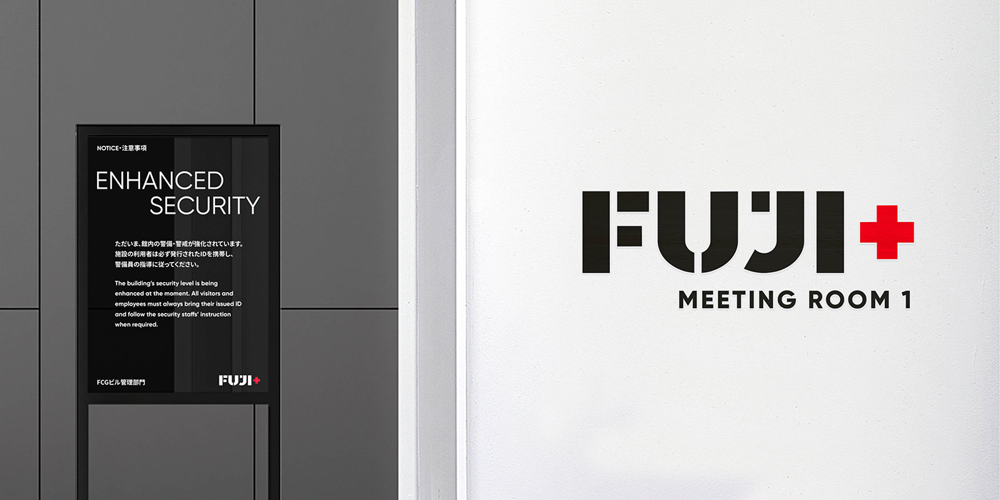
Inspired by the service’s mission to “Foster Communities of Like-minded Audiences,” the new logotype for Fuji+ was designed with “broken pieces of different shapes and sizes” to represent the different communities of audiences that come together through the service. This motif emphasizes the service’s core idea of becoming “a service made by the audience, for the audience.” All the shapes were designed strictly based on a geometrical grid to ensure the balance of the final letters and the harmony between them. The same grid was also used for the kerning, helping to shape Fuji+’s new logotype into a visually attractive design. The design team also chose Fuji Exciting Red (Pantone 2035C) and Fuji Calming Bold (Pantone 419C) from the brand’s color palette for the coloring so as to further add another layer of meaning to the logo while maintaining the legibility and recognizability of the final design throughout different applications.


Color Palette
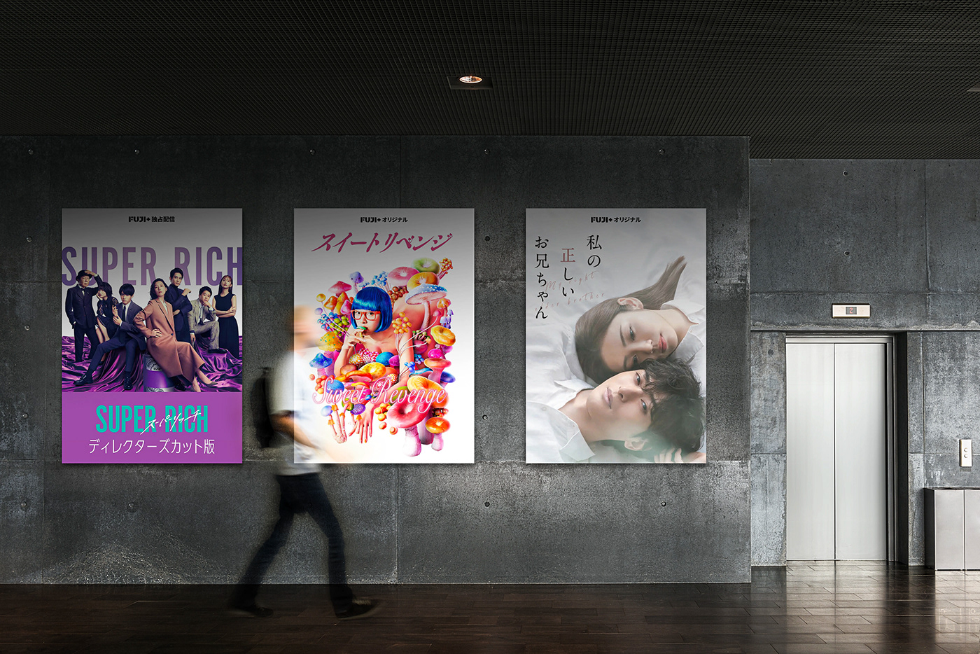
Based on the defined brand core values and design principles, together with the logotype, the project team also defined a new color palette to distinguish Fuji+ from other brands and services. Resultantly, the project team chose Fuji Exciting Red (Pantone 2035C) and Fuji Calming Bold (Pantone 419C), two colors with different characteristics, as the primary and secondary colors for Fuji+. Furthermore, the team also chose a set of extended colors to add more variety and create a dynamic color environment for Fuji+. These colors include Fuji Violet (Pantone 2070C), Fuji Blue (Pantone 2370C), Fuji Green (Pantone 2273C), and Fuji Orange (Pantone 717C). The chosen extended colors are also expanded into different tints and shades to accompany the neutral gray tones defined from the Black and White colors.


Typography System
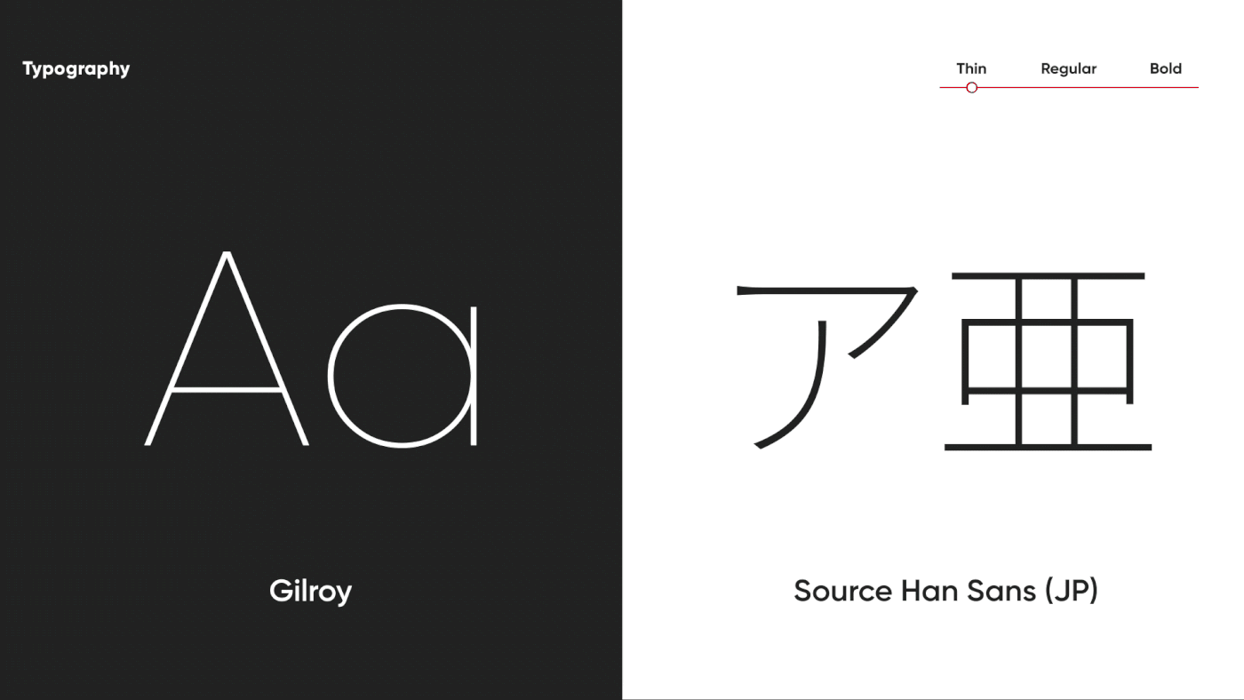
Once the color palette and the logotype had been defined, the project team proceeded to define a typography system for Fuji+. For English-oriented applications, we chose Gilroy, a geometric sans-serif font designed and published by Radomir Tinkov. Optimized for excellent legibility, Gilroy features balanced glyphs with a modern, progressive, and neutral appearance, making the font a perfect choice for Fuji+. Based on Gilroy, we also chose Source Han Sans, an open-source font from the Adobe Originals program, to support applications in Korean, Chinese, and most importantly, Japanese.


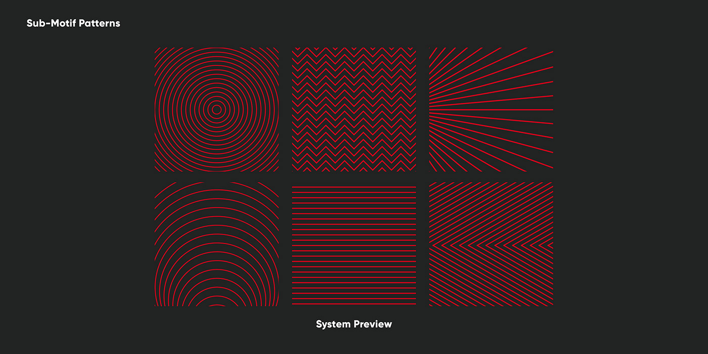
Sub-graphic System
As the final touch for Fuji+, the project team created an extended sub-graphic system to compliment the service’s primary visual identity.
Based on the structure of the "+" symbol, the project team employed a simple "rectangle" (a single stroke from the two strokes required to create the symbol) as the service's primary graphic motif. By combining this "rectangle" with a defined grid system, the project team successfully created a design structure that is easy to implement and powerful enough to separate Fuji+ from competing services. Furthermore, the project team also devised an additional set of six patterns using simple shapes and movements to add more variety to the final system.