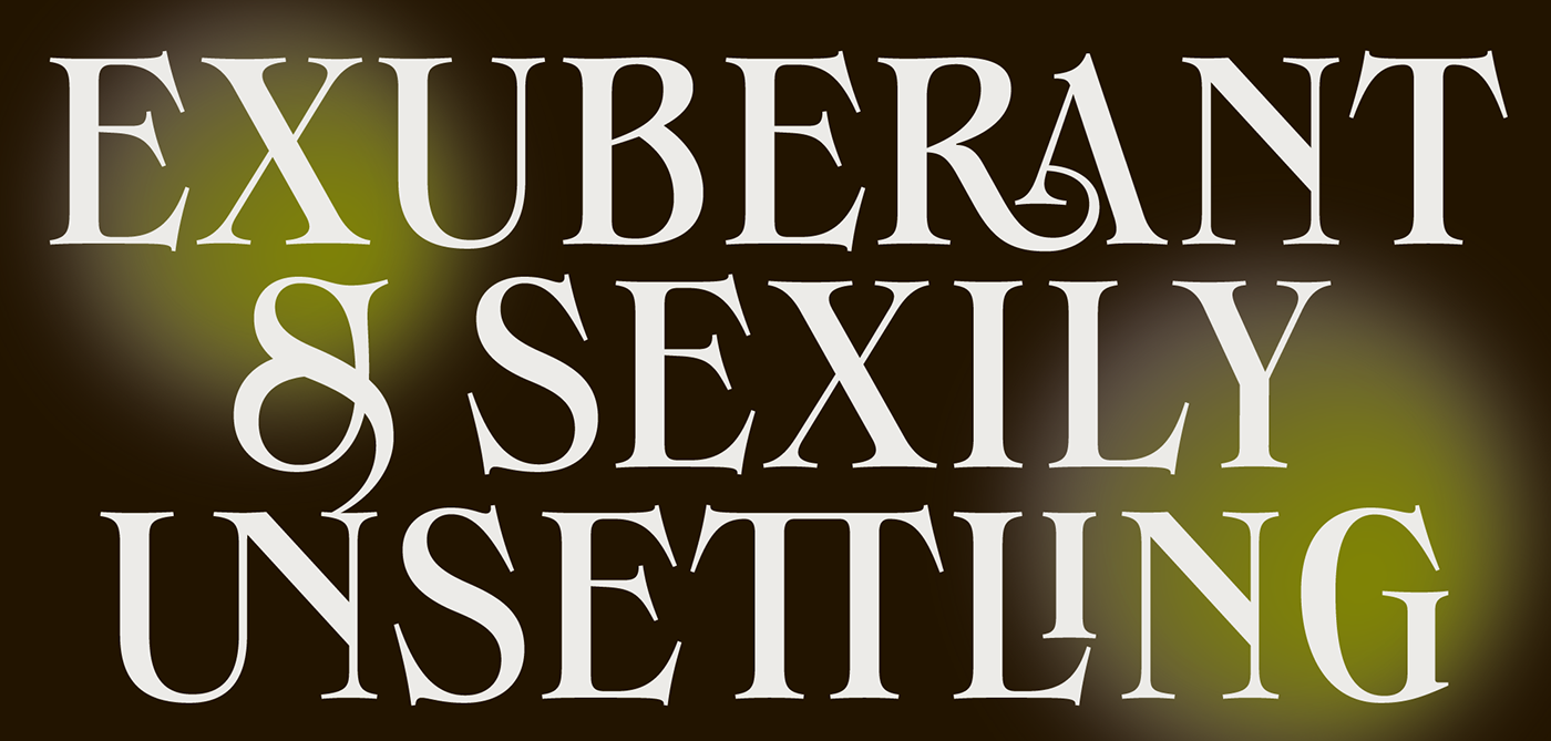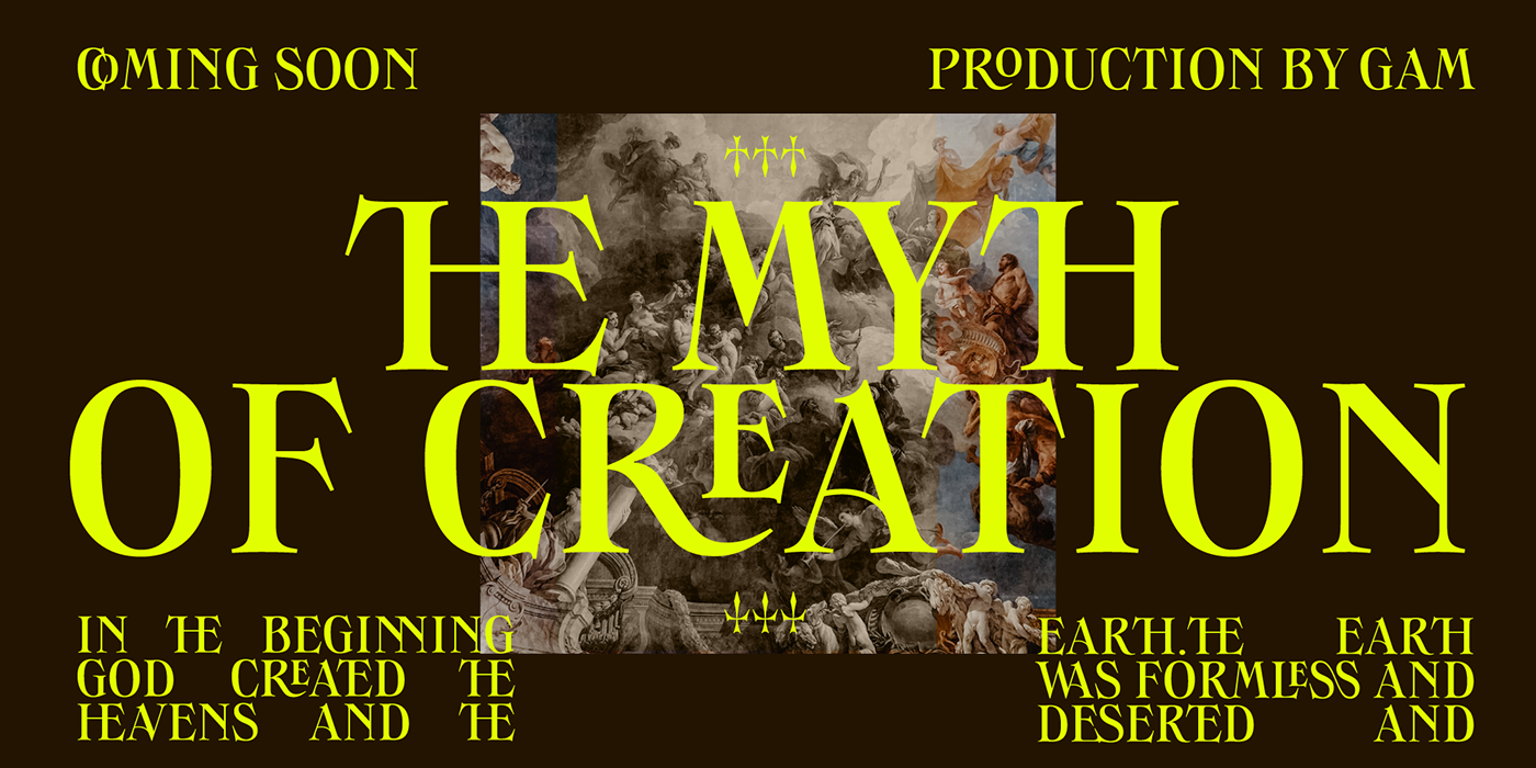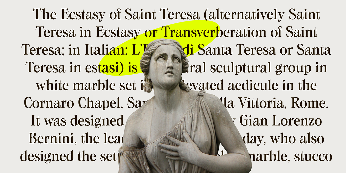
Mario De Libero designed Swanstone while investigating XIX Century Old Style typefaces. Designs like Theophile Beaudoire’s Romana (1860) or Miller & Richard’s Modernized Old Style, that re-imagined the classical “Venetian” letterforms adding flared serifs and early Art Nouveau influences. In Italy, one of these fonts was Raffaello Bertieri’s Raffaello, which De Libero used as the starting point of his research in a contemporary retelling of these exuberant and sexily unsettling letterforms. Developed as a single weight to be released in our Zetafonts Singularity line.
Join our Typeclub
Discover the font and download the trial version
for free on https://zetafonts.com/swanstone
for free on https://zetafonts.com/swanstone


