


SITUATION
Vilniaus Paukštynas, which nurtures long-standing poultry farming traditions, belongs to the largest vertically integrated agricultural and food industry group in the Baltic region, Linas Agro Group, producing products from field to table.
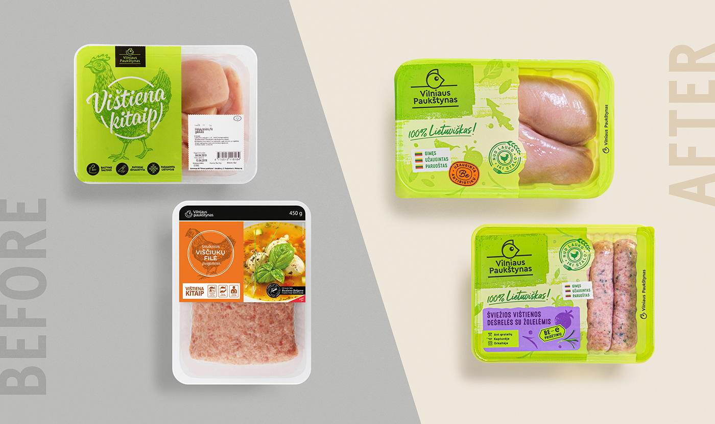
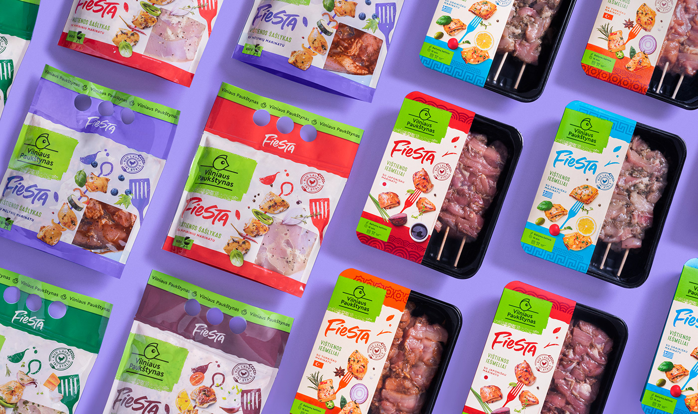
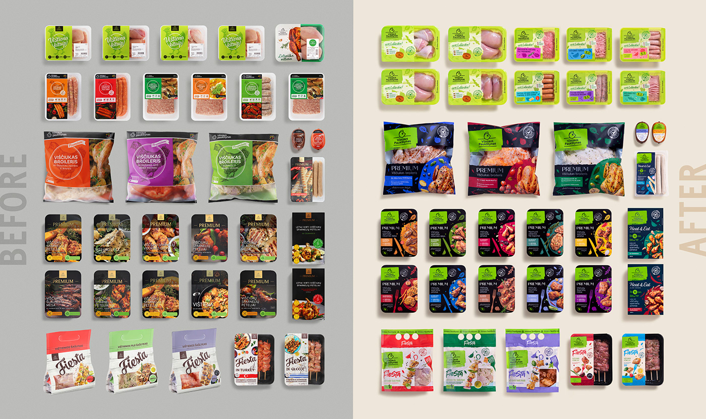
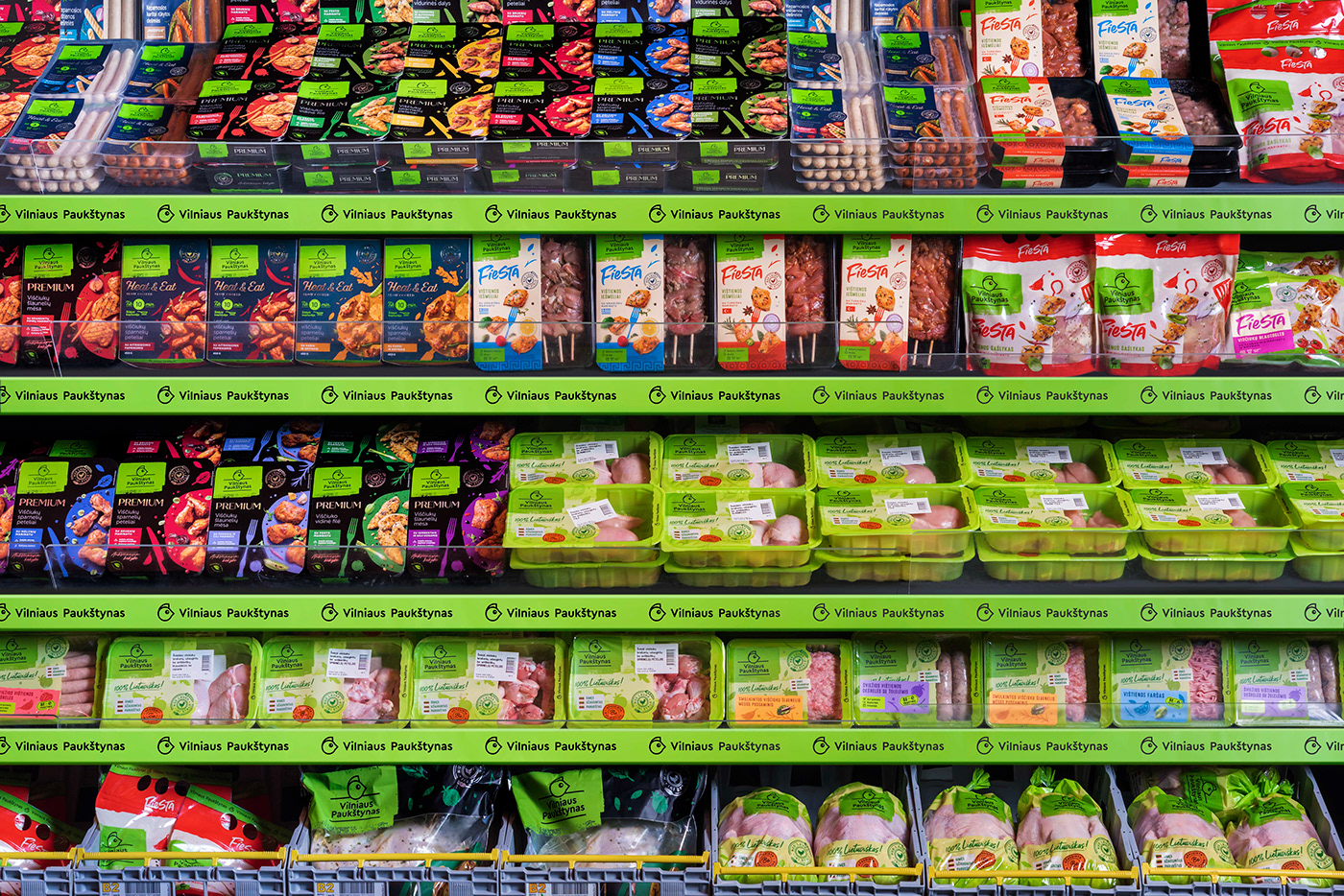
The client came up with a renewed brand positioning. Our goal has been to respond to brand promise, create eye-catching designs that work on shelves and e-commerce, ensure 360° visibility from any packaging position for the entire assortment and at the same time provide every product differentiation. In total: over 100 SKUs in several product subcategories.
SOLUTIONS
Consumers’ attention is constantly dropping, and colours become the first thing that grabs attention. Therefore, both on the visually noisy shelves and the e-commerce interface, the green logo areas that unite the entire assortment and colours that separate the products are gaining critical value.
Depending on the consumption habits, the assortment is divided into three core product lines, which we gave a distinctive look.

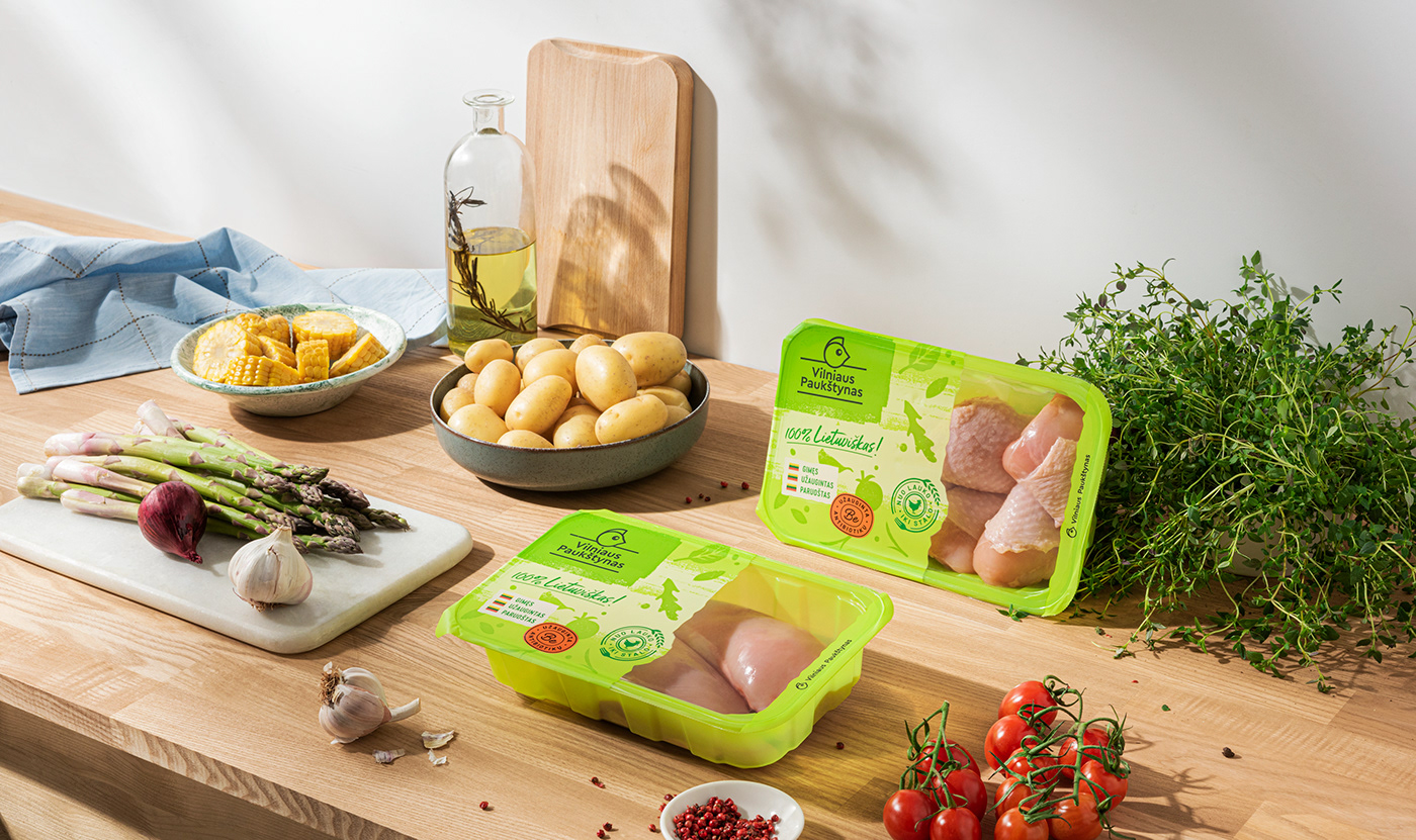
EVERYDAY CHOICE. We used a lot of green colour for the core product trays and films, ensuring maximum visibility for the brand among competitors with almost transparent trays and films.
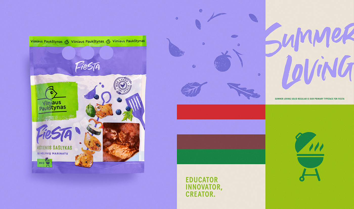
BRAND PROMISE. We reflected the new brand promise to create, inspire, and innovate in the kitchen. We came up with the idea of multi-shade green areas associated with the fields, free-flying herbs, spices, and creative brush strokes. It is an expression of the freedom to create in everyone’s kitchen and on the plate. After all, when cooking, we are all immersed in a little creative mess.
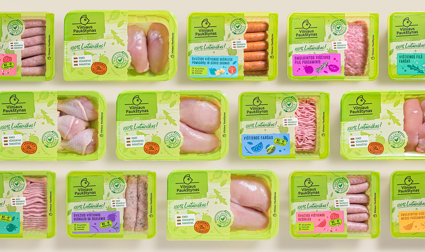
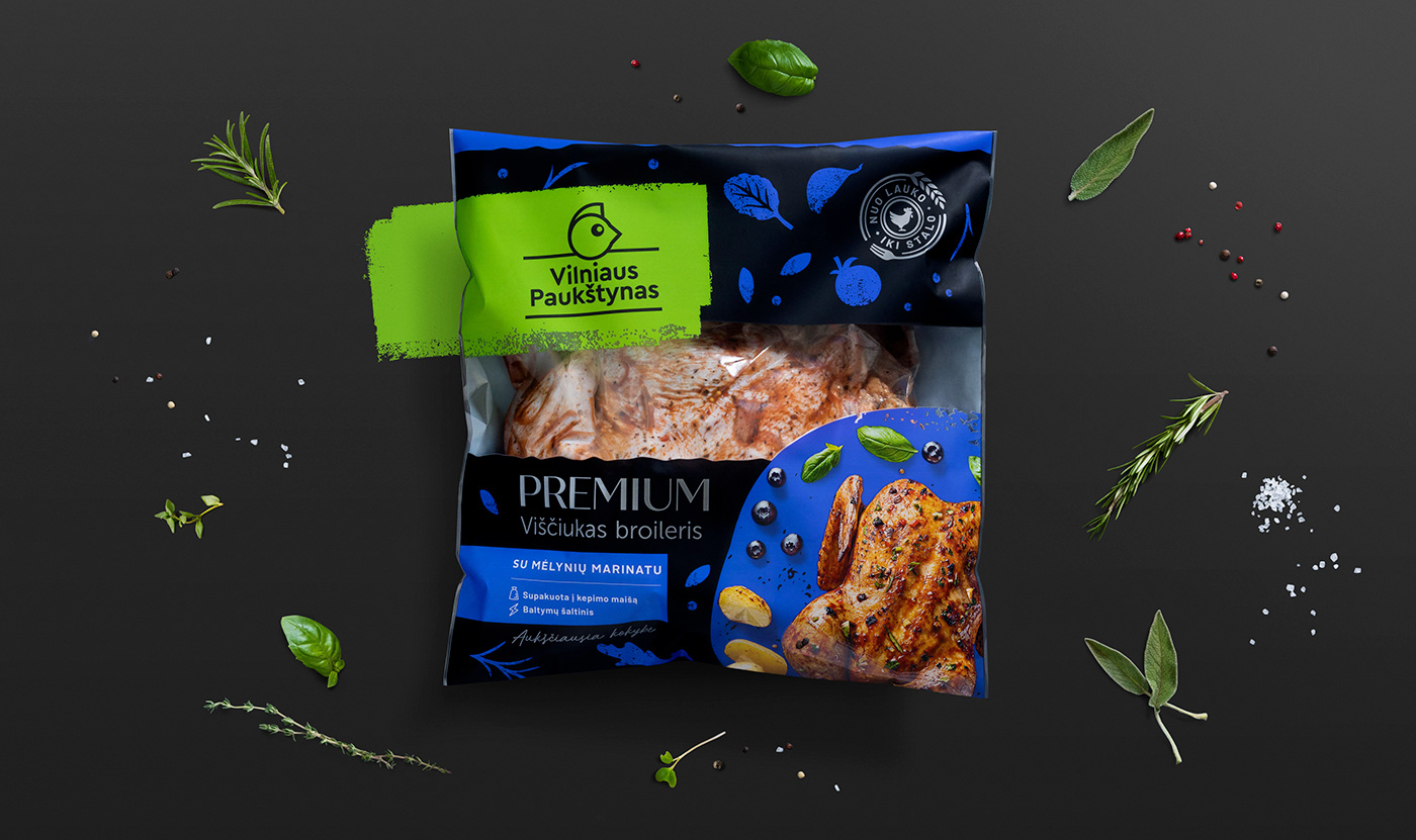
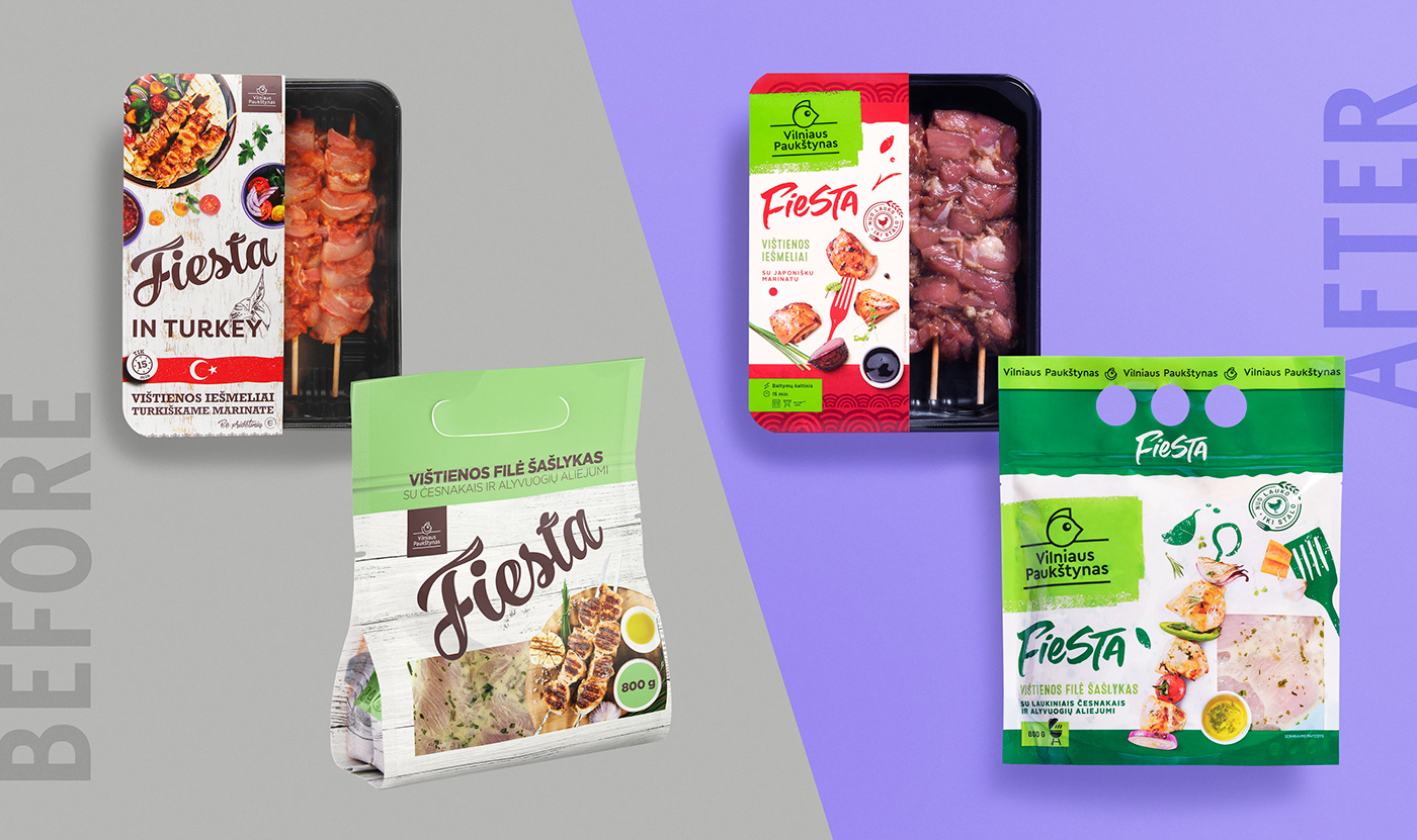
CLAIM GRAPHICS. We spread the core message about the production chain “from field to table” as the client is responsible for each production process. So the visual focus is on the main claim, while other feature badges are smaller. Knowing the imperfect process of tray sealing and labelling, we arranged the claims as a free composition. In this way, we have created a system where sealing and labelling imperfections do not interfere but help the design look good.


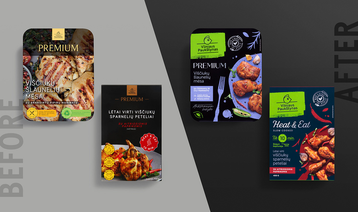
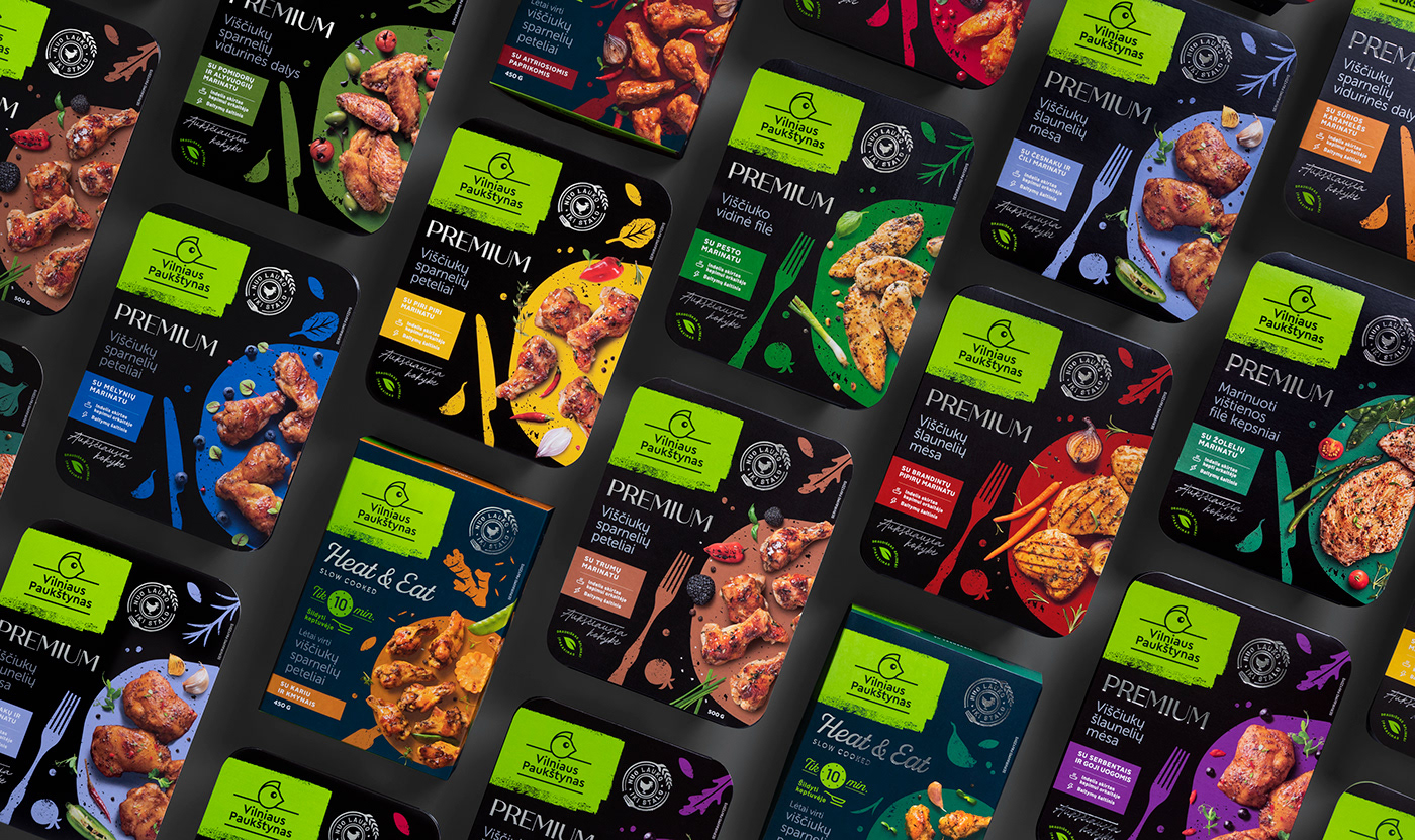
PREMIUM. We kept the historic line name and black background colour. We added a logo on a green background and selected stylish typography that matched the line’s naming. We’ve moved on from gold to silver-coloured details that look more modern and relate to kitchen utensils. And we separated Heat & Eat products by background colour because these products are heat treated.
PHOTOGRAPHS. We wanted the photos to also contribute to the spread of the creative brand idea. So the idea arose to photograph food on drawn plates with free lying cutlery. The concept also responds to people habit of taking food pictures from above and posting them on social media.
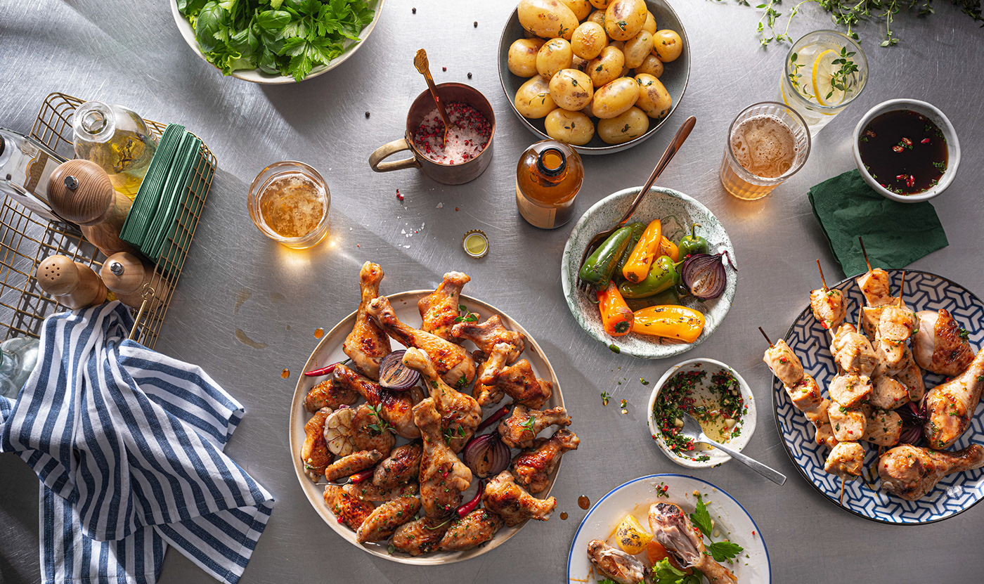

FIESTA. Products for grilling during the warm season. So we used a light background, softer colours and almost dancing ingredients for the packaging. That’s the fiesta mood! As with all assortment, the big green logo location and size are fixed.
Client: Vilniaus paukštynas
Agency: étiquette
Design strategy: Laura Ragaišytė-Važgėlienė, Edvardas Kavarskas
Art direction: Irmantas Savulionis
Design: Greta Dumčiūtė
Prepress design: Daniel Samulevič
Account management: Rita Dargytė, Anton Slepov
Manufacturing & printing: Aurika, Vilpak, Umaras, Ioco Packaging, Polipaks
Product photoshoot: PackShot
-
© étiquette, 2021, Vilnius


