


Av Nuts & Dried fruits packaging design
Objective: To develop a redesign of packaging for an assortment of nuts, dried fruits and mixtures for the Azbuka Vkusa brand. The main target audience is people who consume nuts and dried fruits in their regular diet and appreciate pure formulations without conservatives and added sugar, high-quality raw materials. As well as young people and active people who want to have a snack on the run.
Problem: The main problem is that it is difficult to navigate the huge assortment line, there is a lot of visual noise on the packaging. The product is not much different from competitors' products.
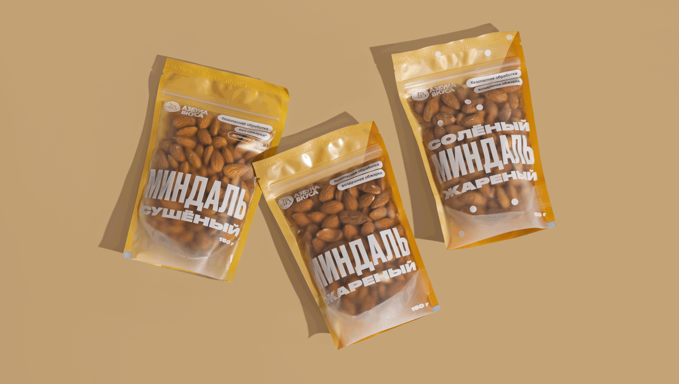
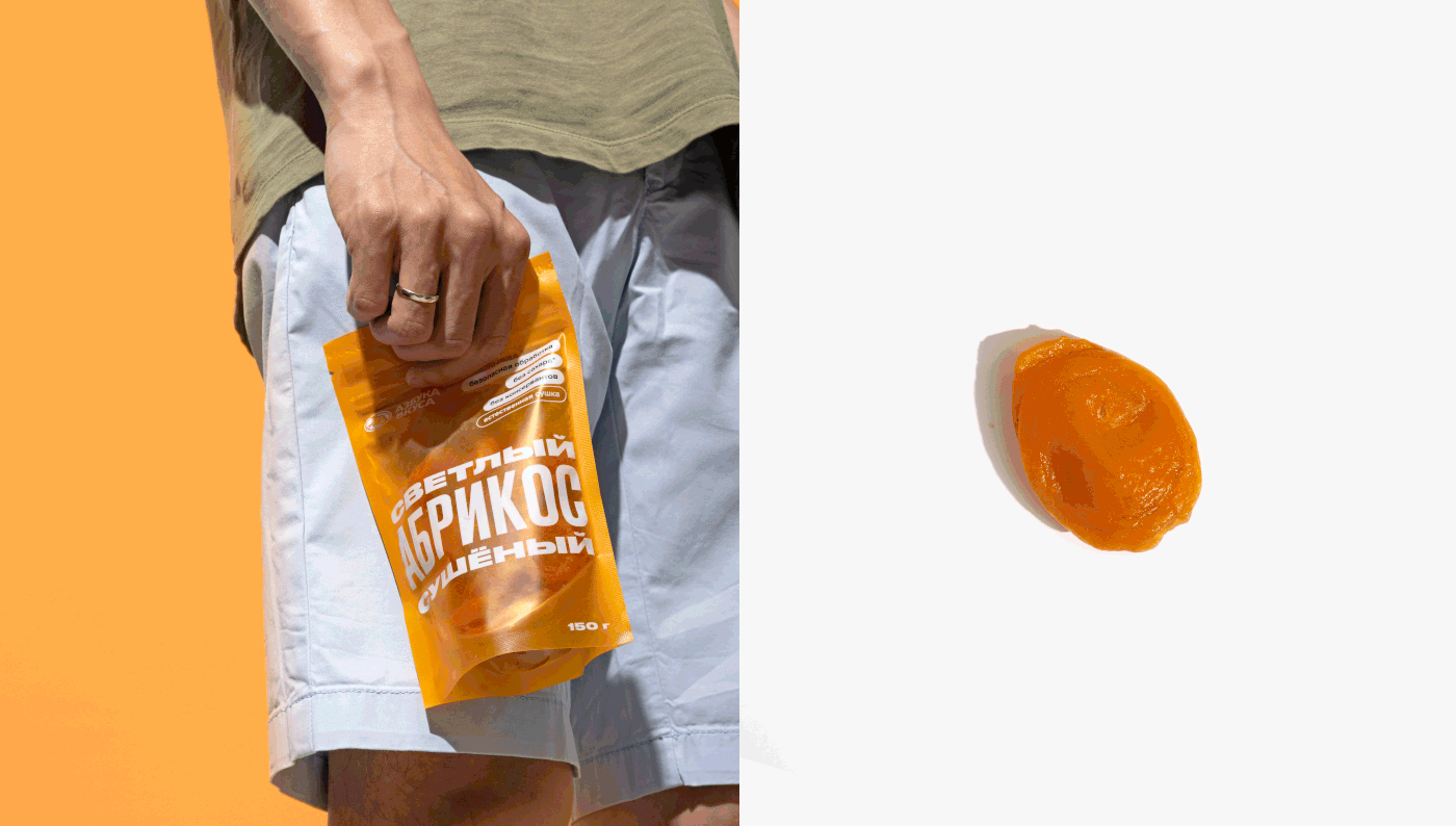
Solution: We approached the redesign comprehensively. We revised the packaging material, color differentiation, in which we pushed away from the color of the product. We made it so that the product was visible in them as much as possible. We have developed a vivid and understandable system: no "enticing" texts and complex brands, and most importantly, we got rid of photos, because the product itself is cool.
The design system is now based on large dynamic typography that grabs attention and tells the consumer what the product is. Simple and straightforward. We took out the features and important USPs to the side and highlighted them with tags so that the consumer could easily find the characteristics that are important to him.In the new design, the product is easier to read from afar and looks cleaner in a single display block.


Задача: Разработать редизайн упаковки для ассортимента орехов, сухофруктов и смесей для бренда «Азбука вкуса». Основная целевая аудитория — люди, которые употребляют орехи и сухофрукты в своем постоянном рационе и ценят чистые составы без консерваторов и добавленного сахара, качественное сырье. А также молодежь и активные люди, которые хотят перекусить на бегу.
Проблема: Основная проблема — сложно ориентироваться в огромной ассортиментной линейке, много визуального шума на упаковке. Продукт мало чем отличается от продуктов конкурентов.
Решение: К редизайну подошли комплексно. Пересмотрели материал упаковки, цветовую дифференциацию, в которой оттолкнулись от цвета продукта. Сделали так, чтобы продукт в них был виден максимально. Разработали яркую и понятную систему: никаких «завлекающих» текстов и сложных клеймов, а главное — избавились от фотографий, ведь продукт сам по себе классный. Теперь в основе системы дизайна лежит крупная динамичная типографика, которая привлекает внимание и рассказывает потребителю, что это за продукт. Просто и понятно. Особенности и важные УТП мы вынесли на боковую сторону и выделили их тегами, чтобы потребителю было легко найти важные для него характеристики. В новом дизайне продукт легче считается издалека и чище выглядит в едином блоке выкладки.
Design director Arnis Millers
Art director Alexandra Loginevskaya
Design & layout Daria Kwon, Alexey Pashnin
Photography Daria Kwon
Text Maria Bushueva, Irina Ivanova
Project management Natalia Zabalueva


