SOBRE | PT_
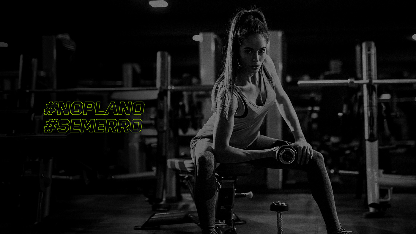
Geandre é um educador físico voltado a prática de treinamentos personalizados para hipertrofia, emagrecimento, qualidade de vida e condicionamento físico para todos os públicos.
Encontrar uma estética única e completamente diferente dos seus concorrentes foi o maior desafio na criação de sua identidade visual.
Para atingir esse objetivo, realizei uma imersão no mercado do Rio de Janeiro e região, bem como na história do próprio cliente, buscando entender quais diferenciais deveriam estar presentes na identidade visual e compreender quais seriam os conceitos essenciais da marca.
Para atingir esse objetivo, realizei uma imersão no mercado do Rio de Janeiro e região, bem como na história do próprio cliente, buscando entender quais diferenciais deveriam estar presentes na identidade visual e compreender quais seriam os conceitos essenciais da marca.
ABOUT | EN_
Geandre is a physical educator dedicated to the practice of personalized training for hypertrophy, weight loss, quality of life and physical conditioning for all audiences.
Finding a unique and completely different aesthetic from its competitors was the biggest challenge in creating its visual identity.
To achieve this goal, I immersed myself in the Rio de Janeiro market and region, as well as in the client's own history, seeking to understand what differentials should be present in the visual identity and understand what the essential concepts of the brand would be.

CONSTRUÇÃO | PT_
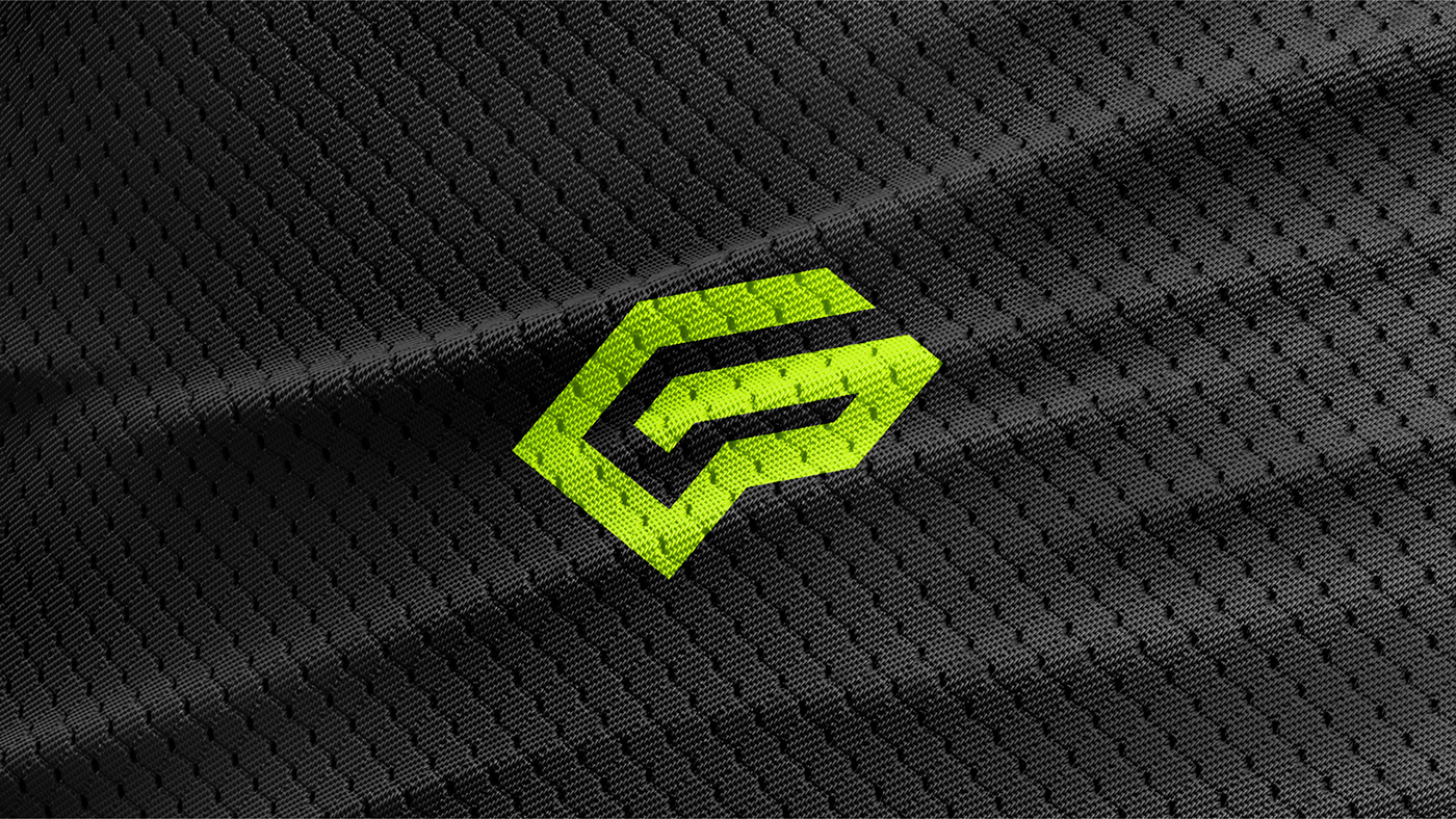
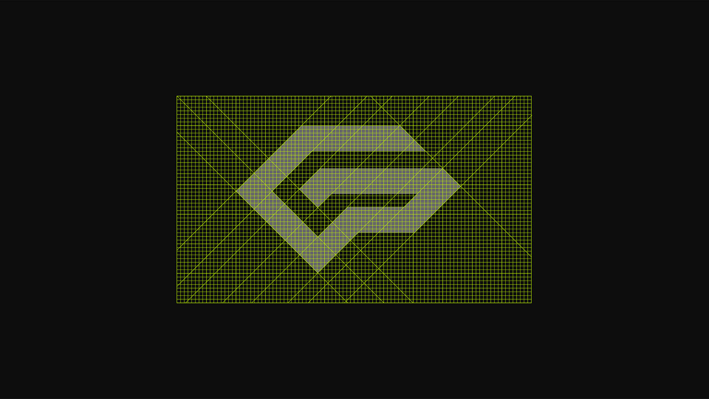
O símbolo se baseia em três ícones relacionados ao cliente: a letra G, inicial do nome da marca, dá forma ao logo, bem como o cérebro e bíceps, presentes de forma mais discretas. O cérebro foi escolhido por ser o local onde é produzida a Endorfina, neuro-hormônio que gera anestesia, prazer, bem estar e aumento da autoestima proporcionado principalmente pela atividade física. Já o bíceps como figura que representa a musculação.
CONSTRUCTION | EN_
The symbol is based on three customer-related icons: the letter G, initial of the brand name, gives shape to the logo, as well as the brain and biceps, present in a more discreet way. The brain was chosen because it is the place where Endorphin is produced, a neuro-hormone that generates anesthesia, pleasure, well-being and increased self-esteem, provided mainly by physical activity. The biceps as a figure that represents bodybuilding.

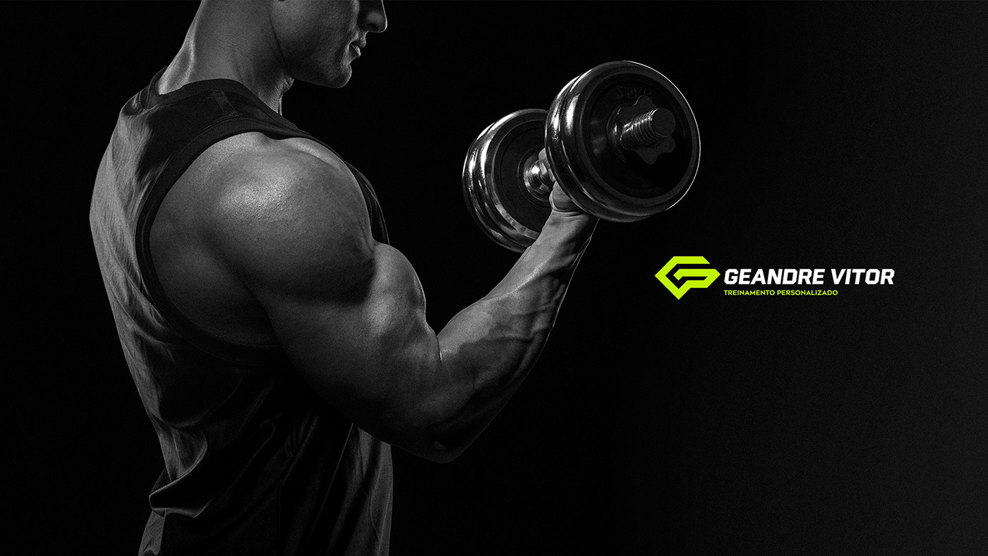
CORES | PT_
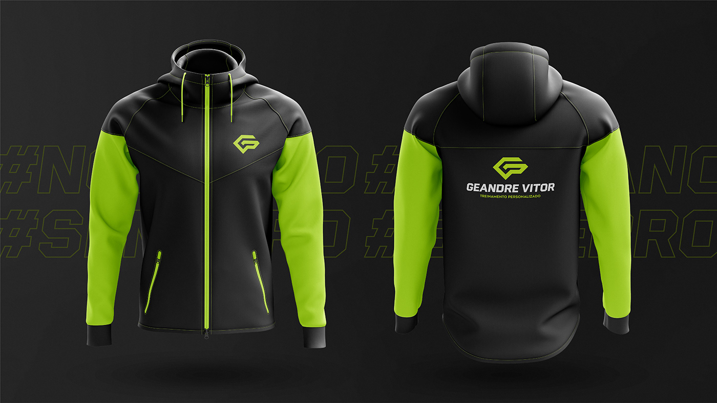
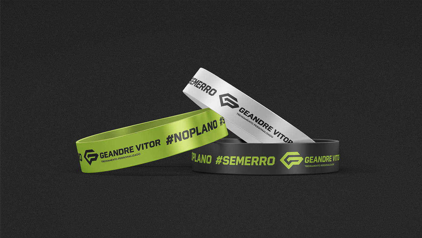
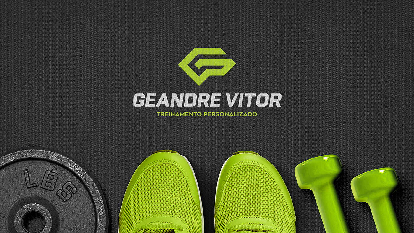
A paleta de cores escolhida, utilizando verde lima e cinza profundo, busca trazer alguns atributos da marca, como energia, vibração, motivação, movimento, diferenciação e ousadia. Além disso, ela ajuda a marca a se posicionar de forma única dentro do seu nicho de mercado.
COLORS | EN_
The symbol is based on three customer-related icons. The letter G, initial of the brand name, gives shape to the logo, as well as the brain and biceps, present in a more discreet way. The brain was chosen because it is the place where Endorphin is produced, a neuro-hormone that generates anesthesia, pleasure, well-being and increased self-esteem, provided mainly by physical activity. The biceps as a figure that represents bodybuilding.

TIPOGRAFIA | PT_
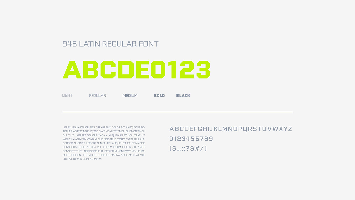
Pensando na assinatura dessa identidade visual, foi feita uma busca pela família tipográfica que tivesse um impacto visual, alinhada aos objetivos da marca e estética adequada para o nicho. Sendo assim, foi escolhida a 946 Latin como tipo principal, no estilo em itálico para dar sensação de movimento, e a Montserrat como tipo de apoio. Ambas as famílias como variedades em peso, amplitude, orientação e estilo.
TYPOGRAPHY | EN_
Thinking about the signature of this visual identity, a search was made for the typographic family that would have a visual impact, in line with the brand's objectives and aesthetics suitable for the niche. Therefore, 946 Latin was chosen as the main type, in italic style to give a sense of movement, and Montserrat as the support type. Both families as varieties in weight, breadth, orientation and style.


formas marcantes, funcionais e de fácil assimilação... | PT_
Durante todo o processo de criação foram pesquisadas referências para a construção do símbolo e escolha da tipografia e cores. Como resultado, uma marca com formas marcantes, funcionais e de fácil assimilação, que dialoga com os diversos espaços e formatos de aplicação.
STANDING, FUNCTIONAL AND EASY TO ASSIMILATE SHAPES... | EN_
Throughout the creation process, references were searched for the construction of the symbol and choice of typography and colors. As a result, a brand with striking shapes, functional and easy to assimilate, which dialogues with the different spaces and formats of application.