REBRAND:
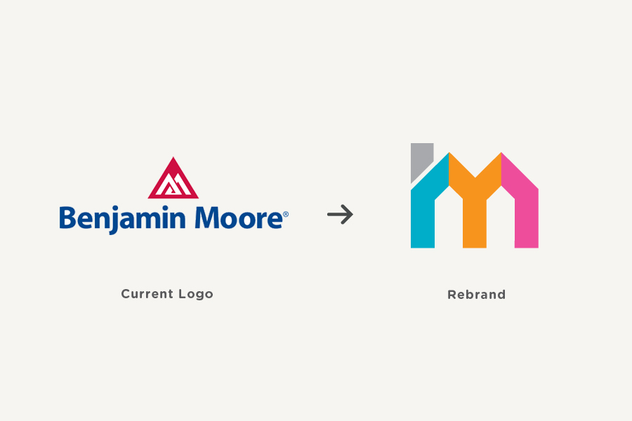
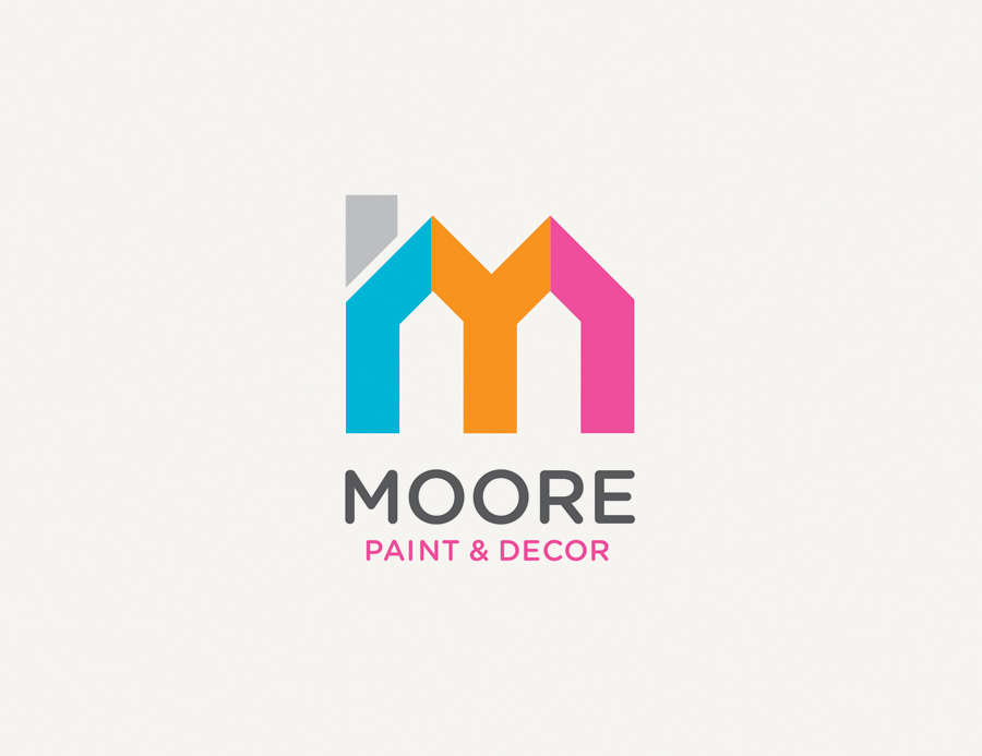
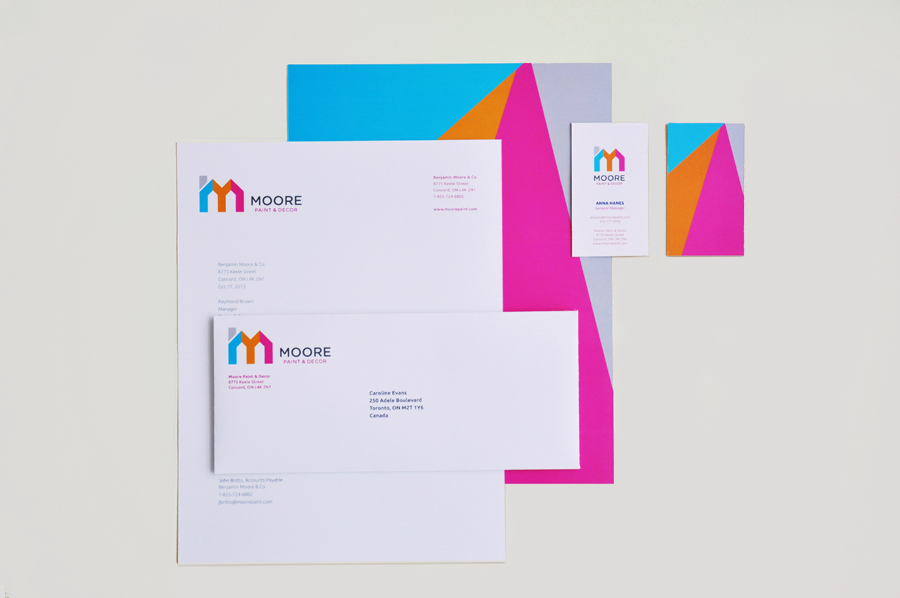
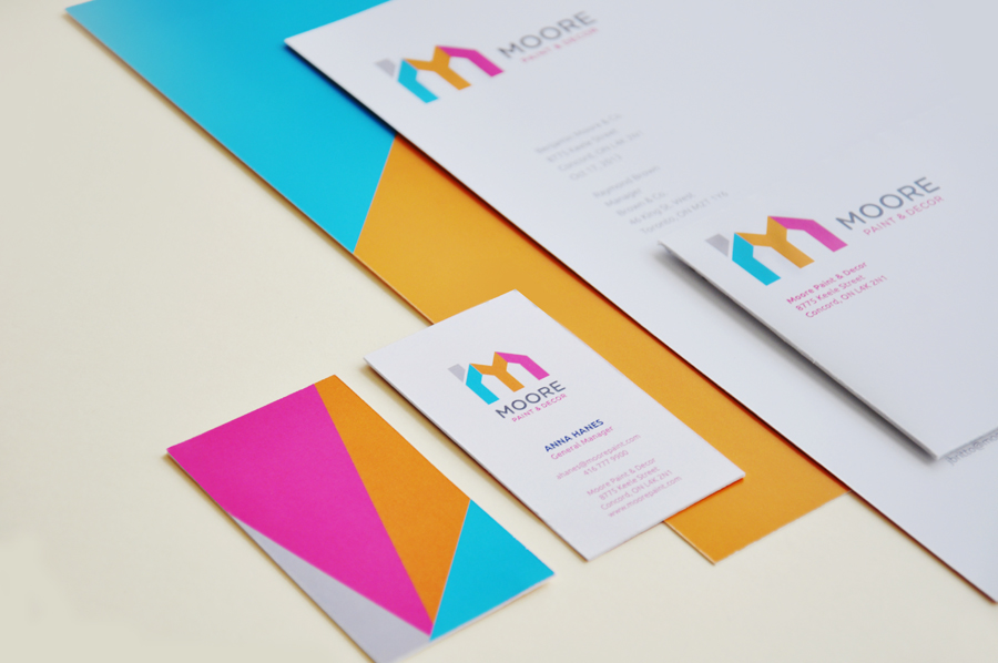
Benjamin Moore & Co.
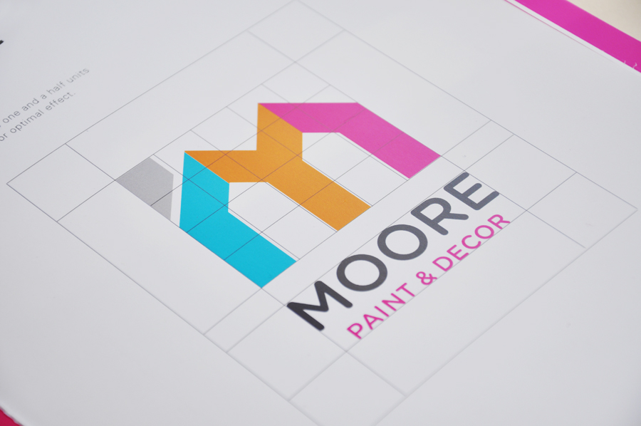
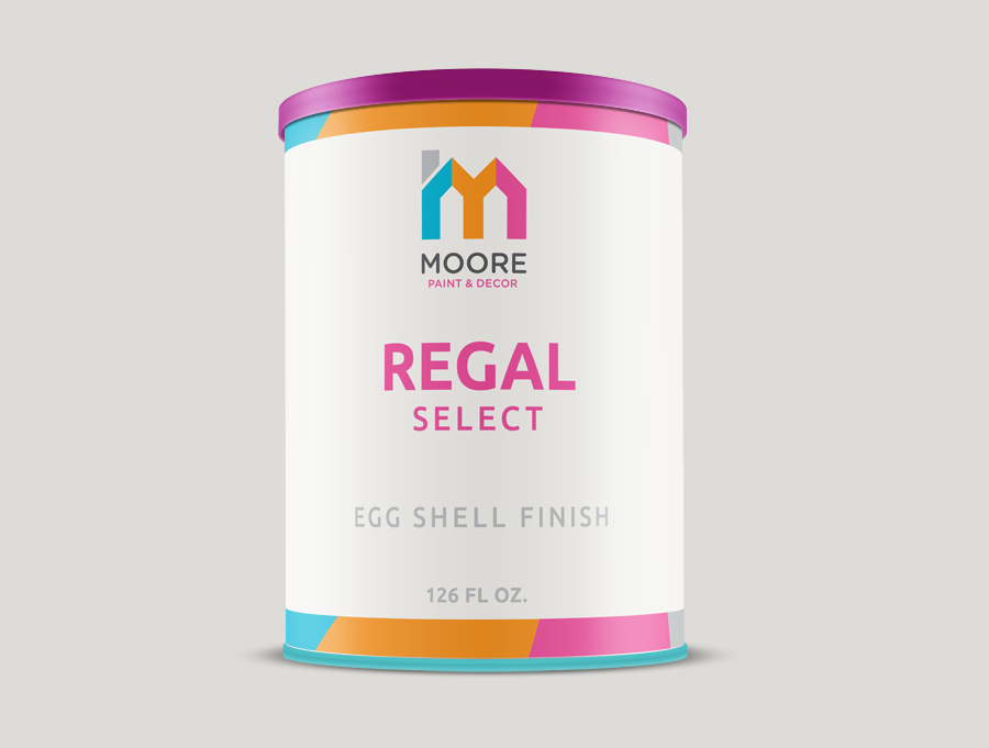
an extra stroke added to create a house-like symbol, highlighting Moore’s line of household paint products. The four different colours used in the logo emphasizes the creative and playful qualities of the brand, while the bold structure of the ‘M’ asserts a sense of reliability and friendliness. The new identity is versatile as the colours provide different possibilities for the brand, while the lettermark is simple but the small touch to the ‘M’ makes it easily recognizable and distinguishable from other competitors.


Thank you!


