EQUALIZER® VI REDESIGN
EQUALIZER®作为sneaker篮球文化的品牌,服装的尺码标,延续篮球球衣的样式;鞋盒根据不同鞋款的设计特性,为顶面绘制不同的概念插画。EQUALIZER®草牌是一个背靠街头篮球文化的运动品牌,产品包括球鞋服配饰。本次的VI更新是回应品牌的策略的变更:从街头篮球属性的“黑草”、与青年文化属性的“蓝草”,两条产品线聚焦回EQUALIZER®,希望在定位上拔高,并呈现“复古未来”的调性。本次设计的难度在于,如何延续品牌精神内核,呈现出与过往不同且更高级的品牌气质。新的品牌视觉跟随一组新品发布使用。基于此,设计围绕了以下三个动作进行突破:
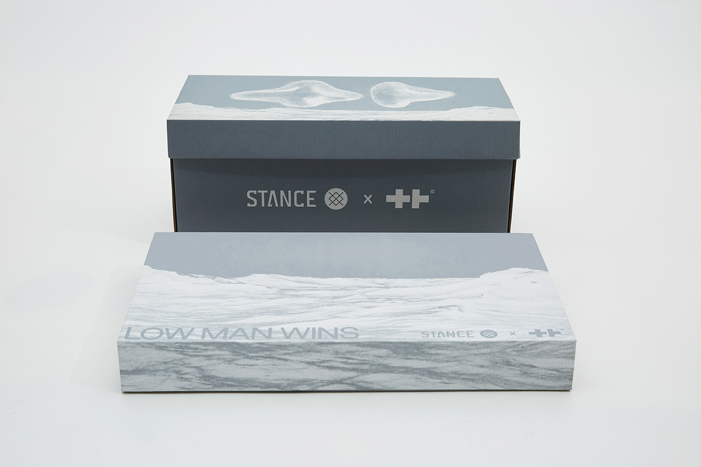
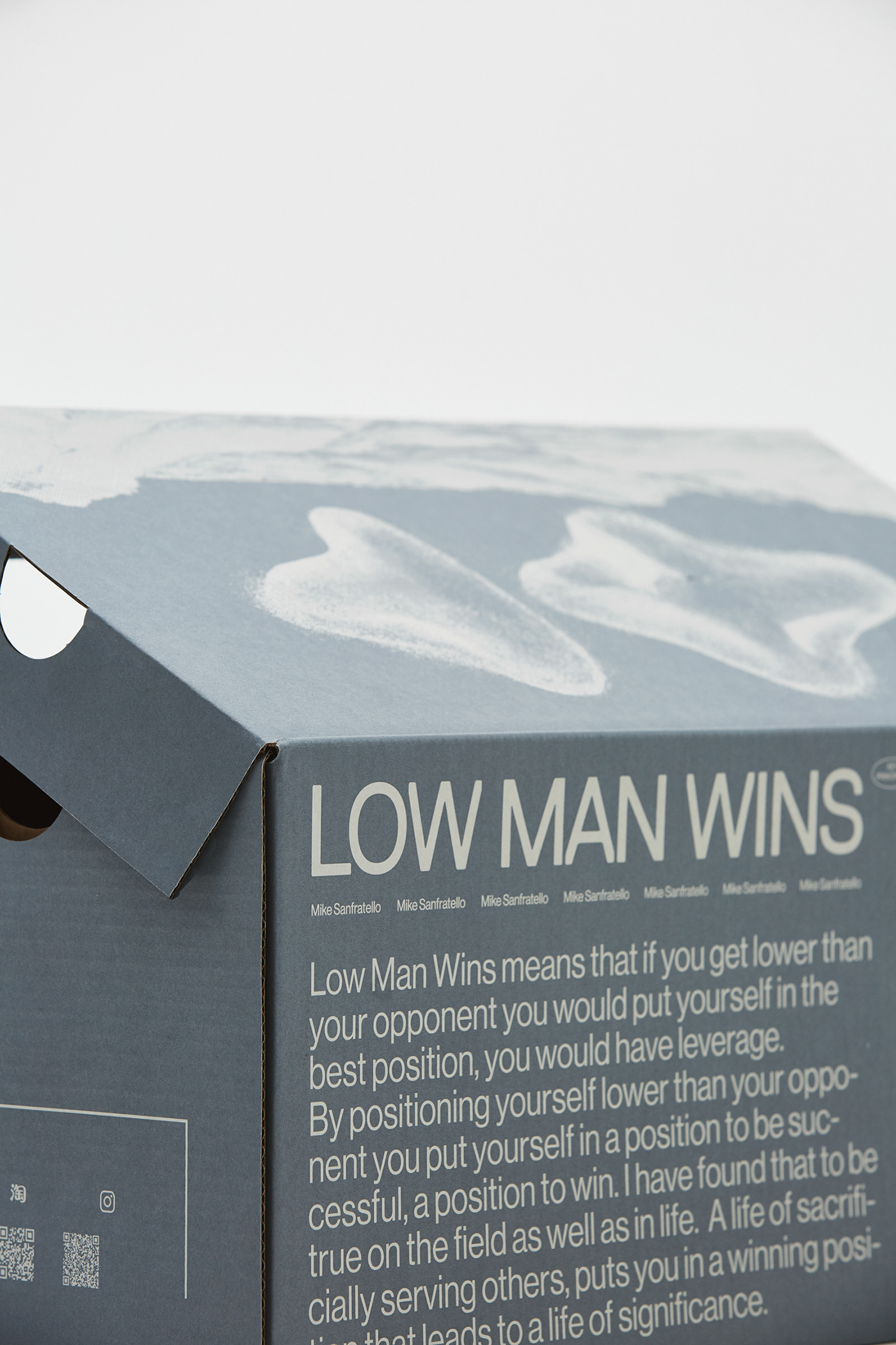
1. 老图像、新变化——选用在过往活动或产品上曾大量曝光过的画面,结合新品的概念,制作三幅插画作为三款新品的主视觉,代表更迭新生:长期出现在吊牌上的蘑菇云、上一款篮球鞋出现的椭圆符号、“艹”品牌logo的变体:1-1.鞋款FAULT:通过模拟屏幕故障的效果,呼应产品“FAULT”错误、断层的概念;1-2.鞋款ONE:在前一款篮球鞋的圆形符号外增加代表“1”的竖向光柱,即该产品名“ONE”,也呼应了“从0到1”的成长变化;1-3. 鞋款OASIS:提取该产品上的变体“艹”符号,升起在沙漠绿洲中,回应该产品“OASIS”的概念;
2. 颜色、画面内敛化——我们选择人们熟知的80年代科幻电影中的视觉元素,来呈现复古未来的调性:太空、光感几何、外星球地形。颜色上选择灰色作为主色,抛弃过往将画面切碎以获得野生张力的手法,实现内敛、科技、高级的感受;
3. 视觉符号延续——在服装产品上,延续了草牌标志性的码标设计,即模拟篮球球衣的码标样式。对于该符号的保留,是对品牌篮球文化根基的确认和强调。
EQUALIZER® is a sports brand based in street basketball culture, providing sneakers and accessories. This brand visual redesign is a response to the brand’s strategy change: two product lines, which are “BLACK GRASS” of street basketball attribute and “BLUEGRASS” of youth culture attribute, are focused back to EQUALIZER®, hoping to improve their positioning and present the tone of “retro future”. The difficulty of this design lies in how to continue the core of the brand spirit but also showing a different and more advanced brand temperament. The new brand vision follows a set of new product launches. Based on this, the design revolves around the following three actions:
1. OLD IMAGES, NEW CHANGES. We choose pictures that have been exposed a lot in the past activities or products of EQUALIZER®, combined with the concepts of the new products to make three illustrations as the main vision of the three new products, representing the brand’s evolution: the mushroom cloud used on the tag for a long time, the oval symbol of the last basketball sneakers, the variation of the “艹” brand logo: 1-1. Sneaker “FAULT”: Through simulating the effect of screen display fault, echoing the concept of “FAULT”; 1-2. Sneaker “ONE”: The vertical light column representing “1”, which is the name of the new product, is added outside the circular symbol which is from the previous basketball sneakers. This also echoes the growth and change of “from 0 to 1”; 1-3. Sneaker “OASIS”: Take the “艹” symbol that is used on this product rising it in the desert oasis in response to the concept of the product “OASIS”.
2. LOW KEY. We chose familiar visual elements from 80’s sci-fi movies to present the tonality of the retro future: space, light-sensitive geometry, exoplanet terrain. The color of gray is chosen as the main color. The method of getting wild tension by shredding the picture in the past is abandoned, and the feeling of introverted, scientific and advanced is realized.
3. VISUAL SYMBOL CONTINUATION. In the clothing products, we continue the EQUALIZER® iconic code design, that is, the basketball jersey code pattern. The preservation of this symbol is to confirm and emphasize the foundation of the brand basketball culture.
Brand: EQUALIZER®
Category: Brand Identity / Package
Year: 2020
Category: Brand Identity / Package
Year: 2020


EQUALIZER® 2021 SNEAKER LAUNCH Posters Series
Brand: EQUALIZER®
Category: Art work / Concept Design / Poster
Year: 2021
Category: Art work / Concept Design / Poster
Year: 2021