TAPTAP - a next-generation loyalty, marketing and payment platform that connects market-leading brands with consumers through a simple-to-use, fully integrated and data-driven coalition loyalty program. TAPTAP's solution enables consumers to earn and burn loyalty points conveniently by interacting and transacting with the brands of their choices across nation-wide merchant network that today reaches 30% of the Vietnamese consumers.
TAPTAP's goal is to revolutionize the omni-channel shopping experience in Vietnam and set the standards for how brands should engage their customers by leveraging data to drive consumer insights, marketing efficiency and product personalization. TAPTAP also offers technology solution to help established businesses enhance their existing loyalty programs with access to a broad, diversified portfolio of brands and rewards.

Straight lines and precise logo shapes impart
STRENGTH, PROFESSIONALISM, MODERN AND EFFICIENCY.
Some variation details on the typeface (letter “A” and “P”)
inspired from the open-minded of new generation.


COLORS
___
Why Yellow? - Bright & Warm - Inspiring Happiness - Laughter - Cheerfulness
Mix with Pink - Calming Shade - Inspiring Love Romance - Gentleness
(In terms of Color Psychology)


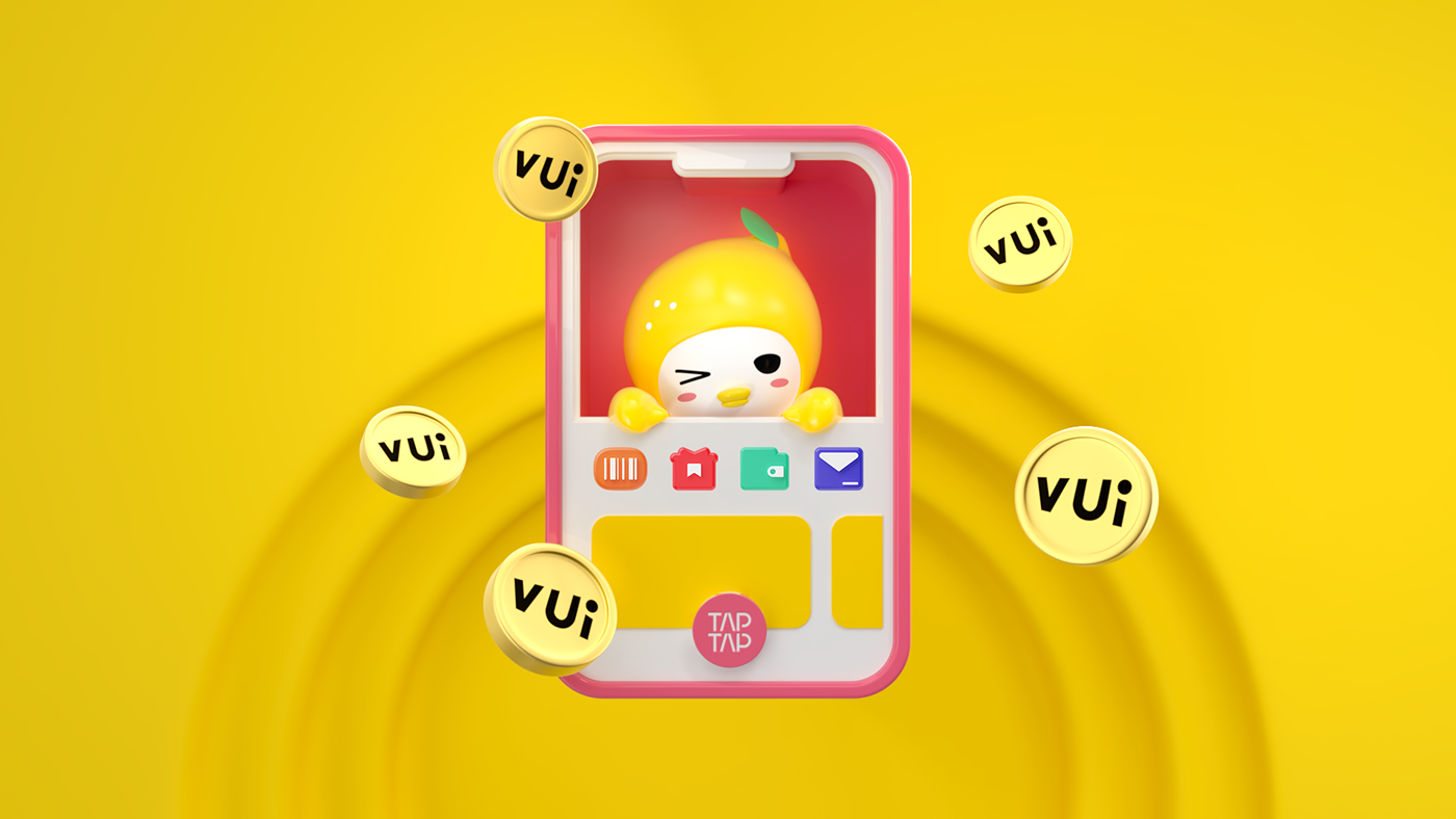
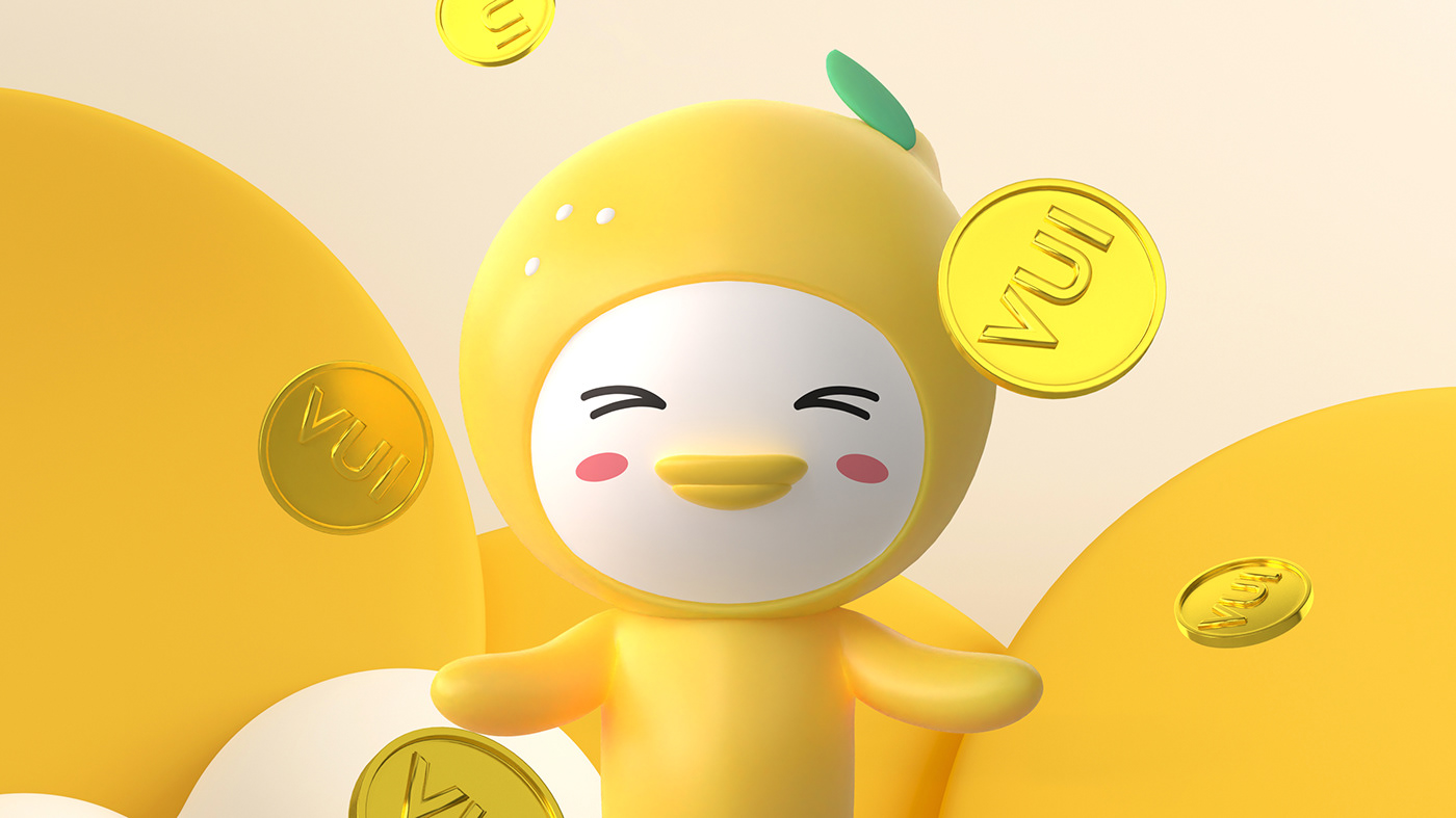
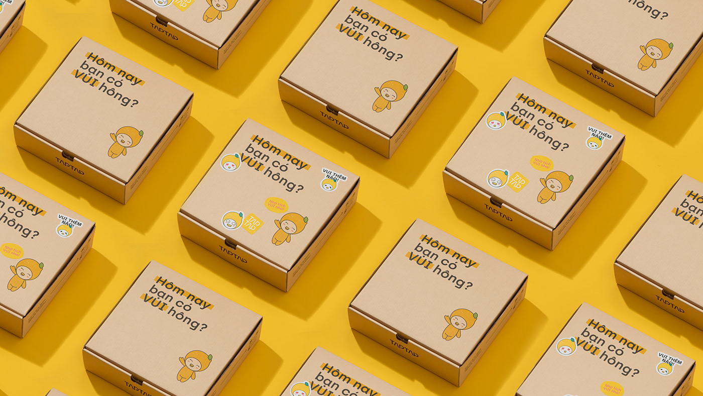
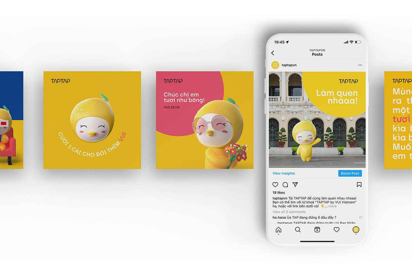
MASCOT
___
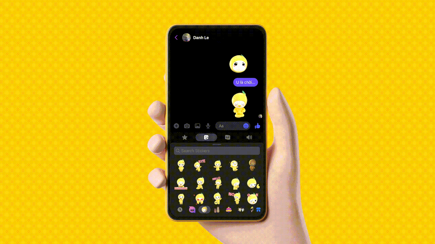
Emoticons have become a crucial part of modern communication. It shouldn't be like typical characters such as mascots for the Olympics, corporations or governments - the characters that just look nice. It should be added a twist to the typical nice character.
It's joyful!


Photos by Maki Studio
Character Design & Concept: Jeremiah Le
3D Character Development: Bao Thinh Dinh & Ky Duyen Nguyen


