D&AD Design Project
Identity - Packaging 2013
D&AD celebrates and nurtures outstanding work in the design and advertising industry each year with its international creative awards. With this, in 2013 I put forward an answer to their Purdey's Brief: To rethink and reposition the packaging of the Purdey's energy drinks and their secret ingredients. In studying the brands principles, I created an abstract design aiming to convey a sense of individualism, mystery, and natural energy.
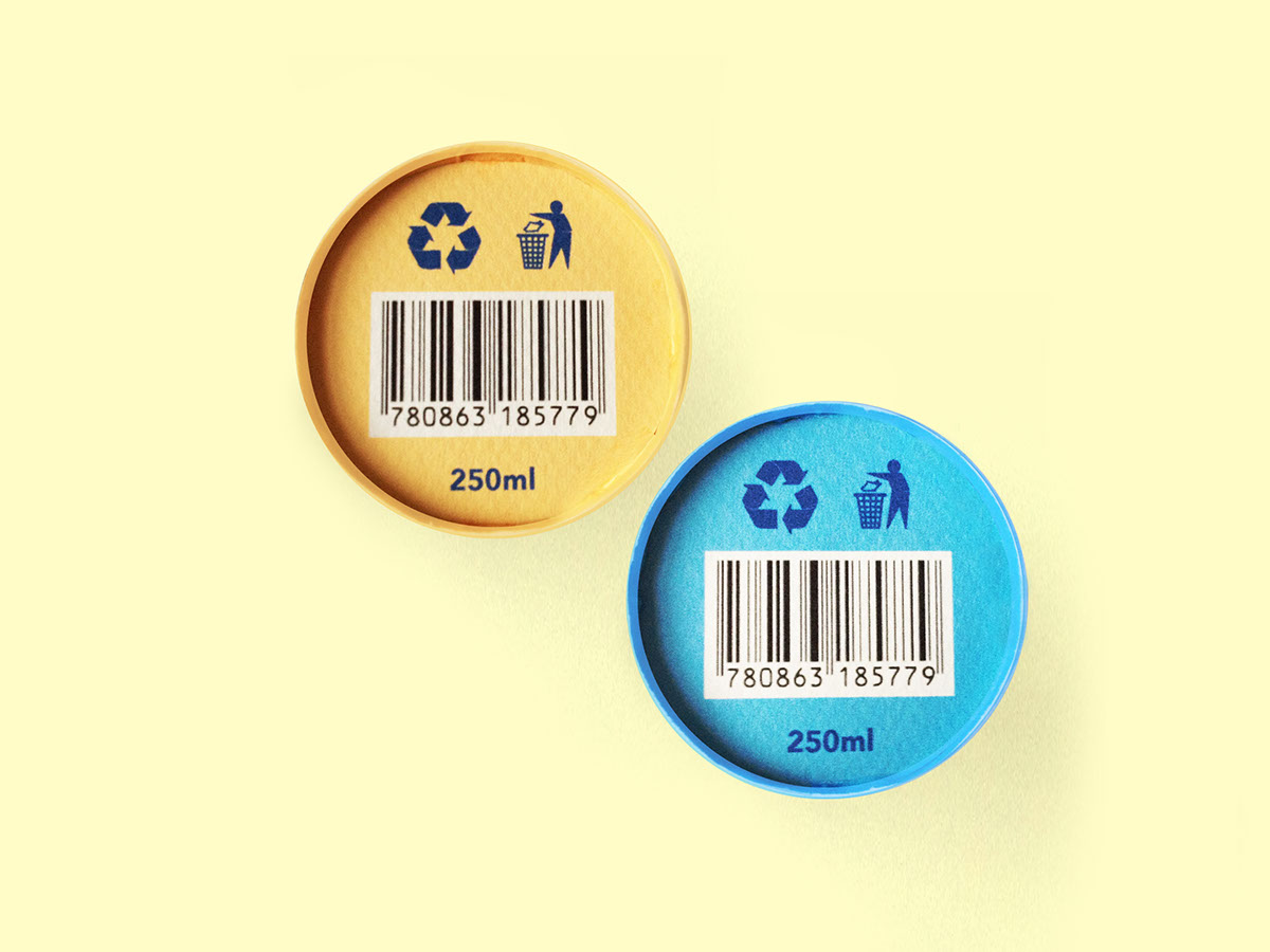
The resulting product design became two eco-friendly card cans adorned with hand-made patterns inspired by wood cuttings. This helped me obtained a naturally energetic feel, but above all also helped to express to others the feelings one may experience when simply taking a sip. In trying the drinks, i personally felt a form of Relaxation from 'Rejuvenation'and an uplifting boost from 'Natural Energy'.


