The Challenge:
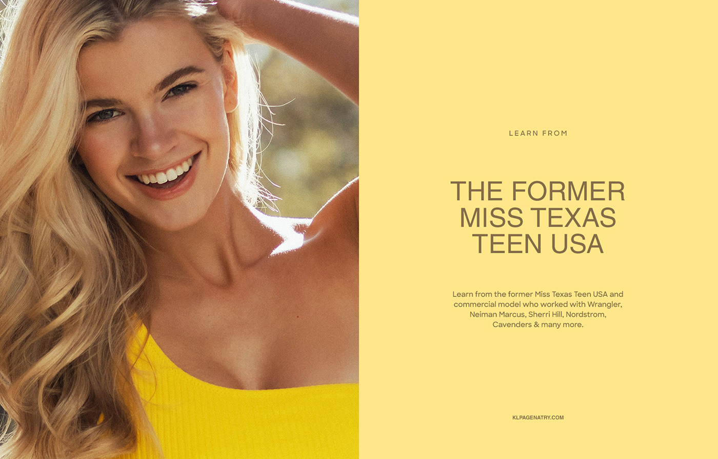
Kirby Long is a beauty pageant coach who helps girls to prepare for a beauty pageant and achieve their bests. Kirby wanted to stand out from other pageant coaches and change the perception of the beauty pageant industry in her own business. She wanted to go away from physical appearance competition and to show girls how this contest can make them a better version of themselves in all aspects of their life, both mentally and physically.
Kirby's competitors in the pageant coaching industry were so much about the glamour, objectifying women, and an outdated look and feel, which created a not welcoming image of beauty pageantry at all. We wanted to create a modern and fresh perspective on the pageant industry. Kirby's target audience should not feel old-school and scared to enter the competition. We needed to create a feeling of self-grow, confidence, and celebration of each girl's uniqueness. It also should be a parade of natural non-filtered beauty, real confidence, and unscripted intelligence.
The Solution:
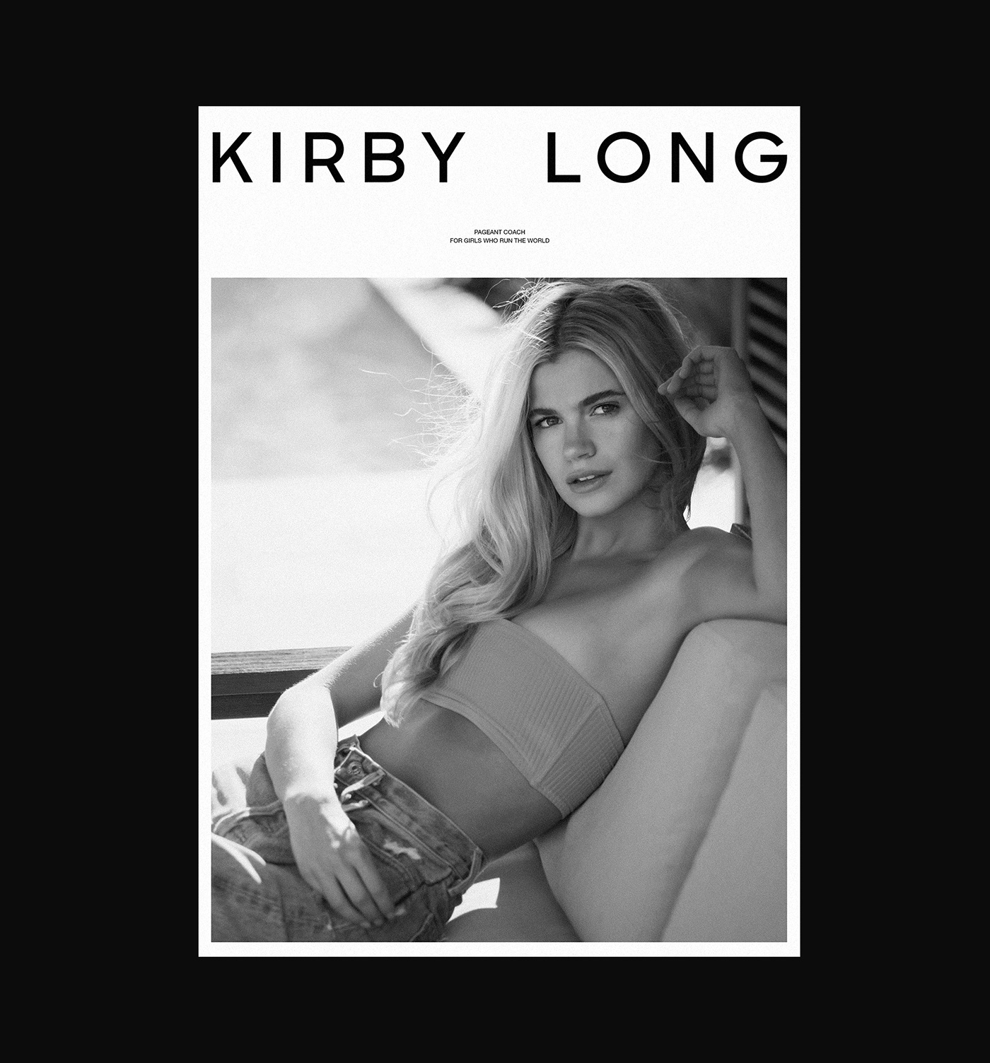
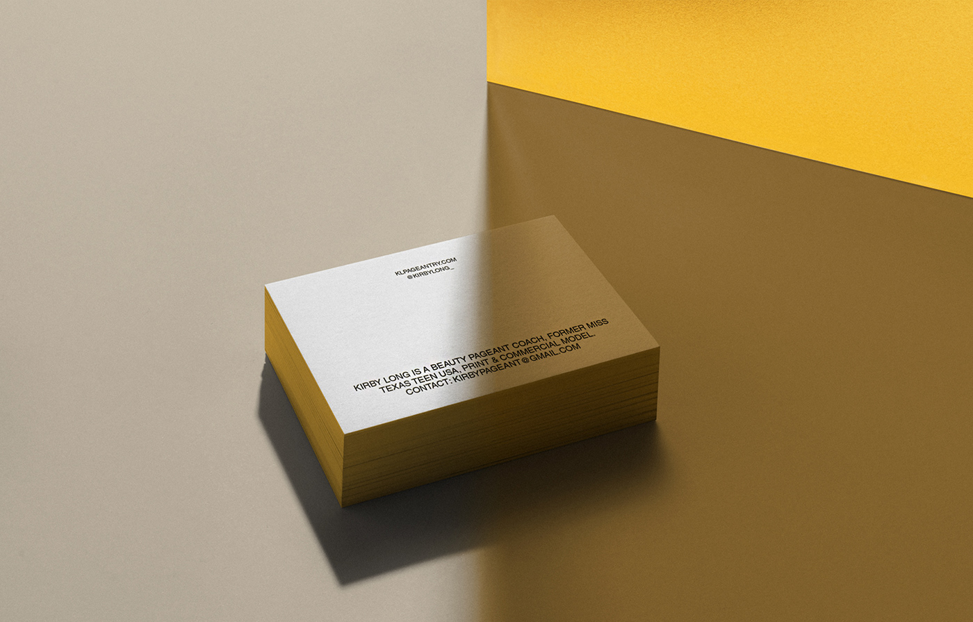
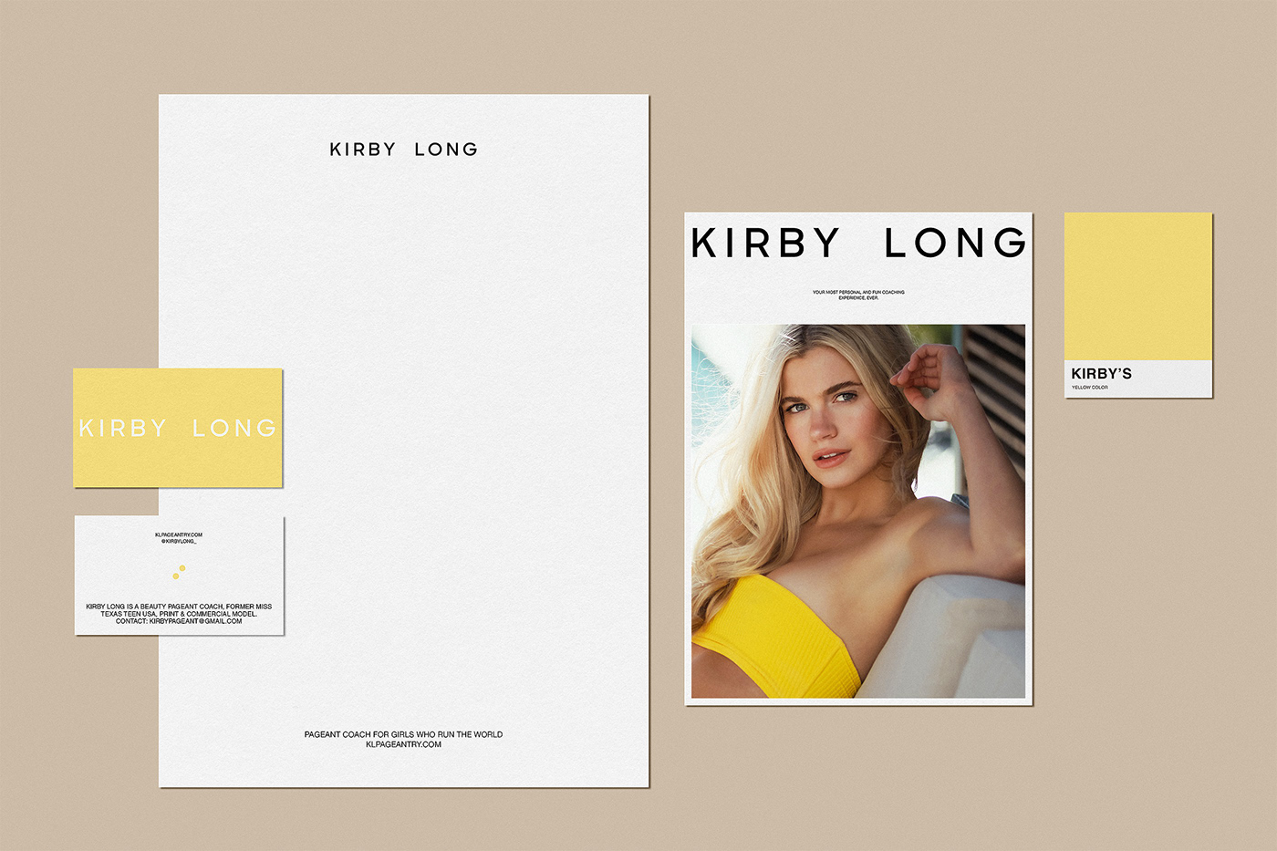
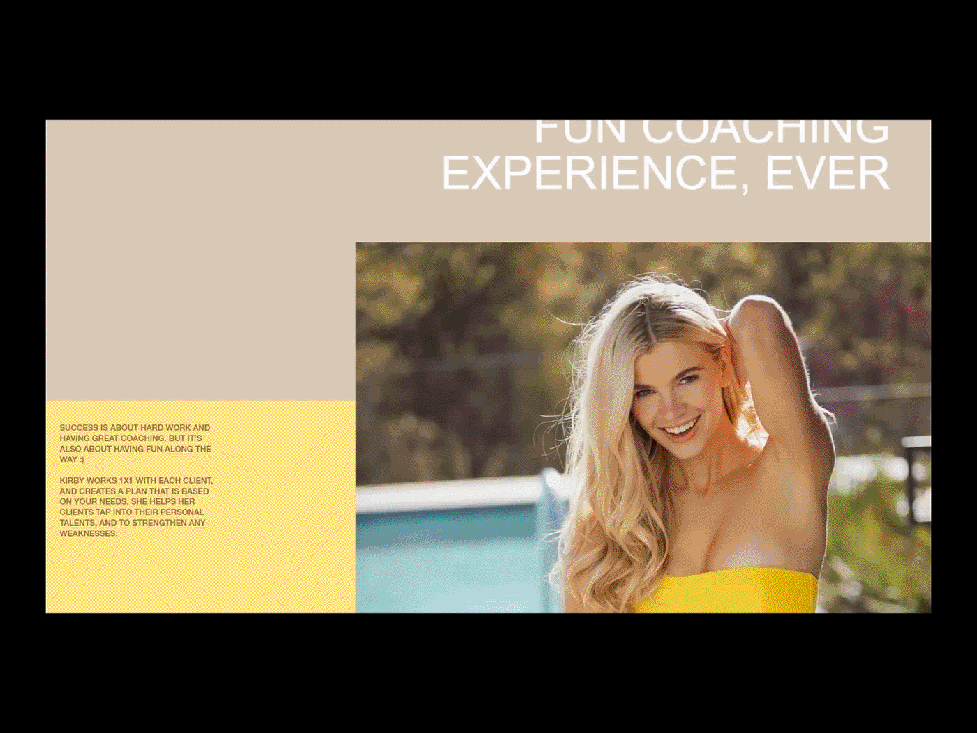
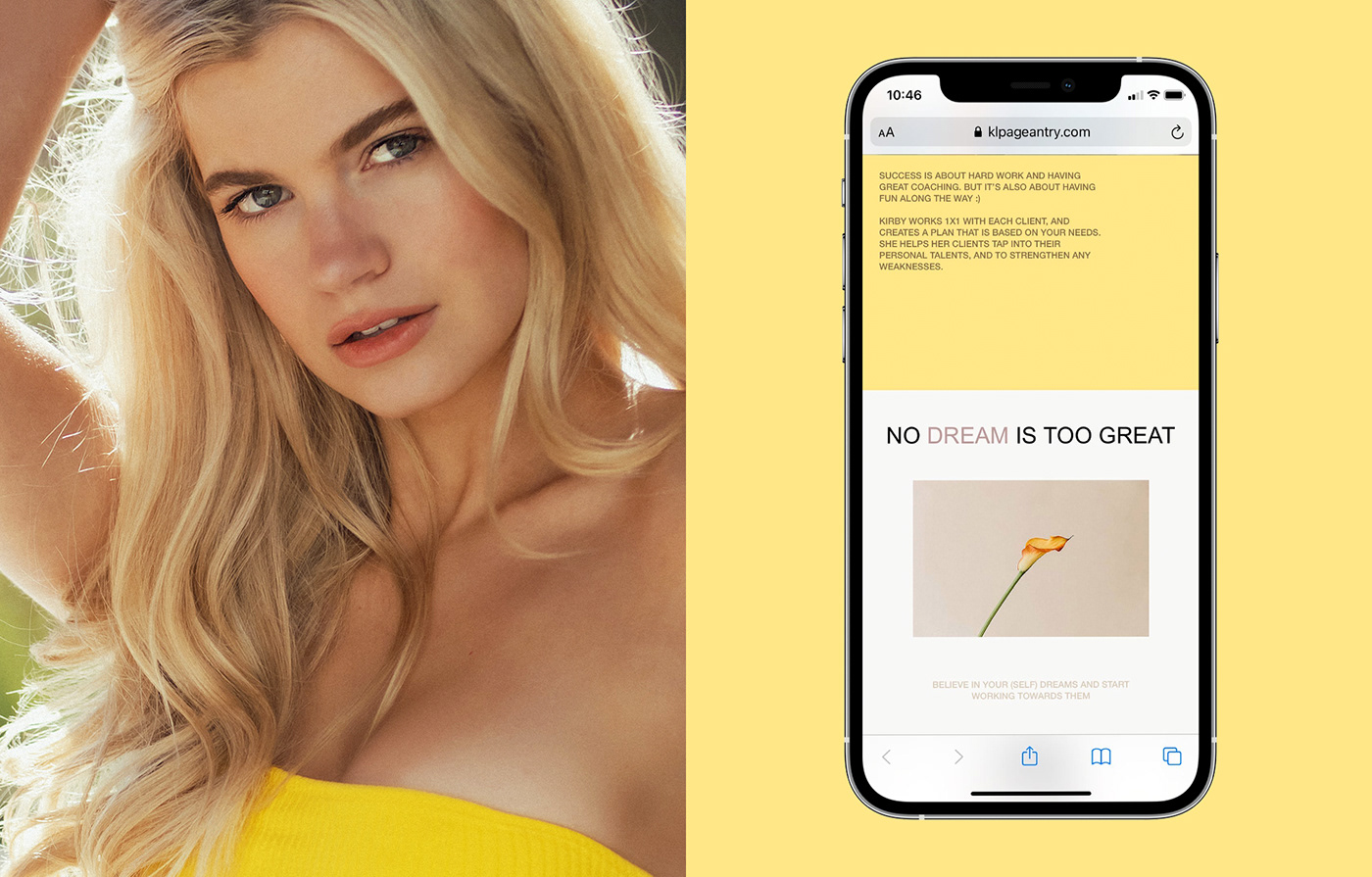
Kirby’s branding needed to communicate high standards, real beauty, and pure confidence. These values should clearly shine through the visual representation of her business. Because of that, we created a brave, modern, and optimistic image of Kirby's brand. The visual language was inspired by youth magazines, the simplicity of flat design, and fresh floral motives. The whole brand design is based on modern strong typography, bright colors, and juicy images. We wanted to put the accent on the target audience and Kirby's positive and fresh point of view through the bright yellow color paired with calm beige and soft pink colors, with accents of black and brown. These colors translate youth, optimism, and an overall friendly attitude. This, as a result, makes the preparation for the pageantry not stressful for the viewer, but a pleasant and fun experience together with Kirby.
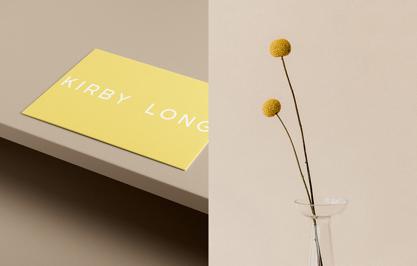
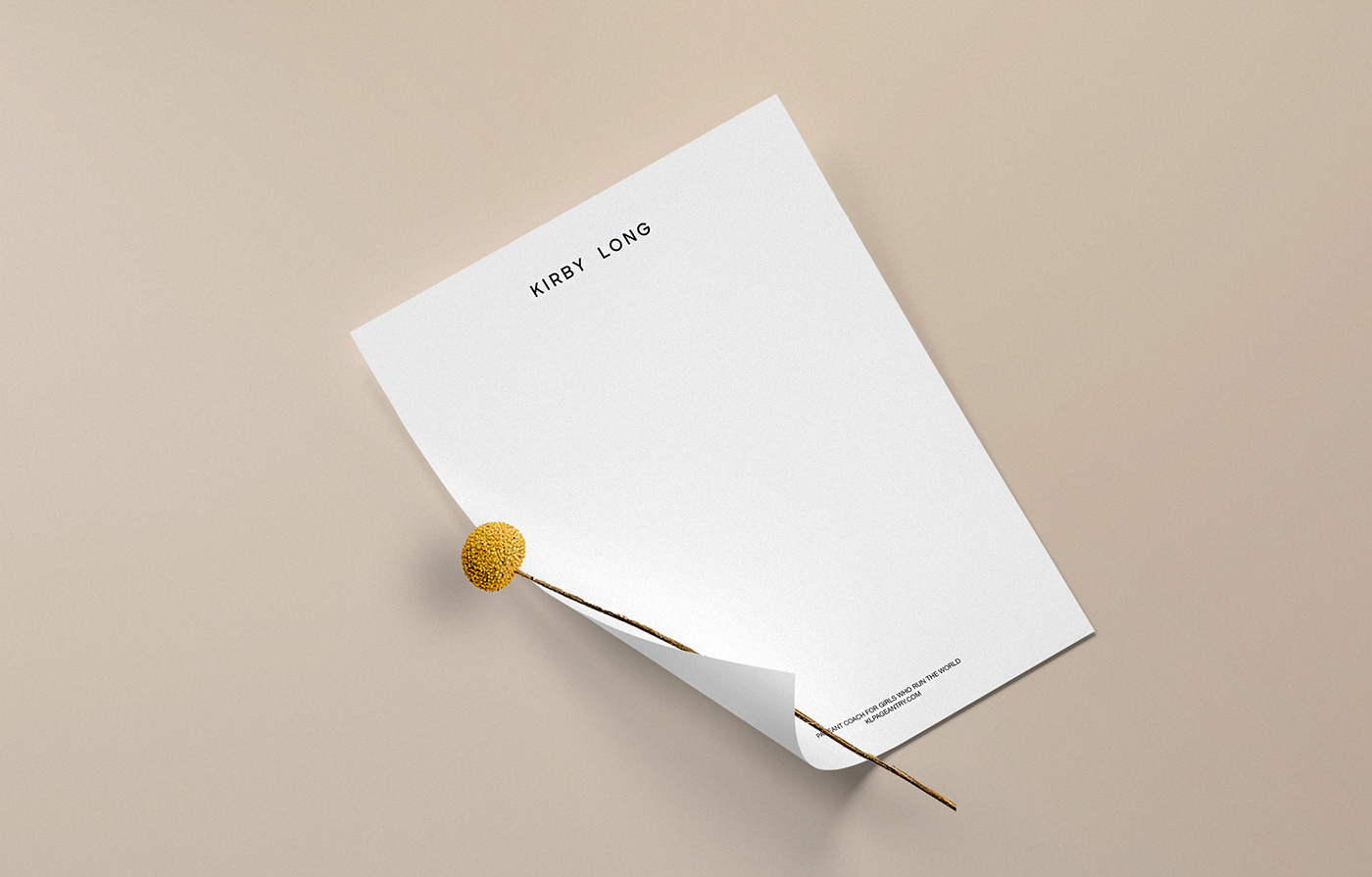
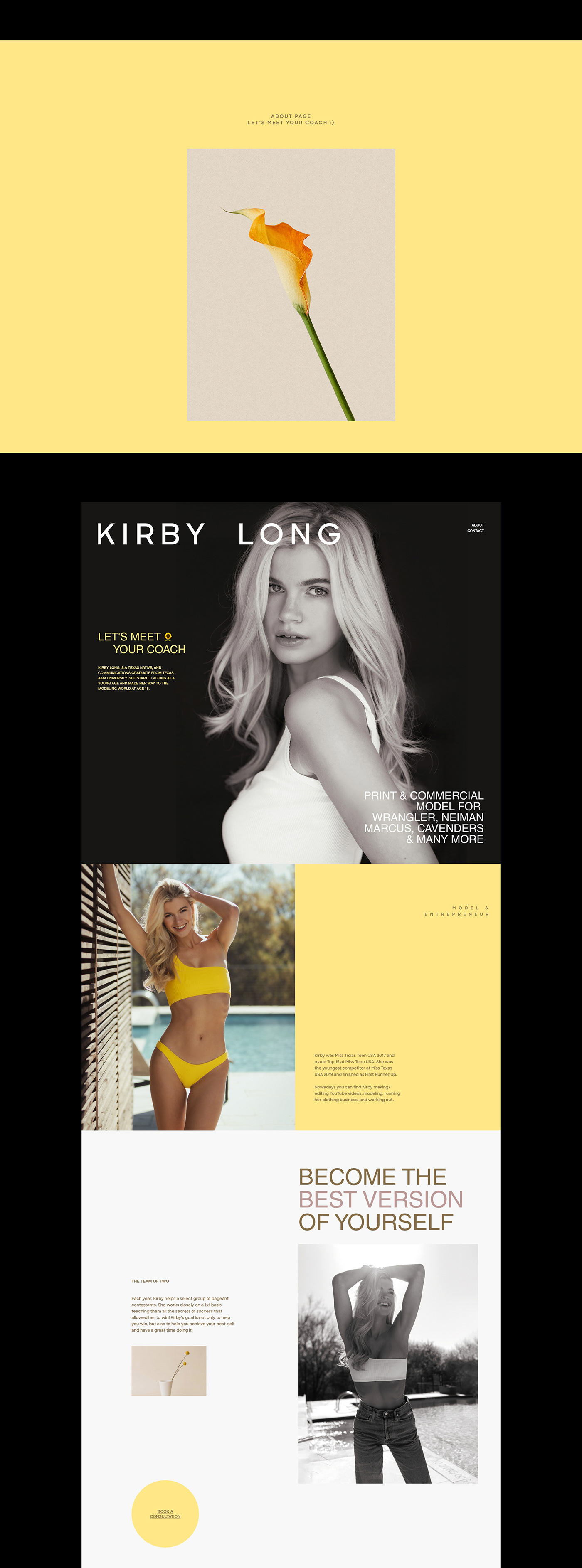
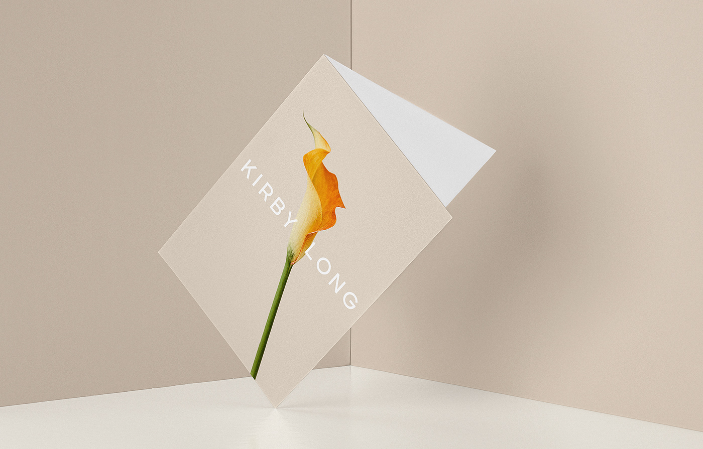
Art direction for images is based on the idea that Kirby helps girls to uncover their potential and talent. The metaphor of this is showcased in flower images: they are different, unique, and showcasing themselves beautifully after a long period of growth - the same as what Kirby's approach and work actually do. Flower shots in the brand color palette also create a warm feeling, sense of comfort and show Kirby's persona as really aesthetic-driven.
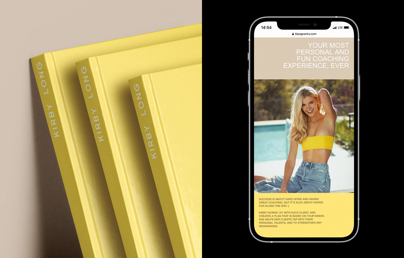
Client: Kirby Long, klpageantry.com
Service: Brand Strategy, Brand Identity, Website Design & Development
Website Awards: Awwwards Honorable Mention | Mobile Excellence Award