


SALTARE
EN_
In recent months I was responsible for developing the rebranding for the Saltare brand, an e-commerce specialized in Women's Footwear. The company has been in the market since 2013 and is going through a period of expansion and franchising, the main objective of the brand, in addition to the desire to become a beacon in the development of trends in national shoes with easy access, conditions and competitive price, is to be a movement around progress and female empowerment, creating current products that bring together boldness and innovation, being a driver of its true authenticity.
PT_
A Saltare é um e-commerce especializado em Calçados Femininos. A empresa está no mercado desde 2013 e passa por um momento de expansão e franquia, o principal objetivo da marca, além do desejo em se tornar um farol no desenvolvimento de tendências em calçados nacionais com fácil acesso, condições e preço competitivo, é ser um movimento em torno do progresso e empoderamento feminino, criando produtos atuais que reúnem ousadia e inovação, sendo um impulsionador da sua verdadeira autenticidade.


THE CONCEPT
EN_
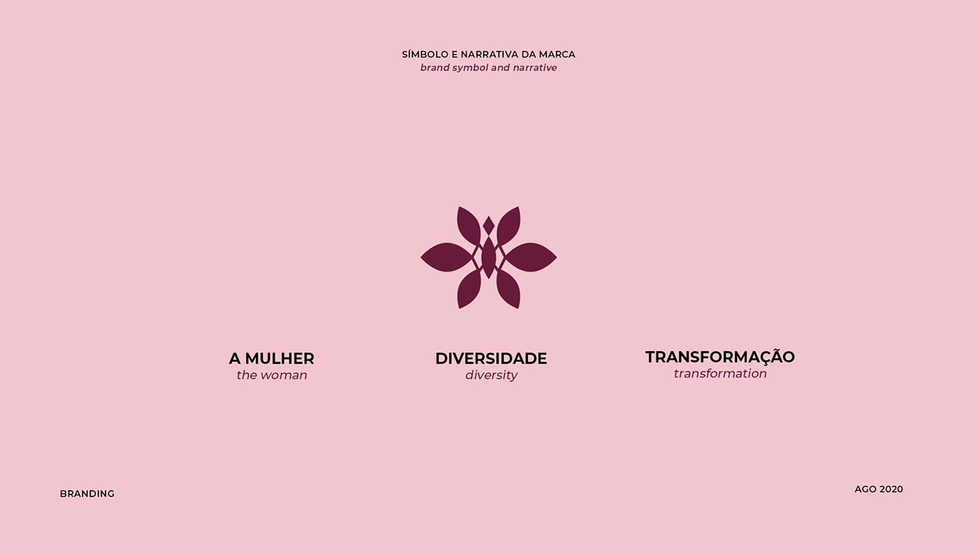
We base ourselves on three pillars to build the brand's narrative: women, diversity and transformation.
All three of these pillars brought us to a common point: The butterfly. The butterfly is considered a symbol of transformation, happiness, delicacy and beauty, as it is a creature that undergoes a metamorphosis to become a butterfly, many of the meanings of its symbology will be linked to its transformation and awakening, which are elements present in the identity of each woman. Just like the butterfly, each woman has their characteristics and style that make them unique, each woman has her own time and transformation.
And, in this case, women go through changes during their lives, a girl is born and becomes a woman, a woman is reborn and a mother is born. All this has to do with finding the innate strength of the feminine, using resources in favor of yourself and improving your interior and exterior, to unfold what you have inside to the world, becoming more beautiful and empowered.
In this process of metamorphosis, what did not attract attention before turns into something charming like a butterfly, like putting on your best clothes and wearing those shoes that value you and set you free for life. Butterflies and women are necessarily engaged in reaching the top, plotting the next conquest and manifesting what is most beautiful inside and out. Therefore, the brand's central message is: May the butterfly represent the woman and her desire to give free rein to her inner self through her style, to awaken the beauty and strength that is already her own.
PT_
Nos baseamos em três pilares para construir a narrativa da marca: a mulher, diversidade e transformação.
Todos esses três pilares nos trouxe para um ponto em comum: A borboleta. A borboleta é considerada um símbolo da transformação, da felicidade, da delicadeza e da beleza, por ser uma criatura que passa por uma metamorfose para virar borboleta, muitos dos sentidos de sua simbologia vão estar atrelados à sua transformação e ao seu despertar, que são elementos presentes na identidade de cada mulher. Assim como a borboleta, cada mulher tem suas características e estilo que as fazem únicas, cada mulher tem seu tempo e transformação.
E, nesse caso, as mulheres passam no decorrer de sua vida por transformações, nasce menina e se torna mulher, renasce a mulher e nasce a mãe. Tudo isso tem a ver com encontrar a força inata do feminino, usando recursos em favor de si mesma e do aperfeiçoamento do seu interior e exterior, de desabrochar o que tem dentro de si para o mundo, ficando mais bonita e empoderada.
Nesse processo de metamorfose o que antes não chamava atenção se transforma em algo encantador como uma borboleta, como colocar sua melhor roupa e usar aquele calçado que te valoriza e te liberta pra vida. Borboletas e mulheres estão necessariamente engajadas em alcançar o topo, tramar a próxima conquista e manifestar o que há de mais bonito por dentro e por fora. E por isso, a mensagem central da marca é: Que a borboleta seja a representação da mulher e do seu desejo de dar vasão ao seu eu interior através do seu estilo, de despertar a beleza e a força que já é próprio dela.

THE TYPOGRAPHY
EN_
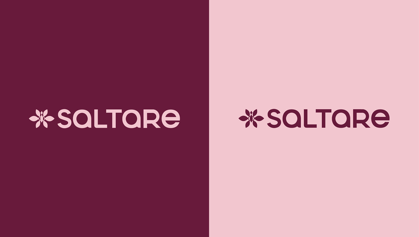
With all the values that the brand carries, this redesign process was thought out with great care so that the proposal conveyed all the meanings that the brand wants to convey and, at the same time, avoid the obvious that until then the brand carried as a symbol (the jump). Several drafts were made until reaching a result that could not only contemplate the characteristics of the brand, but also its concept and what it wants to convey. As we know, the choice of the butterfly was a key point to embrace the concept and thus, a symbol that conveyed delicacy and sophistication emerged and that could fit perfectly with the developed typography, providing a balance between the modern and the sophisticated, valuing it even more the brand.
For the project, an exclusive typography was developed that could bring the brand logo to life and, at the same time, could be worked in a solo way without losing all its essence. The typography developed has simple and geometric lines, with only one weight and height, varying between uppercase and lowercase letters.
With its modern and transitional aesthetic, it presents a straight and uniform style, without contrast. With excellent readability, typography is a wild card, working in virtually any application.
With its modern and transitional aesthetic, it presents a straight and uniform style, without contrast. With excellent readability, typography is a wild card, working in virtually any application.
PT_
Com todos os valores que a marca carrega, esse processo de redesign foi pensado com muito cuidado para que a proposta transmitisse todos os sentidos que a marca deseja passar e, ao mesmo tempo, fugisse do óbvio que até então a marca carregava como símbolo (o salto). Diversos rascunhos foram feitos até chegar em um resultado que pudesse não só contemplar as características da marca, como também o seu conceito e o que ela quer passar. Como sabemos, a escolha da borboleta foi um ponto-chave para abraçar o conceito e assim, surgir um símbolo que transmitisse delicadeza e sofisticação e que pudesse encaixar perfeitamente com a tipografia desenvolvida, proporcionando um equilíbrio entre o moderno e o sofisticado, valorizando ainda mais a marca.
Para o projeto foi desenvolvido uma tipografia exclusiva que pudesse dar vida ao logotipo da marca e, ao mesmo tempo, pudesse ser trabalhada de forma solo sem perder toda a essência. A tipografia desenvolvida possui traços simples e geométricos, com apenas um peso e altura, variando entre letras maiúsculas e minúsculas. Com sua estética moderna e transicional, ela apresenta um estilo reto e uniforme, sem contraste. Com excelente legibilidade, a tipografia é um coringa, funcionando em praticamente qualquer aplicação.


For more, follow me on:
Want to start a new projec? Contact me at


