


The brief/Context
Create a name and identity “that is bold, incredibly flexible, vibrant and unmistakably unique” for the ground floor precinct at the BNZ Centre in Central Christchurch.
Create a name and identity “that is bold, incredibly flexible, vibrant and unmistakably unique” for the ground floor precinct at the BNZ Centre in Central Christchurch.
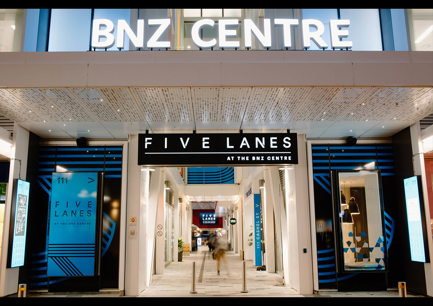
The newly named Five Lanes is a key part of the BNZ Centre in Central Christchurch and occupies the ground floor space bounded by Cashel St, Colombo St, Hereford St and Oxford Terrace. Colliers came to us with a challenge. They wanted to invigorate the space for tenants and customers, provide a point of difference from their competitors, and ultimately increase footfall.
The Thinking/Idea
We started by understanding how consumers interact with the space. We conducted 30 deep-dive, guided discussions with tenants, key stakeholders and customers of the spaces and a few days of observational research within the mall environment. The key findings were that the space lacked a clear identity, the entrance ways were confusing/not clear from a distance, and that from within, what wayfinding and signage was there was inadequate and uninspiring. It wasn’t even seen by many ‘visitors’ as a destination, it was merely used as a shortcut between streets. To attract key tenants, the space needed to become a ‘place’, with a vibe and personality setting it apart from its competitors.
We started by understanding how consumers interact with the space. We conducted 30 deep-dive, guided discussions with tenants, key stakeholders and customers of the spaces and a few days of observational research within the mall environment. The key findings were that the space lacked a clear identity, the entrance ways were confusing/not clear from a distance, and that from within, what wayfinding and signage was there was inadequate and uninspiring. It wasn’t even seen by many ‘visitors’ as a destination, it was merely used as a shortcut between streets. To attract key tenants, the space needed to become a ‘place’, with a vibe and personality setting it apart from its competitors.
To find a name we looked at the history of the site and surrounds. Then we decided to flip the existing confusion and anonymity. There are five lanes leading into the space, Five different laneways, five different stories. All for discovery. And a clear vision to become ‘A unique, curated shopping experience for the curious, the creative, the explorer and the child within us all’ to stand out from its competitors in the central city.
The Execution
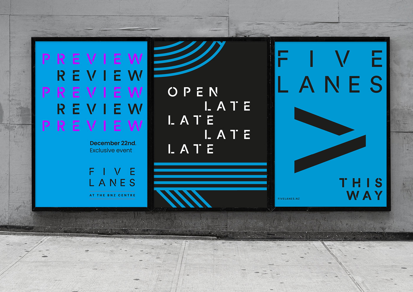
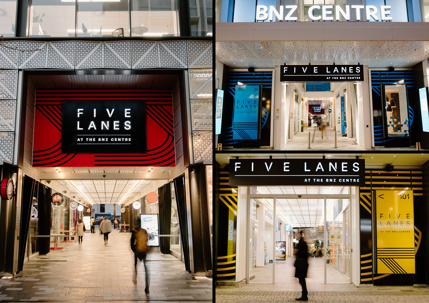
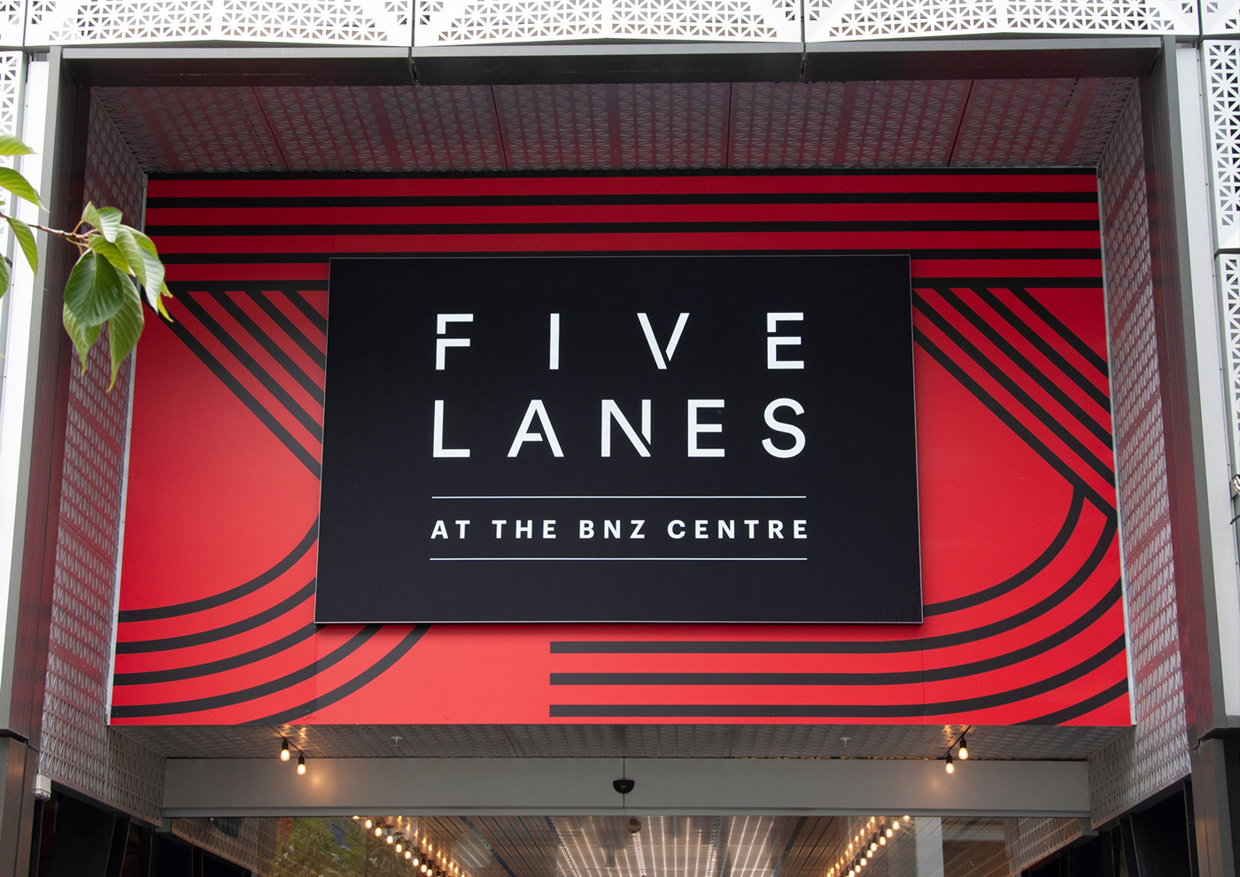
The mall almost named itself, “Five Lanes” - inspired by the five laneways that make up the entrances to the complex.
The mall almost named itself, “Five Lanes” - inspired by the five laneways that make up the entrances to the complex.
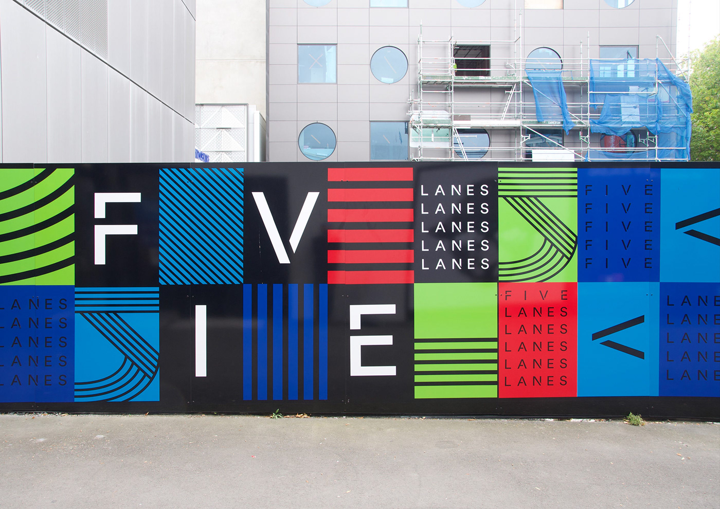
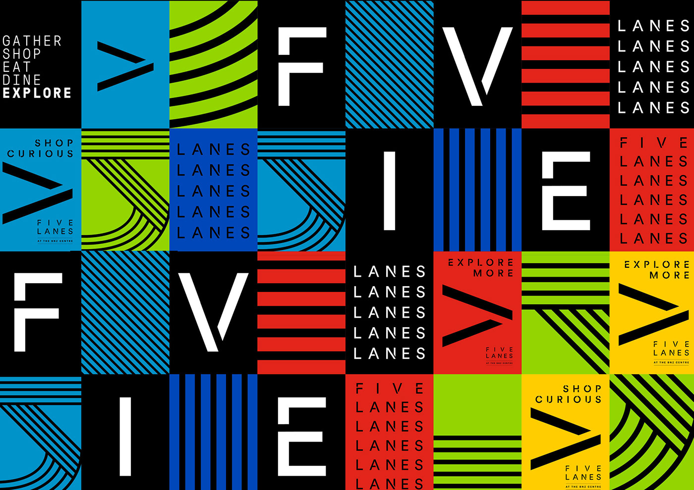
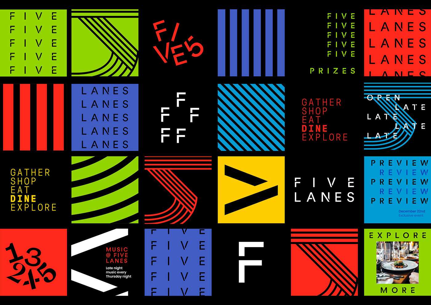
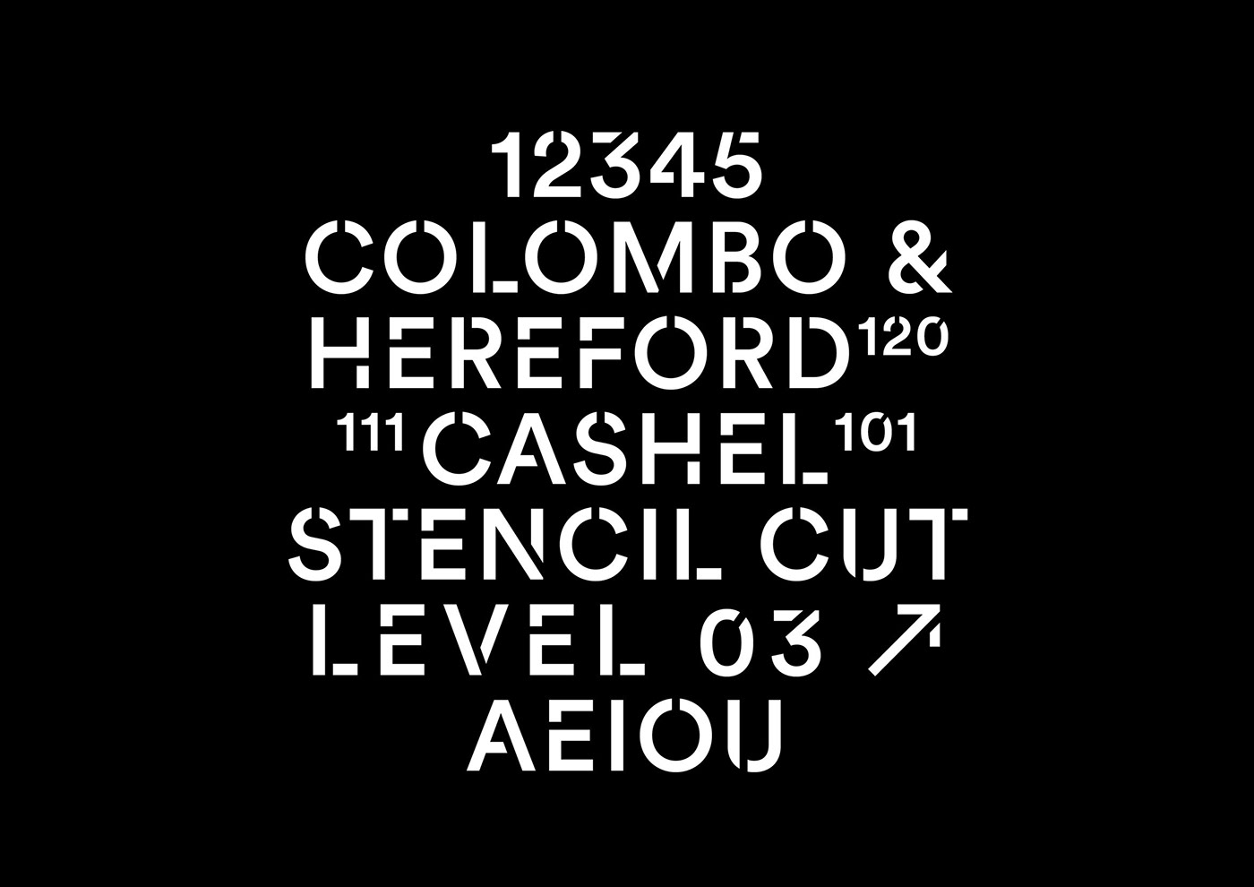
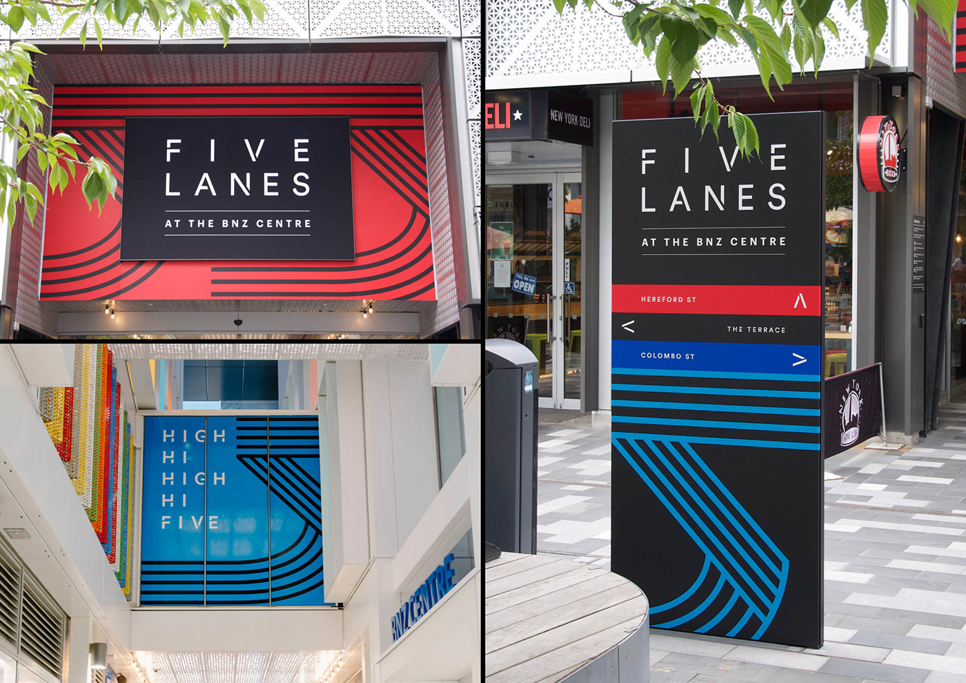
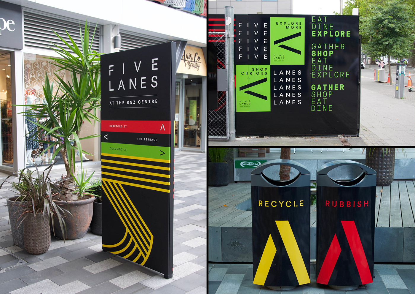
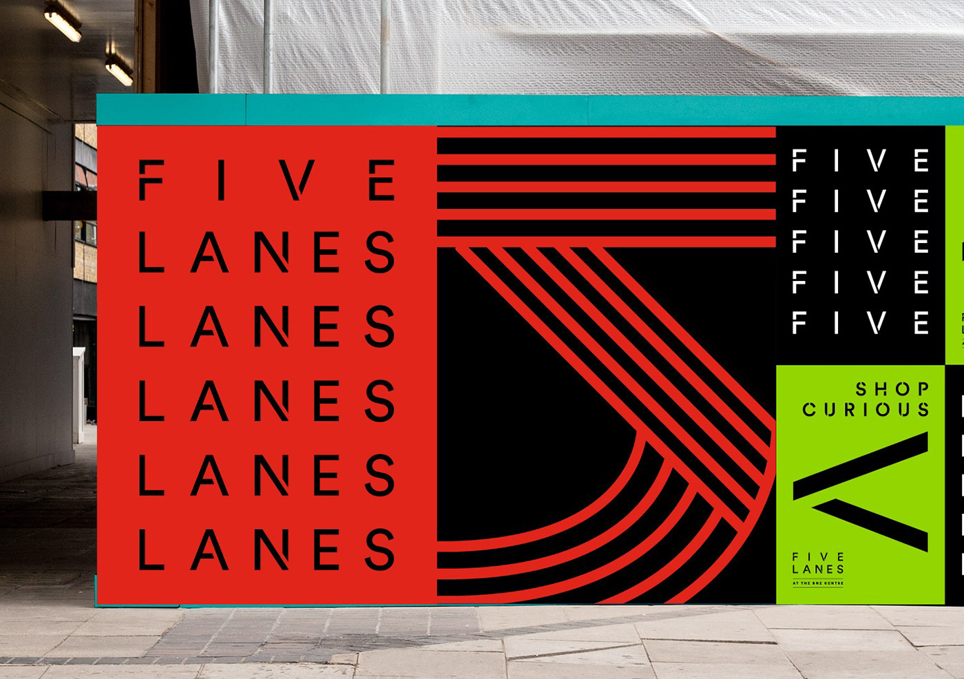
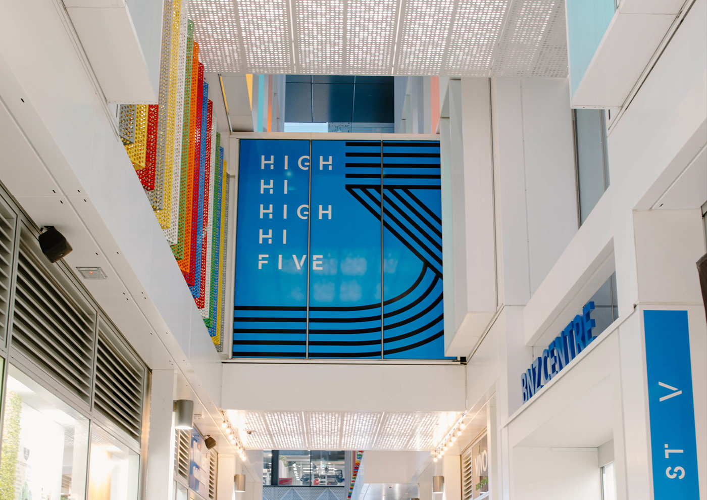
The name helped address some of the major challenges that came out of the research. It was memorable, distinct and highlighted the accessways. The resulting logo design has 5 ‘lanes’ in it. A Secondary graphic made up of 5 lines were developed to combine with the new colour palette to allow for a flexible identity. These elements can be combined in different ways from ‘bright and vibrant’ for the entrances to a more pared back look for collateral.
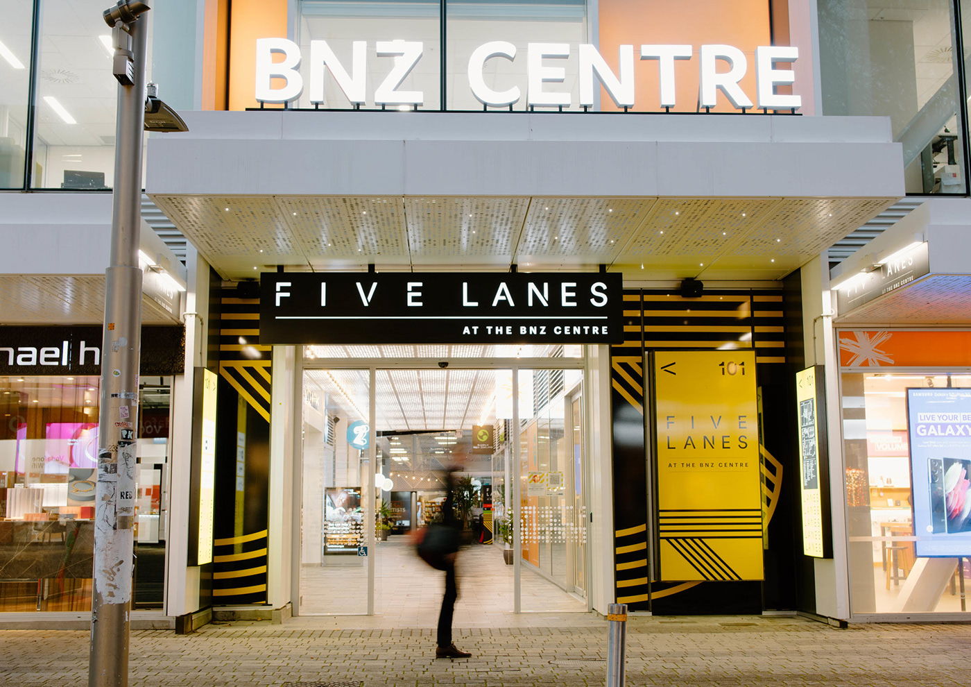
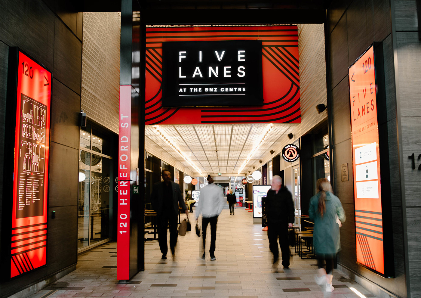
To add energy and boldness to the space we created a dynamic and vibrant wayfinding system. This system used five bright colours, one for each of the five lanes. This tackled two of the major problems at once. It made the entrances stand out, and made the whole mall complex different from the other spaces in the central city. We combined this with a simple messaging system (gather, shop, eat, dine, explore) that showcased what the space had to offer - it also tied back to the wider ChristchurchNZ strategy of “Explore”.
We installed new signage and two 20 metre long hoardings along Colombo St (one of Christchurch's busiest streets) to pull foot traffic down the lanes into the complex.


