Rethinking urban park space
Parks are a point of attraction for residents of large cities. Many of them stand out for their unique style and recognizable image. They attract attention of new visitors, motivate people to come back again and again. Moscow's Zaryadye and VDNH are among such places where people can have a walk, do sport, relax, buy street food, meet friends, take photos for social networks, and generally enjoy their free time.
St. Petersburg doesn’t offer many comfortable urban parks where you can enjoy spending the whole day. The management of Primorsky Park Pobedy and ENDY decided to take up this challenge and create a distinguished place for guests and residents of our city. Such place will be a combination of a fully developed concept, a holistic image and a recognizable corporate identity.
Brand-line of the project — Park of a new type

A place for everyone
Primorsky Park Pobedy is the heart of Krestovsky Island. Citizens appreciate this place as it is close to nature. After the football stadium and other sports arenas were opened to public the island has become a place for people who are into sports.
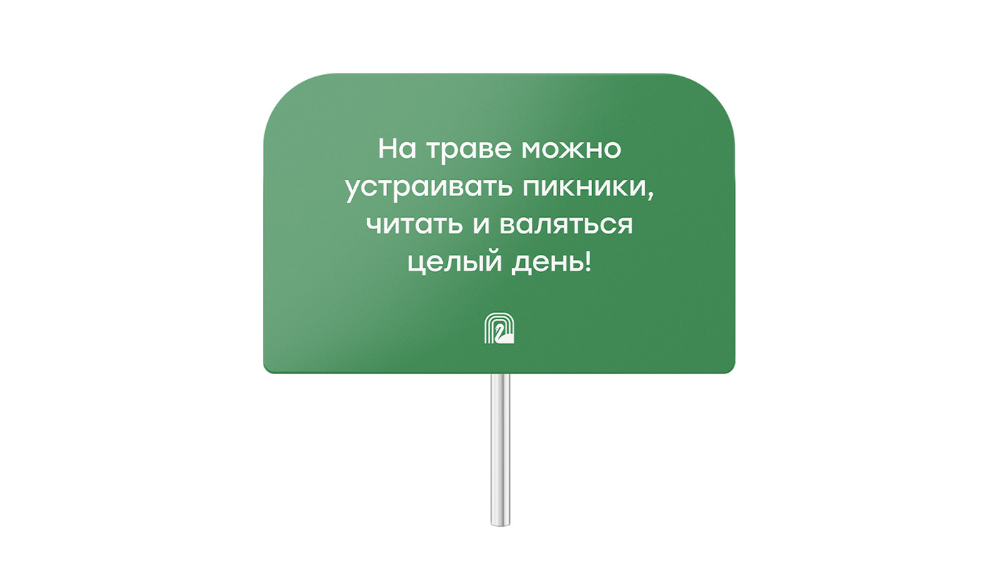
When developing the brand of Primorsky Park Pobedy, we followed the idea that it is a place with many areas for people with different interests. There are jogging and bike paths, sports stadiums and outdoor exercise equipment, picnic areas, ponds, cafes and restaurants, playgrounds, a well-maintained embankment and many more. The park's management plans to cooperate with fashionable catering services, organize sports and entertainment events, transform navigation and logistics.The park will become the center of the entire infrastructure of Krestovsky Island. One of our main aims was to convey this information to people through updated communications and an integral image of the park.
Keeping up with the times
The elements we have developed for Primorsky Park Pobedy are actively introduced into the design of its social networks. The hashtag #pppark becomes the hallmark of this popular place.
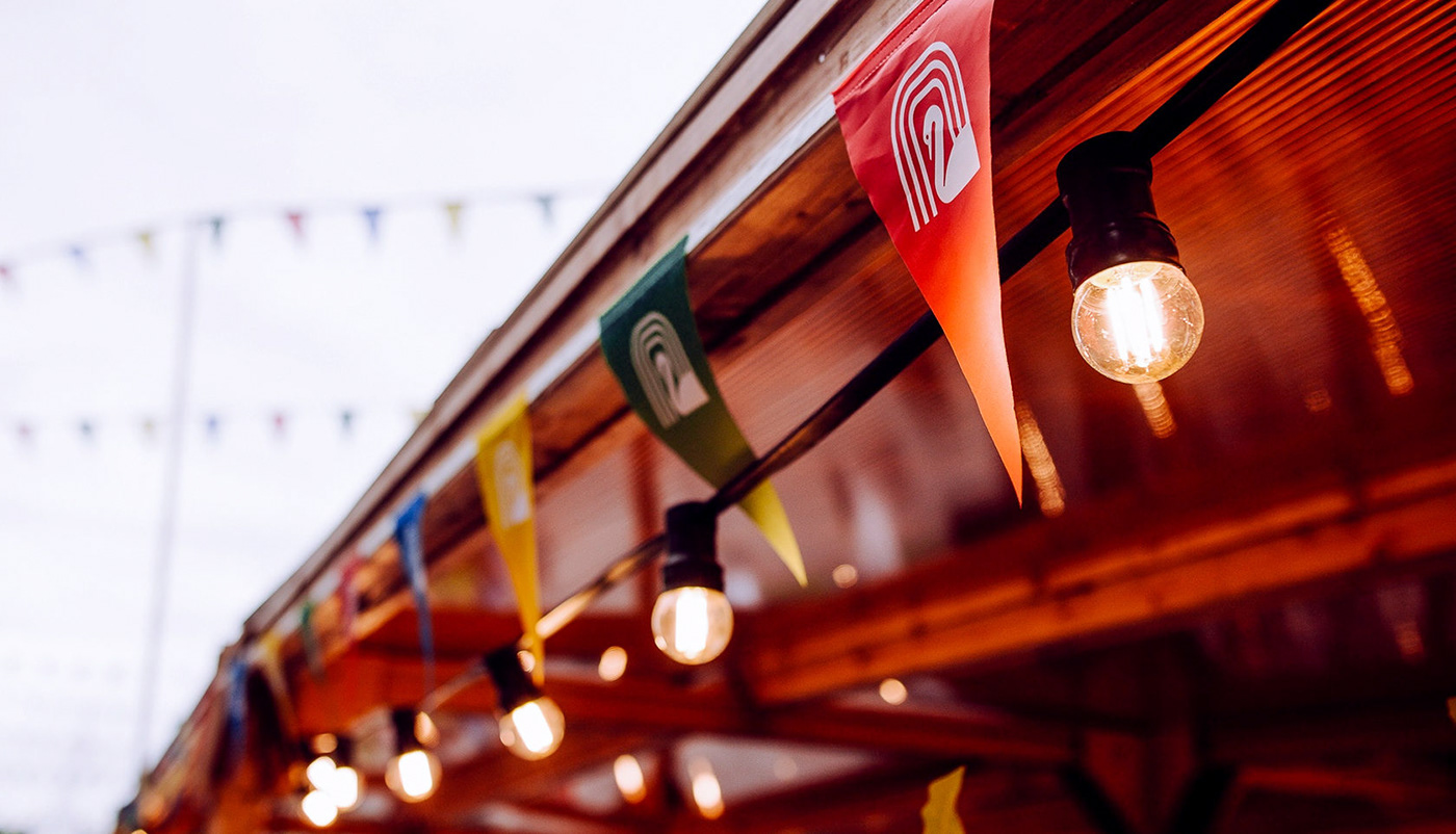
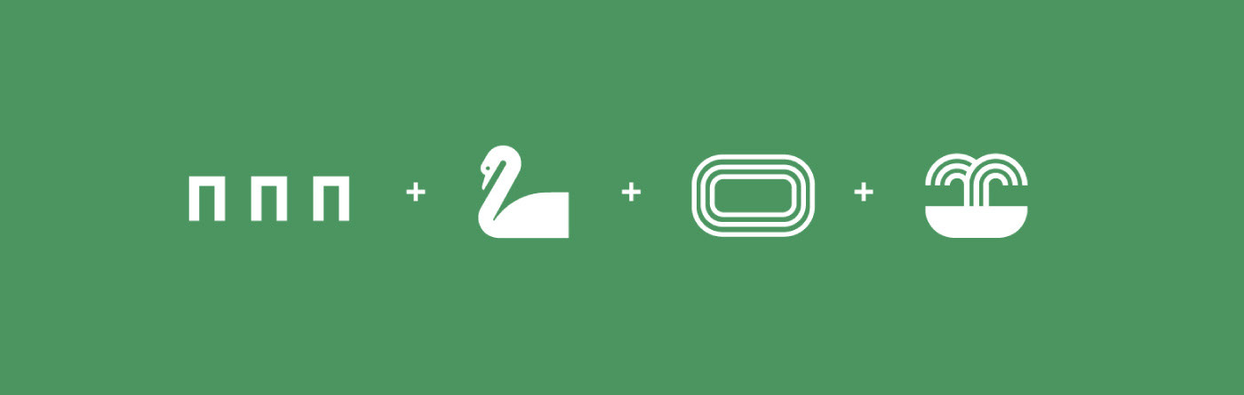
Swan — a symbol of Primorsky Park Pobedy
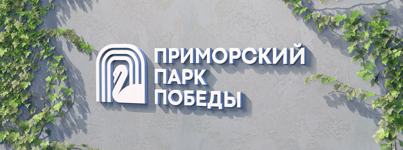
A flock of swans lives on one of the local ponds. They are fed and protected by the park staff. This bird symbolizes true love, grace, perfection, purity. Therefore, the image of a swan is in the center of the Primorsky Park Pobedy logo.
At the same time, the logo combines three letters "P" — the basic idea of the entire corporate identity of the project. PPP is the abbreviation that will become the symbol of the park.
It is easy to remember and to tag on Instagram. In addition, these letters symbolize a fountain, rotunda and running tracks — the mainfeatures of the park.
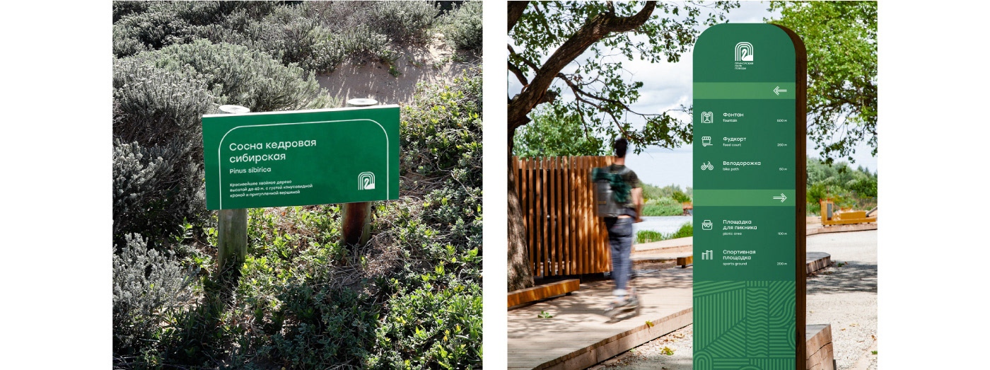
Convenient and organic navigation
Green is the main color of the corporate identity, which helps to immerse into the atmosphere of a summer park and corresponds to the idea of environmental friendliness. The icons used in navigation consist of two repeated lines that reflect the font of the main headings and the park logo.

Pattern with abstractplan of the park
Pattern was the key part of the corporate identity we introduced. We combined a lot of geometric shapes which form an abstract plan of the park and also remind of the abbreviation PPP.
Here at ENDY we have developed a navigation system which has a friendly form of communication. It contains interesting information, reminders and tips on how to feed the animals, where to find a picnic area or exercise equipment. Corporate pattern has become an important part of each of the elements.
Navigation elements are easy to read and remember. They help to find the necessary way around the park and communicate with people in a very friendly way. This approach updates navigation and time spent in the park becomes even more enjoyable.

Easily recognizable staff uniform
It is important for park visitors to understand who to address for help when needed. If we decorate the uniform with elements of corporate identity (a logo and a stylish pattern of an abstract park plan), the employee will be clearly visible and the clothes will become distinguishable.
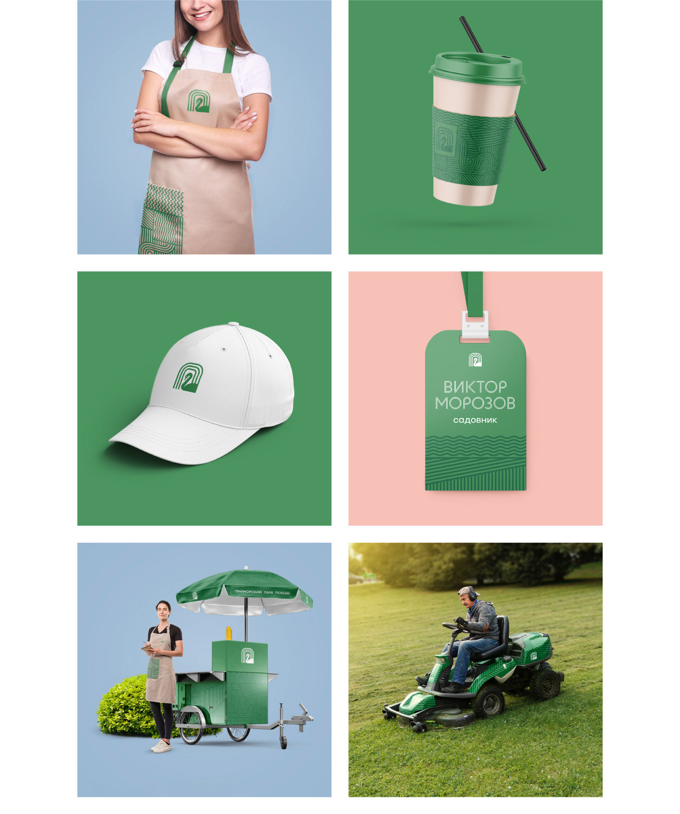
Fashionable urban space
Primorsky Park Pobedy is a modern and trendy urban space.
The park keeps up with similar modern projects and has developed its own branded merch.
Bags and stylish comfortable clothes with recognizable elements will fit into the environment not only on Krestovsky Island, but also far beyond its borders.

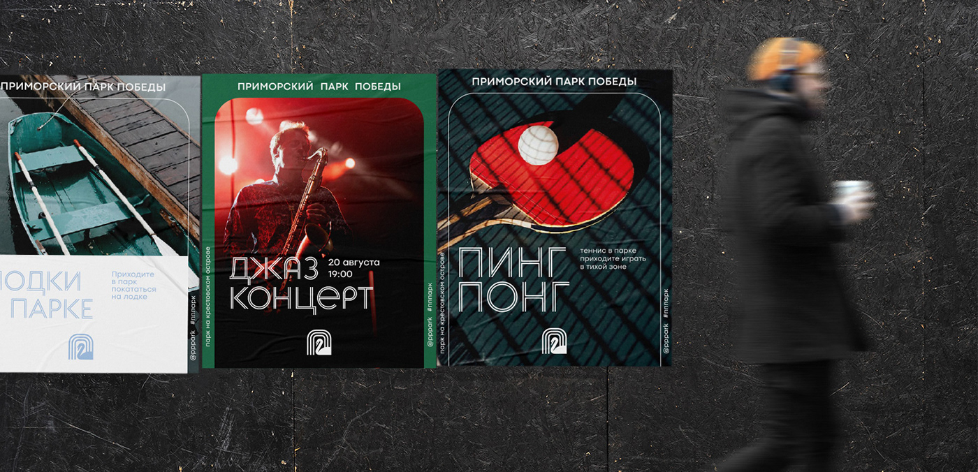
Keep within the frame
Sap yoga, capoeira, park quests, kindergarten lessons are among the events that are constantly organized in Primorsky Park Pobedy and need to be announced. For this purpose, we have created a frame with rounded corners. This solution followed the desire to emphasize closeness to nature and absence of rough boundaries. The shape of the frame reflects the logo design and fits perfectly into the formats of social networks and print media.