
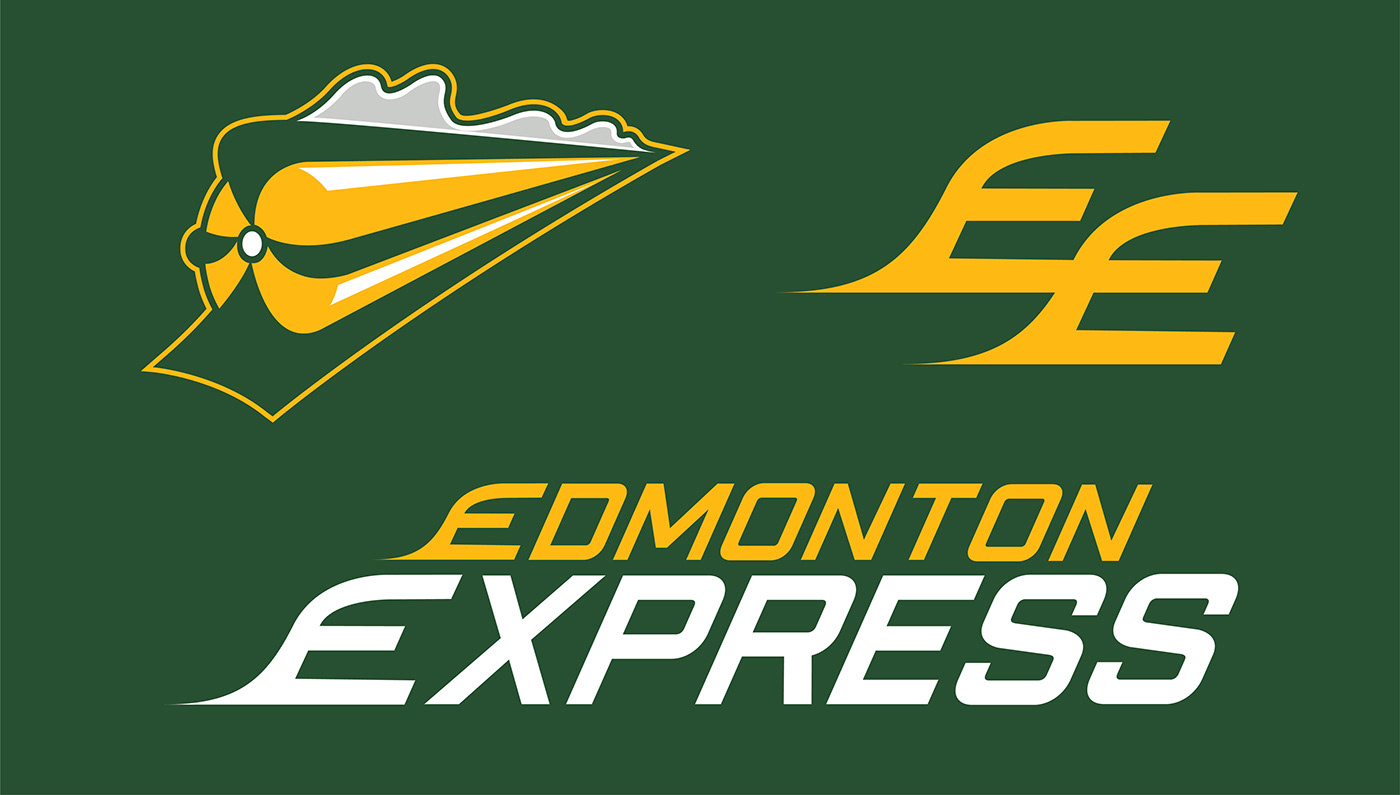
In 2021, the CFL's Edmonton Eskimos re-branded. Here's my proposal for the re-brand: The Edmonton Express.
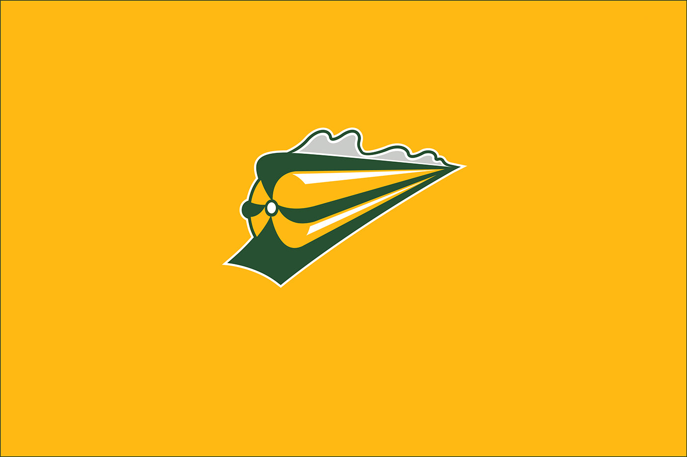
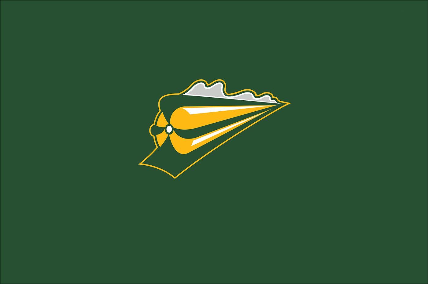
Edmonton's primary logo features a charging steam locomotive, a nod to the expansive history of trains in the city. The green streaks reveal a hidden 'E' , which stands for "Edmonton".
The iconic 'EE' logo would return in the silhouette shape of two locomotives.


Below are six wordmark logos of various colour combinations.


Here's a final look at the locomotive logo in different outline and background colour combinations.


As both a graphic designer and fan of the CFL, this project was a blast to work on. The Edmonton Elks did a great job re-branding and I'm excited to see their designs showcased on the field.
PW


