
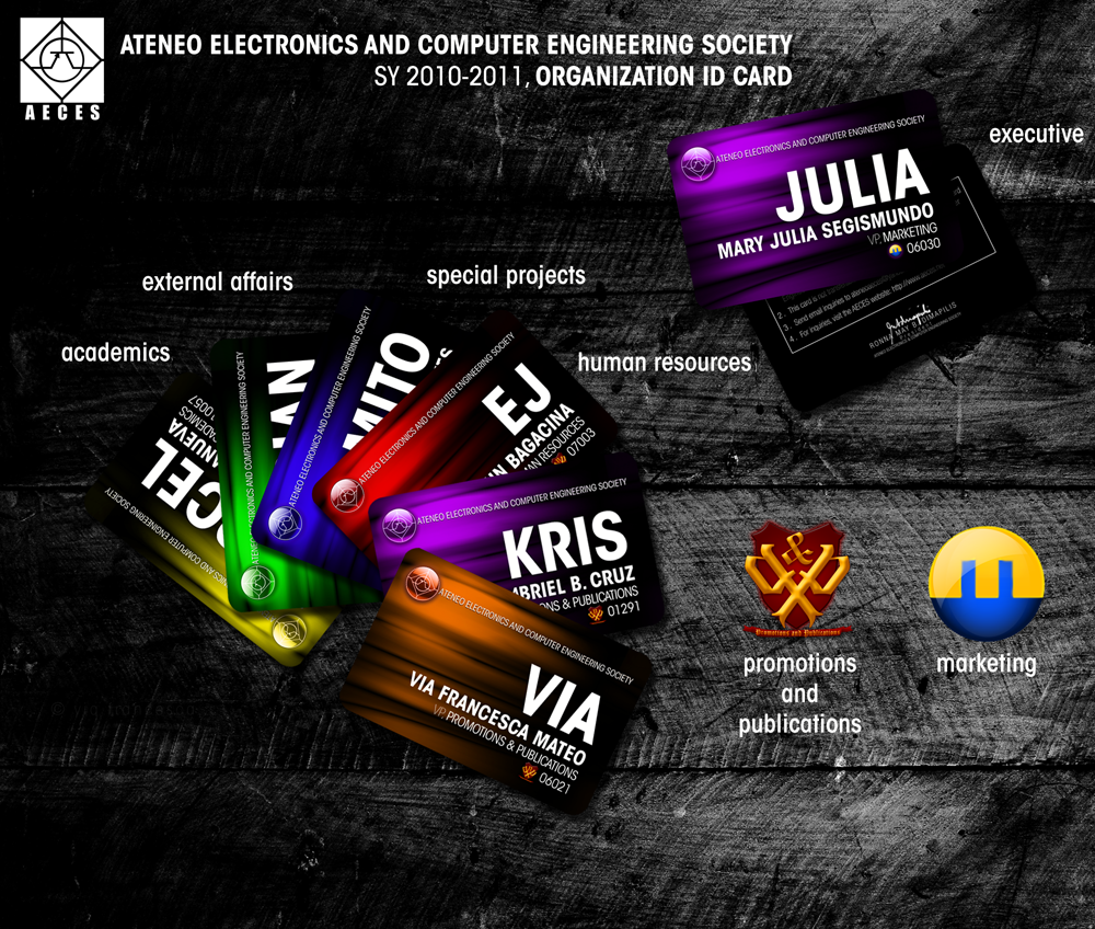
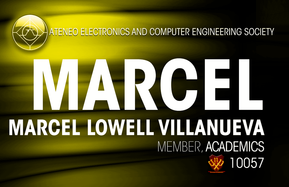
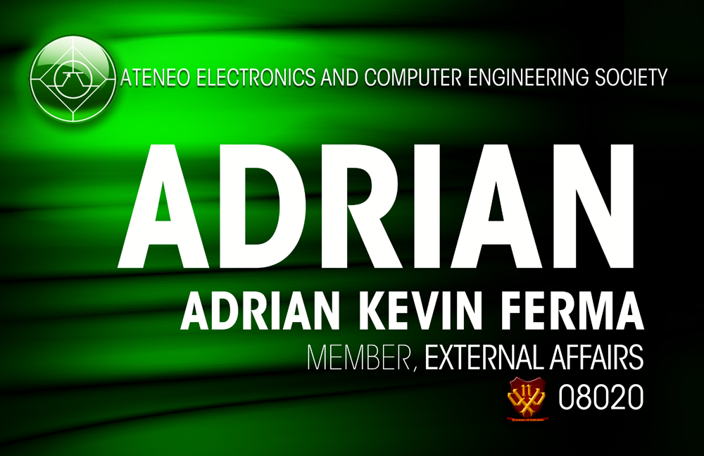
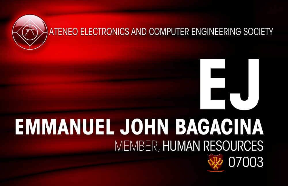
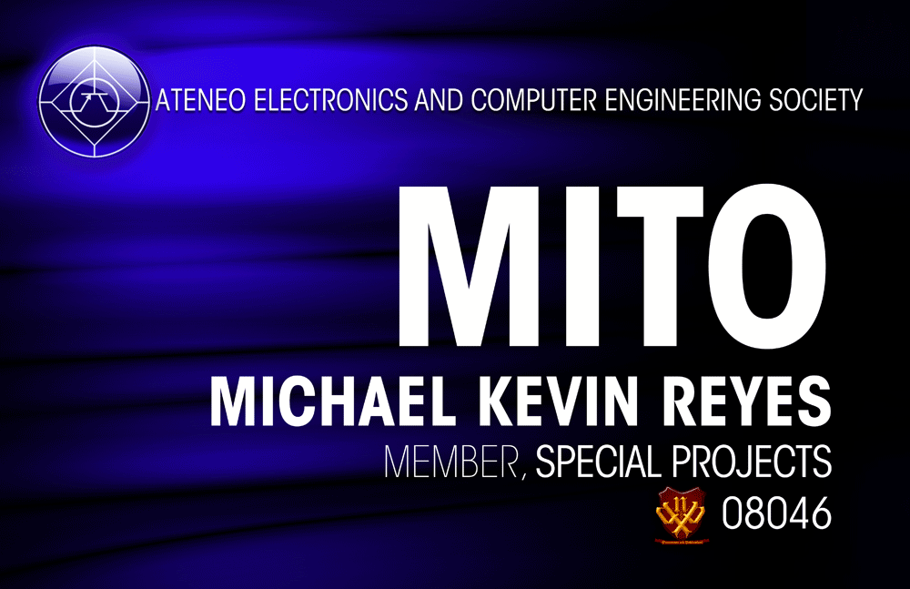
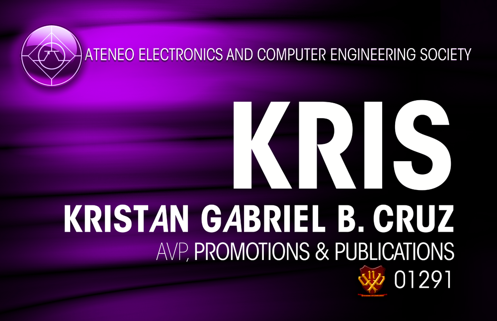
Each of the four departments have different color schemes. I chose bright primaries and secondaries for the color so as not to make it very gloomy despite the high amount of black in the design. The font used for the design is ITC Avant Garde.

Logo designs I made for the two specialized departments and conceptualized with my two assistant vice presidents. The Marketing logo I designed was inspired by the power switch/cord, making the events of our org "Powered by" some awesome sponsor. The concept was originally created by my former VP, Kuya Kim. This logo was a second version, with colors changed according to the preference of the Marketing department itself.

Meanwhile, the Promotions and Publications logo was inspired by the royalty. The concept was created by me and my assistant vice presidents for our department. We intentionally made it look like swords as if every promotion or advertisement of any kind requested to our department is a battle to conquer.


