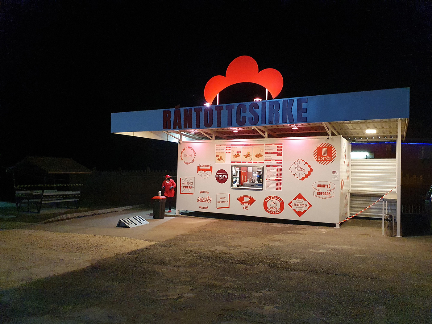
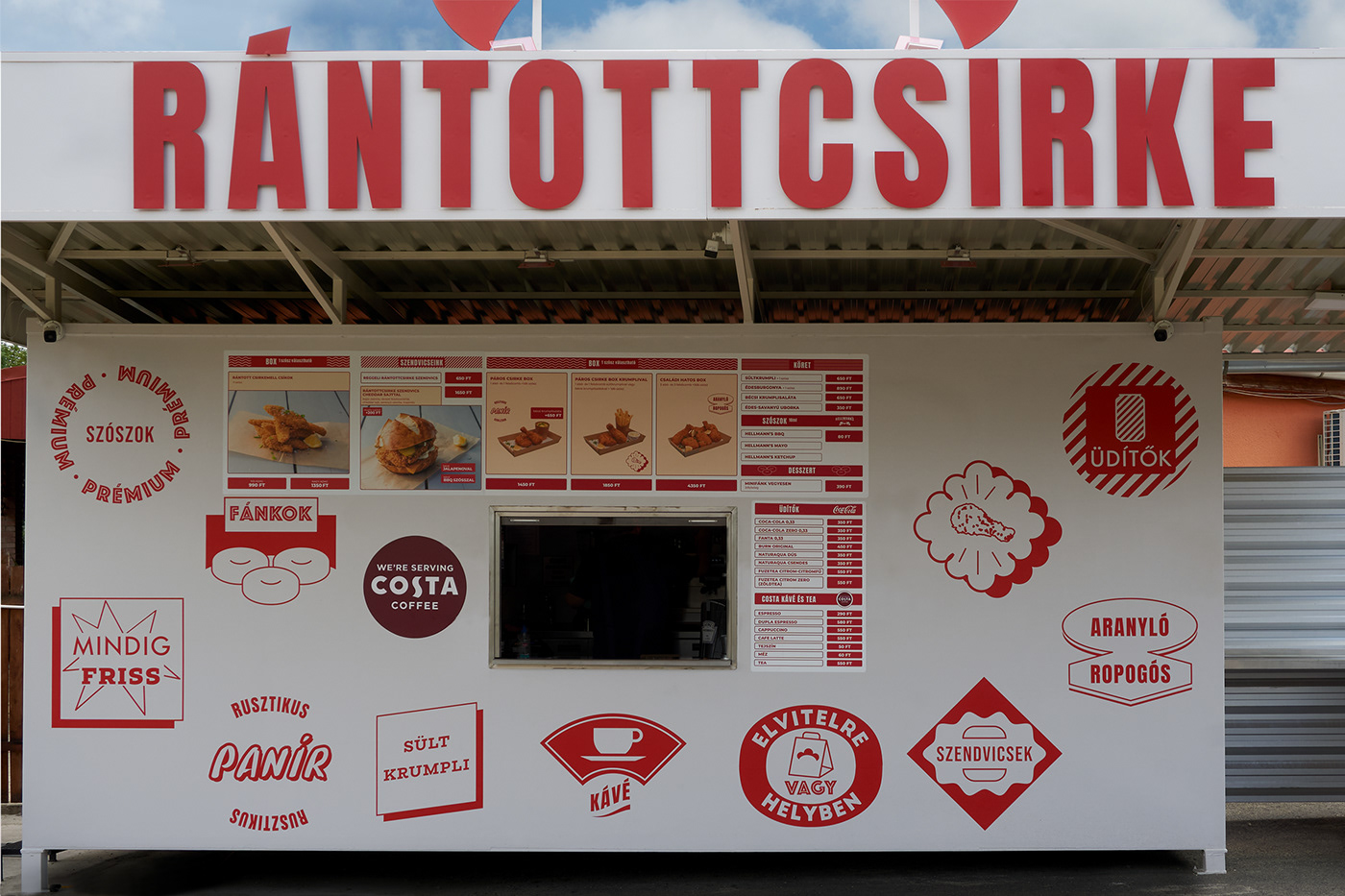
"Rántottcsirke" is quite a honest and straightforward local place. Its name literally means 'fried chicken' in Hungarian. It is serving various forms of delicious fried chicken-based meals with quality sauces and delicious side dishes. We were tasked to design the visual identity for this emerging brand.
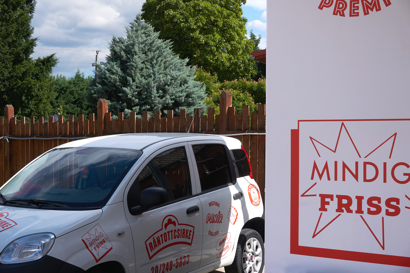
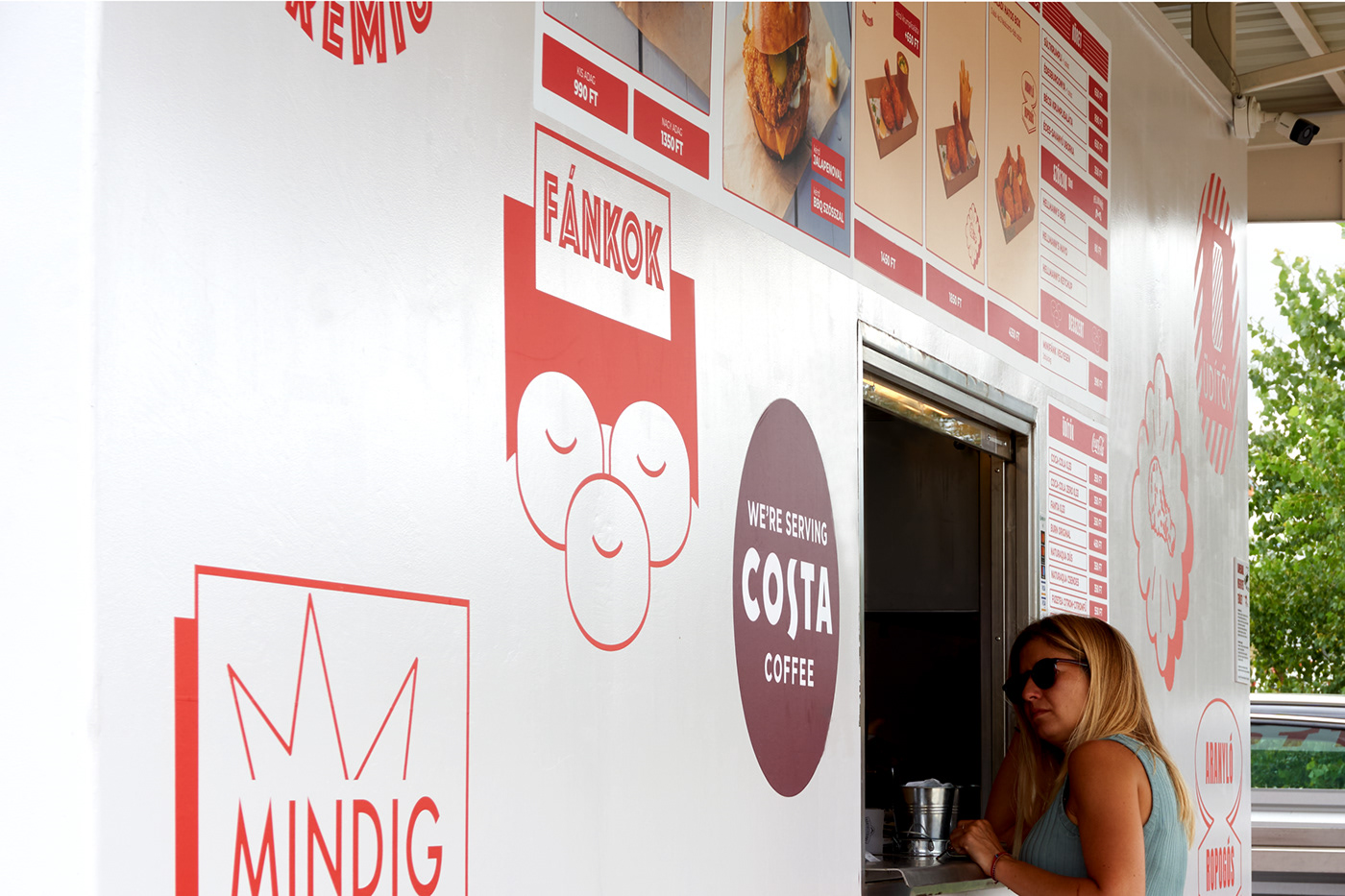
In conversation with the brands' owners, we decided to create an American diner-style design to complement their first place, opened in a specially designed roadside container. The main elements of the identity are the logotype and the "badges" The logotype is set with a bold narrow typeface in all-caps with a stylized chicken comb placed above it. It communicates the message of the brand straightforwardly and elegantly. The emblem is evoking the chicken while its abstract shape, avoiding the natural depiction of it. To communicate all the other features, specialties, and messages of the brand we designed badges consisting of pictographs and short depicting words. These sticker-like elements are then used in offline and online materials as well as on the container itself.
Overall we tried to create the design just like their dishes. Simple but made from quality ingredients and most importantly delish.