Rebranding Medme
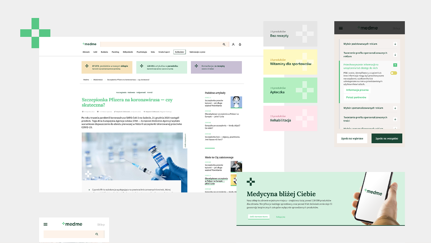
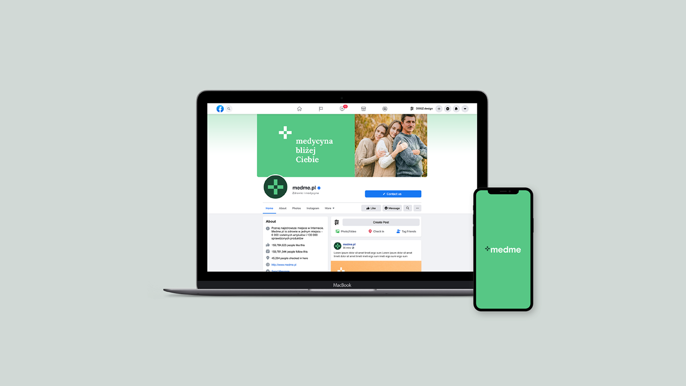
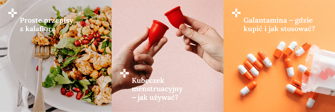
Medme rebranding "Medicine closer to you", the claim developed for medme.pl perfectly reflects the main idea, and became the big idea that accompanied us throughout the design process. First of all, we wanted a graphic representation of the combination of the lifestyle nature of articles with real medical knowledge. The "plus" used in the logo refers not only to the medical industry, but also symbolizes the "capacity" of the brand which, apart from the guide section, also has its own store.


construction of a sign
The medme logo was designed on the base of the Basis Grotesque Bold font (designed by the Colophon Foundry of London), on the basis of the distance × which is the width of a single rectangle in the signet. The length of the plus arm is 1.5 ×. We used Basis Grotesque Regular font to expand the shop.


art direction / graphic design
kasia lewandowska
kasia lewandowska
maciek lomnicki
patryk skoczylas
ux / ui
przemyslaw proszowski
tomasz swierczyk
tomasz swierczyk
work with us, we don’t bite 🦴 → https://dogz.design