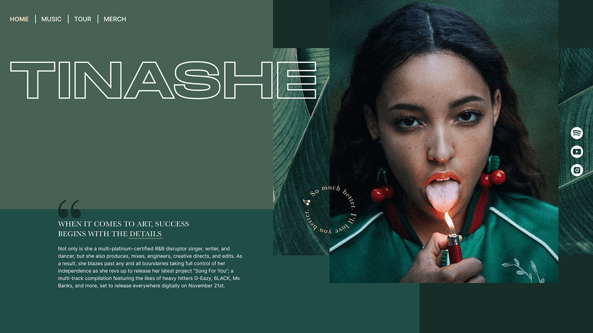
When I run into this amazing photograph by Sean and Seng, I knew I had to use it in my next project. The homepage was created in the next few hours and later I continued to work on other pages in order to create a simple website. For consistency, I used the same colours and combined them with leaves' texture. When it comes to typography, I liked the combination of serif and sans-serif font, although I decided to use a different font for the large header. It was interesting to play with such a limited palette and to experiment with different layouts.
However, it took me way too long to finish this, since I stopped working on it for a while, and then when I wanted to continue, I didn't like it 🙃. In the meanwhile, I started working as a UX/UI designer so I think that completely changed my perspective when it comes to some choices. After some corrections, it's finally here.


thanks for watching 😊


