


Reinventing familiar flavors and aromas
YATTS is a wonderful outcome of incubating and realizing the dream of bringing new taste experiences to Thai food that is so familiar to the Vietnamese. Right from the name, it's a rearrangement of TASTY's letters, just like a new recipe from age-old ingredients to create strong emotions that make people exclaim ‘YATTS!’. Based on that idea, its founders had a vision that only flavors and aromas but also other emotional experiences of the restaurant must be new, modern, related to but different from traditional Thai cuisine.
YATTS is a wonderful outcome of incubating and realizing the dream of bringing new taste experiences to Thai food that is so familiar to the Vietnamese. Right from the name, it's a rearrangement of TASTY's letters, just like a new recipe from age-old ingredients to create strong emotions that make people exclaim ‘YATTS!’. Based on that idea, its founders had a vision that only flavors and aromas but also other emotional experiences of the restaurant must be new, modern, related to but different from traditional Thai cuisine.
YATTS has brought together different creative disciplines, working closely together to achieve a unique and unified experience. The brand and visual experience part was trustingly commissioned to B&A.


Myriad branches from the same one root
The special thing about working with YATTS was that B&A had the opportunity right from the start to participate in the overall experience design process. With a restaurant, although food-taste is the focus, other elements and other senses also play an important part to create a unified experience journey for diners. These elements even contribute to changing the taste, in a more positive or negative way or to a completely different taste dimension.


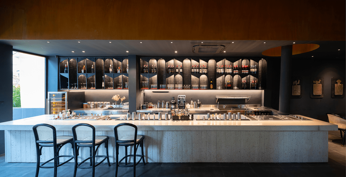
That’s why B&A has worked closely with chefs, interior architects, food stylists, music specialists and other stakeholders to form not only a visual but also a multi-sense identity with lighting, atmosphere, scent, sound, material textures. Everything helps create a journey of culinary experience that is sophisticated but passionate, relaxed but inspirational, a little familiar but full of new and surprising things, borrowed from tradition but boldly modernizes it.


The tree of complementary tastes
Those seemingly opposite characteristics perfectly embody the YATTS culinary philosophy: contrasting flavors create powerful emotions. And that philosophy is clearly reflected in the image that B&A creates.
The YATTS brand logo is a radiating taste tree branching upward to form the letter Y - the first letter of YATTS as well as the symbol of constant growth in the culinary experience of the talented chefs here (Years of experience). The tree canopy is round and full, representing the roundness and full flavor of the dishes at YATTS. It is uniquely shaped from the letter O, the symbol of admiration, amazement at new taste experiences. The base of the tree is an inverted T-shape, referring to the unexpected but subtly hidden creativity.


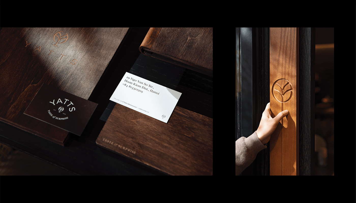


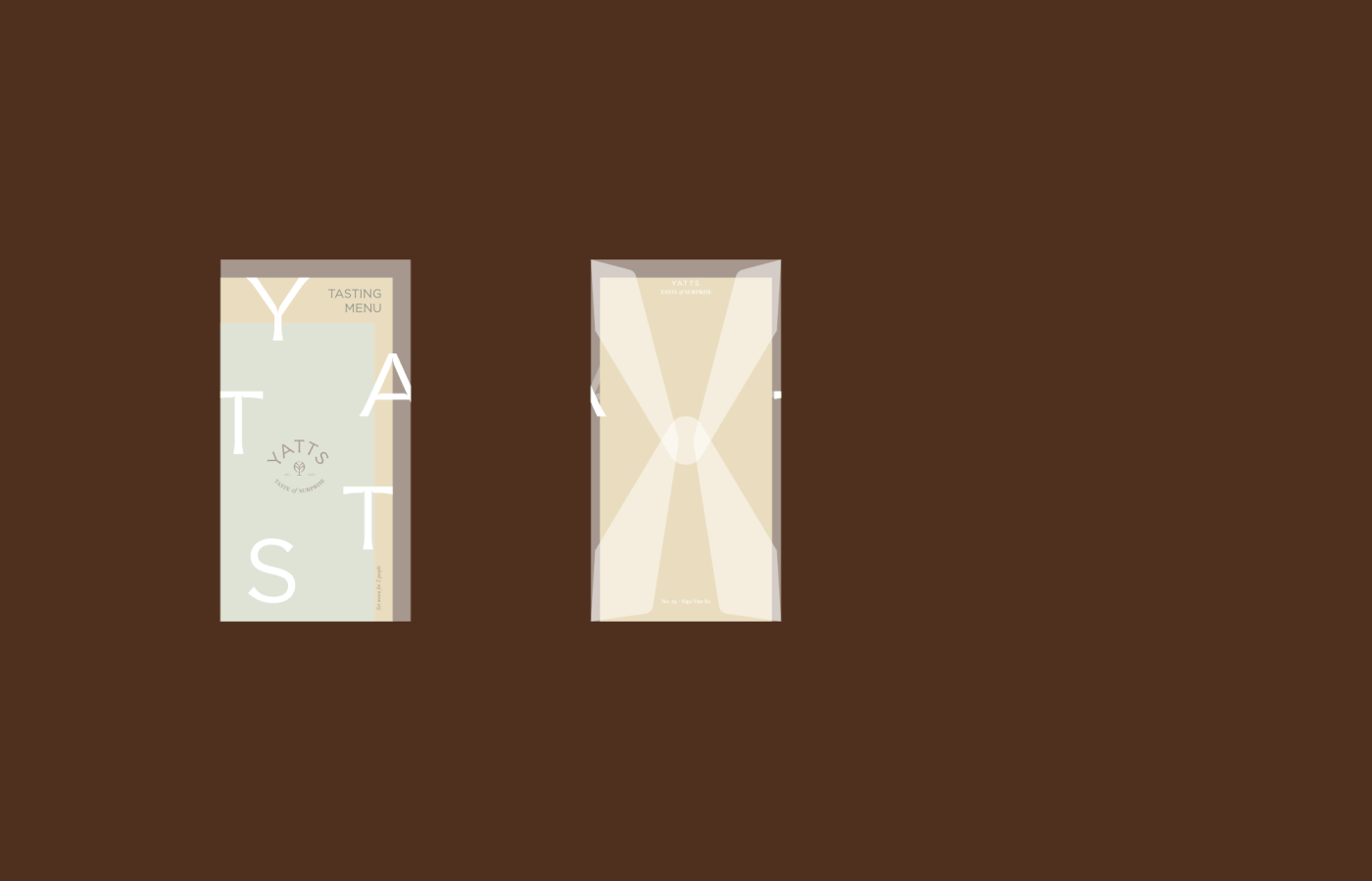
The brand contains both the old and the new, a bit nostalgic but sophisticatedly modern. Because YATTS is a natural tree of life sprouting from the roots of taste memories in the subconscious, in memories to diverse and creative branches and tops. The lines in the symbols and letters are simple, open and friendly, but contain subtle details and unexpected moments such as small engravings or creative letter combinations. They are visual metaphors of YATTS culinary masterpieces waiting to be discovered.


Design Agency: B&A Studio
Creative Director: Hung Nguyen
Designer: Trang Vo, Dat Nguyen
Project Manager: Linh Vu
Architecture & Interior: Toob Studio
Modelling: Pham Thanh An
Contractor: Desicons
Uniform: Fankshirt
Interior Photography: Fuongy Nguyen, Trieu Chien
Food Photography: Fuongy Nguyen
Creative Director: Hung Nguyen
Designer: Trang Vo, Dat Nguyen
Project Manager: Linh Vu
Architecture & Interior: Toob Studio
Modelling: Pham Thanh An
Contractor: Desicons
Uniform: Fankshirt
Interior Photography: Fuongy Nguyen, Trieu Chien
Food Photography: Fuongy Nguyen


