


Open.
Nunca es tarde para abrirse.
Nunca es tarde para abrirse.
Open, el centro comercial del Grupo Falabella, nos invitó a desarrollar un nuevo branding para la marca, que si bien ya había sido lanzada hace unos años aún no lograba construir una identidad visual con un relato y carácter claro.
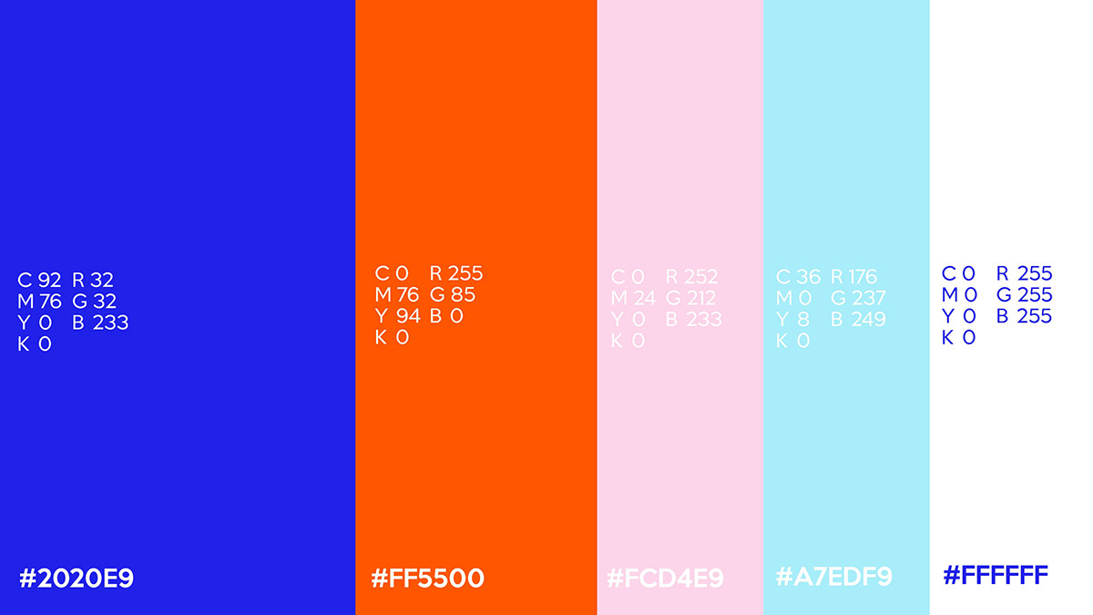
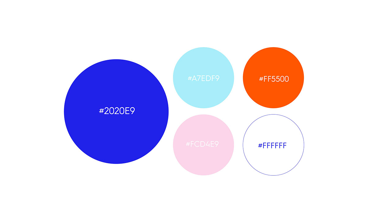
El desafío no era fácil, no solo porque debíamos mantener ciertos elementos del antiguo branding, como el color y el logotipo, sino que además debíamos llevar ese branding hacia la comunicación publicitaria.
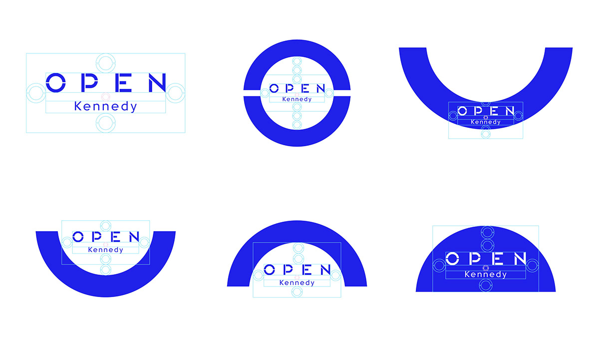
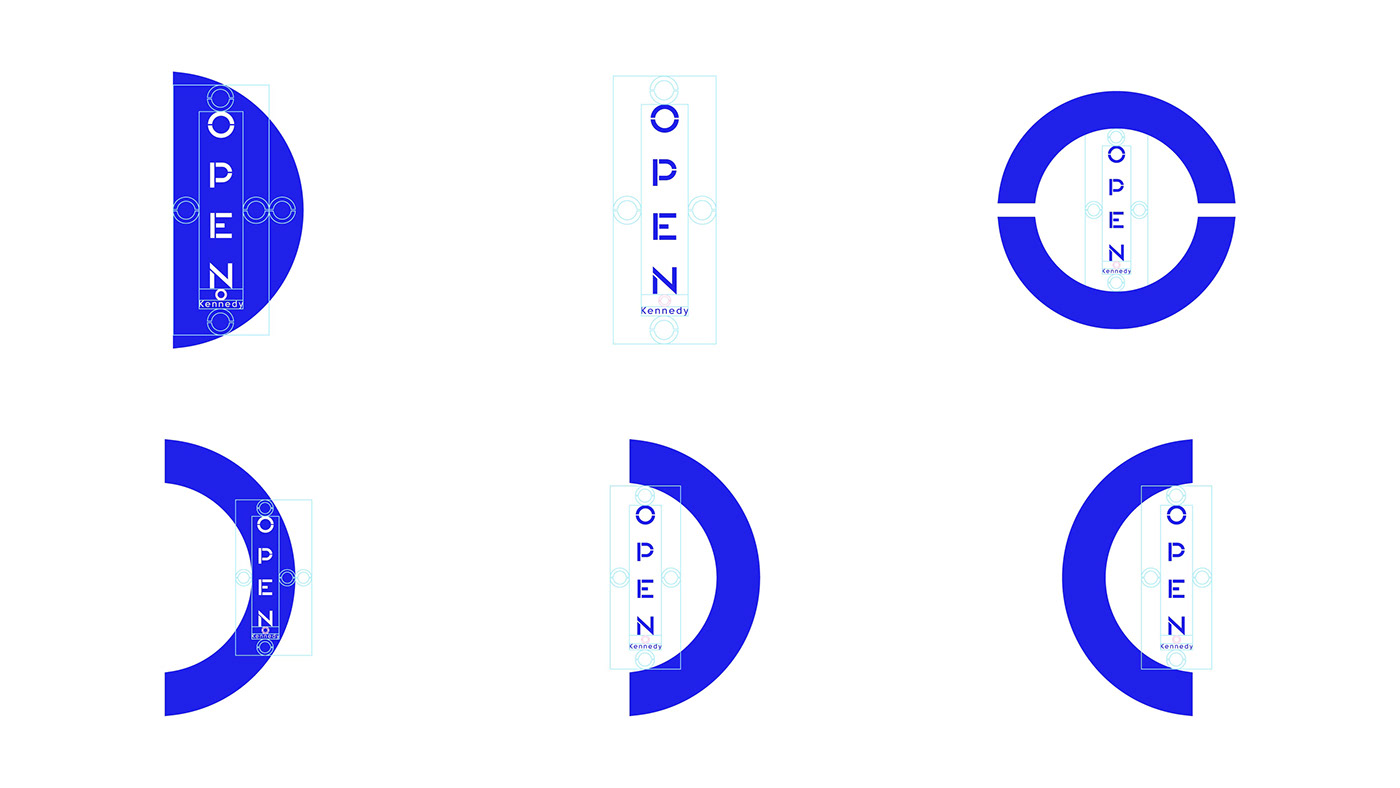
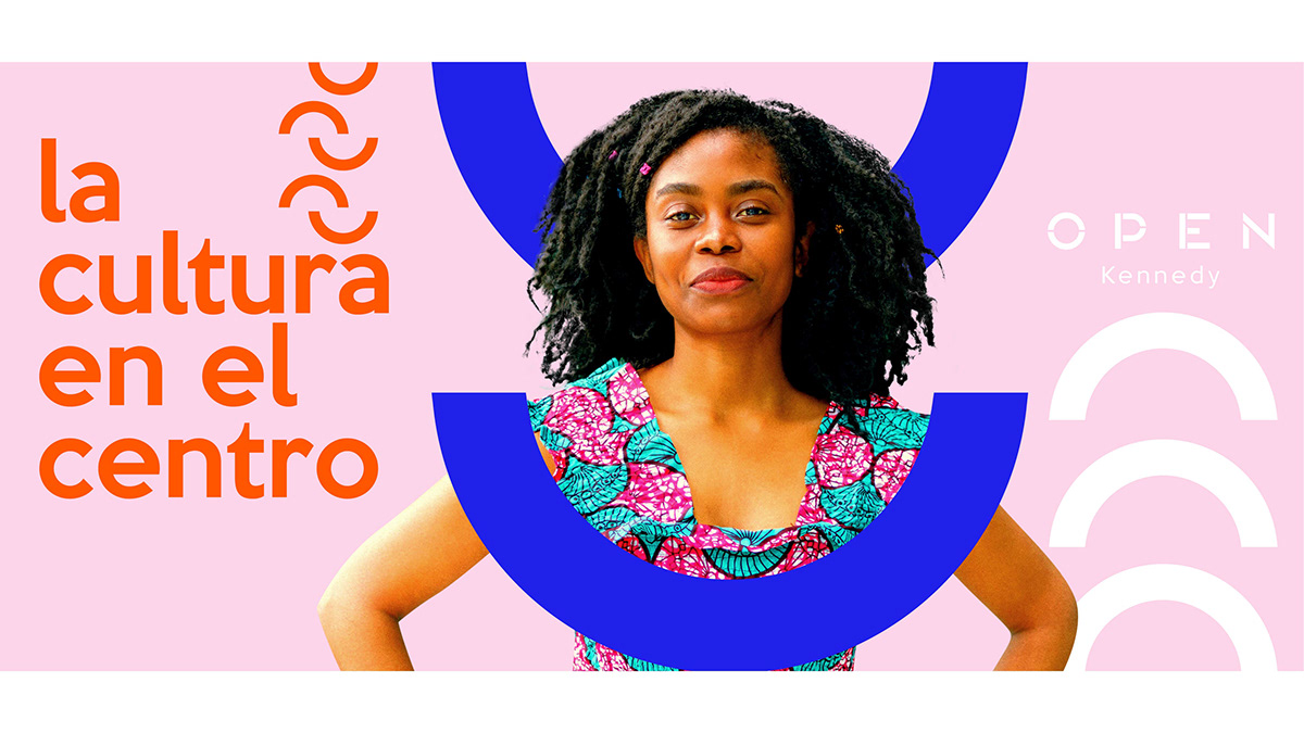
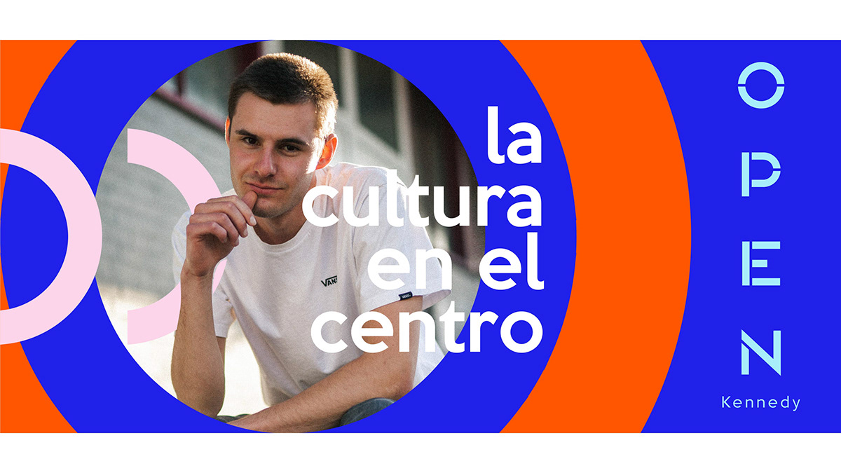
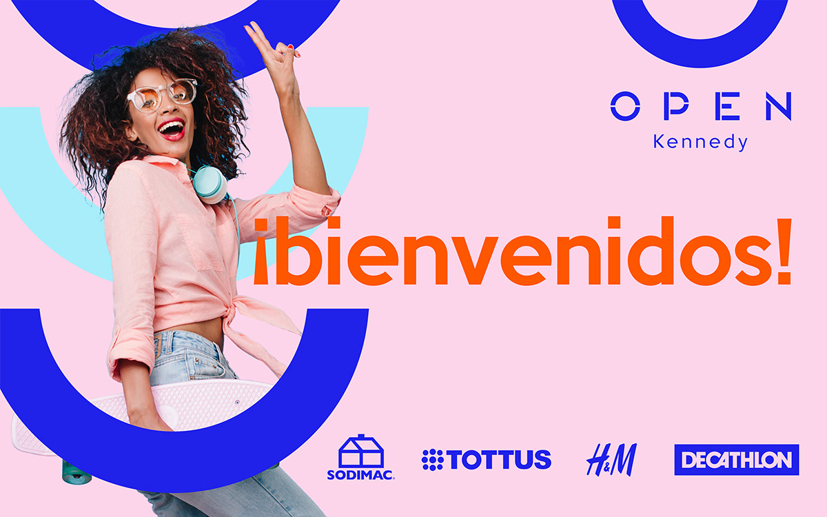
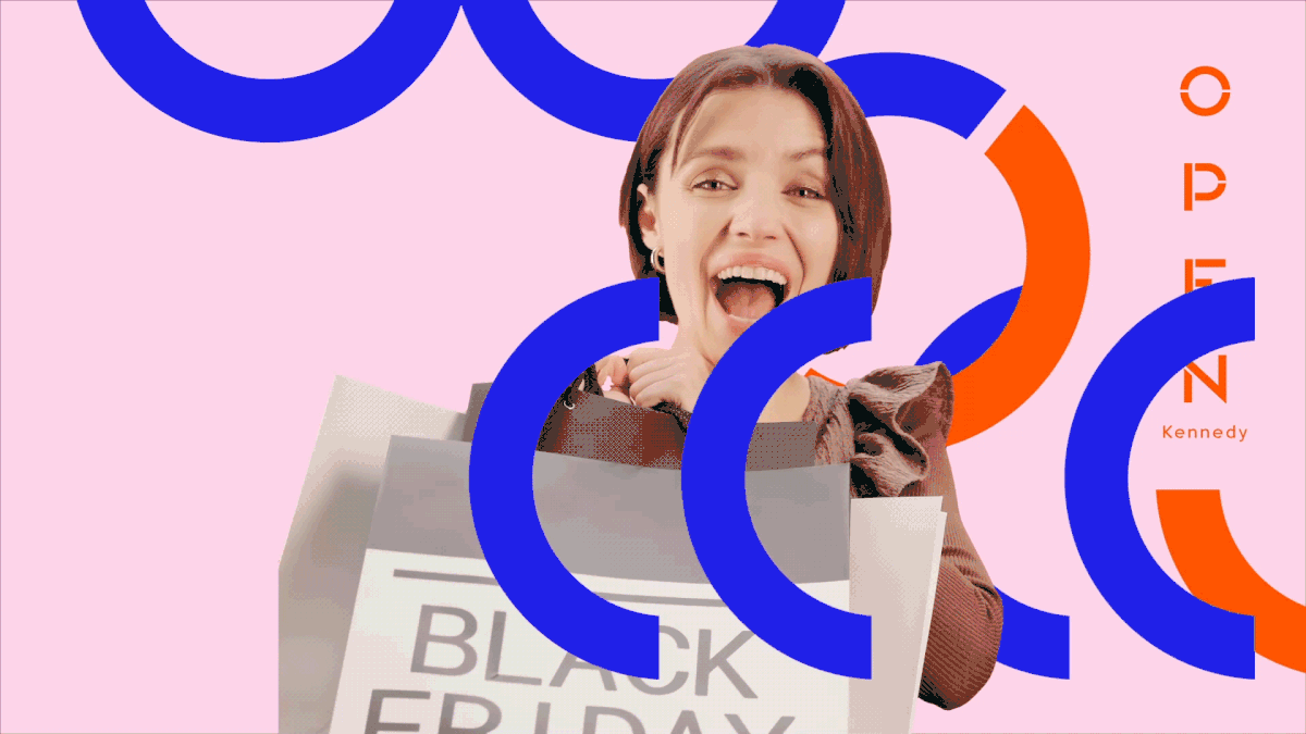
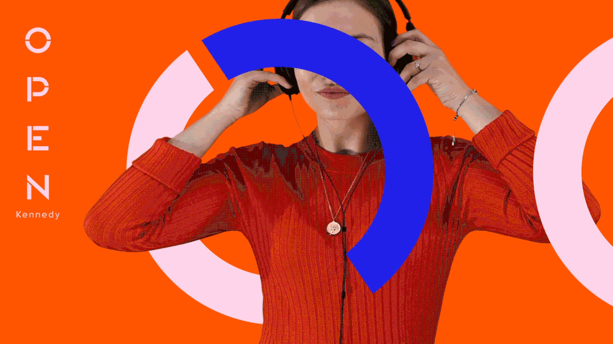
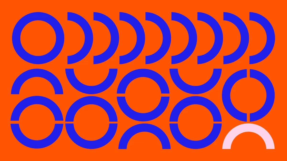
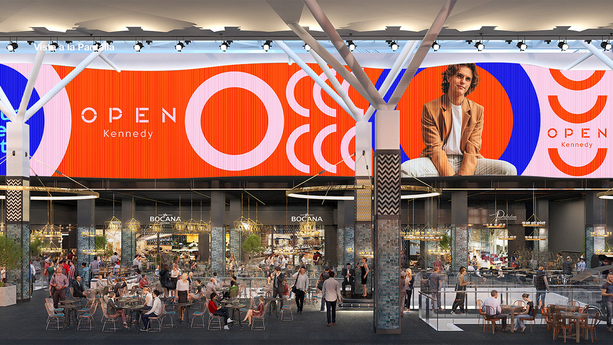
Hasta ahora la “O” de Open, es el único elemento al que la marca podía acudir para traspasar branding a entornos gráficos, fotográficos o fílmicos, pero no tenía un relato y su uso como contenedor se volvió reiterativo y encerrando el contenido. Además, en los canales digitales había una gran presencia de fotos de tiendas, por lo que la comunicación se volvía indoor.
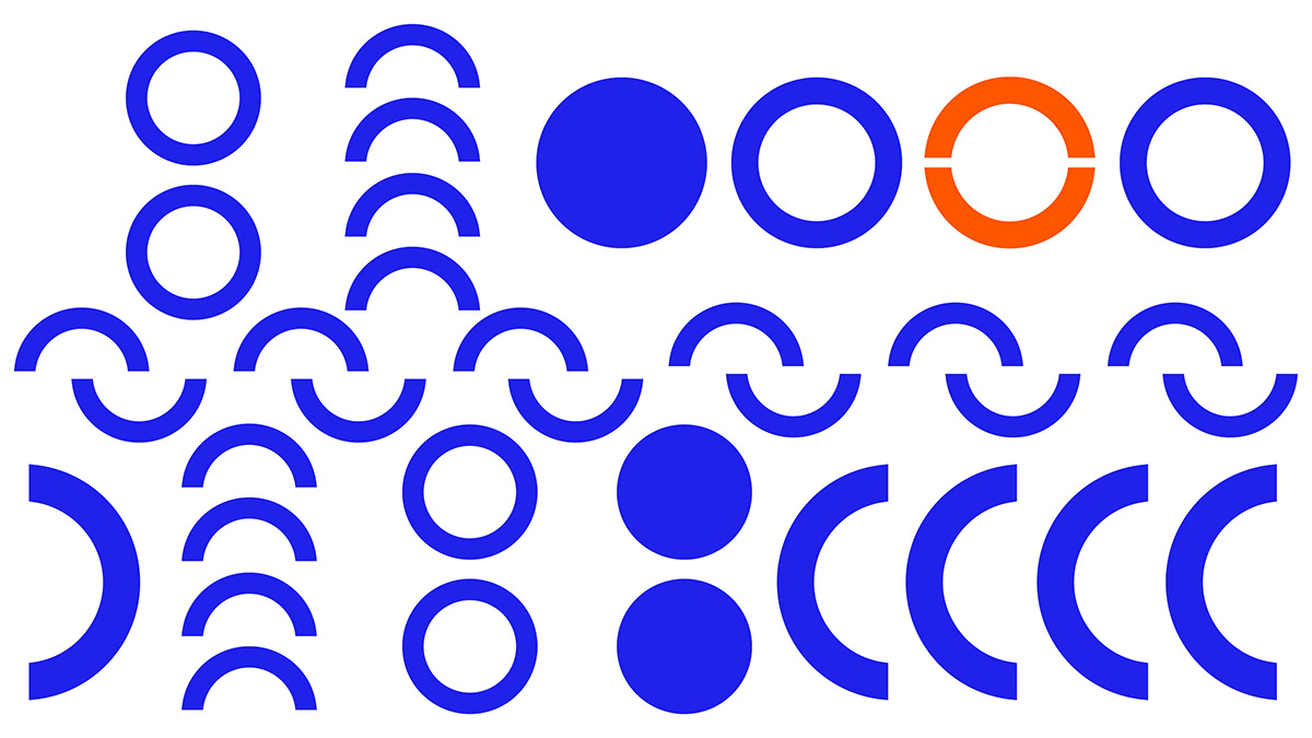
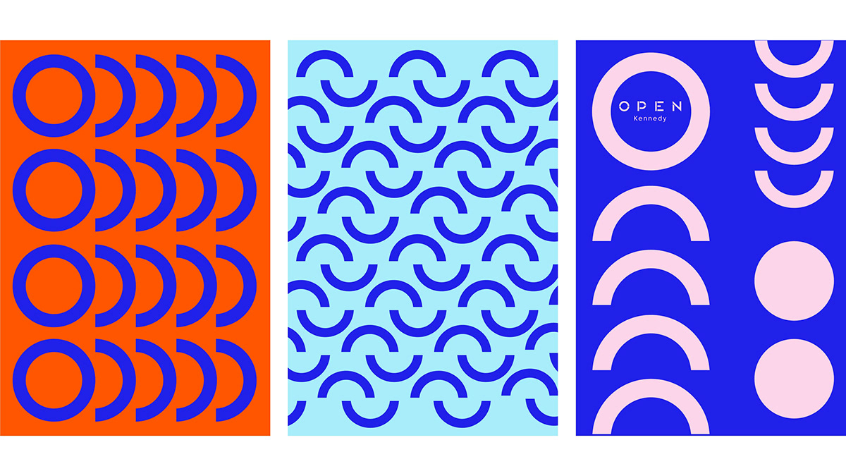
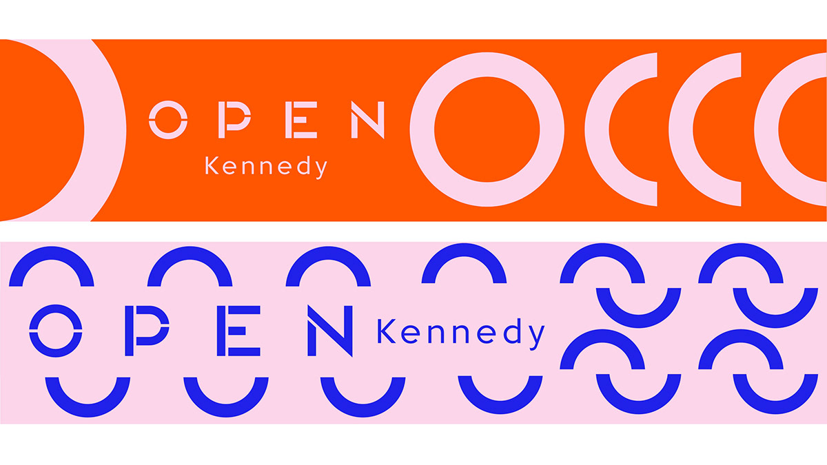
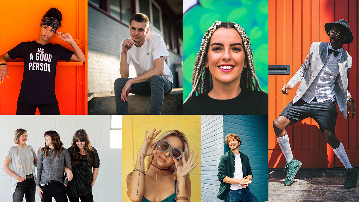
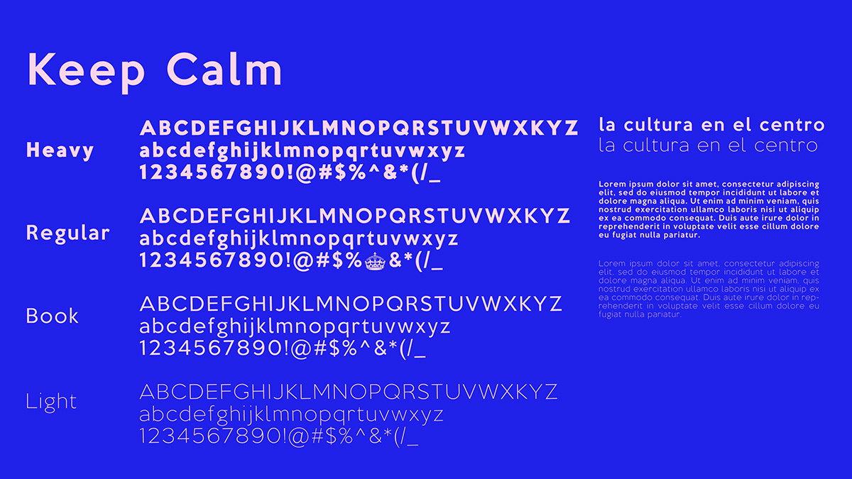
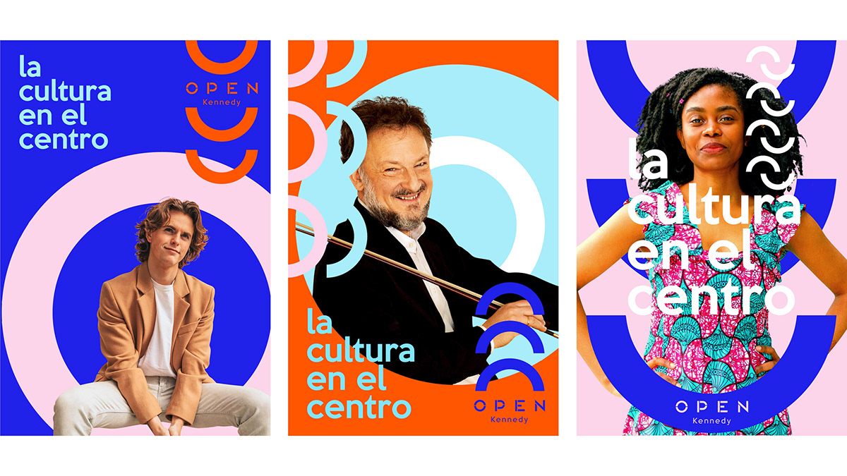
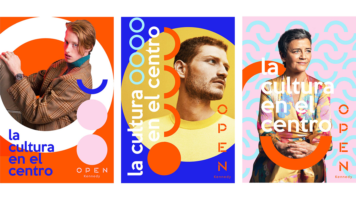
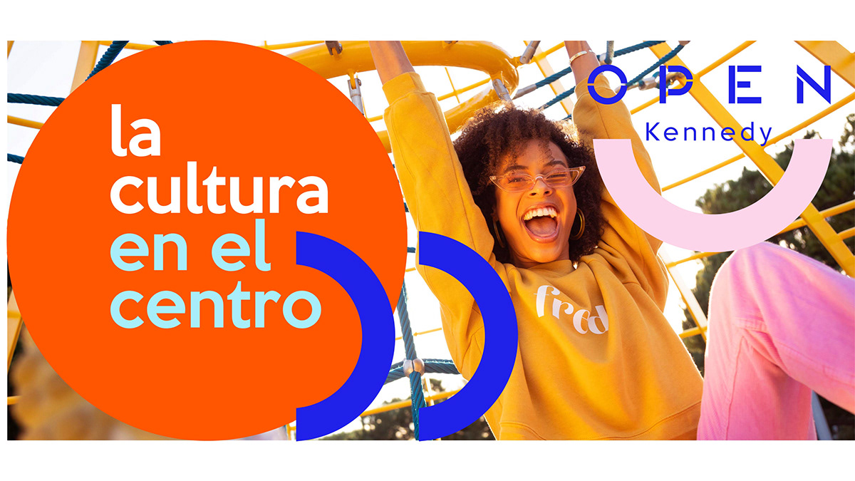
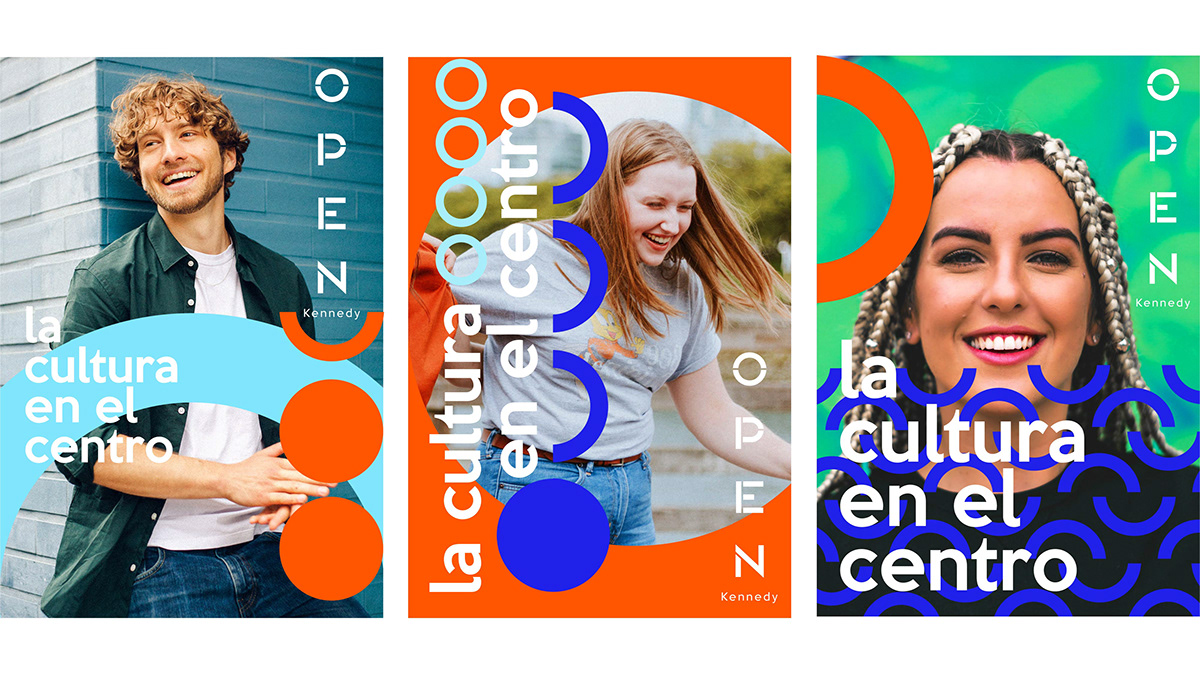
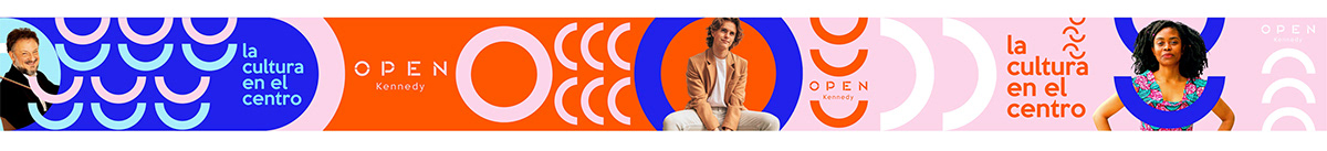
Teníamos que literalmente abrir la marca. Para eso, descompusimos la “O” derivando en un grupo de assets que representan a la Comunidad Abierta de Open, una comunidad diversa, con muchas texturas y que puede componerse de diferentes maneras. En esta comunidad la cultura y las personas están en el centro
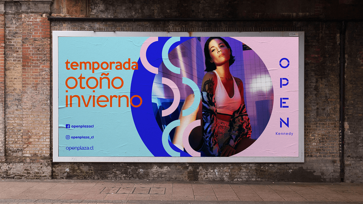
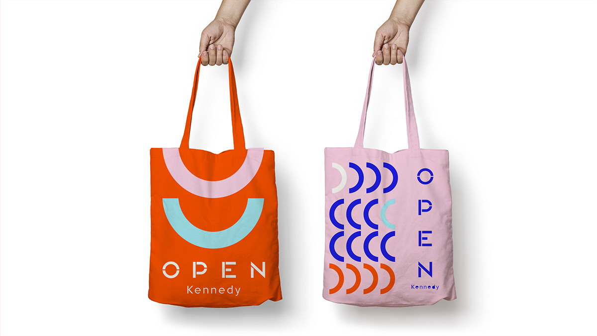
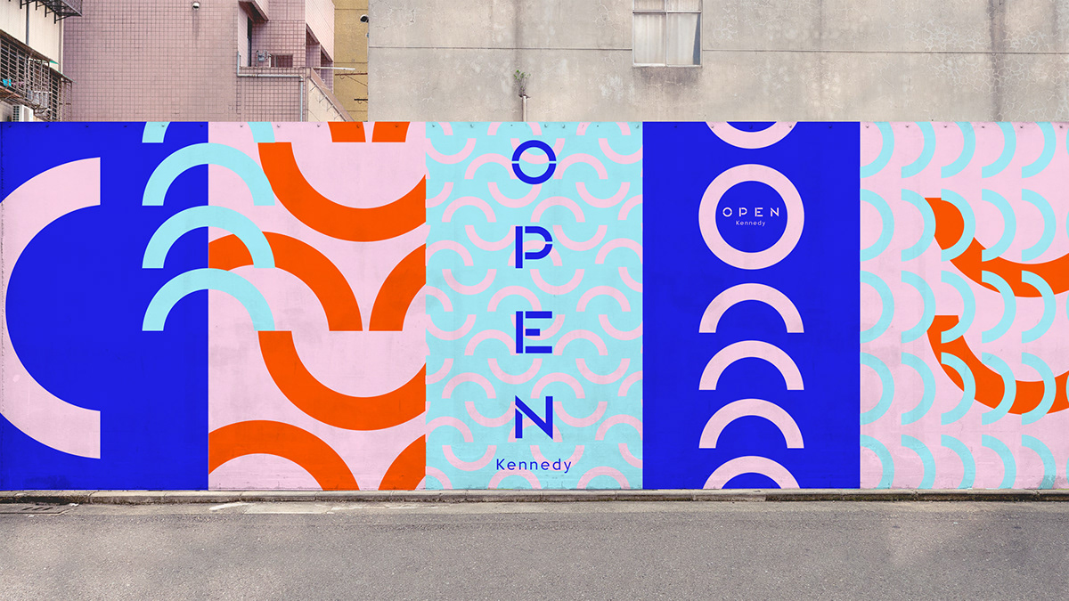
Uno de los sistemas visuales más extensos que hemos creado, diseñamos cientos de elementos y formatos para la marca con un branding consistente, único, con carácter y relato, pero además diverso, variado y lo más importante de todo; responsivo. Para entender mejor el escenario estratégico y narrativo para la marca, desarrollamos una investigación liderada por la planner estratégica Valentina Müller, desde Italia. Y para que nuestro branding desde el comienzo fuese entendido para ser animado y como contenido, nos unimos al estudio chileno de motion graphic Buena Suerte.
Open, the shopping center of the Falabella Group, invited us to develop a new branding, which although it had already been launched a few years ago still could not build a visual identity with a clear story and character.
The challenge was not easy, not only because we had to maintain certain elements of the old branding, such as the color and the logo, but we also had to bring that branding to the advertising communication.
Until now, the “O” in Open was the only element that the brand has to transfer branding to graphic, photographic or filmic environments, but it did not have a story and its use as a container became repetitive and enclosing the content. In addition, in digital channels there was a large presence of photos of stores, so communication became indoor.
We had to literally open the brand. For that, we decomposed the "O" deriving it into a group of assets that represents the Open Community, diverse, with many textures and that can be composed in different ways. In this community, culture and people are at the center
One of the most extensive visual systems that we have created, we design hundreds of elements and formats for the brand with a consistent, unique branding, with character and story, but also diverse, varied and most important of all; responsive.To better understand the strategic and narrative scenario for the brand, we developed an investigation led by the strategic planner Valentina Müller, from Italy. And so that our branding from the beginning was understood to be animated and as content, we joined the chilean motion graphic studio Buena Suerte.
El desafío no era fácil, no solo porque debíamos mantener ciertos elementos del antiguo branding, como el color y el logotipo, sino que además debíamos llevar ese branding hacia la comunicación publicitaria.
Hasta ahora la “O” de Open, es el único elemento al que la marca podía acudir para traspasar branding a entornos gráficos, fotográficos o fílmicos, pero no tenía un relato y su uso como contenedor se volvió reiterativo y encerrando el contenido. Además, en los canales digitales había una gran presencia de fotos de tiendas, por lo que la comunicación se volvía indoor.
Teníamos que literalmente abrir la marca. Para eso, descompusimos la “O” derivando en un grupo de assets que representan a la Comunidad Abierta de Open, una comunidad diversa, con muchas texturas y que puede componerse de diferentes maneras. En esta comunidad la cultura y las personas están en el centro
Uno de los sistemas visuales más extensos que hemos creado, diseñamos cientos de elementos y formatos para la marca con un branding consistente, único, con carácter y relato, pero además diverso, variado y lo más importante de todo; responsivo. Para entender mejor el escenario estratégico y narrativo para la marca, desarrollamos una investigación liderada por la planner estratégica Valentina Müller, desde Italia. Y para que nuestro branding desde el comienzo fuese entendido para ser animado y como contenido, nos unimos al estudio chileno de motion graphic Buena Suerte.
Open, the shopping center of the Falabella Group, invited us to develop a new branding, which although it had already been launched a few years ago still could not build a visual identity with a clear story and character.
The challenge was not easy, not only because we had to maintain certain elements of the old branding, such as the color and the logo, but we also had to bring that branding to the advertising communication.
Until now, the “O” in Open was the only element that the brand has to transfer branding to graphic, photographic or filmic environments, but it did not have a story and its use as a container became repetitive and enclosing the content. In addition, in digital channels there was a large presence of photos of stores, so communication became indoor.
We had to literally open the brand. For that, we decomposed the "O" deriving it into a group of assets that represents the Open Community, diverse, with many textures and that can be composed in different ways. In this community, culture and people are at the center
One of the most extensive visual systems that we have created, we design hundreds of elements and formats for the brand with a consistent, unique branding, with character and story, but also diverse, varied and most important of all; responsive.To better understand the strategic and narrative scenario for the brand, we developed an investigation led by the strategic planner Valentina Müller, from Italy. And so that our branding from the beginning was understood to be animated and as content, we joined the chilean motion graphic studio Buena Suerte.


Client: OPEN
Creativity: FUEGO Company
Planning: Valentina Müller & Camila Barrios
Support Design: Nordanth Muñoz
ID Motion Concept: Buena Suerte Estudio
2021


