Junior Academy of Sciences is the main science organisation for children in Ukraine.
JAS has a century-long history, yet its identity was always portrayed by archaic symbols like an owl wearing the student cap or a quill writing latin sentences. We want to show that the Academy is not a private club for the elite, but a cool progressive educational organization for everybody. It’s high time we made science look admirable and simple.
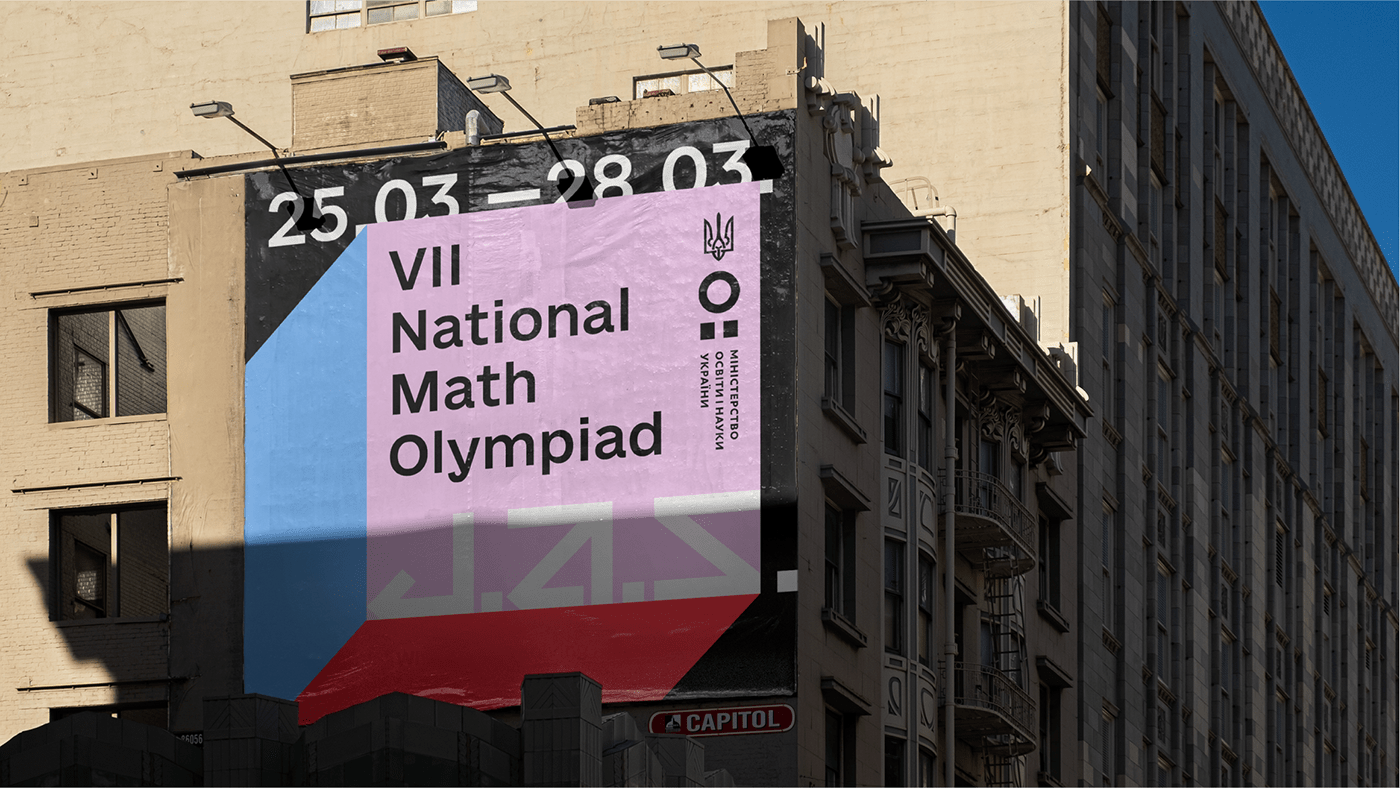
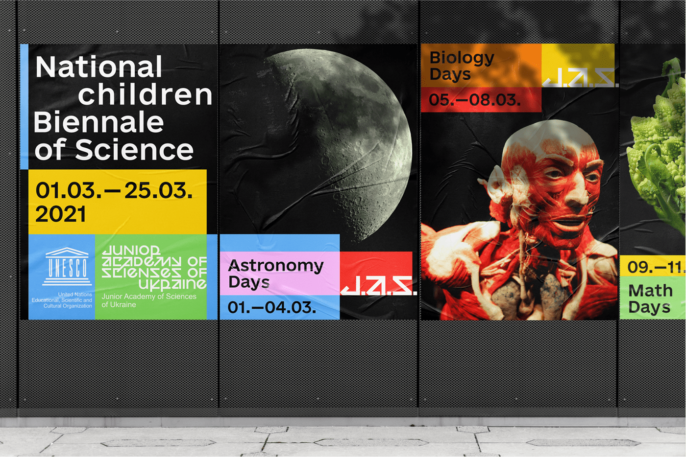
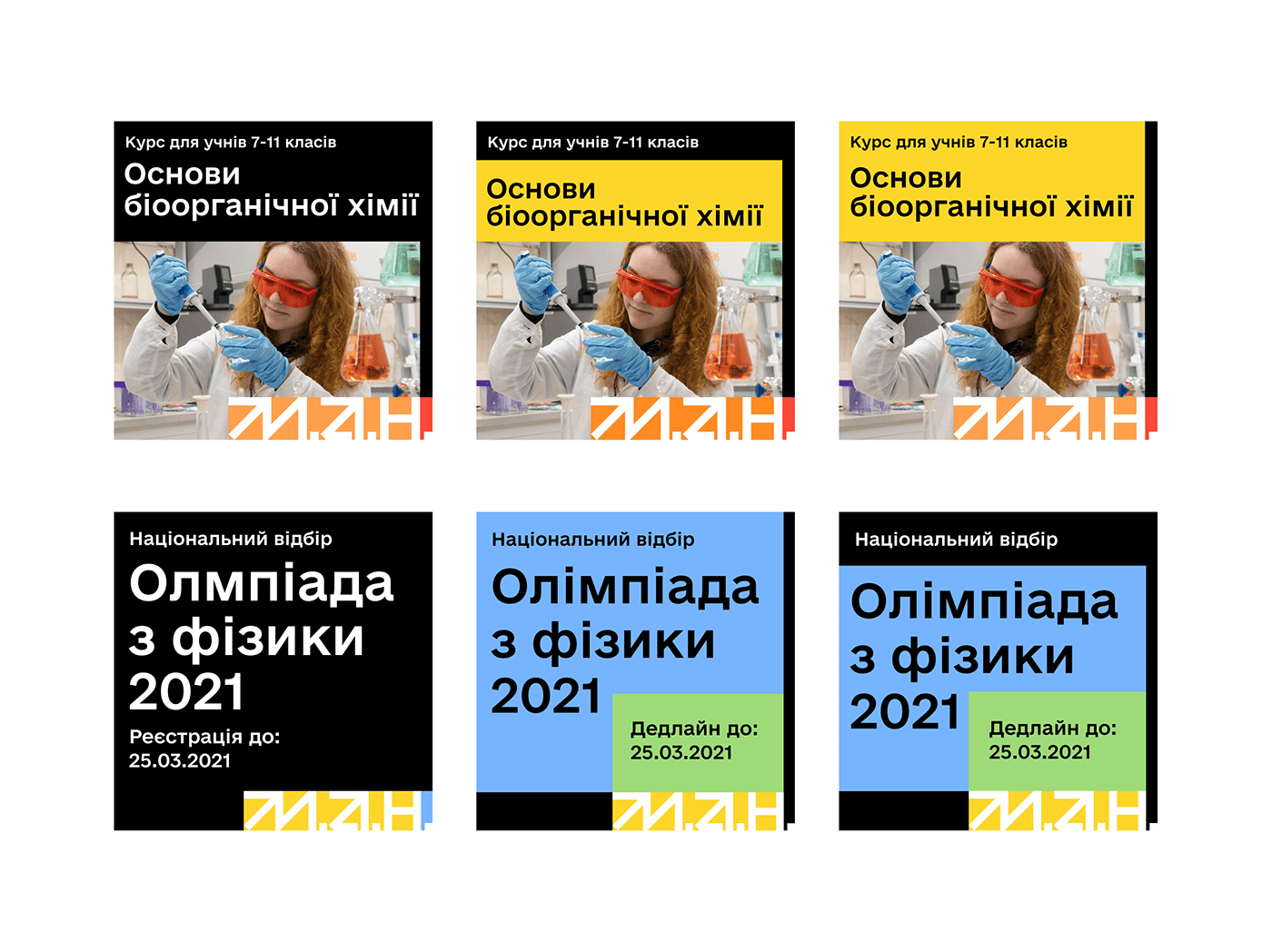
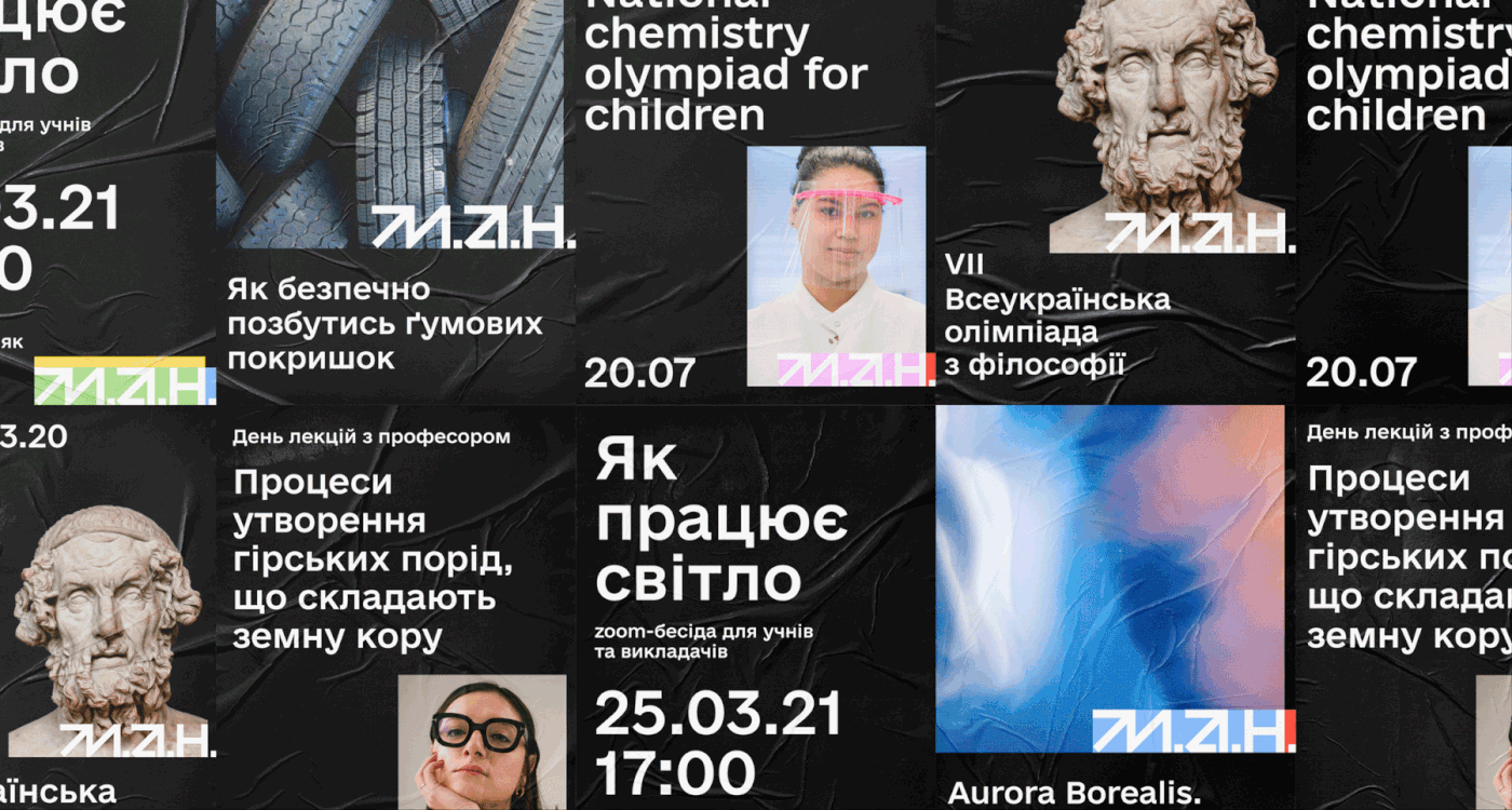
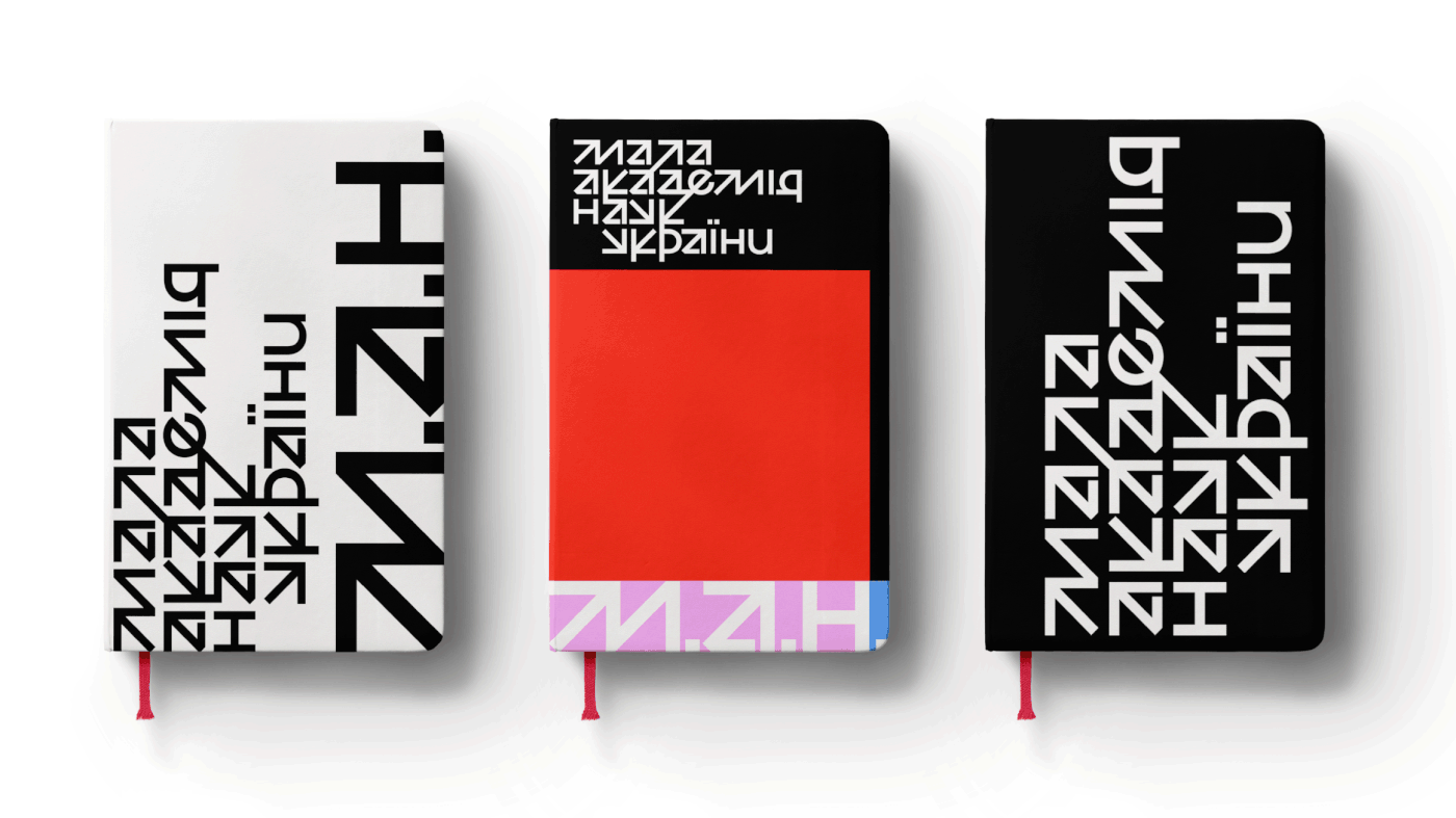
The main idea of the new JAS identity is that such a difficult thing as science is in fact a synthesis of simple elements. To illustrate this we combined primary colors to create new beautiful and complex ones. This made JAS look bright and friendly, and created a visual trick that makes the whole identity consistent and distinctive. The new logotype is pretty daring, since the science requires creativity and courage. The design system is flexible and simple, too. It can be both serious in mono black or playful in bold colours.