


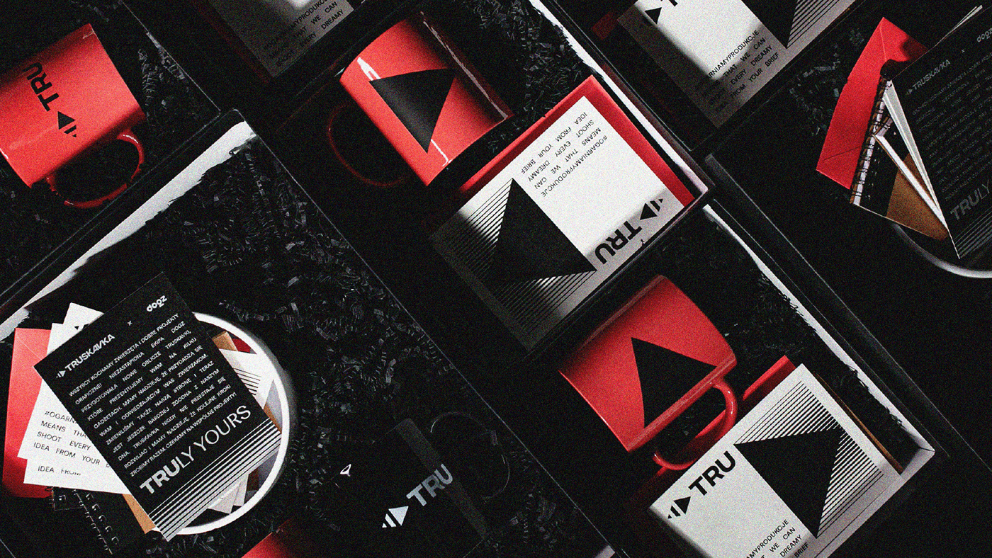
INSPIRATION
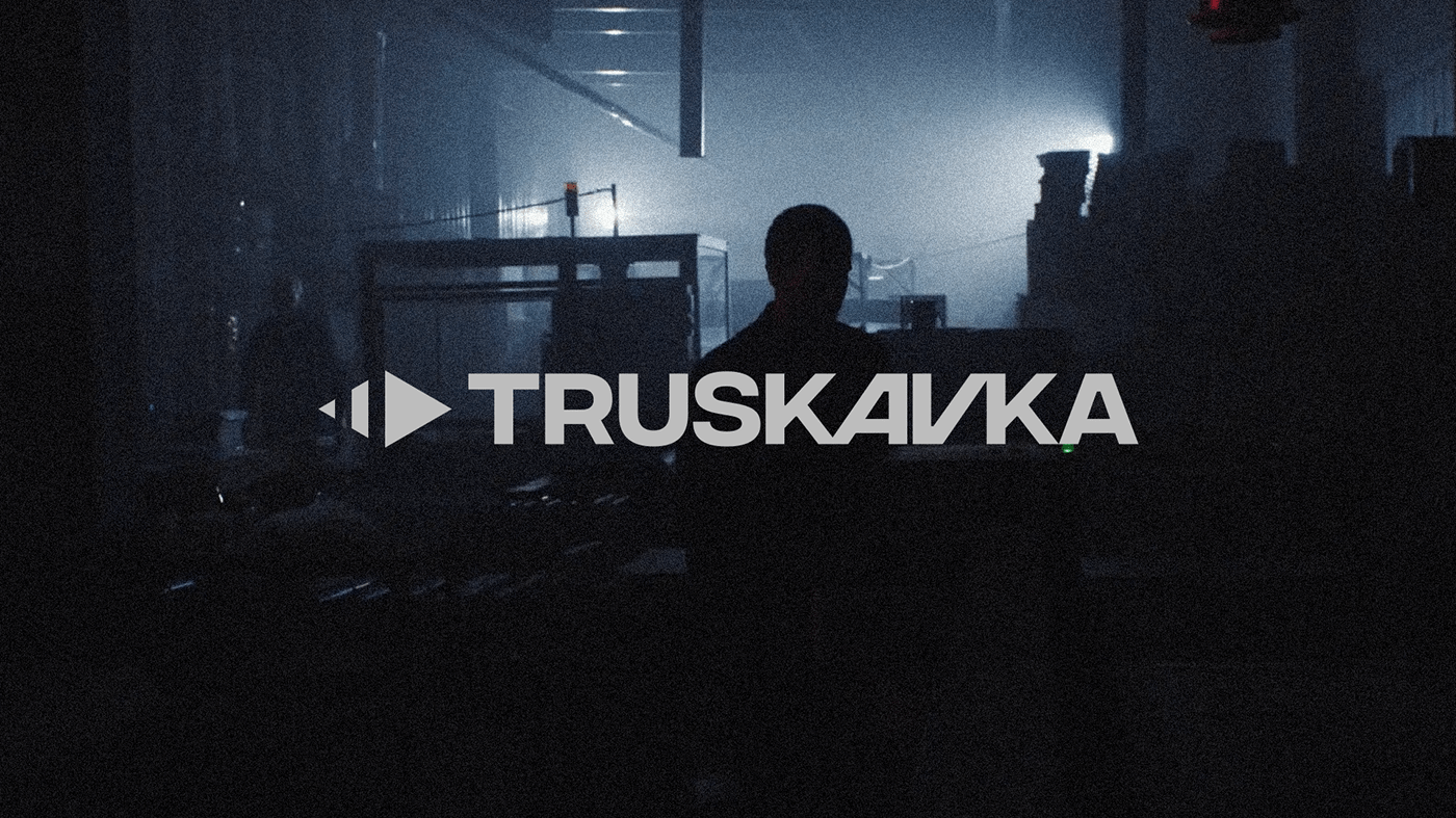
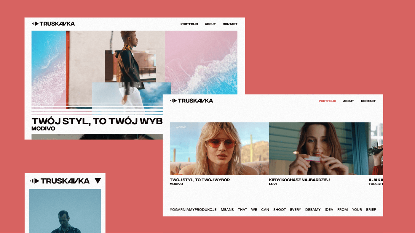
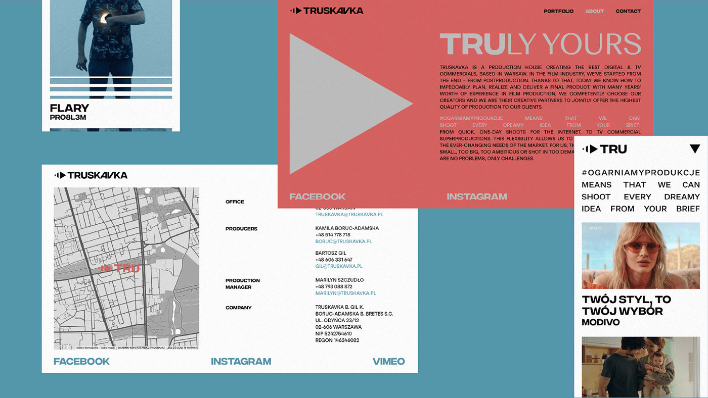
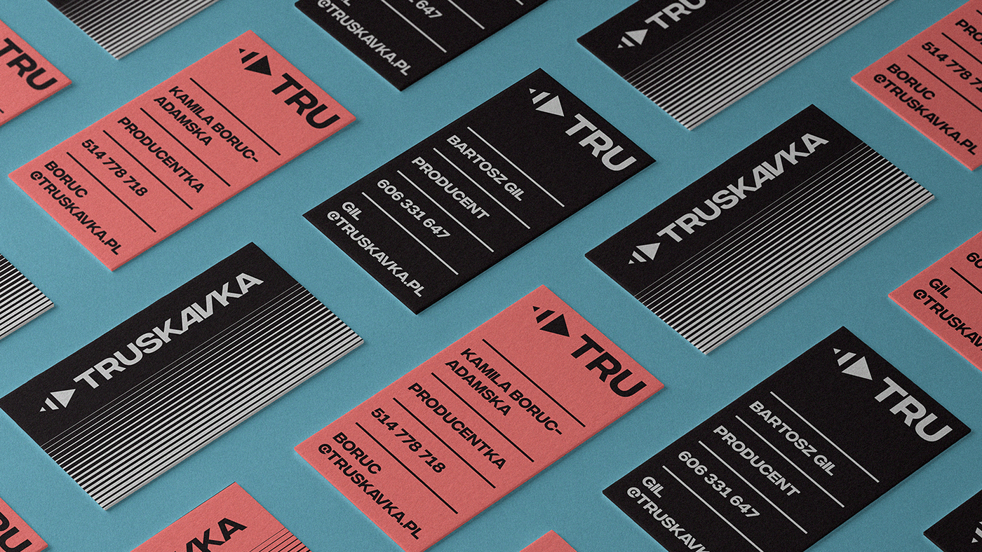
The starting point and the main axis of our inspiration was the keyboard for editing movies, and in fact the symbols on it. The signet contains two pictograms representing the audio-visual world, play and pause. At the same time, it is a simplified graphic representation of the strawberry fruit (truskawka in Polish means strawberry). The second world intertwined in the new brand identification is the design of VHS cassettes, which is characterized by brutalist treatments and typography. An additional creative treatment is a responsive version of the logotype, which emphasizes the main values of the brand. Of the merger, we received a very expressive logotype and signet, both in full
and in the responsive version of the sign.


art direction / graphic design
maciek lomnicki
maciek lomnicki
patryk skoczylas
web development
kacper gałka
work with us, we don’t bite 🦴 → https://dogz.design


