We are excited to spotlight one of our newest branding and User Interface projects for a product called Snappy. Snappy is a new Help Desk web application being developed by the amazing folks over at UserScape (the creators of HelpSpot). Ian Landsman and his team approached us to help bring their idea of a lightweight and speedy Help Desk to life. Throughout the process we’ve found that the UserScape team is a design firm’s ideal client. Not only are they amazing people that understand the design process, but they are also open to any and all ideas, no matter how ridiculous (see: Snappy underwear).
Concept & Direction
When UserScape first approached us, Snappy was named Snap Reply. As we explored the name, as you do in the discovery stage of any branding endeavor, we instantly gravitated towards “Snap” as the primary term. It made sense, because the entire idea of the application is to imply fast, simple and quick. Our early sketch explorations contained related animals and inanimate objects that reflected these key attributes.
We also explored concepts that touched on the “reply” aspect of the name. Ideas like chat bubbles, email icons and arrows were some obvious plays, but at the end of the day, proved too literal and lacked personality. Interestingly, after the first round of digital sketches a name change was made and “Snap Reply’ became ‘Snappy’. It seems as if both parties had been discussing the idea internally, and when it came up as a side note during a branding round review, everyone agreed it was a better fit. The rest is history and Snappy was born.
The Mark
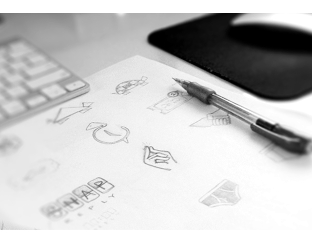
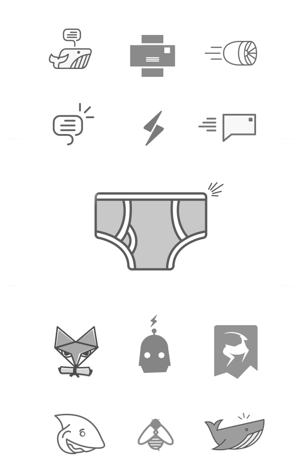
The first round of explorations for the mark covered a lot of ground. From animals, to simple abstract marks, to underwear, we intentionally threw anything at the wall to see what would stick. The main focus was quickness, so animals that embodied the characteristic of speed were the front-runners (no pun intended) early on.
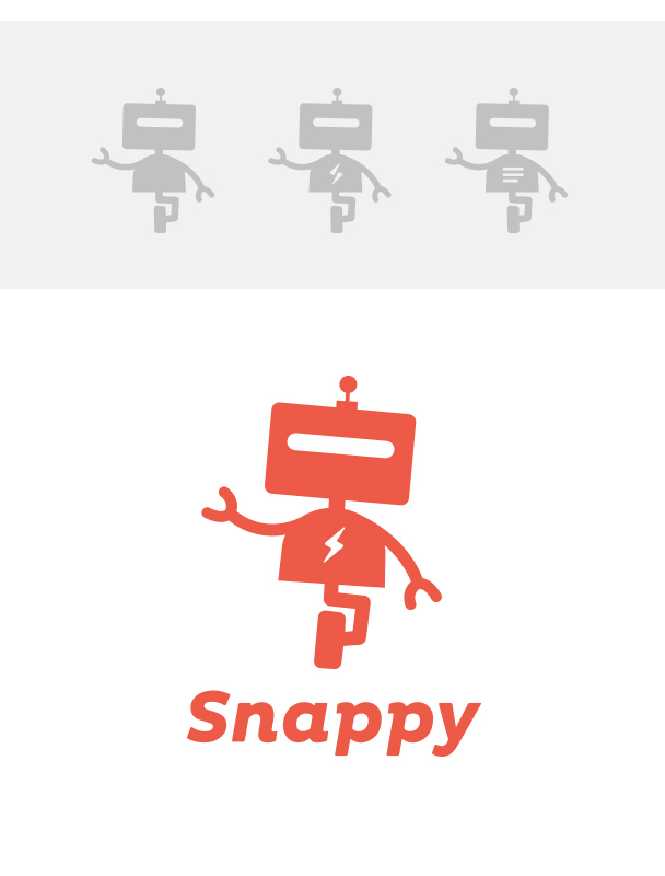
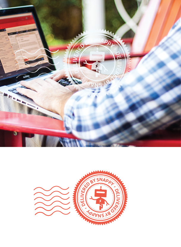
The breakthrough really happened during a follow-up meeting where we were reviewing digital sketches. Ian made a comment regarding one of the concepts, a red cross email combination, observing “Hmm, I thought it was a robot… who doesn’t love Robots?” Oddly enough, the concept that elicited that comment was almost pulled from the delivery, but we decided to keep it in since it was only the digital sketches round. We instantly moved in that direction, sketching robots and pairing them with typography.
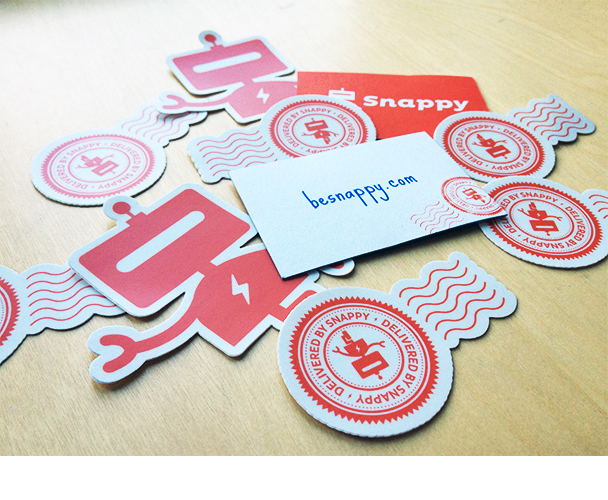
As is typical of our process, we posted examples to Dribbble to gauge initial reactions. We found that after some small tweaks, everyone jumped on board, excited by the possibilities of this robot driven direction. Simple, yet powerful, “Snappy” the robot was exactly the solution we were looking for. A mark that had personality, scalability, movement and a ton of room for great extensions of the brand like stickers, shirts and other collateral. Besides, like Ian said, ”Who doesn’t love Robots?!”
Typography
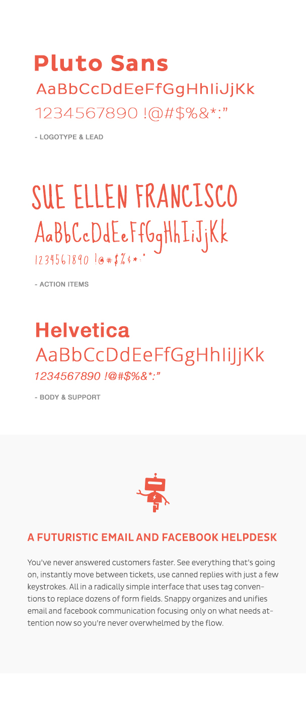
The right typography evaded us as we worked through a couple rounds of robot forms and color palette refinement. Pairing the right typefaces with the mark proved to be a significant hurdle. But when we put the challenge into the capable hands ofMatt Yow, he landed on Pluto Sans which proved to be the perfect solution. It carried the variety of weights we needed to fill out the branding system, while carrying a personality that did not conflict with the new mark. The variety of weights and soft edges embodied the company’s goal of being a bit playful, while remaining a trusted, professional brand.
We also introduced a typeface called Sue Ellen Francisco as a secondary look in the branding system, reserved for call to action buttons. It provides a handwritten style that further emphasizes the playful approachable nature of the product.
Finally, Helvetica was chosen as the body text for both the UI and website. It provides a clean look and feel that balances personality with an effective user-experience.
Color
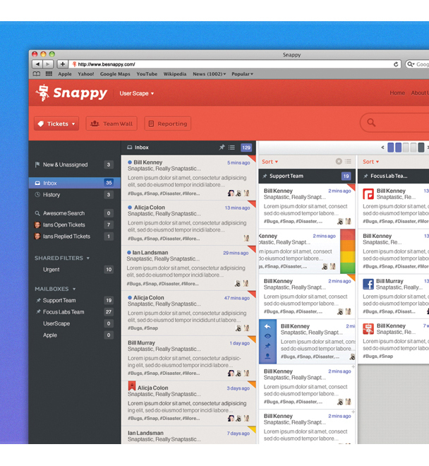
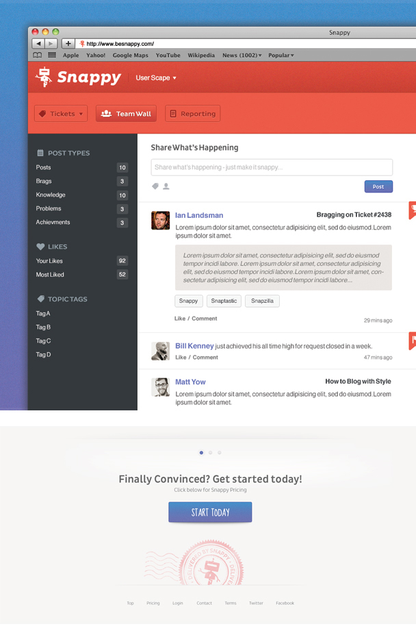
Along with a strong mark and a balanced typography pairing, we knew we wanted Snappy to carry a unique color palette to help set it apart from other Help Desk web apps on the market. It was clear through initial conversations, and then the discovery phase, that the client wanted to avoid being part of the long list of light-grey Apple web apps currently on the market. We decided on a bold palette led by a vibrant burnt orange as the primary color, which can be used to define the brand in any medium. We paired this burnt orange with a collection of light-to-medium tone blues, purples and dark greys to provide necessary contrast. The blue and purple combination was also introduced in a gradient form for call to action buttons and other small applications of the brand.

UI
We were challenged with the task of not only designing the look of the UI, but also with how the user interacted with and experienced this new application. Other than a few wireframes outlining what information the app would contain, we set out to design a lightweight application that would tackle all the previous goals set forth. The goals were to create an application that was not overloaded with features and countless screens, but instead was a lightweight, yet robust application that managed a variety of experiences all within a single screen.
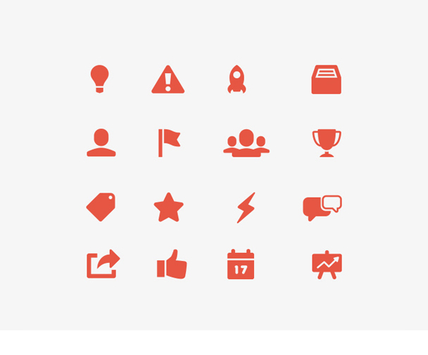
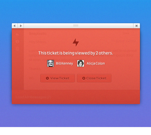
We started out by tackling the general layout and aesthetics by adding bold colors and introducing a general flow of content and simple feature ideas. As we evolved and polished the new look, we began incorporating unique user experience features, such as tickets that could slide right and left to reveal options and priority levels. We also had to account for a collection modal windows and how they live on the canvas, which covered features like ticket replies, conversation threads, attachments, collision notifications and tags. In the end we were successful in keeping 95% of all interactions within a single screen.


Final Product
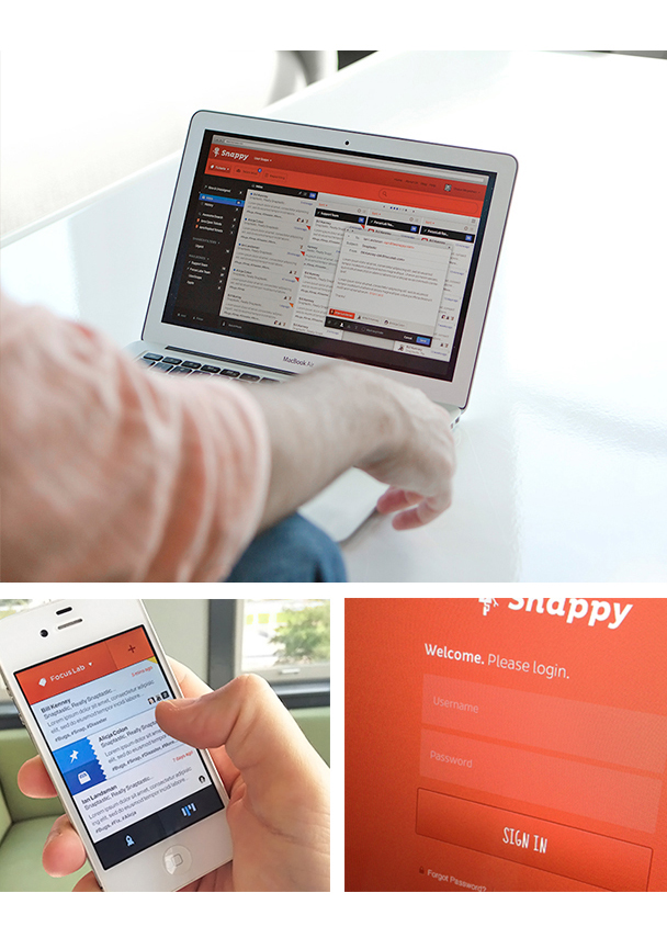
We could not have been more excited to hand over our work to the client. The final product was a unique and personable mark, combined with an approachable, yet professional type. These elements were then implemented into a powerful and efficient User Interface that will round out the full ‘Snappy’ experience.
Working with the UserScape team was a dream. When you have a company that allows you to take some risks and explore your options, it really allows you to take a design to places it may not have wound up otherwise. We are extremely excited for this to reach the market and are also looking forward to working with the UserScape team again in the near future.