


Mr. A's Food & Spice Co. is a brand of chilly sauce which was well-known for their line of product 'Strip & Go Naked'. The brand was founded & distributed in Canada, which is quite a competitive place for a sauce product on the market. In 2021, Thong Dinh was appointed to make a rebranding for Mr. A's Food & Spice in charge of visual identity, labeling & visual story-telling.


Previewing the previous visual identity (which will be shown later) of Mr. A's Food & Spice, we pointed that there were a really strong impression of boldness, young, charming vibe — that they provide to the customers. Their product name 'Strip & Go Naked' gives a really strong vibe of playful; however, the design was somehow old & not suitable anymore for the modern market. We decided to bold the thing up (really!)
The brand mascot — Mr. A, was a very funny and always—smile character, who gives a happy soul to the total theme of Mr. A's Food & Spice. One of the first design decision was to keep the spirit of previous brand system — the mascot Mr. A & happiness. However, in demand of a sharp visual identity, we tent to create a system of typography which can be used & adapted in modern market & social world.


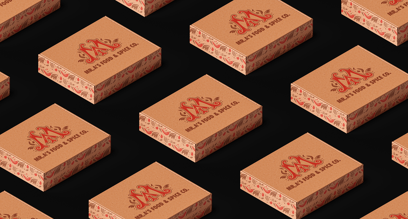
Inspired by some of the American dance (texture & boldness), chillies originals (Palm), vintage typography, how tide a shelf in supermarket can be, we create a logo mark system which can be fixed in various of sizing and labeling. The aim was to make the journey of Mr.A's to be much more closer and playable to the customers. Logos can be set in various type and sizing of situation of design.


We tried out mostly compact typefaces for the logotype. The forms of logos in general were also made as compact as we can, so that they can fit well on a vertical design layout (which was mostly used for sauce labeling & packaging)
The logotype was set in Futura BT Condensed Pro (Bitstream) with a little tweak in type form of the letter R (mimic the beard of mr.A). Pictorial marks of Mr. A & logo mark MA were hand-crafted with the rules of unexpected — in every touch of the logo set — we tried to make it as playful & happy as we can, in case of shape detail.


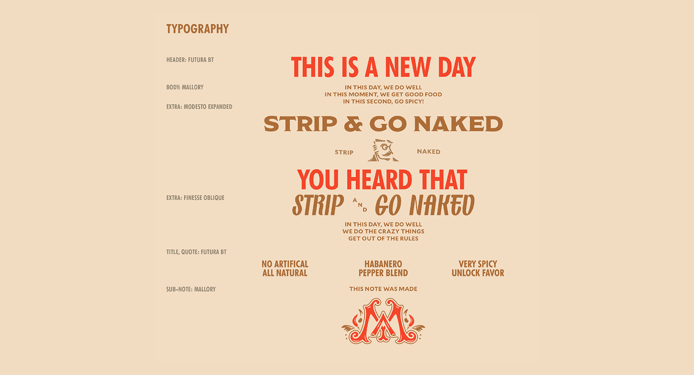
About typography set, I used quite a bit of combination.


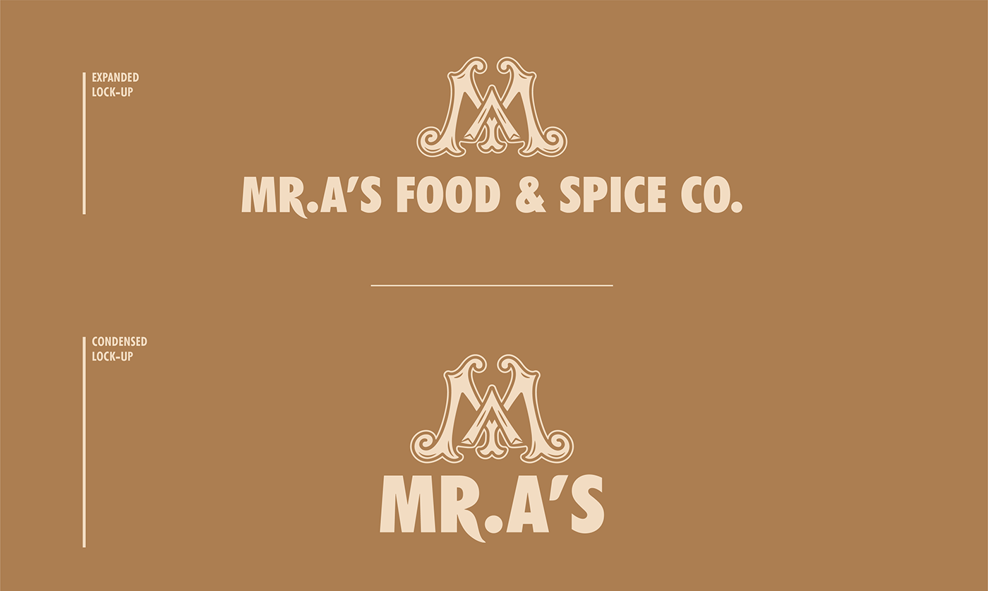
We create various version of lock-up of logo mark, signature mark & pictorial, so that the logo system can be dynamic and easy to access. Each combination has their own proportion & sizing between element. Using it in the correct way remains the coherent of brand identity in general.


The label design for product was set in a four-face dieline. Each of theme represent each type of information that are about the product. We learned some about the ingredient there. As the product of chillies sauce are usually made from natural ingredient like habanero pepper, cayenne, pepper, sumac, lemon peel. As thinking directly about the main ingredient of the product leads us into the next step of the visual identity, which is color palette and main pattern.


Designer: Thong Dinh
Credit to Unsplash for presentation photos
Client: Mr. A's Food & Spice Co.
Year: 2021
Thank you for watching.


