


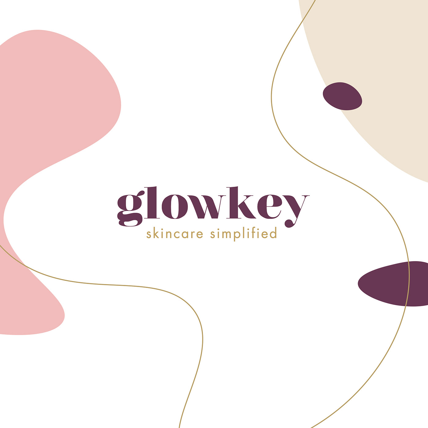
Glowkey
Glowkey is an online beauty destination store specializing in G-beauty - skincare from Germany, which is known for being clean, minimalistic, modern, effective and simple. Based on science rather than fads and trends. I was hired to single-handedly build the brand identity from scratch and continue to produce content after launch. Since G-Beauty is based on science and minimalism the client wanted a visual identity that was the opposite; a playful, dynamic vibe with feminine and timeless colors.
Underneath you will see a more detailed walkthrough of the design process. I have not included all of the sketches and variations because that would be too much, but I have included enough examples to give you an idea of my thought process. If you only want to watch the finished product you can do so on my website www.renedoesdesign.com
This gallery shows my logo design process as well as the color palette process.
We went for #7 with an extra secondary color. Click to zoom.


This next gallery shows font- and layout iterations of the thank you
cards that is going to be sent with the orders. Click to zoom.


This next gallery shows color scheme and design iterations, based on two fonts the client liked. Click to zoom.


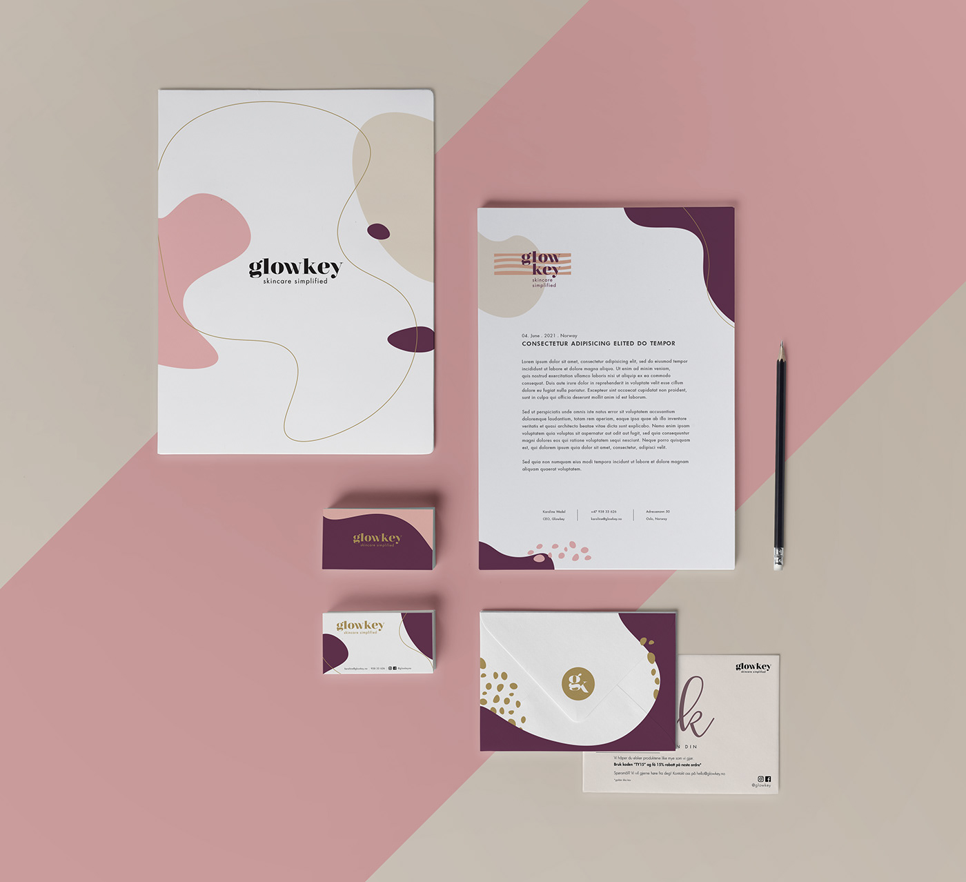
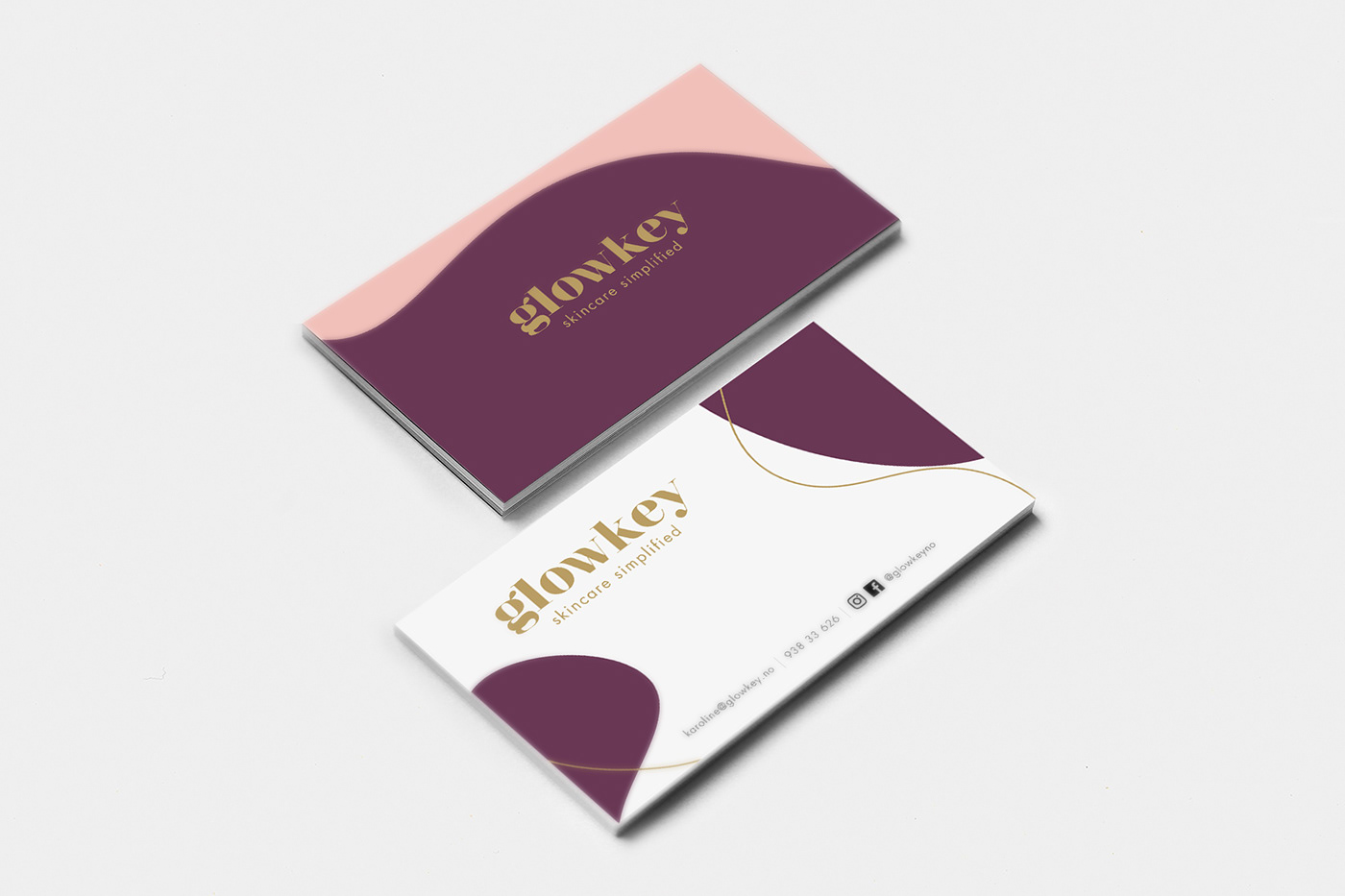
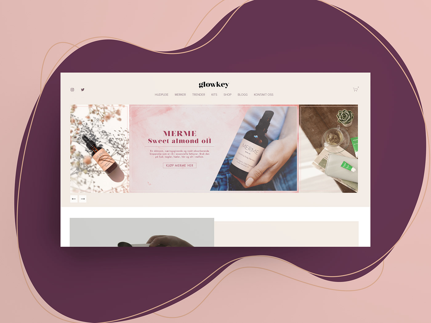
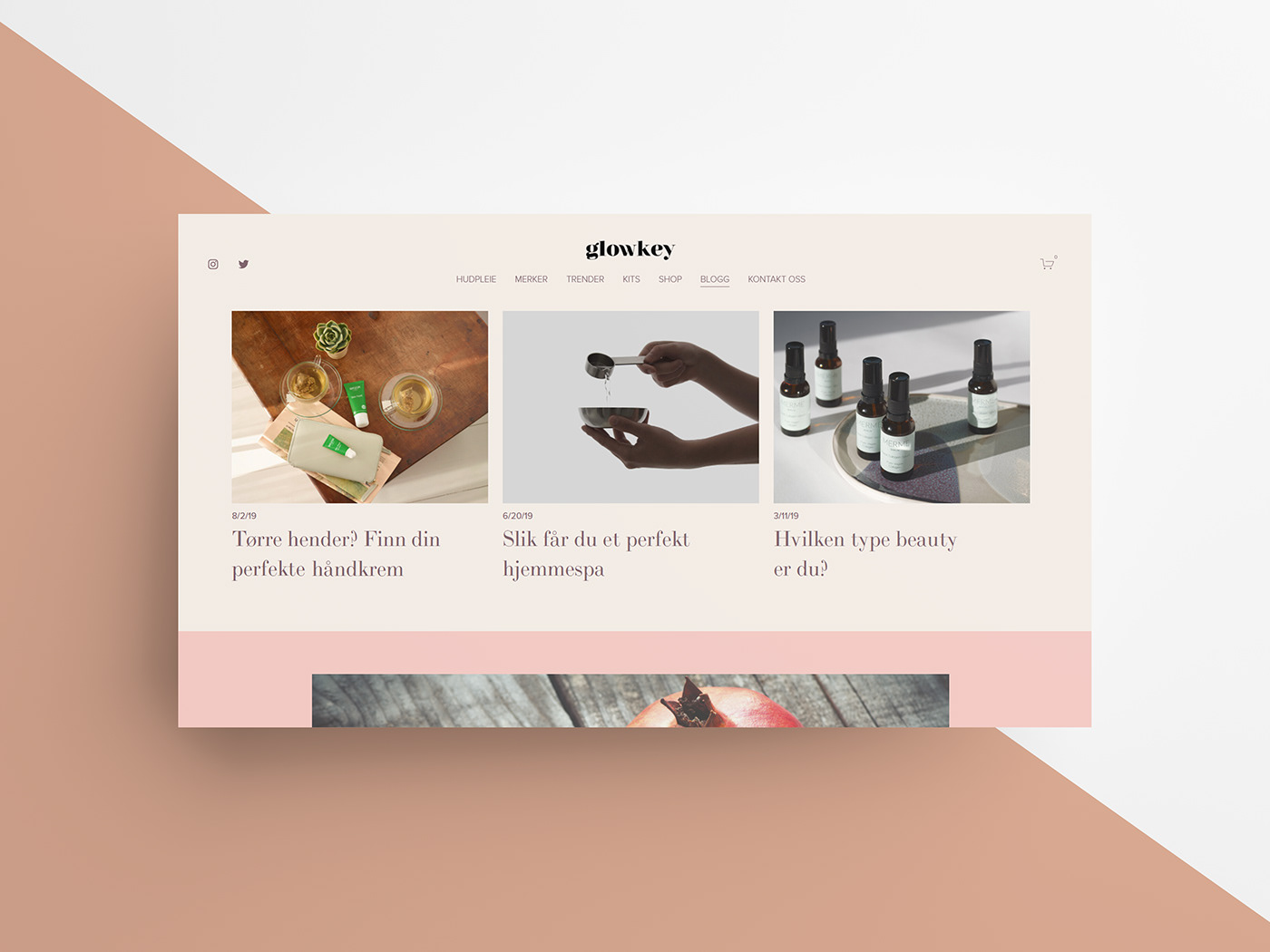
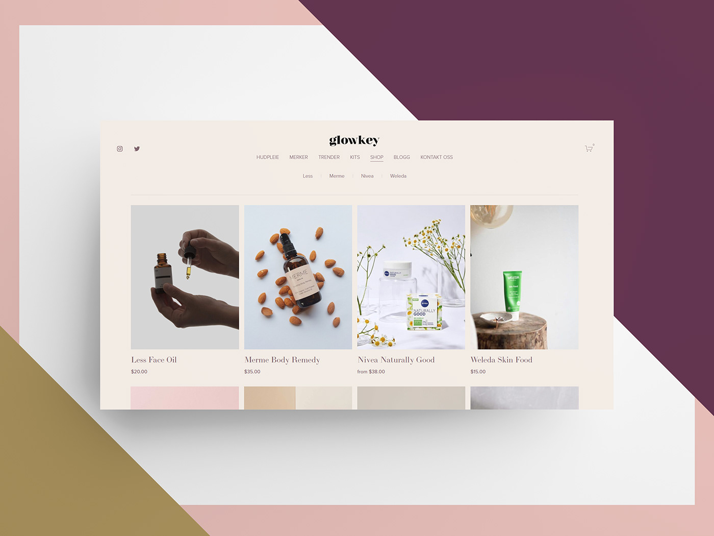
Below are images of the finished products. Enjoy!


Thanks for watching!
If you want to see more of my work you can head on over to www.renedoesdesign.com (currently under construction)
I am currently available for booking, for inquiries please email reneeide.r@live.no


