Within the last ten years information design has seen an unparalleled growth. Access to huge datasets, visualisation tools, and mass awareness has led to a cultural understanding of data visualisations. We are on the cusp of a huge leap forward in data mapping, and I think that narrative information design sits firmly at the centre. In order to see why, we need to explore the foundations of information design, see exactly where it is now, and find what role this emerging field of storytelling has within it.
With sprawling sheets of data at our disposal, we are seeing the rise of massive infographics spanning a huge number of topics. These pieces are incredibly interesting and their educational value seems to know no bounds. But when faced with so many vast data maps, we start to lose the human touch - the intrinsic personal narrative that makes each piece relatable.
“I need to feel that there’s a human being who thought and felt and made that thing.”1
Narrative information design recaptures that personal element, using infographics as a method of storytelling, bringing each piece down to an individual level. We’ll see how that is effective, and why exactly it is important in modern data mapping.


It’s every creator’s ambition to tell a story. Using a narrative is one of the best ways to connect to an audience. A piece of information design is no different. We love to find patterns within things, and presenting large amounts of information in an easy to understand graphic is a fantastic way for a viewer to discover the story behind it.
However, information design is used for many different reasons, and telling a story is not necessarily a piece’s focus. We use data mapping to try to understand large amounts of information; whether it is incomprehensibly vast numbers, or seeing patterns emerging over time. The stories behind the data aren’t always the focal point - that lies purely in providing an understanding of the data itself. As Edward Tufte puts it:
“At their best, graphics are instruments for reasoning about quantitative information. Often the most effective way to describe, explore, and summarize a set of numbers - even a very large set - is to look at pictures of those numbers.”2
Tufte’s work is the zenith of information design theory, but his focus is on quantitative data, and the best ways to show that. We’re dealing in something slightly different, so Tufte’s opinions are still very important, but not the final say.
Narrative-led information design dates back hundreds of years, but its modern interpretation is something that is still trying to find its voice. Because it’s an emerging field, it’s useful to define exactly what we mean by narrative information design. Charles Joseph Minard’s now legendary visual representation tells the story of Napoleon’s march on Russia in 1812. But that isn’t a narrative piece of information design. We must look at the thought process behind the piece to identify exactly what we mean.

Fig. a
Most typical infographics will follow the same method of construction. We start with a large amount of data. It may be picked by a corporation to advertise their products, or be of interest to the designer, a combination of the two, or come from a completely different place entirely. The designer has a job to convey the information in a way that is easier to understand. They may choose a simple time graph, or try to visually represent numbers according to scale, or any number of visualisations. The method of visualising depends on exactly what story the designer can glean from the data. It is at this stage that the designer creates the narrative. They can use many different tricks to tell the viewer a very specific story, or they may decide to leave it more open to let the viewer come to their own conclusion. They may choose some data to leave in and other data to take out to guide the audience toward their chosen outcome. This is where the narrative is born. The designer then creates the visualisation according to the desired narrative, and presents it to their audience. The narrative is but a way of getting from the visualisation to the data. The infographic “can tell a story about the subject between the lines”3, but its focus is on presenting information.
A narrative-led infographic happens in a slightly different way. Rather than starting with the data, the designer will start with a narrative. They set out to tell a very specific story, and they will find (or create) data to match. From there they will design the piece. The manner in which the designer goes about each step is very similar; it’s just that the driving force behind the graphic is on telling the story. It’s this distinction that we will be focusing on.
A narrative-led infographic happens in a slightly different way. Rather than starting with the data, the designer will start with a narrative. They set out to tell a very specific story, and they will find (or create) data to match. From there they will design the piece. The manner in which the designer goes about each step is very similar; it’s just that the driving force behind the graphic is on telling the story. It’s this distinction that we will be focusing on.


We can trace the origins of data mapping back several hundred years to the creation of simple charts by William Playfair. In 1790 he published the book The Commercial and Political Atlas, including line graphs, bar charts and histograms. With more statistical bookkeeping and the Industrial Revolution sky-rocketing production, the amount of data swelled considerably during the late 18th and the 19th Centuries. Being able to control and present the data brought with it its own problems, which is why information design as we know it today was born. The social climate at the time led to the creation of information design, even though the mathematic principles it was founded on were created hundreds of years previously. Tufte supposes that it was “a surprisingly recent invention, perhaps because of the diversity of skills required”4.
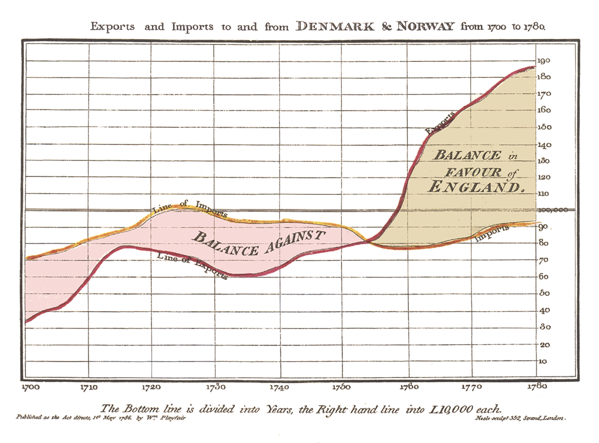
Fig. b
The evolution of infographics continued throughout the 19th Century, with Florence Nightingale’s diagrams about causes of death during the Crimean War, and the maps by Dr John Snow, and John Venn’s invention of the Venn diagram.

What is interesting about a lot of these early diagrams is that they were born out of necessity. Dr John Snow’s famous map of Broad Street tells a story: that of hundreds of lives cut short by cholera which can be attributed to a single water pump. Snow’s plotting map showed what would otherwise be almost impossible to verify: that cholera deaths were focused on one particular place. Through his mapping he was able to identify the source of the outbreak.

Fig. c
Florence Nightingale’s polar area diagrams were presented to Queen Victoria in order to succinctly prove a point about the conditions in military hospitals. Without these visualisations, the stories would have been a lot harder to tell.

Fig. d
Strangely, these early pieces of data mapping are very close to our earlier definition of a narrative-led infographic. The creators were not designers by profession, but were observing the stories they wished to tell, and found information design as a key way of doing so. Some would argue that these people were best suited to creating information design:
“Information visualization is too powerful and important to be left only to designers”5
They collected data to support their personal experiences, and visualised it in a way that propelled their narrative.
As time went on, information design went through a bit of a lull. Traditional charts and graphs were used in a business environment, but not widely published. The 1970s saw a huge revival of information design from an editorial point of view, being popularized by designers like Nigel Holmes and Peter Sullivan. Information design was frequently used in journalism in order to illustrate statistics within articles. From then up until present day, data mapping has become a mainstay of most broadsheet newspapers.
Towards the end of the 20th and the beginning of the 21st Centuries there was an unparalleled growth within information design. The last fifteen years saw a very new way to view information: the emergence of the internet. Having an almost unlimited amount of information at our fingertips has changed the foundations of how we learn. This great change was imperative to the shaping of modern information design, and is very important in seeing how and why narrative based data mapping has come about.

In 2007 infographics saw a new-found interest, “as people shared old infographics like Napoleon’s march on Moscow”6 amongst others. Soon many older pieces were rediscovered and posted online alongside more contemporary designs. This piqued awareness led to infographics being used more widely, with newspapers and magazines dedicating more space to data visualisations. With access to more advanced rendering tools and a huge amount of data, it was easier than ever to create infographics. Reif Larsen says:
“There’s so much data that people are really completely overwhelmed, and that’s why I think they’re looking to the seduction of information design because it synthesises big data very quickly...”7
There had been an explosion of accessible information, and a huge desire to see it condensed into an easy to understand format. Information design had hit an all time high.
With data mapping becoming more commonly seen, and more desired, more people set out to create it. Easy to use tools such as Infogr.am, Piktochart or Easel.ly became available for collecting data and visualising it without much effort on the designer’s behalf. Infographics cropped up everywhere, from newspapers and magazines to websites and social media. Entire books have been made containing a huge amount of infographics on various topics. The majority of pieces followed a fairly standard approach though. Most were designed around news stories – editorial pieces to support a traditional prose report.
With so many pieces being published, information design was becoming synonymous with journalism. The New York Times has become renowned for their information design, with their dedicated department producing “between five and ten print graphics each day and three or four online graphics each week”8. Using such huge quantities of information lends certain credibility to a piece, causing most to not question an infographic. Reif Larsen points this out, saying:
“I think unfortunately we also have a tendency in information design to - because they’re so succinct and seductive - to ascribe more power to them. That they have a deeper kind of analysis. I find they’re the beginning of a conversation rather than a full conversation.”9
Although an unquestioning acceptance of facts is by no means a new phenomenon, the prevalence of data mapping in modern reporting meant that often visualisations were approved without checking sources or other reports, the high gloss put on them proof enough.

Fig. e
With so much exposure, a backlash was inevitable. Critics appeared everywhere, complaining about methods of visualisation and good practice in researching topics. The complaints echoed of Edward Tufte’s thoughts on data mapping presented originally in – among his other works – his seminal volume from 1983, The Visual Display of Quantitative Information. The biggest criticism to this boom came in the wake of the assassination of Osama Bin Laden in May 2011. Juan Antonio Giner and Alberto Cairo called out the designers of dozens of inaccurate infographics telling the story of the mission. They claimed the graphics to be “flashy and hyped and very inventive” and that “if they portrayed what actually happened, it was only by accident.”10 The resulting manifesto was signed by over fifty designers, pledging that their information design would be subject to the same due diligence as journalism. Their final point indeed called infographics “neither illustrations nor ‘art’”, naming them instead visual journalism. Modern information design had risen and fallen, assuming a subservient role.

Fig. f

We’ve already found our definition of a narrative-led piece of information design, but it demands a closer inspection.
All data has a narrative component to it; after all, data is just lots of individual stories collected together. Even the most tedious ledger from a shop is a record of every individual interaction between two people. This is why it’s worth making the distinction between what the focus of the infographic is.
All data has a narrative component to it; after all, data is just lots of individual stories collected together. Even the most tedious ledger from a shop is a record of every individual interaction between two people. This is why it’s worth making the distinction between what the focus of the infographic is.

Although a piece may be comprised of hundreds of personal stories, if the focus is on presenting them as a vast amount of data, they are not narrative-led. David McCandless skirts this line quite frequently. He produces infographics on a macro scale, but on closer investigation the stories are quite pertinent, raising the question of exactly what the most important part of the visualisation is.

Fig. g
Considering that data mapping has been pigeonholed into a tool for journalism, taking a different approach to a diagram is a bit of a counter-culture. In a way, Giner and Cairo’s definition of what an infographic is has only served to open the door for creative thought as to what else it could be. Without being tied to the accepted norms of information design, we are able to see what the medium can also be used for.
The main thrust of the Giner and Cairo manifesto is on reliable, quantifiable data. They say that if a designer doesn’t have access to accurate data, “no infographic can be produced”11. A narrative-led infographic doesn’t often have clear sources. Qualitative data is frequently used instead, providing a more personal outcome. The data itself may be very personal, with no way of verifying its accuracy – in these situations the designer must act with a degree of integrity (if the data is indeed that important). And of course the data may be purely fictional, only there to serve as a foundation for the story telling.
To fully understand how the data is used, we should separate different types of narrative infographics. Of course, each designer has their own reason for creating work, so we cannot possibly hope to cover everything. That said, we can attempt to split narrative information design into three distinct categories:
Biographical Fictional Rational

Nicholas Felton has become synonymous in recent years with the very specific field of biographical information design. His annual reports began in 2005. He records mundane data about his life – day to day things like distance travelled, food eaten, and music listened to – over the course of a year, and then creates visualisations from it. Although chronicling one’s entire life for the purpose of design may seem a little strange, at its most basic, it is a very normal and familiar thing. Essentially Nicholas is documenting his life just as a person may write a diary, a blog, or a biography. The story of his life is as interesting as anyone else’s, but presented in a radical way. Biographical design sits neatly on the line between editorial and narrative information design.

Fig. h
Jehiah Czebotar (inspired by Felton) creates his own biographical infographics, although his are all presented in an interactive online format. His choice of presentation follows a very traditional infographic approach – the use of plotted charts and bar graphs – which results in quite a dry look. However, on closer inspection we begin to see trends and facts that help us to build an image of the kind of person he is. His chart plotting trips for coffee for example isn’t something that on its own is very interesting, but when presented as a year of data we start to wonder why exactly he switches coffee shops in mid-April. Did he move house? Did the old shop close? Although presented as mass data, this infographic style lies firmly within the boundaries of narrative-led.

Fig. i


A fictional infographic is exactly that. Unlike a journalistic or editorial piece of information design, solid facts are completely irrelevant in a fictional piece. The data itself is entirely fabricated, the infographic serving purely as a visual or narrative exercise. Reif Larsen has extensively used narrative infographics in his novel The Selected Works of T.S. Spivet. The novel itself is about the eponymous 12-year old cartographer, and frequently uses data mapping to show parts of the story that aren’t covered in the prose – sometimes they are used as an aside to give more information about related topics, and at others are used as a driving force in the underlying story. The infographics and maps in the novel were added after the prose was written:
“I got to a certain place and thought there was something really missing. So the need for image was out of need of the story. I guess I’m a believer of when you’re telling stories to first figure out what your story is and then figure out what the best way to tell that.”12
This method of creating the illustrations is important, as the data in Larsen’s infographics – although based in reality – is fabricated for the purposes of the story.

Fig. j
A fictional infographic can also be quite strict in its use of data, even if that data comes from a fictional place. Andrew DeGraff has mapped various blockbuster movies, turning the narrative itself into a piece of information design. His maps use fictional data, making the actions of the characters into plotted lines to indicate where they are at a given time. He converts an existing story into a new format – much in the same way as those the New York Times does – but isn’t subject to the specific rules of Giner and Cairo. He says that his narrative cartography is “certainly more subjective, but I try to treat it with as much austerity as possible”13. Although his data is fictional, the same amount of due diligence is required to produce a piece that’s entertaining and has integrity too.

Fig. k


A rational infographic is probably the hardest to describe. The term comes from Wendy MacNaughton’s idea that she uses information design to rationalise and understand her own thoughts and the world around her:
“That’s what it really is for me, it’s like figuring out an equation, but it’s an emotional equation, or psychological equation, or an experiential equation.”14
The data itself is very similar to a biographical design, but unlike the annual reports seen earlier, it is very hard to quantify. This style of mapping is probably the farthest from traditional journalistic standards, as the data is frequently personal thoughts and expressions that can’t be supported by any statistics. MacNaughton comes from a social working background, where she would use a series of groupings to categorise various social and psychological disorders. She says that “if you think about the world that way and all of your experiences internal and external and look at it through that systems lens, then it ends up being a diagram.”15
MacNaughton tries to address ephemeral or cerebral topics in a logical manner, using familiar graphic forms to make sense of the world.

Fig. l
This type of information design is prevalent online, and what often separates a good piece from a bad piece isn’t accuracy in recording data, but instead in visualising a narrative common to many people; turning a personal story into something that many people can relate to. We see that very frequently on the website I Love Charts, run by Jason Oberholtzer and Cody Westphal. The two curate the site, posting various diagrams, infographics and - yes - charts that try to rationalise the world through familiar images. They claim that charts “can illuminate simple truths and recontextualize conversations”16. It’s this that lies at the heart of a rational infographic: trying to show the ephemeral in a way that is easy to understand not just by the creator, but by the audience too.

Fig. m

With so much information readily available online, it’s no wonder that information design has seen a huge rise within the last five years. Google CEO Eric Schmidt famously claimed that every two days humans create as much information as we have from the dawn of civilization up until 2003 . The average American in 2009 “consumes about 34 gigabytes of data and information each day”17 (which corresponds to around 100,000 words), so finding a way to make that data easy to understand is imperative to designers. Needing to make sense of this vast amount of data has shifted our way of learning. Information design has become more important than ever to understand what we’re faced with. David McCandless has called information design our “modern-day map book”18.

With such a bombardment of information, it’s no wonder that attention span is dropping substantially. One report claims that “over the course of the last ten years the average attention span has dropped from 12 minutes to a staggeringly short 5 minutes”19. This, combined with the prevalence of information design is actually somewhat of a double edged sword. With a shorter attention span, a reader needs to be given a good reason to read an article or look at an infographic. The initial attraction to a piece falls on the visuals, so designers need to make pieces that immediately grab an audience’s attention. Often – particularly in newspapers and magazines – an infographic contains a huge amount of information, but the importance is put purely on visuals, meaning that the narrative within a piece can be a lot harder to immediately understand. It’s becoming a common practice to make the most visually beguiling and aesthetically pleasing infographic in the hopes that it will attract a reader’s attention for a longer while.
This form of data mapping often loses a tight focus, becoming almost like a puzzle that needs to be figured out in order to understand the story behind the piece. The viewer gets “an almost erotic experience when you look at a bunch of data synthesised graphically”20, but at this point that the infographic loses its purpose entirely: to make data easier to understand than a traditional list or article would be able to do. A picture should be worth a thousand words, but often these high-gloss, journalistic infographics end up taking a lot longer to figure out than a thousand words would take to read. Edward Tufte demonstrates this point very well. He claims that “the graphic is worth at least 700 words, the number used in [the] news report”21. His diagram takes a lot less time to understand than it would take to read the 700 words, and so is successful. We’ve already seen Reif Larsen’s map of a dinner table conversation. He says of creating it:
“I had a whole paragraph there describing the shift in conversation and it was quite detailed. Then I made that diagram and was like ‘woah, I really don’t need any more than that.’”22

Fig. n
In contrast, this infographic from Golden Section Graphics demands close examination, taking a long time to uncover the meaning and narrative behind it, which “seems counter-productive in some ways, because [we] could just read the article probably a lot quicker.”23

Fig. o
In a counter to this style of information design, we’ve seen a recent emergence of the editorial style of information design; “long, skinny graphics, designed to fit within a blog’s width”24 that cover important information on a topic, with various visualisations throughout. These are often promoted by larger companies, using data they have researched themselves and presenting it in an appealing way that’s perfect for reblogging. With an emphasis on aesthetics and well-researched data, this style falls very close to our narrative-led information design, but has one rather large difference. The majority of these sprawling editorial pieces contain very limited or even no data visualisation. Edward Tufte’s Visual Explanations: Images and Quantities, Evidence and Narrative extensively covers methods of representing data, including spatial, form, colour, and many, many others. Without use of data visualisation, these editorial pieces cannot be seen as true information design, merely illustrated facts.
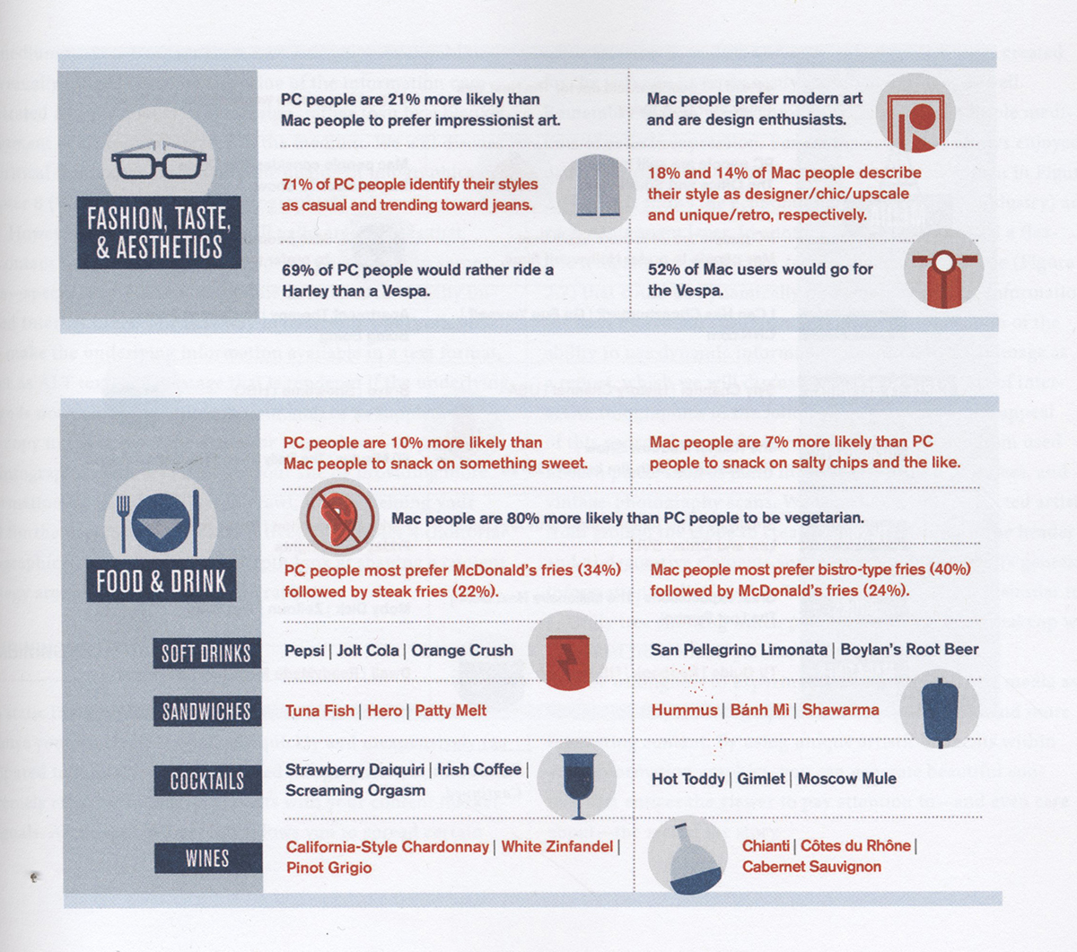
Fig. p
These pieces do a good job at summing up long sheets of data in a way that promotes understanding and retention, but the illustrations support the text rather than enhance understanding. We see the same thing in two different novels: the aforementioned The Selected Works of T.S. Spivet by Reif Larsen, and in The Curious Incident of the Dog In the Night-time by Mark Haddon. In Haddon’s novel, we are quite often greeted by data maps (again supposedly drawn by the main character, Christopher Boone). The difference between the two is that Haddon’s maps are purely to support and further demonstrate what has been mentioned in the prose, where as Larsen “puts key elements of the story” within his diagrams, ones that actively advance the narrative and provide otherwise unmentioned information.

Fig. q
There’s a school of thought that these more illustrative pieces are harmful to information design. Relying heavily on text to prove a point and leaving visuals purely as an aesthetic point of view is directly opposed to what data mapping is fundamentally about. Edward Tufte sits at the complete opposite end of the spectrum to these long editorial pieces, he claims:
“Graphical excellence is that which gives to the viewer the greatest number of ideas in the shortest time with the least ink in the smallest space.”25
Tufte is firmly opposed to superfluous illustration, preferring to present the information concisely, and he’s not alone. Down the road of illustrative data we see data taking a back seat to aesthetics, with designers merely listing facts as a secondary concern. Infographica by Martin and Simon Toseland comes close to this notion, with their visualisations merely being illustrated lists of facts with little to no comparative exploration. The pieces offer no additional information other than a list, and the data is no better off for being presented in an illustrative way. This is a direct contrast to the idea of information design, as was put so eloquently in Using Vision To Think:
“The purpose of visualization is insight, not pictures.”26
New media is seeing a rise in the construction of narrative, not just within information design. As we get used to innovative means of communication, we start being able to digest them more easily. Some then use the various new mediums to create stories, for example with the recent Twitter Fiction movement of October 2012. Authors from around the globe try to tell a story within a single Tweet of 140 characters, or combining a series of Tweets, each one a single chapter of a novel.

Fig. r
Larsen’s The Selected Works... - in addition to data mapping - uses new technology as a method of presenting its story. The text has been both criticised and praised because it is seemingly inspired by online interactions: there are frequent asides and footnotes in the same way as an article posted online will hyperlink to other pages as a way of quickly explaining a reference or term. He describes his novel:
“It’s not a children’s book where you read a thing and there it is on the next page. I was always quite
“It’s not a children’s book where you read a thing and there it is on the next page. I was always quite
purposeful about showing the images I did include weren’t exactly what was being talked about.
They were the page just after.”27
His use of separate illustrations and paragraphs to give more detail is an example of how new technology is becoming more widely accepted within more traditional story telling. With the commonness of information design, we’re beginning to see the same thing happening. “Visualizations have reached the point where most audiences understand their value”28, and so an infographic – rather than being a method of showing data – can become primarily a medium for telling a story, purely because of the audience’s familiarity with the format.
His use of separate illustrations and paragraphs to give more detail is an example of how new technology is becoming more widely accepted within more traditional story telling. With the commonness of information design, we’re beginning to see the same thing happening. “Visualizations have reached the point where most audiences understand their value”28, and so an infographic – rather than being a method of showing data – can become primarily a medium for telling a story, purely because of the audience’s familiarity with the format.

Fig. s
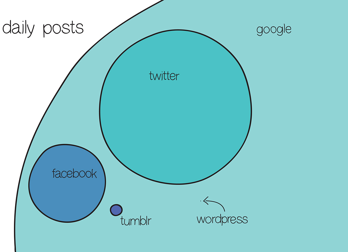
Even places that produce huge amounts of information are struggling to organise it. Social media is a driving force behind the amount of information we see every day. With around 500,000,000 Tweets and over 71,000,000 Tumblr posts every day, social media has had to adapt to this influx of information. One key example is the development of a Facebook Timeline. Social media is a direct evolution of biographical writing, such as what we’ve seen from Nicholas Felton. Users are encouraged to share their lives with friends, family, and strangers, and this is no more apparent than on Facebook. A timeline is a classic staple of information design - temporal graphics such as the line graph have become “the default way of succinctly displaying changes in numbers over time”29 since William Playfair’s invention of lineal arithmetic in 1786. The Facebook Timeline is nothing more than the simplified narrative of a person’s life. Although not a traditional infographic medium, social media is key in understanding the desire to see a narrative presented in a familiar way.

New media provides us with such incredible tools for research, as well as easier to access tools for creating technically outstanding data maps. As we’ve seen though, in a lot of more traditional spaces that the narrative inherent in the data is being overlooked in favour of visuals or reliance on sprawling sheets of information.
As we are being affronted by data visualisations wherever we go, there’s an understandable wave of unsettlement with the common high-gloss media infographic. Such pieces serve a very specific purpose, but don’t have a very personal feel. Many of the narrative-led infographics we’ve seen display a very simple approach to visuals and data, forgoing the two for a heavier emphasis on story.
As we are being affronted by data visualisations wherever we go, there’s an understandable wave of unsettlement with the common high-gloss media infographic. Such pieces serve a very specific purpose, but don’t have a very personal feel. Many of the narrative-led infographics we’ve seen display a very simple approach to visuals and data, forgoing the two for a heavier emphasis on story.

Wendy MacNaughton refers to these personal, more self-reflective pieces as coffee shop diagrams. Those that can be quickly and easily sketched out, letting the idea shine above all else. This naming is appropriate, but of course not entirely accurate – many of these handmade diagrams take painstaking hours of work, and produce visually stunning results. The name instead refers more to the manner of the inception of a piece: something that would come to the designer “sitting in the coffee shop trying to figure out [their] life”30, rather than a more traditional background of hard data.
Fig. t
The reason for this more handmade approach is inherent in the stories the infographics tell. Many are deeply personal, often based on a very small pool of information. Keeping mistakes and or inaccuracies as well as hand colouring all introduce the idea that the infographic isn’t perfect. The data may not be accurate, or even entirely fictional. A handmade style implies that the graphic is made by and is for someone who is “more interested in the relationship between the quantitative and the qualitative”31 than by the data itself. A highly polished approach has become associated with journalism, and an infographic whose primary purpose is to educate. When adopting the same style for a personal piece, we see a striking contrast in message; one that is used to great effect can be seen series 50 Days – Interrogation Log Detainee 063 by Jan Hartwig. A clinical presentation is taken with “a series of dehumanising graphs”32 revolving around a deeply personal story, which invokes a great sense of unease in the reader – one that works perfectly within context, but not so well for most personal narrative infographics. Wendy MacNaughton puts it very well:
“Those hard edged computer generated infographics are speaking the language of the computer on the computer to my eyes. To me, that’s too much computer! If I’m looking at the computer and I’m getting this barrage of images all day I actually need to see humanity there. I need to feel that there’s a human being who thought and felt and made that thing.”33
By rejecting the highly polished visuals that are expected from information design, this new movement of handmade graphics can focus purely on telling a story. As a style becomes more common, the audience becomes more accustomed to quickly assessing what each piece is trying to say, and the designer is able to push the boundaries of what can be done.

Fig. u

Narrative information design is being increasingly used purely for entertainment. With no larger story to tell and serving no educational purpose, these coffee shop diagrams quite often drift into parody, heavily referential topics, or just simple humour. We only have to look at a few images from I Love Charts to see their widespread impact in this area, answering David McCandless’s question “can you make jokes in graphs? Are you even allowed to?”34 The answer is an emphatic yes.

These infographics broadly fall into our category of being rational, albeit in a simplistic way. The pieces will pick a particular pop culture reference, or find something specific about the visual language of a style of chart, and turn that observation into a diagram. The overwhelming purpose of this style of infographic is purely to entertain. Songs are frequently turned into flow charts to highlight repeated lyrics; objects resembling the form of an established style of chart are turned into the chart itself; and every day observances are categorised in new ways all for the purpose of entertainment.

Fig. v
The use of comedy is quite widespread in this new style of narrative-led information design. It’s hardly surprising as it connects easily with an audience. Many charts and infographics are written as an extension of a comic format. The use of sequential art is a long established way to tell stories, and with a little thought the ideas can easily be used in information design. Looking at the infographics created by Randall Monroe we see how easy a transition it is. Randall is primarily a comic author – his work on XKCD is critically lauded. However, from time to time he will choose to present an idea in the form of an infographic. His diagram Up Goer Five combines two sets of data in a manner that only a piece of information design can: a technical drawing of the Saturn V rocket annotated with only the thousand most often words used in the English language. In other diagrams we’ve seen combinations of data yield interesting and provocative results, and although in this piece the focus is primarily on entertainment, the rational approach to combining information is identical.

Fig. w
Demetri Martin approaches comedy within information design in a slightly different way. He also creates diagrams from a rational point of view, often playing with the format as well as the data (most of which is qualitative in nature). His diagrams are often incomplete – lacking sufficient data or a key with which to understand exactly what he is trying to show. This is when the live performance aspect of his work comes into play though. As a stand up comedian, his diagrams do not need to be complete, when he can add in additional information directly to the audience. His diagrams serve as a background for the jokes he tells, and often the data itself is complete irrelevant and nonsensical. He uses information design as a backbone to a story, so that they help to detail his narrative and provide humour. The often day to day events he talks about are given a tilted viewpoint when presented through the filter of information design. His work tries to explain everyday occurrences in a rational manner, in a way that’s “more personal, displaying qualitative data in a quantitative manner”35 and it’s often that insistence that provides the humour.

Fig. x
Although traditionally seen as a low form of art, this style of entertainment does indeed hold true to our definition of a narrative-led infographic. The rational infographic tries to explain something transient in a measured and controlled way, putting the story of the piece at the forefront. We’ve already seen Andrew DeGraff’s timelines do this; they provide a very distinct point though. These light-hearted, often referential diagrams take an existing narrative and present it in a new way. Doing this we often see things that we otherwise wouldn’t have noticed. As Degraff points out:
“I think the necessary abstraction when done properly can illuminate an issue or a data set, along with context and narrative.”36
Does that sound familiar? It’s exactly what Florence Nightingale, Charles Minard, and Dr. John Snow were doing two hundred years ago. Information design started as a way to tell stories in a way that presented the information in a new, easier to understand manner. Although journalism and vast amounts of data have taken it on a bit of a detour with various different focuses, it seems it may have found its original message again, albeit in a slightly unusual place.


We’ve seen infographics from all sorts of places, and seen how a lot of them focus on very different things. Narrative-led isn’t necessarily the right direction for information design to take in the future, it’s just a part of what it has become. Depending on the audience and desired purpose of an infographic, different approaches could work better. But narrative-led information design is getting overlooked, treated as a fad or even seen as wholly unimportant when compared to more serious or wider focused styles.
Narrative-led information design will be increasingly important as it paves the way for how the whole field could be used in the future. One of the biggest issues in the modern, information driven world is - as we’ve seen - an overabundance of data. As we continue to see an increasing amount, we expect designers, journalists and writers to “uncover things for [us]... to do the legwork and tell [us] things”37. This doesn’t just refer to large amounts of data. We expect advertisers, the products we use, magazines, and newspapers for example to provide interest and enjoyment. We also expect the providers of those services to edit their stories accordingly. Narrative information design is already doing that. Its focus on stories directly mirrors what is happening in advertising, with corporations finding that “hard-sell advertisements are no longer effective”38 and switching to unconventional, user-specific techniques. Creating a narrative that the audience not only understands, but empathizes with is imperative to getting their message heard.

Fig. y
In the world of information design, narrative-led projects are very important too. Within the last five years we’ve seen the field open up drastically, and then close down again as it “witnessed the tipping point”39 in reaction to the growth. Seeing a tool like data mapping go through such a huge change has caused reactionary behaviour: trying to list rules of what exactly it is in order to monitor growth in a controlled way. Narrative-led data visualisation is one aspect of its emergence into the wider world as something more than a way to rationalise or visualise datasheets. Following these emerging threads of information design in the last few years, we see it being used more as an art form than purely a method of journalism. Already we’ve seen social commentaries, vignettes, comedy, entire novels, and even purely aesthetic designs based around the idea of data mapping. This widespread burst of creativity signals a new direction for information design; that of being a complete artistic or cultural movement, one with much larger reaching scope than just a way to explain complex newspaper articles. Manuel Lima is broadly in favour of the idea of visualisations opening up new avenues of expression, but is quite staunch in his resolution that information design should “at this stage make a clear departure from other parallel, yet distinct practices.”40 He calls for a distinction between data visualisation and what he calls information art. His Information Visualization Manifesto does have merit in clearly defining what it is that makes data mapping unique, but like Cairo and Giner repurposes it to fit his point of view. In an interview in Data Flow: v. 2, Lima is clearly put at unease by interviewer Robert Klanten when presented with the question:
“But aren’t some of the most interesting visualizations we’ve seen lately somewhere in the middle between those two categories [of information visualisation and information art]?”41
“But aren’t some of the most interesting visualizations we’ve seen lately somewhere in the middle between those two categories [of information visualisation and information art]?”41
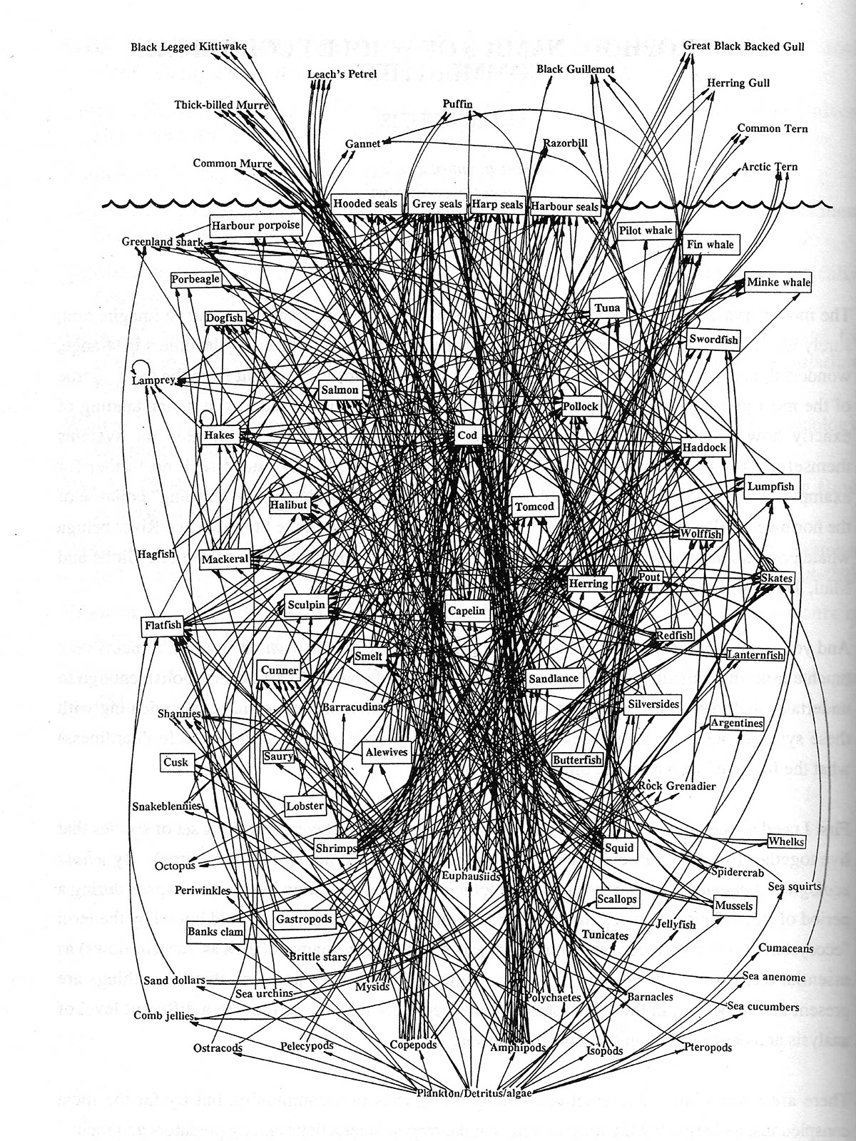
Fig. z
Klanten proves the point that information design should not be limited by a set of rules. Some of the most interesting and ground-breaking visualisations we’ve seen in recent years are in response to the opening up of the field. To disconnect with a particular style means that designers are limiting the tools they can use. Lima is very much in favour of creating a narrative with visualisations, he even puts The Power of Narrative as number five of his ten point manifesto, saying that “storytelling is one of the most successful and powerful ways to learn, discover and disseminate information.”42 For such a supporter of narrative within design, he might be surprised at some of the infographics included here, having already dismissed them because of a self-imposed separation. Narrative-led information design has already seen such mixed outcomes that it would be foolish to overlook it and its bearing upon the future of information design.
Andrew Vande Moere considers a different approach:
“I feel the distinction between information visualization and information art is too much along the already much-debated lines of utility versus art. Instead, I believe the real innovation is happening in the combination of the two, which I have named information aesthetics.”43

This combination approach seems to capture much more the spirit of where information design sits in a wider scope. He also makes another very important point in that we should “determine [the] more usable criteria of good and bad visualization.”44
The overall quality of information design has indeed seen a fairly sharp decline in recent years. We’ve already seen several exemplary infographics, supporting a narrative in a clever, original, and appropriate way. However, for every one of those commendable pieces, there are a hundred that don’t meet those standards. This is nothing unprecedented:
“As with any field experiencing this kind of growth, overall quality of designs vary drastically - which has attracted criticism (read: utter disdain) from the academic and scientific visualization community.”45

Fig. æ
As Lankow, Ritchie and Crooks mention, the community criticises and dismisses this new wave of infographics due to the sometimes overwhelming lack of quality. While completely understandable, it is endemic of the segregation we’ve seen from Lima, Cairo and Giner, and not beneficial to the entire field. Steve Duenes claims:
“With so many people trying so many things, something good is likely to result, but a golden age should really be defined by lots and lots of quality.”46
Narrative-led design falls within the realm of this new wave of creativity, and often gets tarred with the same brush. By accepting the less defined world of narrative based information design, we can better move on to assessing where exactly the quality comes from, and how that can be used to better the entire field. By not acknowledging narrative-led design, the community loses out on some of the great storytellers we’ve seen, purely due to dismissing what many see as whimsy or “relatively meaningless data visualizations”47.
Information design provides us with a powerful tool in our data fuelled lives, and constructing a narrative is one of the most important steps towards understanding that data. Even though a lot of data-led infographics are light-hearted, or unassuming, they have a role in helping us to understand the world.
Narrative-led design often leads to messy grey areas where qualitative information becomes more important than quantitative, verifiable data, but as long as the intention isn’t to provide an unbiased, wholly accurate depiction - as information design traditionally has - should that matter?
With the acceptance of narrative information design into a wider community of information aesthetics we take a step towards data mapping becoming something more. Splitting the field up puts us at risk of becoming less than the sum of our parts, and judging various styles of infographic separately presents a scattered, disorganised front that cannot learn from one another. However, combining skill sets could lead to information design that not only educates, but tells a strong story in a visually stunning manner. With the visualisation skills shown by journalists, intense information mining from the companies producing sprawling illustrated datasheets, and the narrative aptitude of writers, we could reach a place where information design becomes not just a helpful aside to a piece, but a comprehensive final product in itself.
Information design should be increasingly seen as a tool with which to tell a story and communicate rather than just providing a shortcut to information. Not forgetting that “the purpose of visualization is insight, not pictures”48, maybe we need to expand our definition of what “insight” really means.


With thanks to Reif Larsen, Wendy MacNaughton, and Andrew DeGraff

1. Interview with Wendy Macnaughton - Transcript 3 - page 5
2. The Visual Display of Quantitative Information - Edward Tufte - page 9
3. Data Flow: v. 2: Visualizing Information in Graphic Design - Robert Klanten - page 13
4. The Visual Display of Quantitative Information - Edward Tufte - page 9
5. Data Flow: v. 2: Visualizing Information in Graphic Design - Robert Klanten - page 9
6. Infographics: The Power of Visual Storytelling - Jason Lankow, Josh Ritchie, Ross Crooks - page 31
7. Interview with Reif Larsen - Transcript 2 - page 2
8. Data Flow: v. 2: Visualizing Information in Graphic Design - Robert Klanten - page 140 -
quote from Steve Duenes
9. Interview with Reif Larsen - Transcript 2 - page 4
10. Editors, Artists Chafe at the Errors and Hype in Bin Laden Death Story Graphics - Juan Antonio Giner and Alberto Cairo -
http://www.niemanwatchdog.org/index.cfm?fuseaction=Showcase.view&&showcaseid=152
11. Editors, Artists Chafe at the Errors and Hype in Bin Laden Death Story Graphics - Juan Antonio Giner and Alberto Cairo -
http://www.niemanwatchdog.org/index.cfm?fuseaction=Showcase.view&&showcaseid=152
12. Interview with Reif Larsen - Transcript 2 - page 1
13. Interview with Andrew Degraff - Transcript 1 - Question 2
14. Interview with Wendy MacNaughton - Transcript 3 - page 1
15. Interview with Wendy MacNaughton - Transcript 3 - page 2
16. Tech Crunch - MG Siegler - http://techcrunch.com/2010/08/04/schmidt-data/

17. The New York Times - Nick Bilton -
http://www.nytimes.com/2009/12/10/technology/10data.html?_r=0
18. Information Is Beautiful - David McCandless - page 6
19. Social Times - Neil Vidyarthi -http://socialtimes.com/attention-spans-have-dropped-from-12- minutes-to-5-seconds-how-social-media-is-ruining-our-minds-infographic_b86479
20. Interview with Reif Larsen - Transcript 2 - page 2
21. The Visual Display of Quantitative Information - Edward Tufte - page 37
22. Interview with Reif Larsen - Transcript 2 - page 3
23. Interview with Wendy MacNaughton - Transcript 3 - page 5
24. Data Flow: v. 2: Visualizing Information in Graphic Design - Robert Klanten - page 140 -
quote from Steve Duenes
25. The New York Times - Ginia Bellafante -
http://www.nytimes.com/2009/06/21/books/review/ Bellafante-t.html
26. The Visual Display of Quantitative Information - Edward Tufte - page 51
27. Using Vision To Think - Stuart K. Card, Jock D. Mackinlay, and Ben Shneiderman
28. Visual Storytelling - Andrew Losowsky - page 7
29. Visual Storytelling - Andrew Losowsky - page 5
30. Interview with Wendy MacNaughton - Transcript 3 - page 3
31. I Love Charts: The Book - Jason Oberholtzer and Cody Westphal - page XII
32. Visual Storytelling - Andrew Losowsky - page 69
33. Interview with Wendy MacNaughton - Transcript 3 - page 5

34. Information Is Beautiful - David McCandless - page 6
35. I Love Charts: The Book - Jason Oberholtzer and Cody Westphal - page XI
36. Interview with Andrew Degraff - Transcript 1 - Question 6
37. Data Flow: v. 2: Visualizing Information in Graphic Design - Robert Klanten - page 141 -
quote from Steve Duenes
38. Infographics: The Power of Visual Storytelling - Jason Lankow, Josh Ritchie, Ross Crooks - page 12
39. Information Visualization Manifesto - Manuel Lima -
http://www.visualcomplexity.com/vc/blog/?p=644
40. Information Visualization Manifesto - Manuel Lima -
http://www.visualcomplexity.com/vc/blog/?p=644
41. Data Flow: v. 2: Visualizing Information in Graphic Design - Robert Klanten - page 29
42. Information Visualization Manifesto - Manuel Lima -
http://www.visualcomplexity.com/vc/blog/?p=644
43. Data Flow: v. 2: Visualizing Information in Graphic Design - Robert Klanten - page 29 -
quote from Andrew Vande Moere
44. Data Flow: v. 2: Visualizing Information in Graphic Design - Robert Klanten - page 29 -
quote from Andrew Vande Moere
45. Infographics: The Power of Visual Storytelling - Jason Lankow, Josh Ritchie, Ross Crooks - page 31
46. Visual Storytelling - Andrew Losowsky - page 25 - quote from Steve Duenes
47. Visual Storytelling - Andrew Losowsky - page 7
48. Using Vision To Think - Stuart K. Card, Jock D. Mackinlay, and Ben Shneiderman

Fig. a - Flow map of Napoleon’s Russian Campaign of 1812 - Charles Minard - 1869
Fig. b - The Commercial and Political Atlas - William Playfair - 1786
Fig. c - The Broad Street Pump - Dr. John Snow - 1854
Fig. d - Diagram of the Causes of Mortality in the Army in the East - Lawrence Nightingale
Fig. e - For Much of the Country, A Sizeable Shift - The New York Times - 2008
Fig. f - Bringing Down Bin Laden - Column Five - 2011
Fig. g - Mountains Out Of Molehills - David McCandless - 2010
Fig. h - 2008 Annual Report - Nicholas Felton - 2008
Fig. i - 2012 Personal Annual Report - Jehiah Czebotar - 2012
Fig. j - Patterns of Cross-Talk Before and After from Notebook B56 -
The Selected Works of T.S. Spivet - Reif Larsen - 2009
Fig. k - Paths of Hope - Andrew DeGraff - 2013
Fig. l - Universal Laws of Safe Distance - Wendy MacNaughton - 2012
Fig. m - What Moving Makes Apparent - Miss E (Decomposingclassroom) - 2013
Fig. n - Franked Mail Tie To Voting Showdown - Edward Tufte - 1983

Fig. o - 60 Jahre Brd Ein Rundes Jubiläum - Golden Section Graphics - 2009
Fig. p - Profile of a Self-Described Mac Person vs PC Person - Column Five - 2011
Fig. q - The Curious Incident of the Dog in the Night-Time - Mark Haddon - 2003
Fig. r - Twitter Fiction Festival -
http://blog.twitter.com/2012/10/announcing-twitter-fiction-festival.html - 2012
Fig. s - The Autopsy Report from Notebook G45 - The Selected Works of T.S. Spivet -
Reif Larsen - 2009
Fig. t - Coffee Forever - Wendy MacNaughton - 2012
Fig. u - 50 Days - Interrogation Log Detainee 063 - Jan Hartwig - 2008
Fig. v - Hey Jude Flowchart - Sarah Emerson - 2009
Fig. w - Up Goer Five - Randall Monroe - 2013
Fig. x - Person - Demetri Martin - 2007
Fig. y - Traffic Analysis, Project Info: CNN - Nicholas Felton - 2009
Fig. z - Cod Food Web - Professor David Lavigne - 2007
Fig. æ - The Mission to Find Life on Mars Starts in Brislington - The Bristol Post - 2013


Edward Tufte, Envisioning Information, 1990, Graphics Press, 9780961392116
Edward Tufte, The Visual Display of Quantitative Information, 1983, Graphics Press, 9780961392147
David McCandless, Information is Beautiful, 2010, HarperCollins, 9780007294664
Robert Klanten, Data Flow: v. 2: Visualizing Information in Graphic Design, 2010, Gestalten, 9783899552782
Jason Lankow, Josh Ritchie, Ross Crooks, Infographics: The Power of Visual Storytelling, 2012,
John Wiley & Sons, 9781118314043
Stuart K. Card, Jock D. Mackinlay, and Ben Shneiderman, Readings in Information Visualization: Using Vision To Think, 1999, Morgan Kaufmann Publishers, 9781558605336
Andrew Losowsky, Visual Storytelling, 2011, Gestalten, 9783899553758
Jason Oberholtzer and Cody Westphal , I Love Charts: The Book, 2012, Sourcebooks, 9781402267383
Reif Larsen, The Selected Works of T.S. Spivet, 2010, Vintage, 9780099555193
Mark Haddon, The Curious Incident of the Dog in the Night-Time, 2003, Vintage, 9780099450252
Lev Manovich, The Language of New Media, 2002, MIT Press, 9780262632553
Richard S Wurman, Information Anxiety 2, 2000, QUE, 9780789724106
Martin Toseland, Simon Toseland, Infographica: The World As You Have Never Seen It Before, 2012, Quercus, 9781780877570
The Bristol Post, The Mission to Find Life on Mars Starts in Brislington, February 11th, 2013

Juan Antonio Giner and Alberto Cairo, Editors, Artists Chafe at the Errors and Hype in Bin Laden
Death Story Graphics, 2011, http://www.niemanwatchdog.org/index. cfm?fuseaction=Showcase.view&&showcaseid=152
Jehiah Czebotar, 2012 Personal Annual Report, 2012, http://jehiah.cz/one-two/
MG Siegler, Tech Crunch, 2010, http://techcrunch.com/2010/08/04/schmidt-data/
Nick Bilton, The New York Times, 2009,
http://www.nytimes.com/2009/12/10/technology/10data.html?_r=0
Neil Vidyarthi, Social Times, 2011, http://socialtimes.com/attention-spans-have-dropped-from-12- minutes-to-5-seconds-how-social-media-is-ruining-our-minds-infographic_b86479
Ginia Bellafante, The New York Times, 2009,
http://www.nytimes.com/2009/06/21/books/review/Bellafante-t.html
Manuel Lima , Information Visualization Manifesto, 2009,
http://www.visualcomplexity.com/vc/blog/?p=644
Richard Alleyne, The Telegraph, 2011, http://www.telegraph.co.uk/science/science-news/8316534/ Welcome-to-the-information-age-174-newspapers-a-day.html
Martin Hilbert and Priscila Lopez, The World’s Technological Capacity to Store, Communicate, and Compute Information, 2011, http://www.sciencemag.org/content/332/6025/60.full
Nicholas Felton, Traffic Analysis, Project Info: CNN, 2009,
http://www.guardian.co.uk/news/datablog/2012/mar/16/infographics-data-visualisation-history
Professor David Lavigne, Cod Food Web, 2007, http://www.visualcomplexity.com/vc/project_details. cfm?id=47&index=2&domain=food%20webs