


SHIRAISHI
Brand eXperience Development
April 2021 - July 2021
----------------------------------
Also featured on: Packaging of the World
----------------------------------
SHIRAISHI is a jeweler based in Japan. Found in 1963, the business gradually becomes one of the big names in the Japanese jewelry industry and is now known as one of the biggest suppliers for many of Japan’s well-known jewelry brands, including 4℃ Jewelry, STAR JEWELRY, Vendome Aoyama, and more. As a famed jeweler, SHIRAISHI prized itself for its designers' and craftsmen’s precision, dedication, and efforts in creating beautiful jewelry for both consumers and businesses. Entering 2021, the business hopes to rebrand itself to represent its products in a new light and convey its visions and values to prospective customers. Furthermore, with this rebranding, the business also hopes to build a foundation for its expansion overseas.

Redefining Brand Values
To begin the project, the project team first proceeded to exploring and redefining SHIRAISHI's brand values. This step is vital to the project as it defines the brand design principle and helps to define SHIRAISHI's new positioning after the rebranding. Through discovery sessions and research into the business, we agreed on the new image of SHIRAISHI as a fine jewelry provider that aims to support customers' confidence, beauty, and happiness by providing sophisticated, well-crafted, and unique products for customers and business partners.
Brand Core Keywords: Sophisticated, Confidence, and Beauty.


Brand Architecture
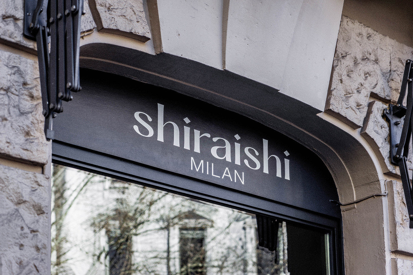
Aiming to expand into foreign markets such as the European and American markets, SHIRAISHI also needed an overhaul of the brand architecture. The project team engaged in meetings and discussion sessions with stakeholders, through which we came to an agreement that instead of the business's product lines, SHIRAISHI will use the location where its (future) stores locate as the sub-brands. This decision shows SHIRAISHI's vision and dedication to becoming a jewelry provider that supports customers from around the globe.


Visual Identity Development
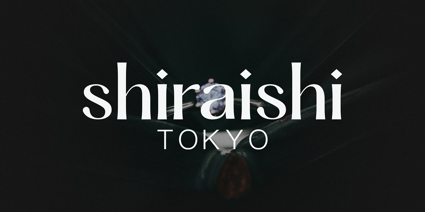
Designing the Logo
Moving on to the Visual Identity Development phase, we first proceeded to design the logo to replace the old logo which SHIRAISHI had been using for over 20 years. Based on the three brand core keywords: sophisticated, confidence, and beauty, and inspired by the historical typefaces of the old London and by the early Showa-era designs in Japan, we chose to create the type mark with alternating weighted strokes to create an elegant, yet bold, appearance. On the other hand, we employed modern sans-serif typefaces as the base to create a contemporary feeling for SHIRAISHI for the type mark's sub-text.
To design SHIRAISHI's symbol mark, our project team decided to rely on the business's product lines. Unlike many other jewelry brands, SHIRAISHI's products employ simpler but more precise cuts such as the Rectangular, Octagon, Drop, Trapeze, Half Rose, and Trillion cuts. Understanding this, we chose the Half Rose shape as the base and central image for the symbol mark while combining the remaining shapes in a blooming manner to create the final design. The result is an elegant symbol mark that not only presents SHIRAISHI's sophistication and precision and the brand's vision to support and connect with customers from around the globe.


A New Color Palette & Typefaces
An identity system could never be completed without a dedicated color palette and typefaces. For SHIRAISHI, we chose Cirka, an elegant and sharp serif typeface designed by Pangram Pangram, as the primary/headline typeface. Furthermore, we also chose Charlevoix Pro, a slim, humanist serif typeface also designed by Pangram Pangram, as the secondary/body typeface. We also chose the universally available Noto CJK package as the primary and secondary typefaces for Chinese, Japanese, and Korean text.
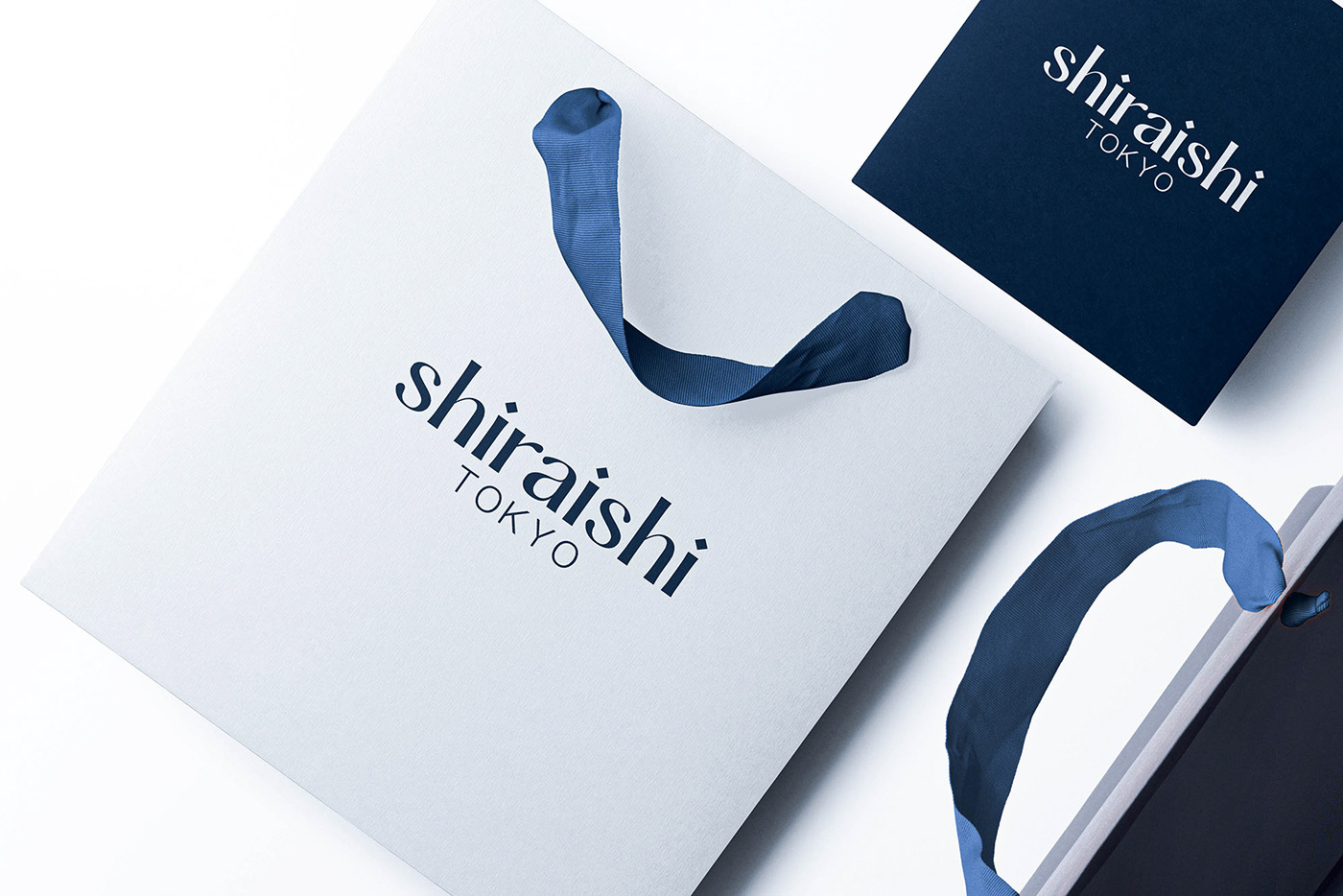
Inspired by the product lines from SHIRAISHI, we chose Deep Sapphire (PMS 289C/ PMS 296U) as the brand's primary color to complement the three accent colors: Silver (PMS Cool Gray 1C/PMS 10450C for packaging), Gold (PMS 465C/PMS 8383C for packaging), and Rose Gold (PMS 487C/PMS 8905C for packaging).


Paper & Packaging System
In the final phase, the project team proceeded to select the type of papers used for different applications. For SHIRAISHI, we decided to combine three types of Washi (和紙 or Japanese paper) for packaging and other printing applications. Unlike common papers, most Washi touts a beautiful texture, good ink absorption, and an ivory to pearly appearance that creates a luxurious feeling, matching the values of SHIRAISHI's products.
We also chose high-quality papers with composite coating for the shopping bags and the products' outer packaging.
In consideration of SHIRAISHI's future expansion, more specifically product line expansions and future branch establishments, we also devised a simple grid design system for the business's unified packaging.


Credits
Client: SHIRAISHI Co., Ltd. (Tokyo, JAPAN)
----------------------------------------------------------
Creative Agency: LNM Production
Creative Director: Nhat Minh Ly
----------------------------------------------------------
Marketing Team Leader: Junichiro OZAWA (SHIRAISHI Co., Ltd.)
Project Manager: Kaoru SATOSHI, Misaki KITO (SHIRAISHI Co., Ltd.)
©2021, LNM Production & SHIRAISHI Co., Ltd.


