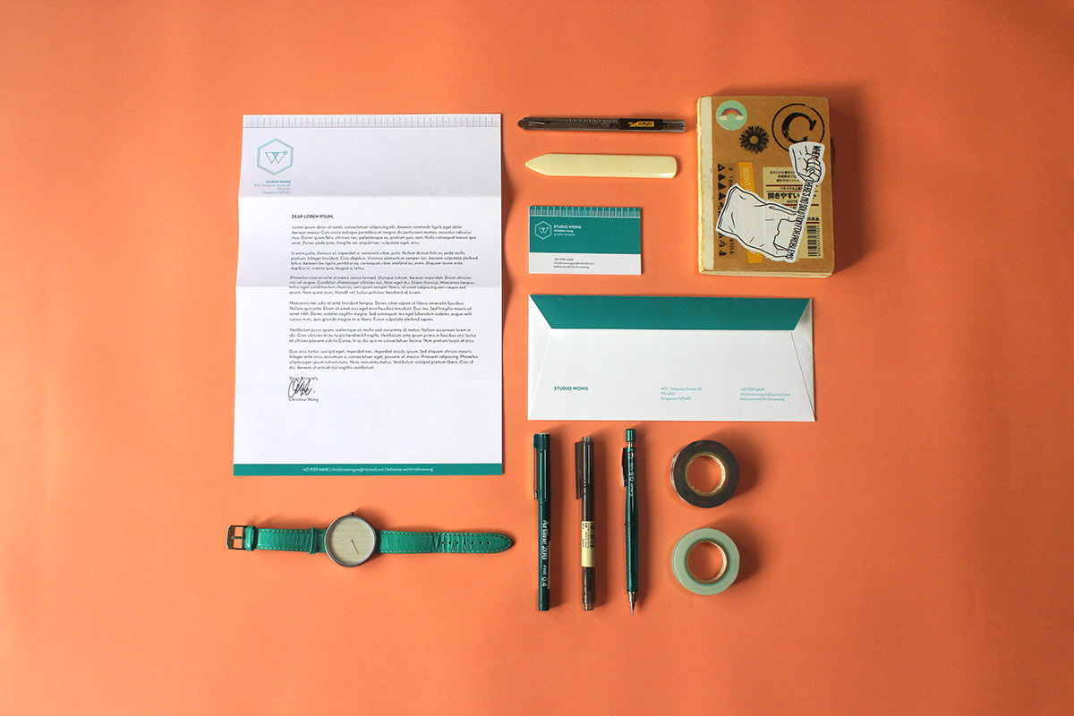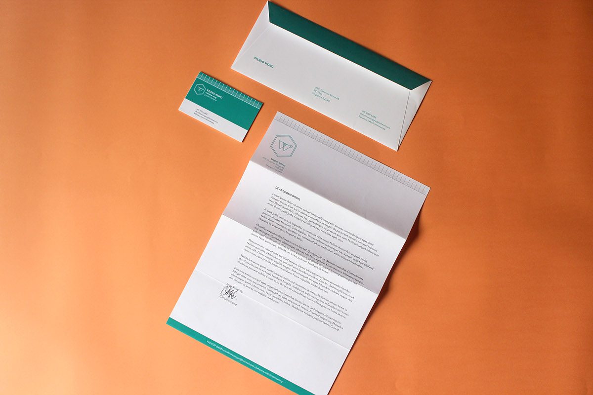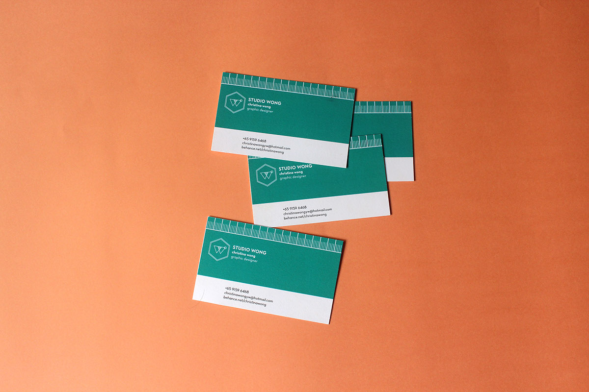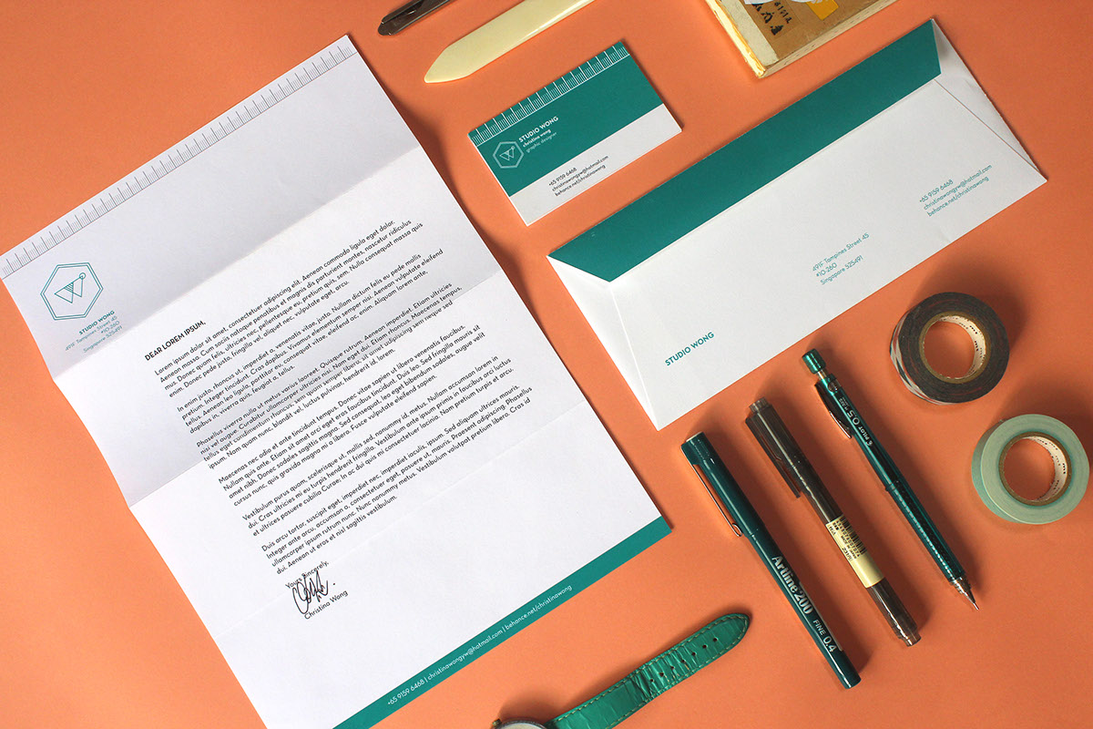
The logo was constructed by purely geometric elements. The main hexagonal element was conceived through the idea of an open cube - symbolising "thinking out of the box" literally. Two triangles intersect to form the letter 'W', also resembling a venn diagram to symbolise a collaboration between the designer and the client. Another interesting brand element would be the debossed ruler, representing precision and meticulous attention. The simple colour scheme pays homage to the classic Pantone swatches.


