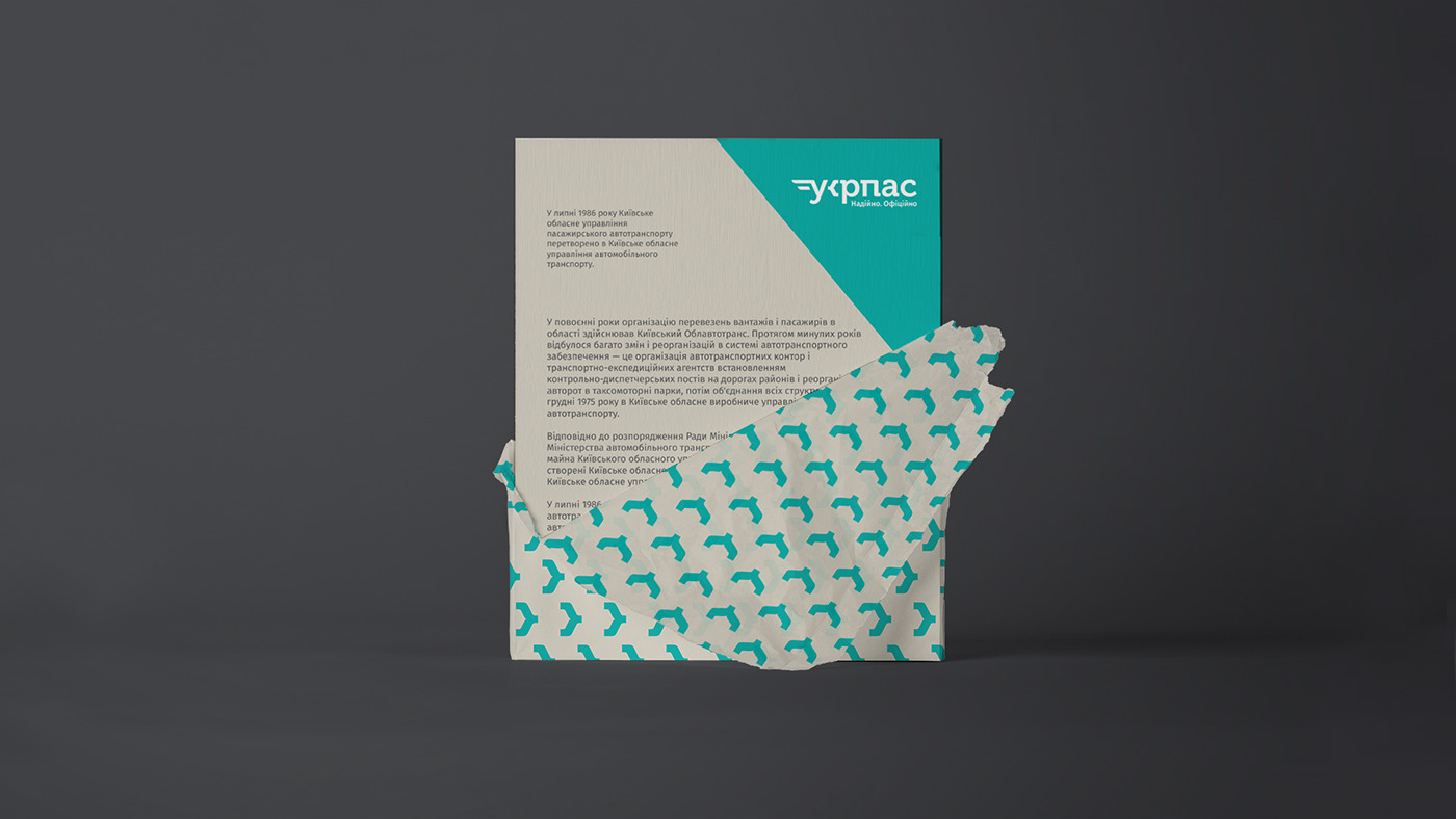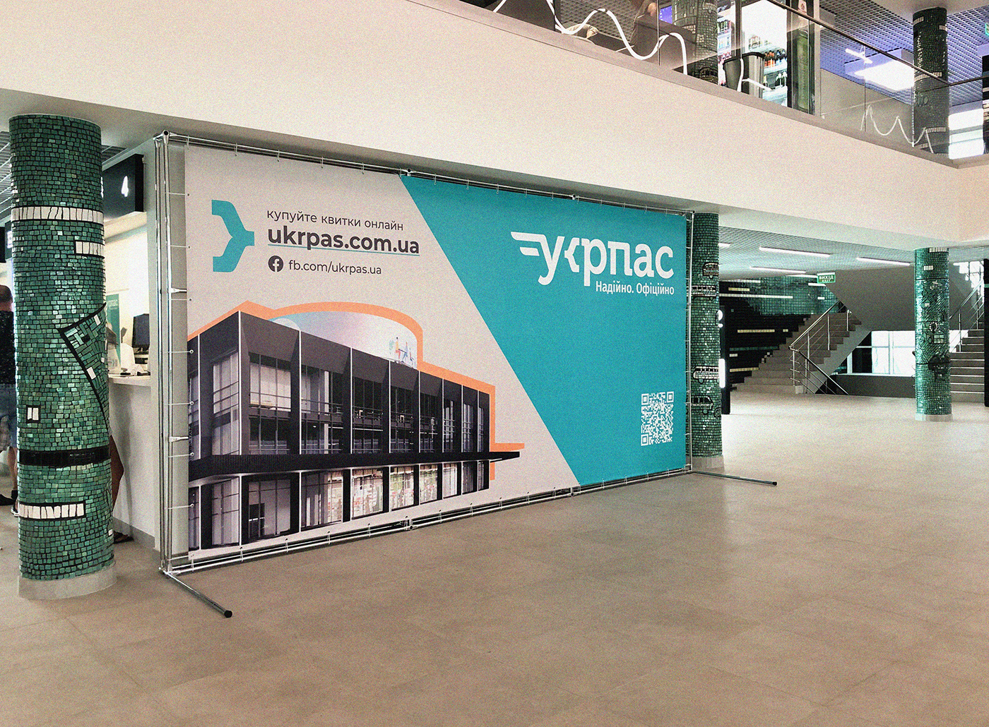
ukrpas is a brand in a new category for Ukraine, combining a network of bus stations and a modern service for online ticket sales. Kyiv Central Bus Station has not been updated for 60 years. Therefore, it was the first to undergo quite radical changes. And now the brand combines a wide range of excellent bus services. After the reconstruction of the Central Bus Station is over, recreation areas, food courts, and other innovative services will be introduced there to ensure perfect comfort and convenience.
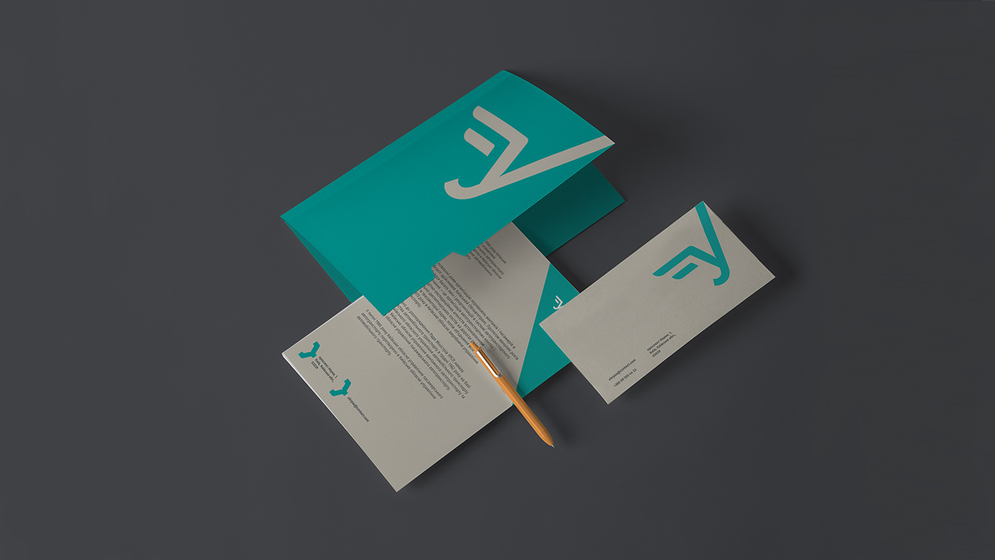
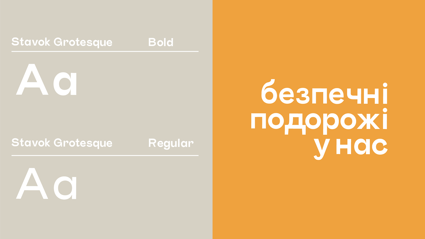
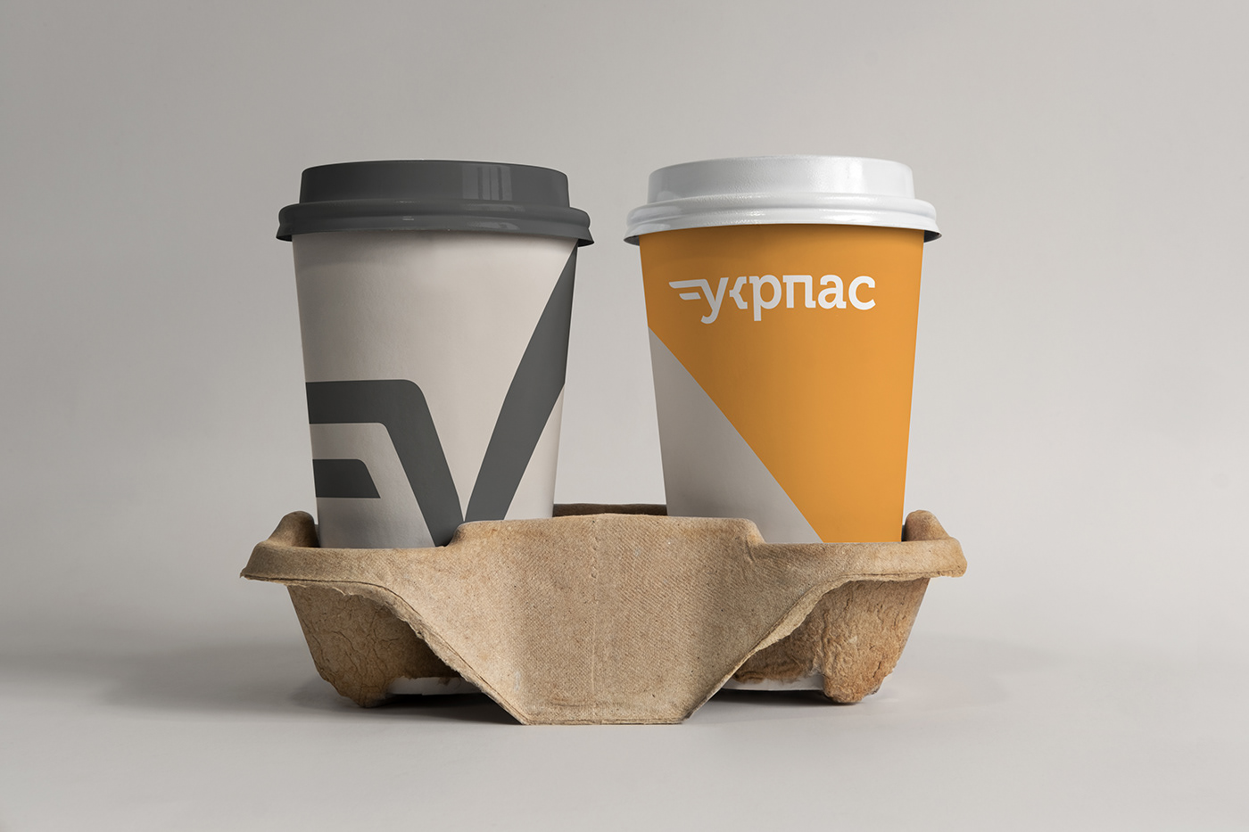
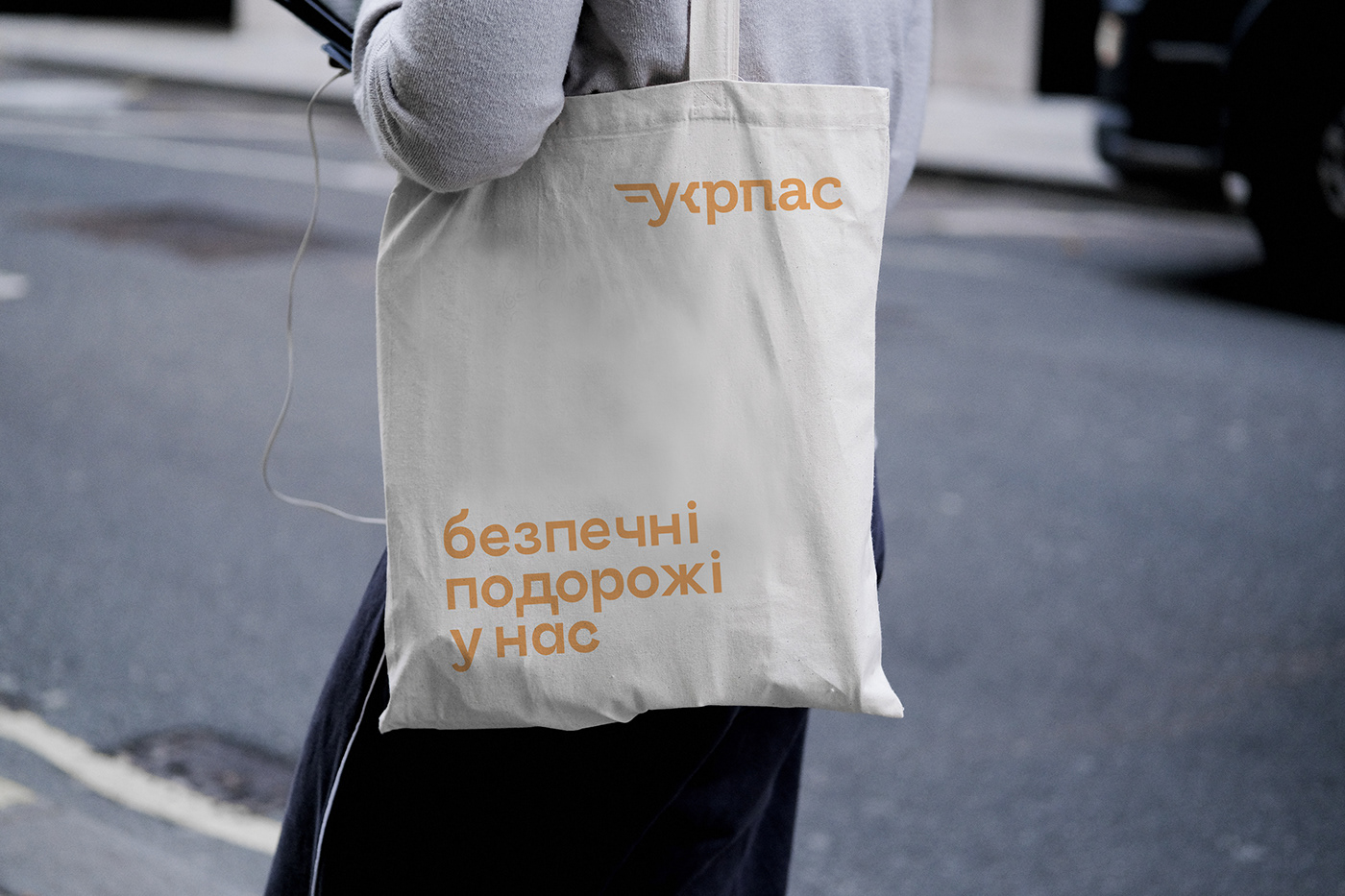
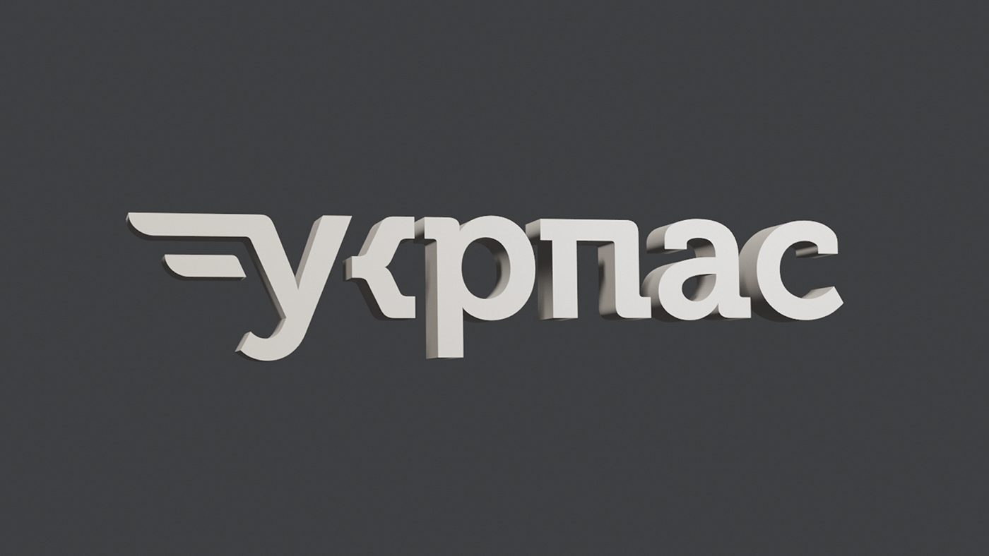
During the reconstruction it was decided to preserve the historical heritage, that is mosaics and panels. Inspired by the work of restorers, we started working on branding. The basic idea of creating a logo is to introduce history into the modern design of a new brand. Therefore, the laconic logo should preserve the wings, which are a symbol of bus stations. Another creative solution is the style of the "K" letter. It lacks a basic stroke, and, thus, resembles a curly bracket more. This creates an association of the cutting-edge service that will continuously evolve. For this project, we've chosen the Stavok Grotesque font from a Ukrainian developer. Enlarged extension elements of this font set the character of the text and dynamics. In conclusion, this coincides with the main idea of our identity.