

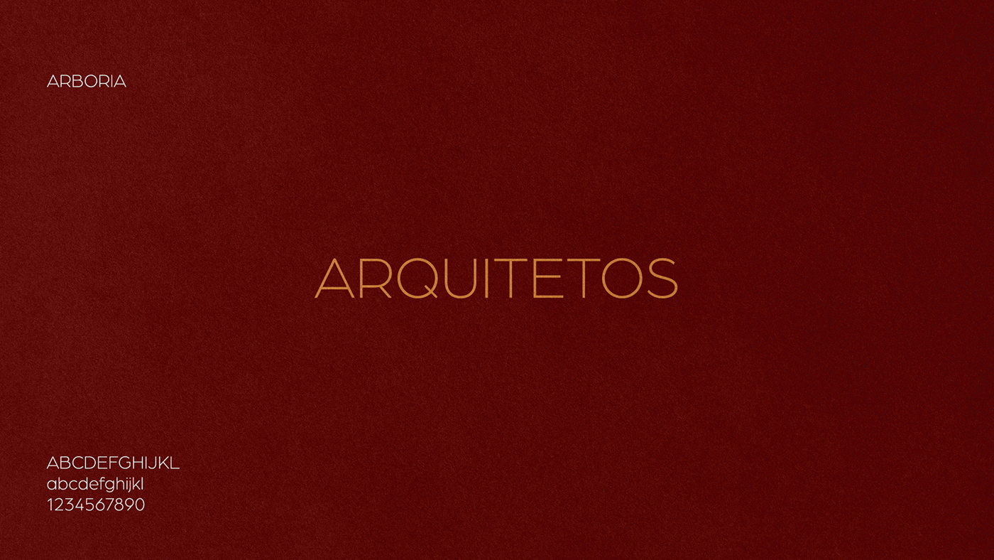
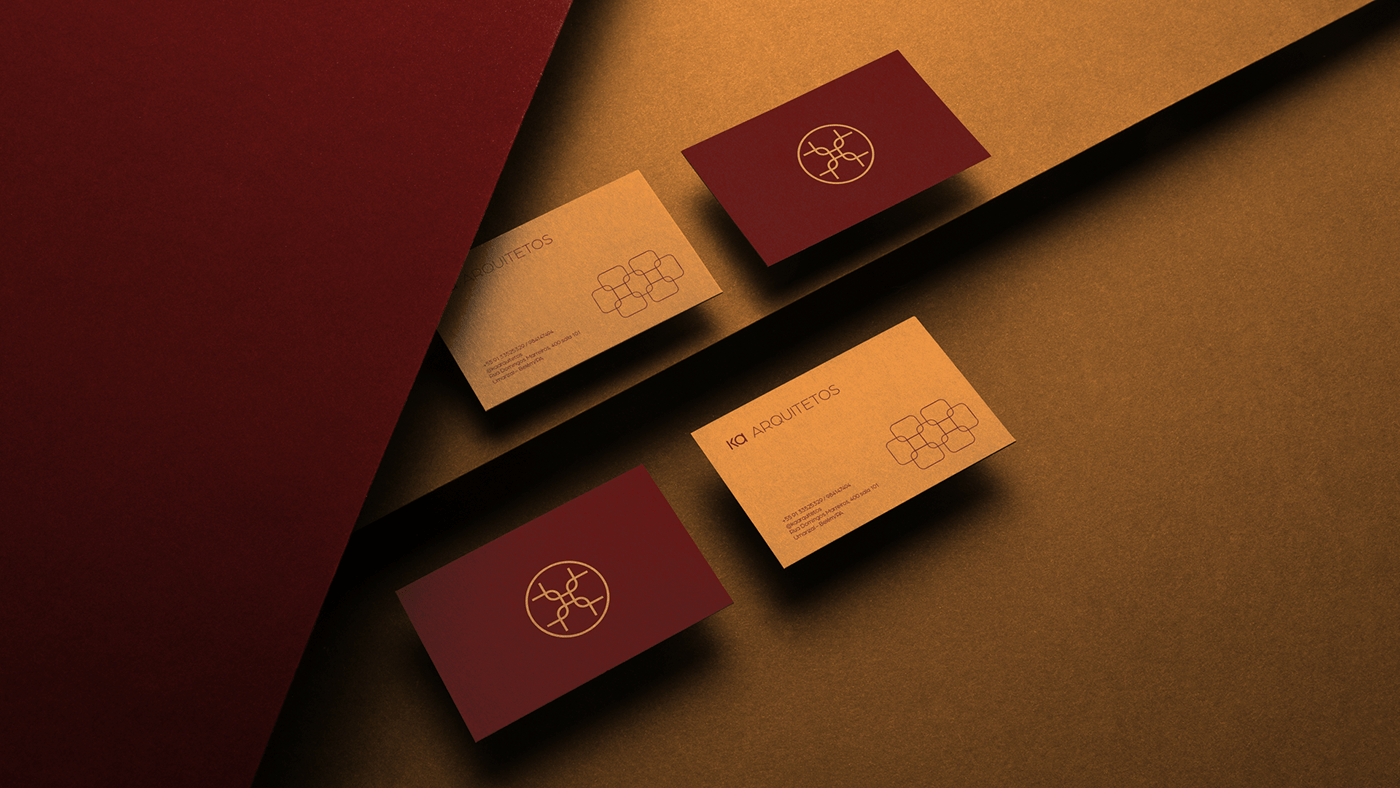
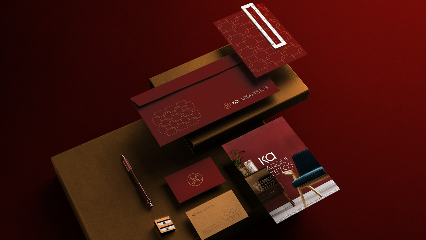
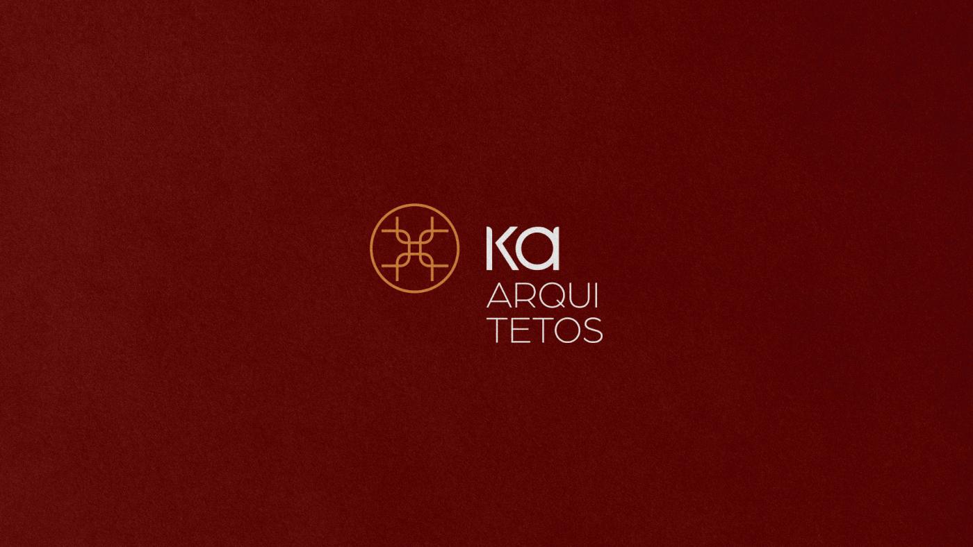
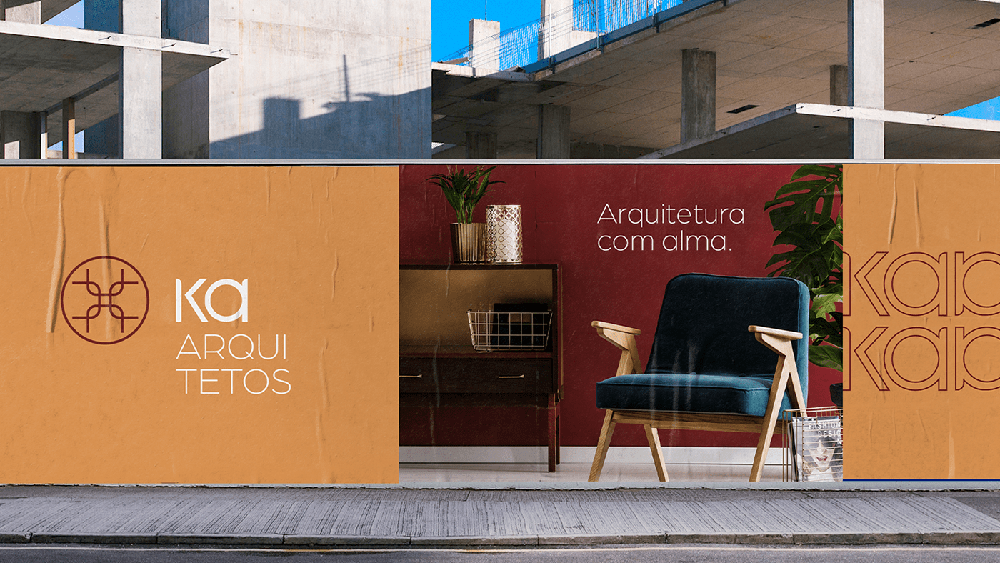
KA ARQUITETOS
PT
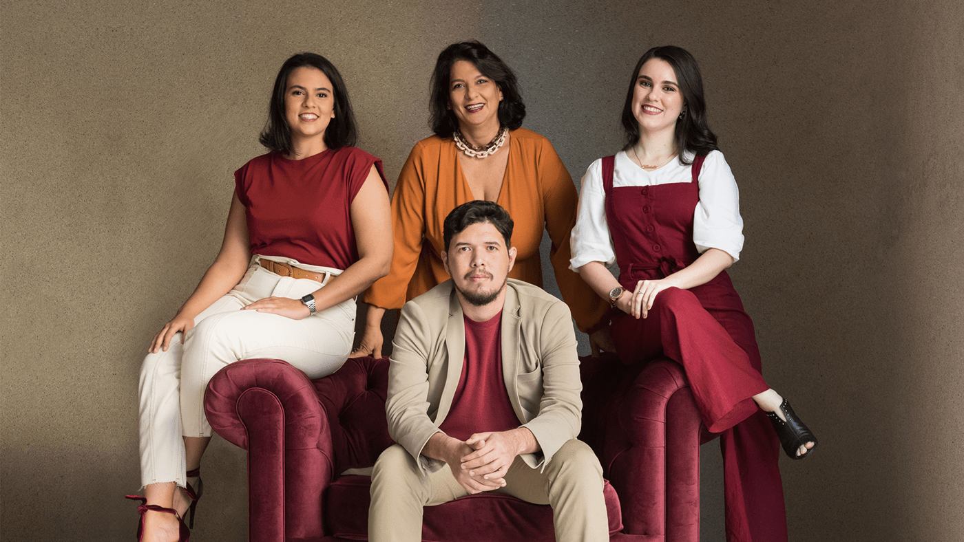
Despois de 30 anos à frente dos projetos do seu escritório, a arquiteta Isabela Kalume, resolveu inovar.
“Com essa evolução das coisas, da arquitetura, da casa, do novo pensar, da valorização do espaço. A gente não podia ficar pra trás. O escritório também evoluiu, tá crescendo, tá somando. E essa soma veio com pessoas novas.”
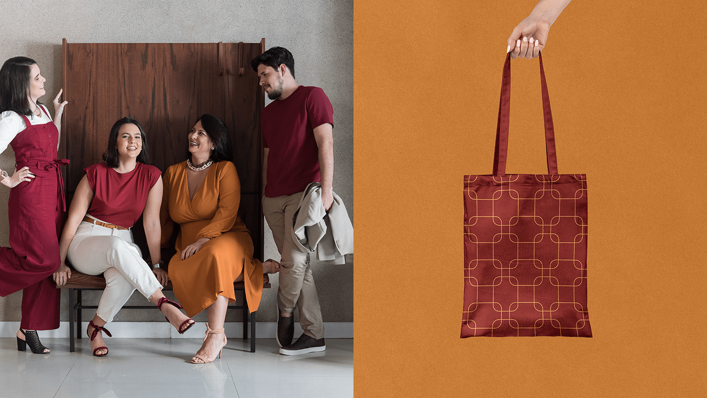
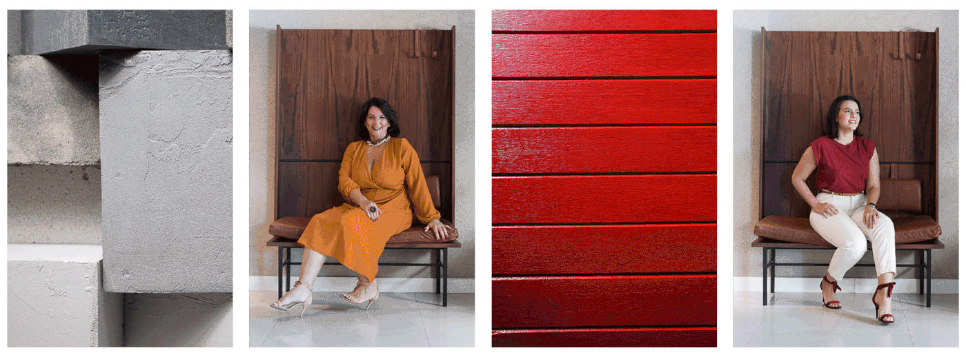
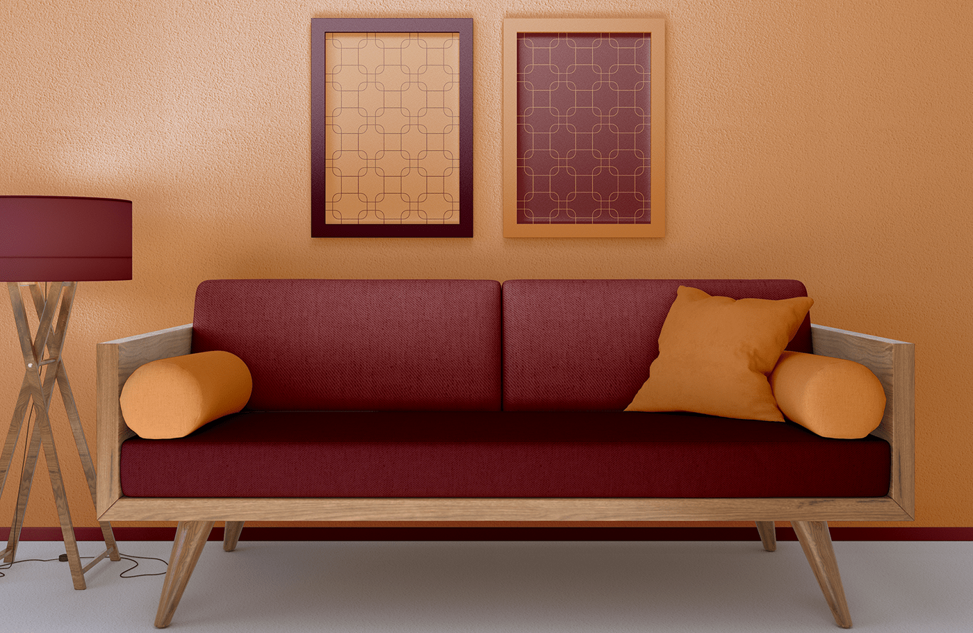
No Ka Arquitetos cada sócio tem uma essência, uma personalidade, assim como os projetos e ambientes elaborados e executados pelo escritório, o que torna cada projeto único e exclusivo.
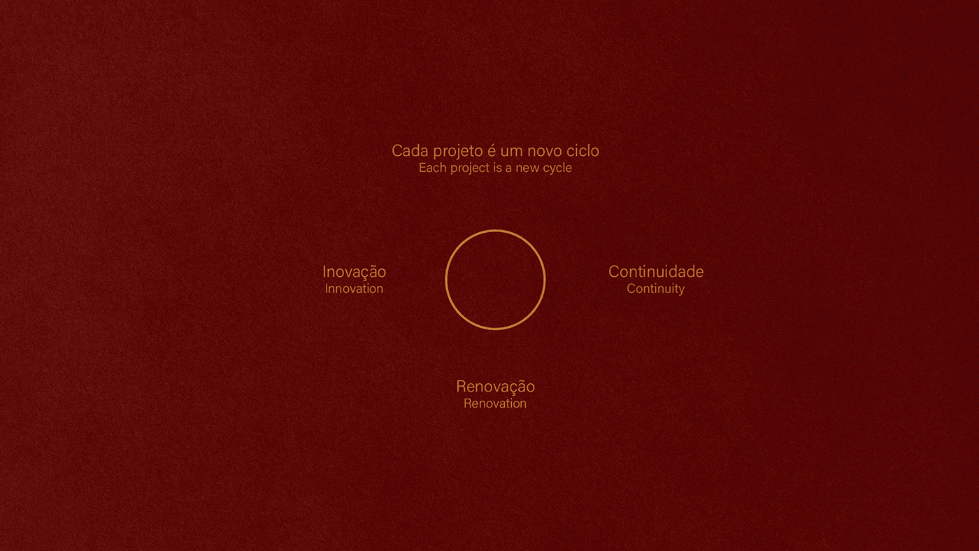
Toda conceito do projeto de identidade visual foi desenvolvido a partir dos valores do escritório, da sinergia entre os sócios e do significado/simbologia do KA.
O nome surgiu da abreviatura do sobrenome Kalume e ao pesquisar o significado, os clientes descobriram ser de uma palavra egípcia sem tradução definida, mas a que melhor simboliza é ALMA.
“A gente pegou essa essência da palavra ALMA pra fazer uma arquitetura com ALMA”.
EN
After 30 years in charge of the projects of her office, the architect Isabela Kalume, decided to innovate.
“With this evolution of things, of architecture, of the house, of new thinking, of valuing space. We couldn't stay behind. The office has also evolved, it's growing, it's adding up. And that sum came with new people.”
At Ka Arquitetos each partner has an essence, a personality, as well as the projects and environments created and executed by the firm, which makes each project unique and exclusive.
The entire concept of the visual identity project was developed based on the firm's values, the synergy between the partners and the meaning/symbolism of KA.
The name came from the abbreviation of the Kalume surname and when searching for the meaning, customers found it to be an Egyptian word without a defined translation, but the one that best symbolizes it is ALMA.
“We took this essence of the word ALMA to create an architecture with ALMA”.
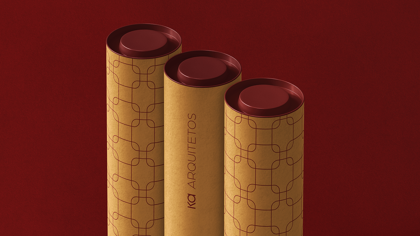
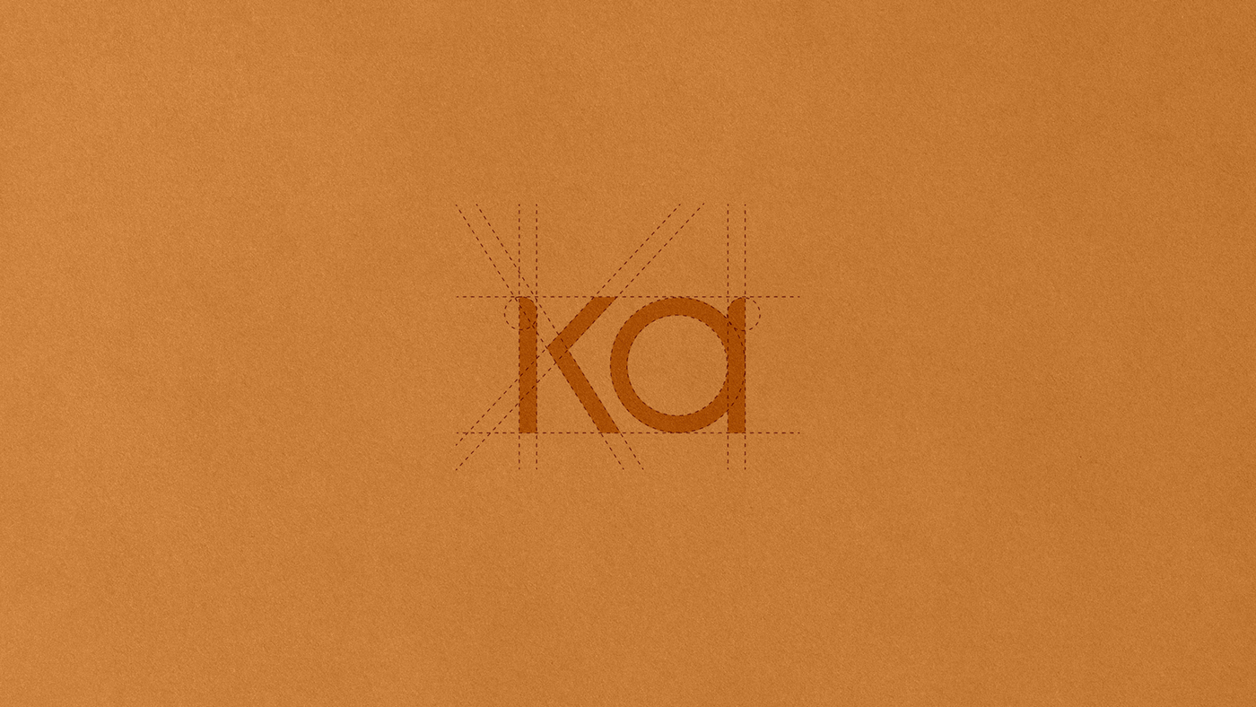
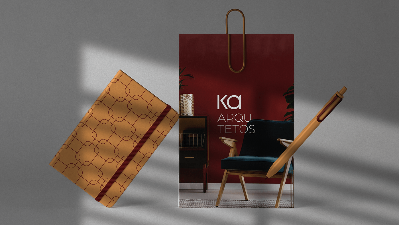
TIPOGRAFIA
Para tornar a marca única e fortalecer o conceito exclusivo e diferente do escritório, desenhamos o tipo do nome KA. Para dar equilíbrio e contraste a marca e torná-la mais elegante, utilizamos na tagline uma tipografia mais fina na palavra ARQUITETOS.
TYPOGRAPHY
To make the brand unique and strengthen the exclusive and different concept of the office, we designed the brand name KA. To give balance and contrast to the brand and make it more elegant, we use in the tagline a finer typography in the word ARCHITECTS.
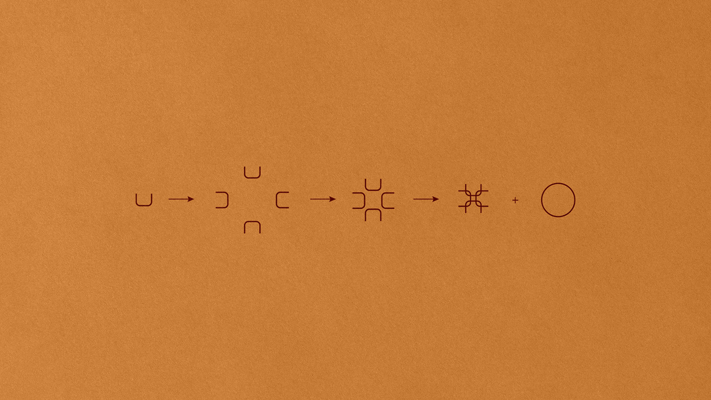
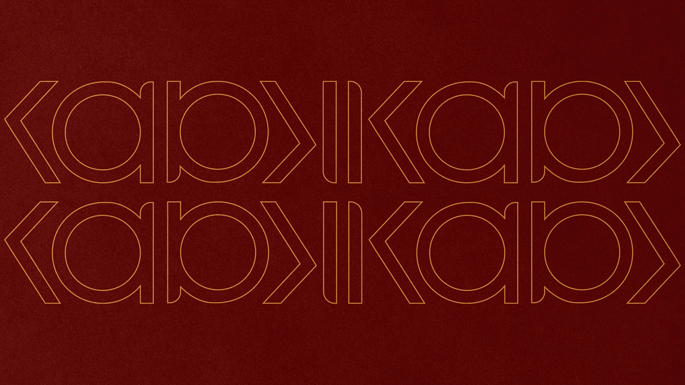
CONCEITO
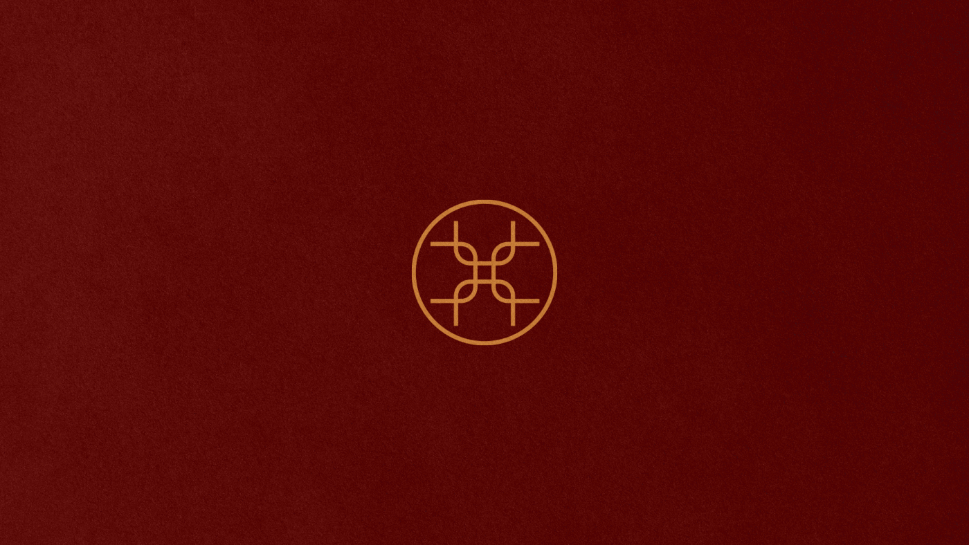
O KA é representado por um hieróglifo com um par de Braços Erguidos. Designava a essência de cada divindade e a cada pessoa, o espírito, a força de vida. Princípio ou elemento metafísico, invisível e volátil, de certa forma metafórico. Palavra sem tradução definida, mas a que melhor simboliza é ALMA, existente tanto nos homens quanto nos deuses.
Cada sócio tem uma essência, uma personalidade, bem como os projetos e ambientes concebidos e
executados pelo escritório KA ARQUITETOS, o que torna cada projeto único e exclusivo.
executados pelo escritório KA ARQUITETOS, o que torna cada projeto único e exclusivo.
CONCEPT
KA is represented by a hieroglyph with a pair of Uplifted Arms. It designated the essence of each deity and each person, the spirit, the life force. Metaphysical principle or element, invisible and volatile, somewhat metaphorical. A word without a definite translation, but the one that best symbolizes it is ALMA, existing in both men and gods.
Each partner has an essence, a personality, as well as the projects and environments designed and
executed by the KA ARQUITETOS office, which makes each project unique and exclusive.
executed by the KA ARQUITETOS office, which makes each project unique and exclusive.


Client: KA Arquitetos
Location: Brazil
Creative Leader: Ton Portela
Team: Ton Portela, Artur Santos e Joanderson Sales
Creative Leader: Ton Portela
Team: Ton Portela, Artur Santos e Joanderson Sales
Photos: Lucas Ohana, Bernad Cunha


