Zilla Capital - Brand Identity
Zilla Capital is a merge between two formerly individual entities serving different purposes in the financial and investment sector. Merged together, these two firms have grown into one, making them the ultimate comprehensive firm for financial and investment needs. Their youthful edge is a catalyst instigator of their success today and the bright future that awaits them.
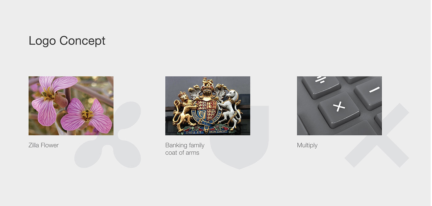
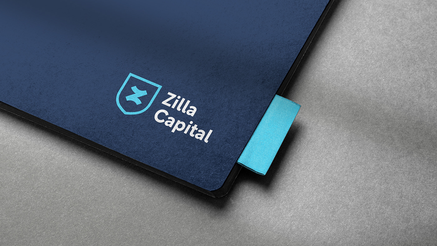
Inspired by the one of the world’s most unique flowers – the Zilla flower - the logo combines the letters ‘Z’ and ‘X’ to reflect on the two firms’ merge. This dynamic logo is optically illusive, where the eye translates the icon as an ‘Z’ up close, but when the logo is zoomed out it then looks like an ‘X’, mirroring the looks of a Zilla flower and signifying a promising merge.
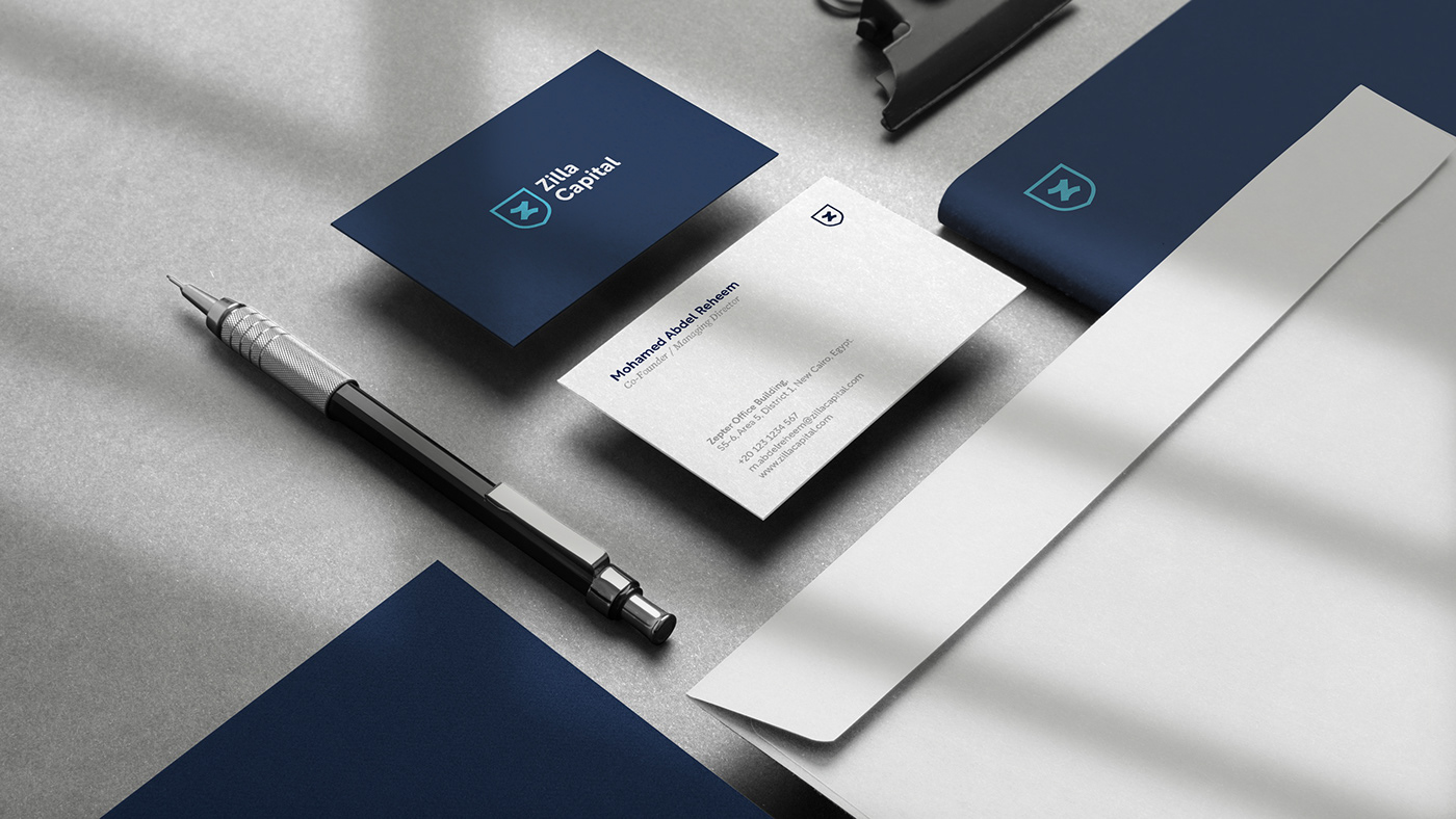
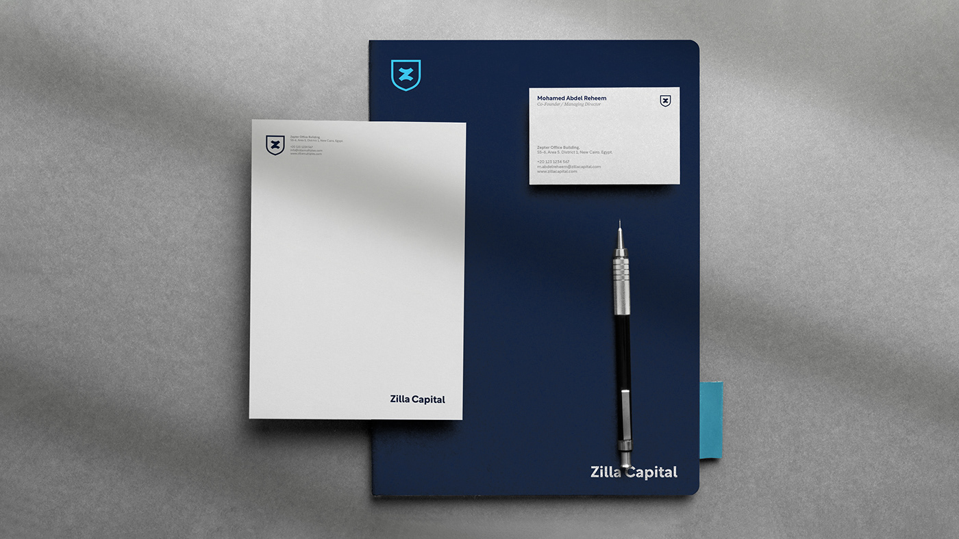
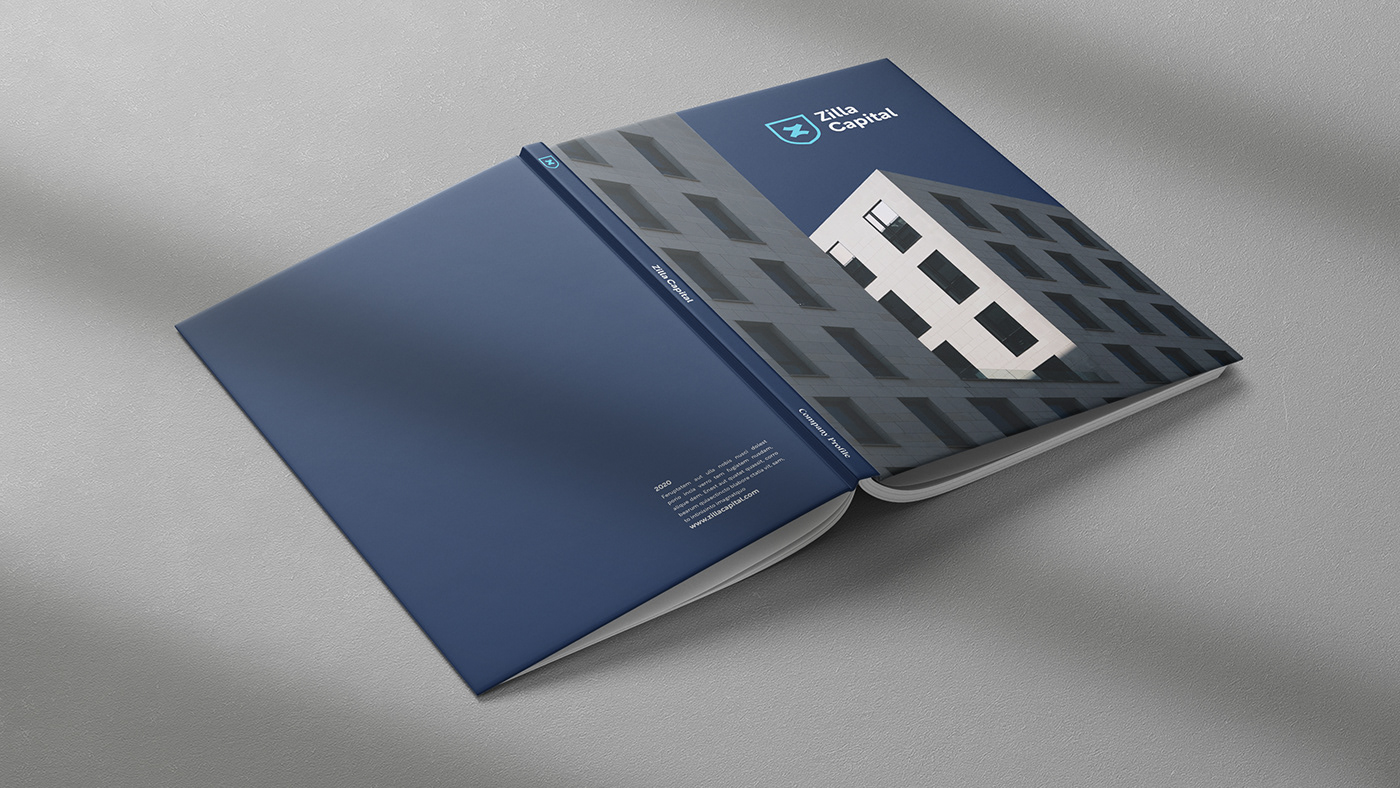
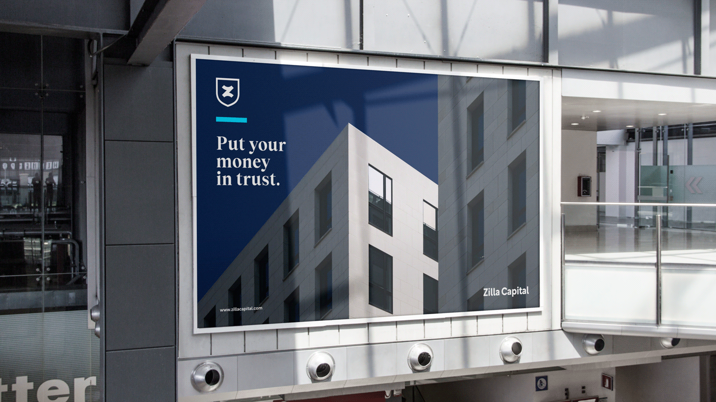
The design team wanted to portray the firm’s strength and diverse range of services, while still highlighting a young and energetic attitude. The different shades of blue are purposefully incorporated – where the dark blue shade portrays trust and capabilities, and the lighter shade gives off a smart and youthful vibe.