

Intro
Some of the most exciting and intensive work we've done this year just went live!
Our clients at Ankho Active took on the brave challenge to join the highly competitive market of Luxury Athleisure Wear, and we were assigned the task to create a brand that helps them cut through the noise.
Contributing to someone else's dream is not always easy and it surely comes with a lot of responsibility. However, working very closely with our clients, truly understanding them and translating their visions and desires into a brand that lives up to the task is what we do best here at Symbold.
In a market this competitive, the only way to stand out is by doing things better than others and telling a story worth remembering. Together with our clients we created 3 strong pillars for communication that easily carry the brands messages on their channels: Performance, Looks and Sustainability - all three elements where the products excell compared to most of their competitors.
We then had a deep dive into their audience's needs and desires. The intensive research revealed a great insight that later translated into the brand's slogan: true performance and the ability to overcome your own limits are goals that take courage. We feel more courageous though, when we are well grounded, when we know where our roots lie and where our safe space is. From there, we can venture out and conquer the world. From there we can go anywhere and achieve anything.
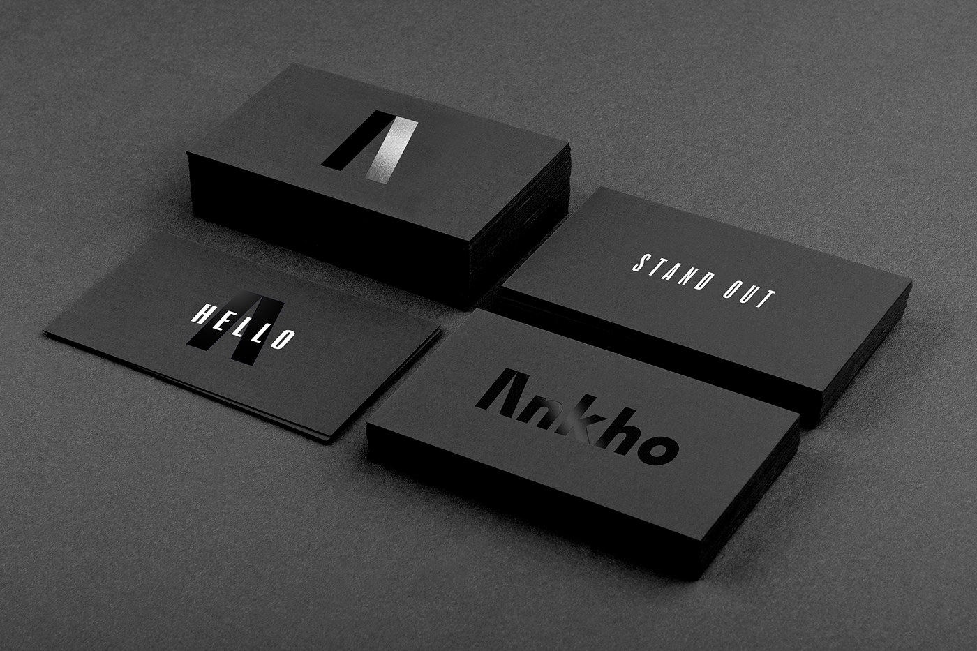
Ankho.
From here to anywhere.
How it all begins? By taking that very first step. A step so important, it may define a journey. A step so important, that we just had to include it in the logo.
Goals, ambitions and determinations are serious elements in one's journey to great achievements. That's why in our visual style we chose a determined look, rather than smiling models.
Last but not least, we created the brand design, as most times, as a flexible and scalable one - one that can get many forms and directions, and that, when used correctly, can carry endless messages into the world.
The mono-chromatic logo is complemented by a varied color palette, allowing the brand to use a variety of other colors to promote its upcoming collections.
The brand manual explains how the logo should be integrated on materials, on clothing items and packaging, in social media brand campaigns as well as on the website. It also includes business cards, shipping boxes, logo animation guidelines, branding do’s and don’ts, an illustration style and a photo guide for online presence.


Team:
Brand Strategy: Carla Moss
Brand design & Creative direction: Ovidiu Pop
Photography: DistrictOne STudio


