


BlancLab「宿醉面膜」,宿醉Veisalgia一詞,源自挪威語Kveis(狂歡後的心神不寧)和希臘語Algia(疼痛),體現飲酒者普遍經歷過的不適,也代表著乏味日常裡冒出心頭的一點小叛逆。
BlancLab "Hangover Mask" : the term 'Veisalgia' is derived from the Norwegian 'kveis' (restlessness after a carnival) and the Greek 'algia' (pain). It reflects the discomfort commonly experienced by drinkers and also represents a little rebellion that often comes up in the boring daily life.


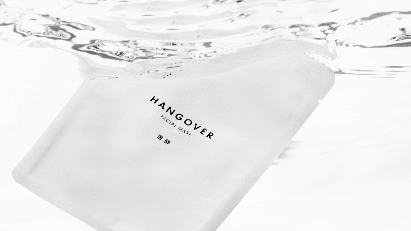
極簡的設計,從品牌到包裝,使用無襯線字體呈現品牌的俐落感,保留最純粹的識別,以最少的元素,傳達乾淨並且優雅的產品。
在宿醉面膜的包裝設計上,用紙質與工藝去表現層次,中間的H字樣取自hangover的H,採用珍珠箔,讓整體的包裝調性更顯光澤,在俐落的包裝上更顯層次,將面膜精緻化,使用禮盒的形式,包裝內盒使用厚卡表紙,在面膜使用完畢後,外盒可提供收納小物循環再利用。
The minimalist design, from brand to packaging, uses sans-serif fonts to present the brand's neatness, retains the purest identity, and conveys clean and elegant products with the fewest elements.
In the packaging design of the hangover mask, we use hot stamping and paper embossing to add a little elegance. The H in the middle is taken from hangover's H, and pearl foil is used to make the overall packaging tone more shiny, and add opulence to the image of this product. The packaging design used in the form of a gift box. The inner box of the package uses thick cardboard. After the mask is used, the whole package can be used to store small items.


