


The updated logo of the Yermolova Theatre was introduced for the institution’s 95th season beginning in 2020 and takes the form of a typographic interpretation of the theatre's almost century-long history: a visual bridge connecting past and present, a combination of the Art Nouveau and Futura.
#shukadesign 2020

The central motif of the logo is the image of Maria Yermolova herself. The iconic image of the actress is taken from her portrait by Valentin Serov, as used in the previous logo, but is present in the updated version in the form of a graphic rhyme with the proportions of the letter E.


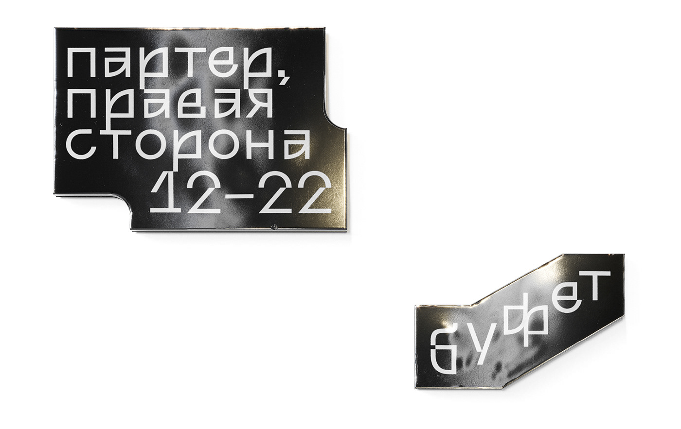
The logo is complemented by the corporate font Yermolova 95, which refers to the era of Maria Yermolova in its decorative plasticity. Historicity is more obvious in the Latin version (the semi-ovals and arcs of the b, d, g, h, m, n, q and u), and is only manifested in the Cyrillic version in certain parts of the graphemes (the closed forms of the а, б, в, е and я). The theatre’s contemporary vibe is expressed in the sharp deconstructed geometry and embossed pixels.


SHUKA
creative director → ivan velichko
art director → dasha zudina
design, typeface → varya goncharova
3D → oleg mushta
designed by shuka ®
© all rights reserved


