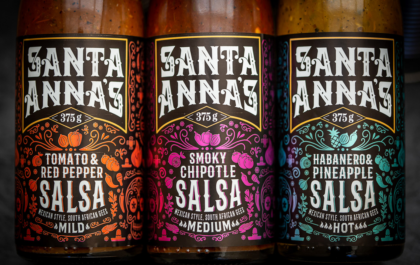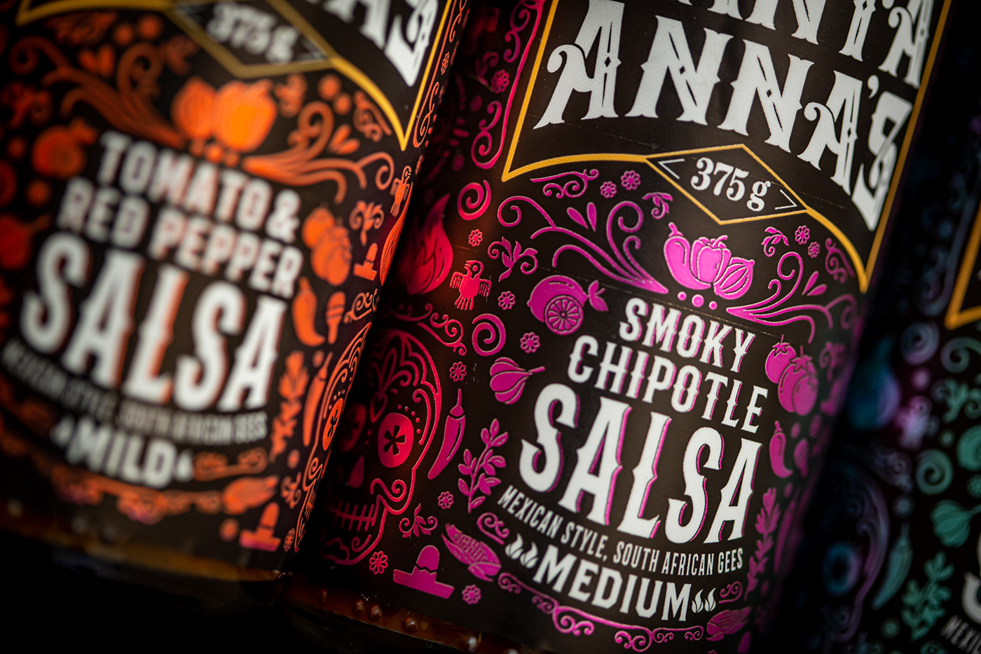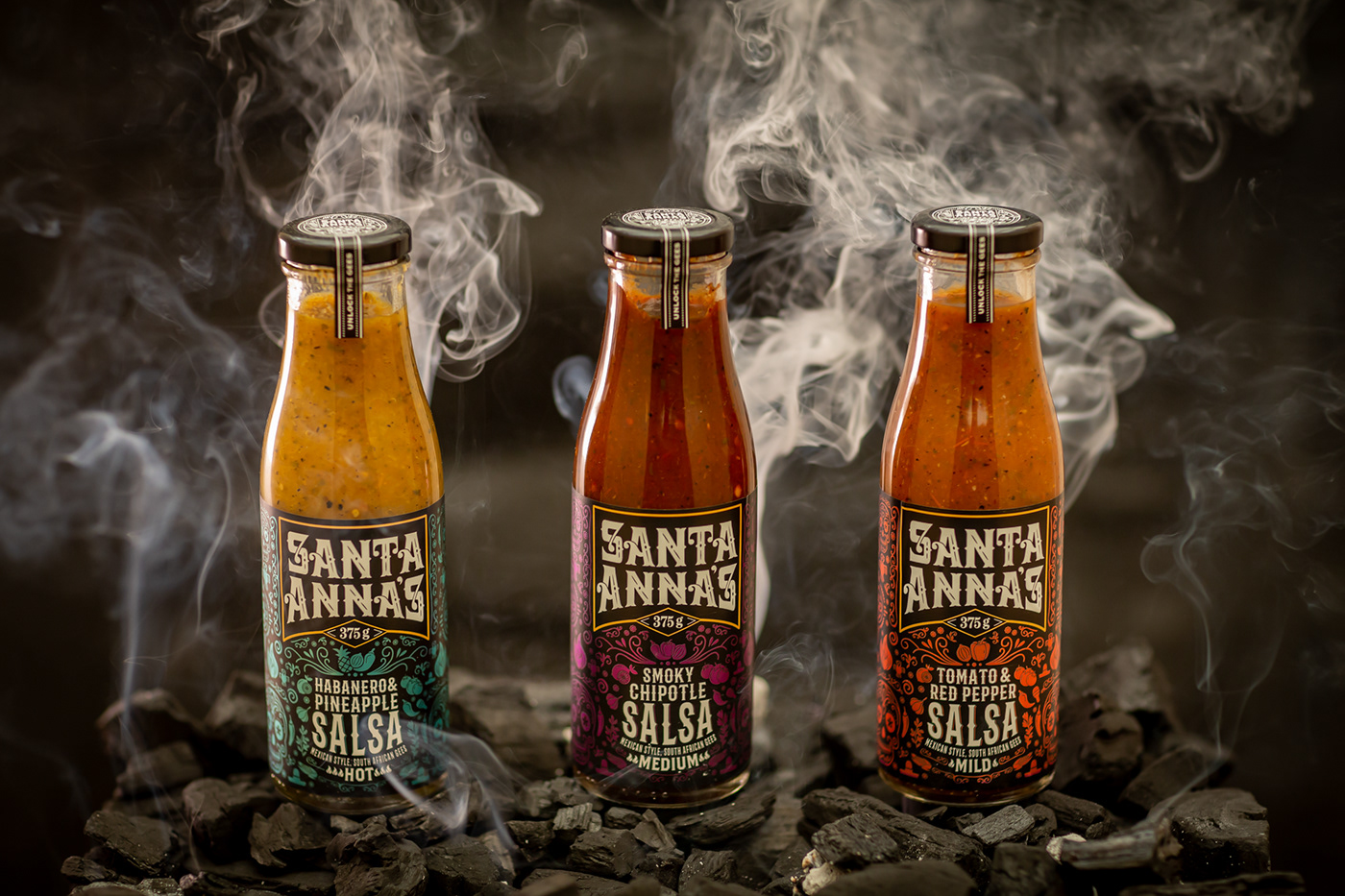
Packaging
Santa Anna’s new range of salsas required a fiery label to represent the spicy bottled sauces accurately. Since the salsas were developed to accompany their corn chips,
we looked to Mexico and the vibrant Dia de Muertos festival for inspiration. Symbols associated with the celebration, alongside the product’s ingredients, create an
interesting pattern. Each product is represented by a bold colour on a black backdrop. This juxtaposition intensifies the vibrancy of the label.
Mexican style - South African gees!