While working for the Cleveland Institute of Art's Marketing Department, one project I designed on short notice was an informational brochure and flyer for a suicide prevention film that Student Life would be screening in the coming week. Unfortunately, the last-minute event fell through and the work was never used.

Bright colors may not seem to be the most intuitive choice for such a topic, but I felt the typical doom-and-gloom aesthetic frequently used in mental health visuals often had the counter effect of contributing to the very stigma the information needed to overcome in order to be effective. I wanted this brochure to be approachable, not something to be avoided.


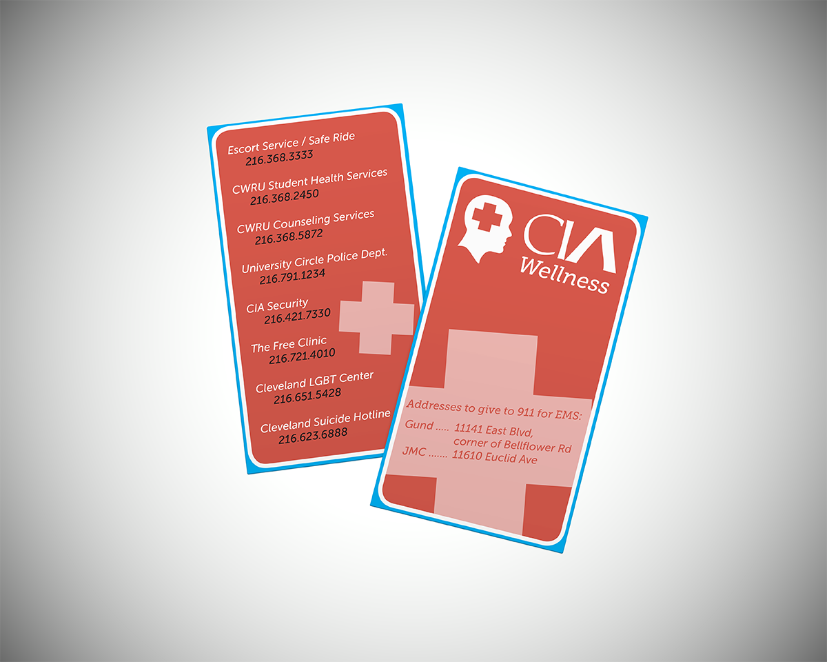
Also part of the reinvigorated wellness initiative, below are In Case Emergency card designs, intended to be distributed amongst the CIA student body.