
Been on the market since 2015, SGF has become a pioneer in cryogenic freezing technology with a wide range of frozen seafood products and ready-to-cook meals. The old packaging design is consistent and recognizable, yet soon become unfit as new players emerged in and took a bite out of the market.
SGF decided to renew the packaging to achieve a more professional image and let customers feel engaged with the brand.
Creative Director: Trung Nguyen
Art Director: Huy Nguyen
Graphic Designer: Trang Ká, Huy Nguyen, Tommy Nguyen
Photography & Food Stylist: Nguyen Bui (Hotpot), M&M Production House (Fishball)
Photography & Food Stylist: Nguyen Bui (Hotpot), M&M Production House (Fishball)
Account: Jun Nguyen

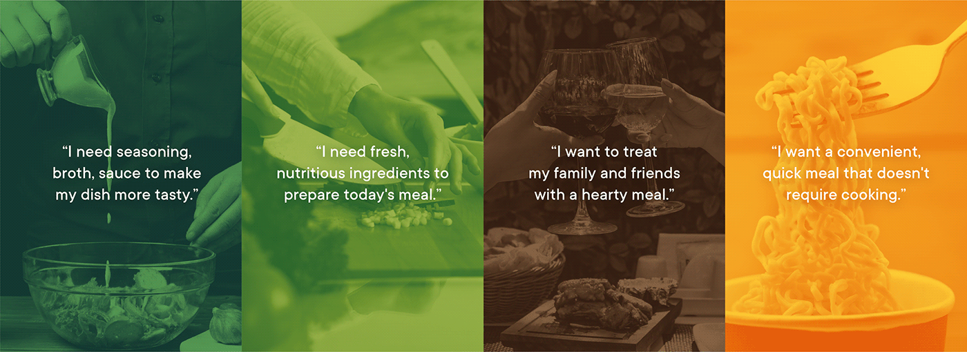
We don't just consider this a regular revamp project, but as an opportunity to get to know the customers' needs and let them feel their emotional connections are fostered. To achieve this, we undertook research to understand consumers' demand behind their everyday choice and use a need-based segmentation method to restructured the 100-product portfolio. Our purpose is to create each distinct identity that speaks directly to its target audience following a systematic architecture and brand image.
The assurance of freshness
The label tag is chosen as a visual cue across all product lines to emphasize quality assurance and the heritage of the brand. When adapted to different products, this label scales and adjusts responsively to fit each packaging forms and formats.

Essential
SG Food Essential offers concentrated hot pot flavors and auxiliary spices. Being commonly used by mass consumers, esp. among traditional home cook, the visual language is kept friendly and accessible. The image aims to show the taste made from fresh spices, especially the focused spoon helps to evoke the smell from boiling broth, let the packaging be more appealing.


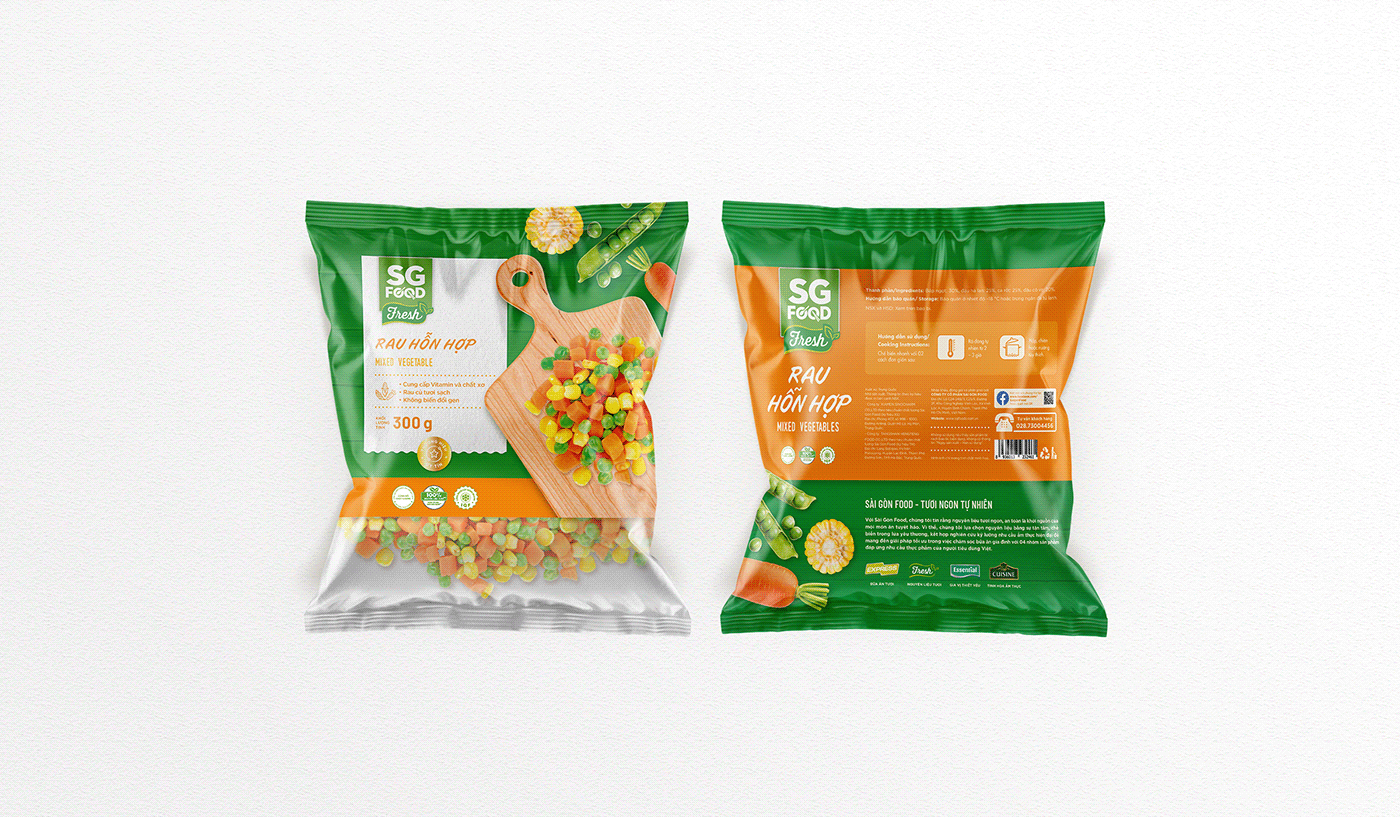
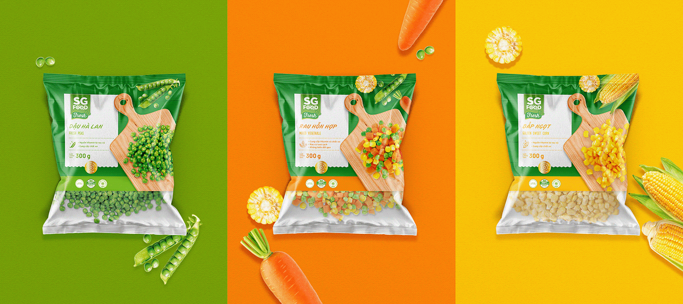
Fresh
SG Food Fresh, is a line of traditional pre-processed vegetables and seafood. We want the consumer to feel healthy and assured choosing these product by using the ingredient in its raw state, with little to none interference. In addition, we chose a modern script typeface and the leaf-shape logo evoke a sense of organic and rawness.


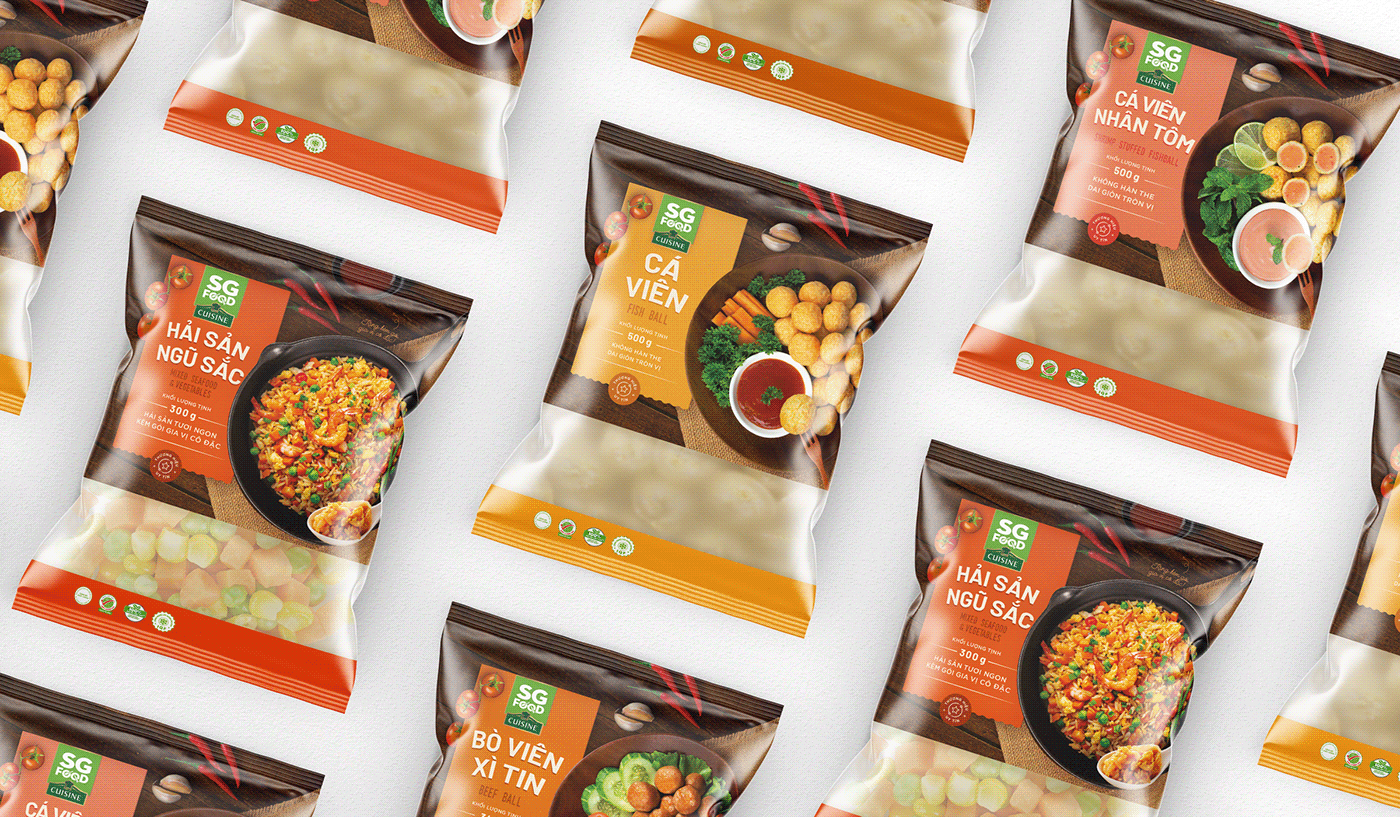
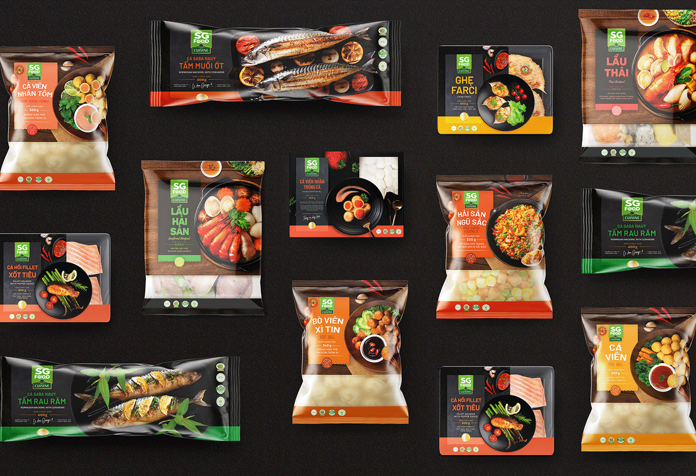
Cuisine
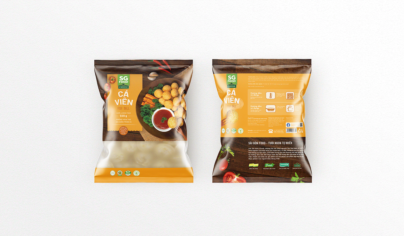
As the flagship product line, SG Food Cuisine includes a wide range of product from hotpot set, fishball to marinated seafood. Here we want to show this is a premium-yet-favorable culinary experience, a restaurant-quality meal made at home. The product stays as the hero to emphasize the carefully presented delicacy. Dark tone are used to boost the premium vibe, in addition, we add the handwritten typeface to add the extra touch of exclusiveness to the Cuisine Premium branch.


Express
SG Food Express is a new product line that provides RTH meal for busy schedule. Targeting a completely new customer, this product line carries a modern and youthful look that's different from all the previous lines. Vibrant colors evokes a sense of joyous and dynamic energy. The main course is decorated on the table with side dish, creating the feeling of a whole meal wrapped in a single package.


