Rebranding of the Luigi Bernabò Literary Agency
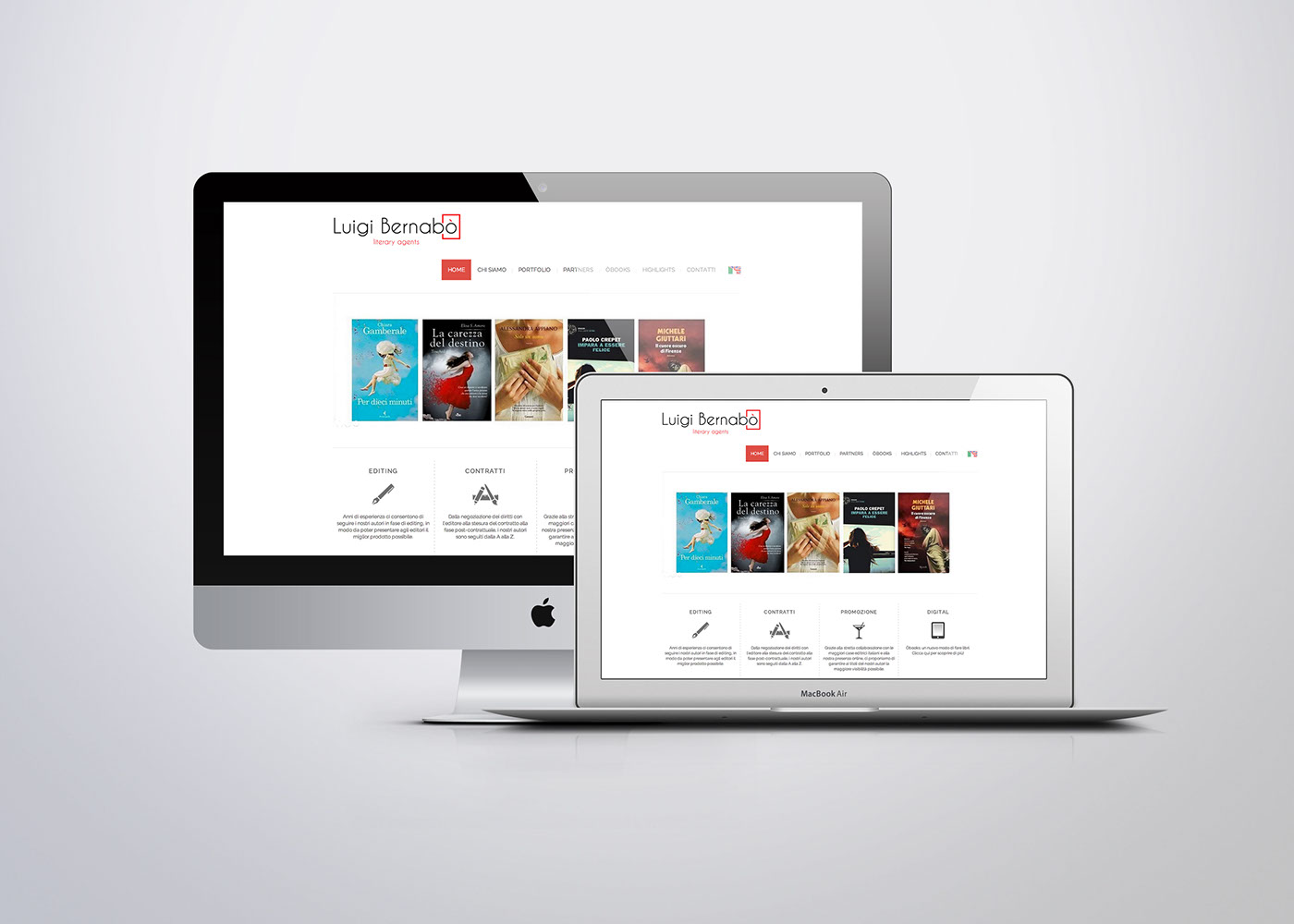
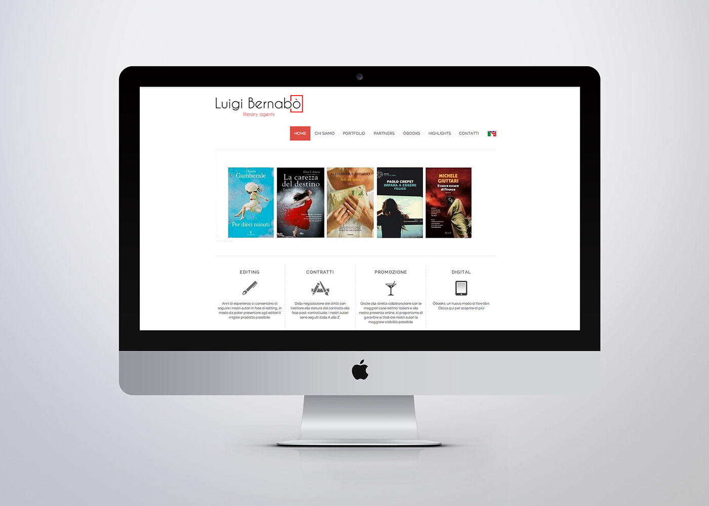
The brief was to create an identity that would mirror the translation of the agency to the digital age.
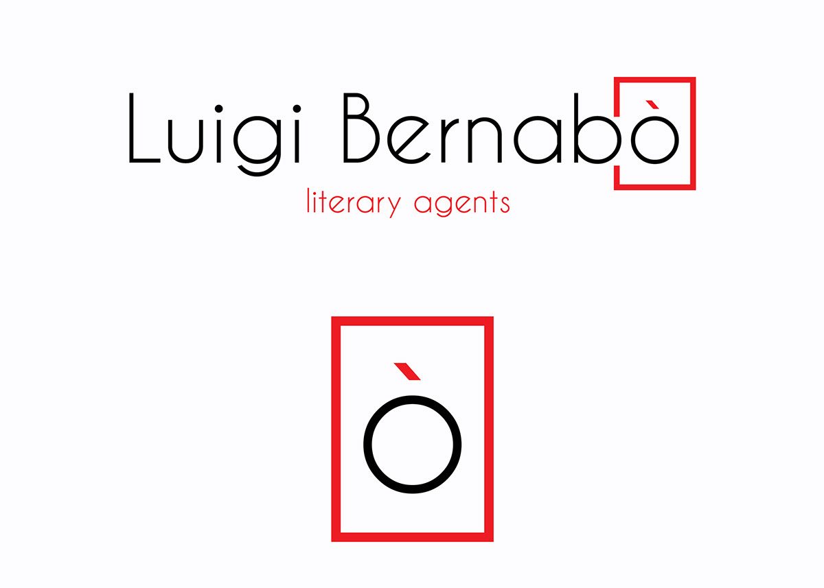
I chose to keep the new identity as minimal and plain as possible. Since red was the colour used in the old logo, I decided to keep it and reintroduce it a more playful and light way.
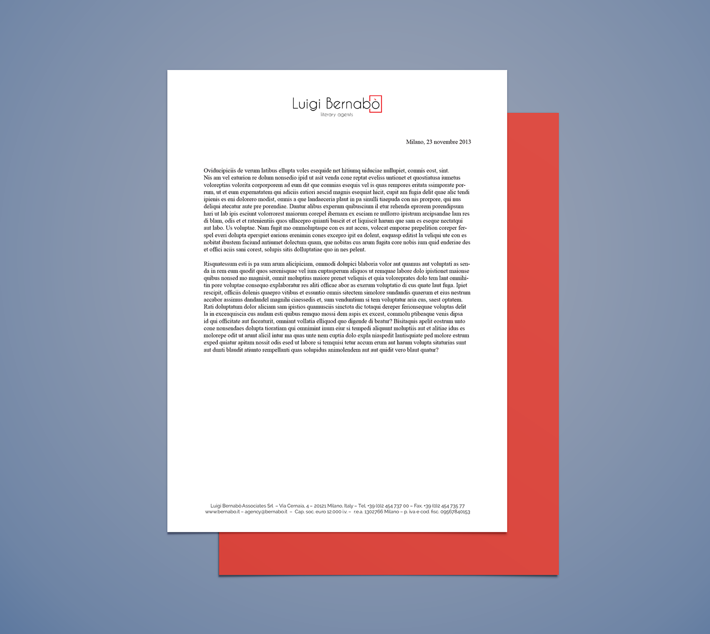
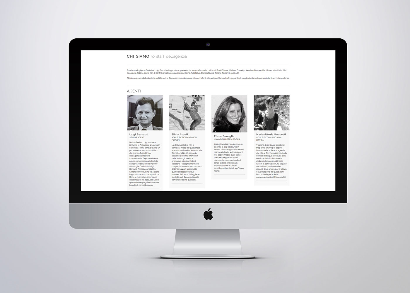
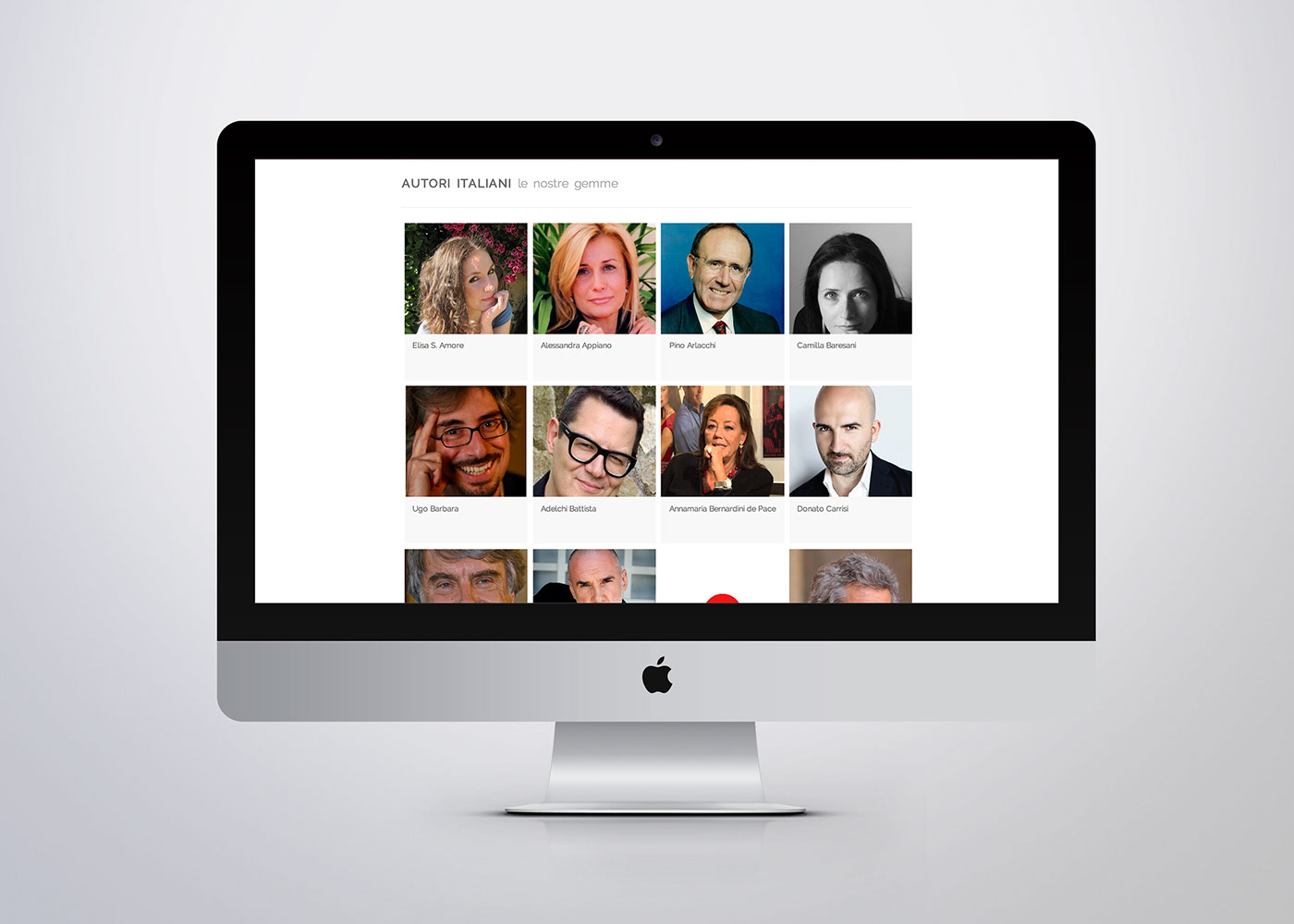
The whole identity suggests essentiality and simpleness. What stands out is just the name of the agency and, in the website, its clients and products.
The logo focuses on the accented O, which has always been the benchmark of the agency. The red rectangle around it is the size of an A4 paper.
Therefore, the 'ò' acts both as sign of quality and copyright simbol on a piece of paper (the rectangle), stressing the importance of the agency within the Italian and international publishing panorama, its long tradition and its role as defensor of copyright.
Therefore, the 'ò' acts both as sign of quality and copyright simbol on a piece of paper (the rectangle), stressing the importance of the agency within the Italian and international publishing panorama, its long tradition and its role as defensor of copyright.