


Locale is a Bangladesh' Building Management & Services brand, built by ISHO IKKO Inc. Its mission is to fill the gap between building participants, including (1) Renters, (2) Landlord, (3) Services. Their key product is an application.
My mission was to develop an identity system for Locale. This system should provides a modern mood about the app, and also, which is most important - the sharp discipline between the three roles of participants. It's a need that those roles are separated clearly, with shapes, colors, and typography.

I start with simple questions. So, what make Locale become locale? Where is the thing that should be exist between renters, landlord, services? Several sketches was drafted, some ideas was told. However, all it comes to was the 'connection'.


After various sketches & drafts (which will be shown at the end), I decided to move forward and think differently. So, the connectivity is basically made by human - and be maintained by human also. The logo would show the way people connect, not strictly just by typography and icon mark. To much headaches, I adapt the rope rules with hand-drawing draft for this logo.
"If two people are, together, pulling a rope, a connection would be made."
Handmade logo was crafted, then.


Imperial URW (UWR Type-Foundry) and Poppins (Indian Type Foundry) were chosen as the brand typefaces. These two are good partners to each other. Imperial gives a feeling of modern, luxury, trust-worthy. On the other hand, Poppins is modern, lovely readable & legible.

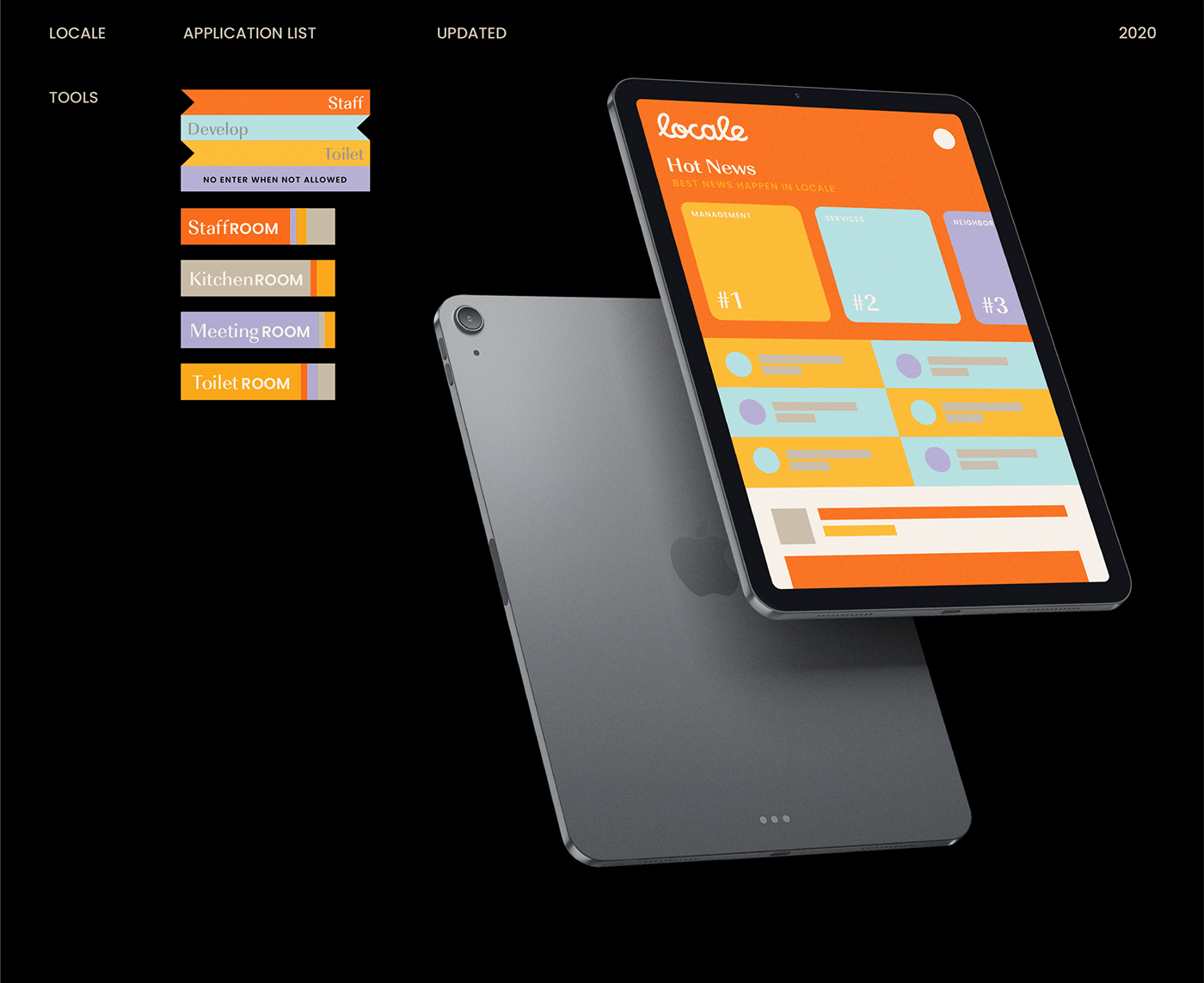
Buildings, block and block, floors & floors, colors, people. In the application, there will be sections for each participants of the buildings, renters, landlord, services, which is somehow, structural and hierarchical. The identity and graphic assets were created, then, with structural grids, hierarchy.
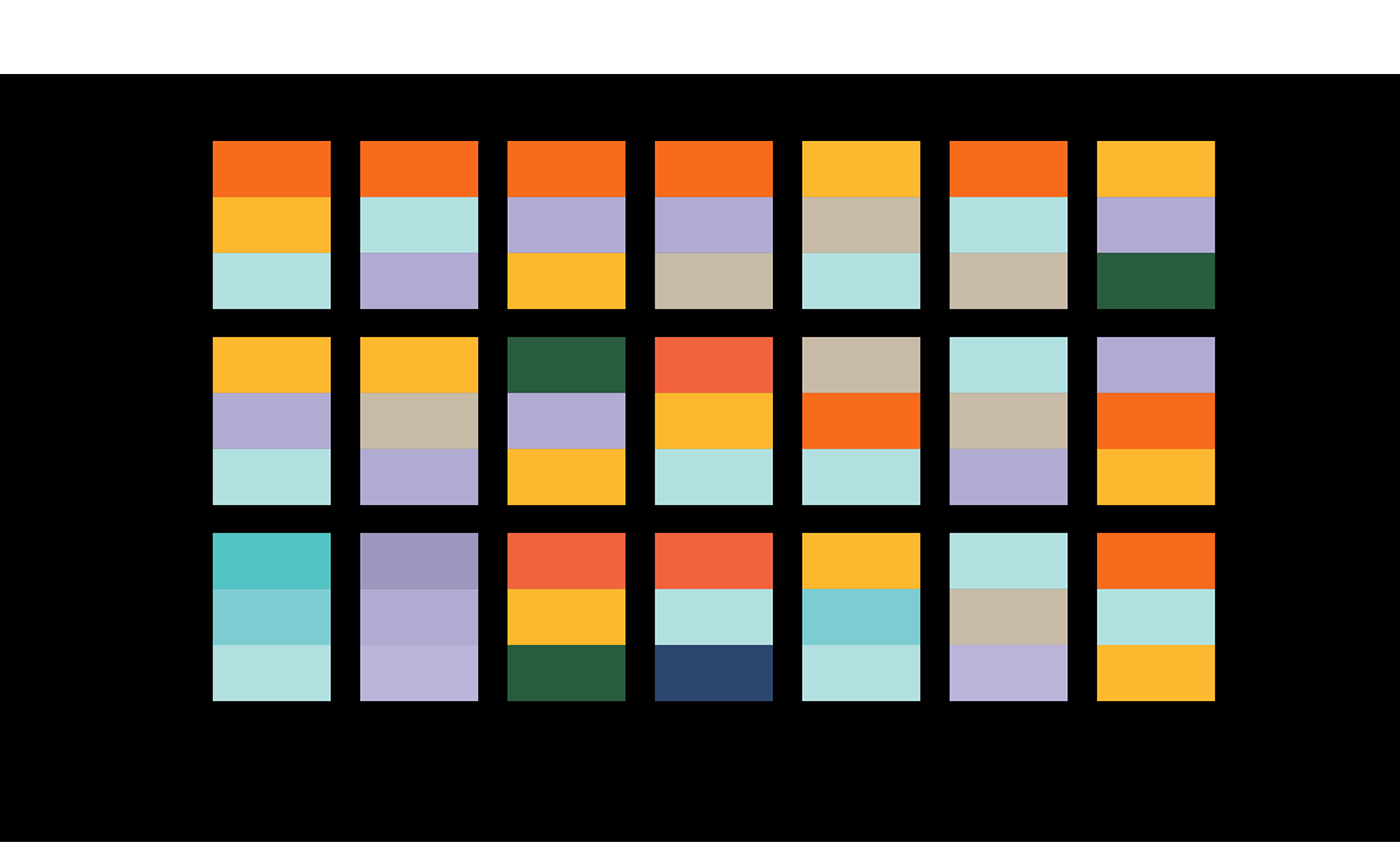

The rules was simple, a design are always considered as blocks, which is layering vertically on each other. The Locale logo are used in big size, and the block that has important information should be highlight in some ways.
Hmm, actually, during the process, the Locale team did not ask me about this system, but logo only. However, nice to have, isn't it?


Colors were considered as the key aspects of the identity, besides shapes, as they will be the notion to separate and make three roles more distinctive, inside the application. I develop a full range of colors - a powerful palette for Locale to execute further assets. Intentionally using soft color palette, I tend to bring a feeling of connection - but in a peaceful & harmonious way.


I wasn't asked to do the application for Locale. However, there was a demand to separate & differentiate Renter, Landlord & Services with colors & scheme. So, I tried learning about hierarchy in side a building and being clear about their interaction which each other.
(1) Renter sections will be colored mainly in Light Orchid which telling a feeling of freedom, easy ease, purposing. (2) Landlord, on the other hand, was colored in Fuzzy Yellow, with a UI color mix which raises the feeling of luxury, owning, easy-to-use. (3) Services section, which is now mainly Sky Blue, tastes trust-worthy, freedom, hopes.


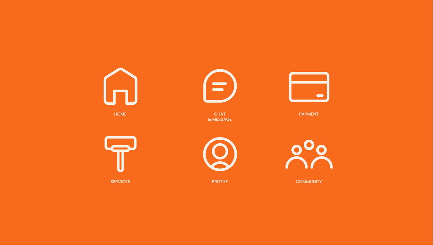
Icons was then developed. The icon system was mainly to support the application, when it represented for in-app 6 features. Again, I wasn't allowed to build the application along the way. However, doing my best to deliver it. I focus on legibility, readability & understanding.


During the process, yes, of course we had some turned off proposals and some failed prototype. However, I wanna share with you, so that, we can together, have something to celebrate and memorize.


Art Director: Thong Dinh
Designer: Thong Dinh, Dieu Ly Nguyen
Credit to Unsplash for presentation photos
Client: Locale
Year: 2021
Thank you for watching.


