


Scilife
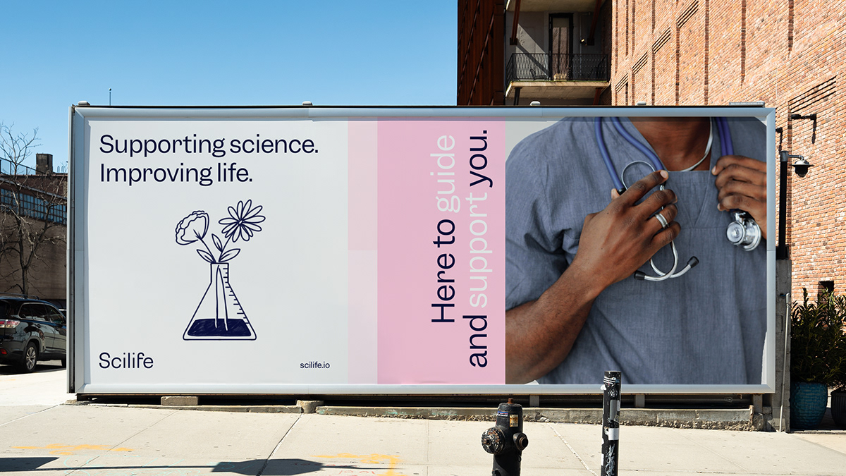
Supporting science.
Improving life.
Improving life.
Life sciences have had to adapt at breakneck speed to the new era. Compared to other industries, they have been behind the automation curve; searching for effective solutions in an ocean of brands that talk about controlling science through software, consultancy, training, knowledge, or community. With this project we have turned the discourse on its head, helping QualityKick, a life science quality control software, to reposition itself and give life sciences the boost they need.
Challenge
The repositioning and redesign of QualityKick with a differential proposal in a mimetic market that bases its value on functionalities. The opportunity to fnd a space that helps them become specialists and build a discourse that connects with the motivations of professionals in the sector to become their allies.
Solution
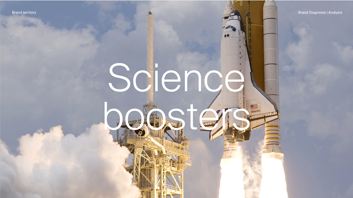
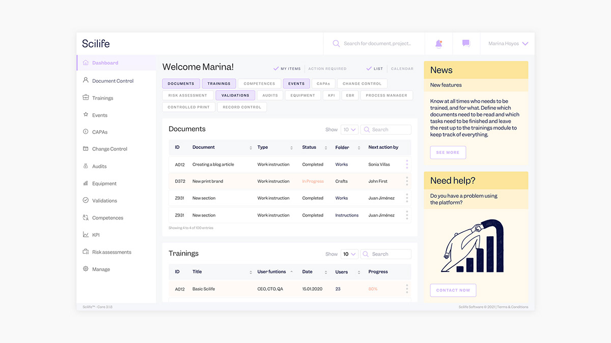
After an exhaustive analysis of the competition and the social and cultural situation of the brand, we saw the opportunity to get away from the noise and stop being just another piece of the ecosystem, to turn the brand into a frame of reference that could encompass other products and services, driving the brand towards growth and competitiveness. We created a positioning territory called "Science Boosters", where we moved from using quality management to CONTROL science to using the platform to BOOST science. From a quality management system to a Platform for care and support for Science and Life.
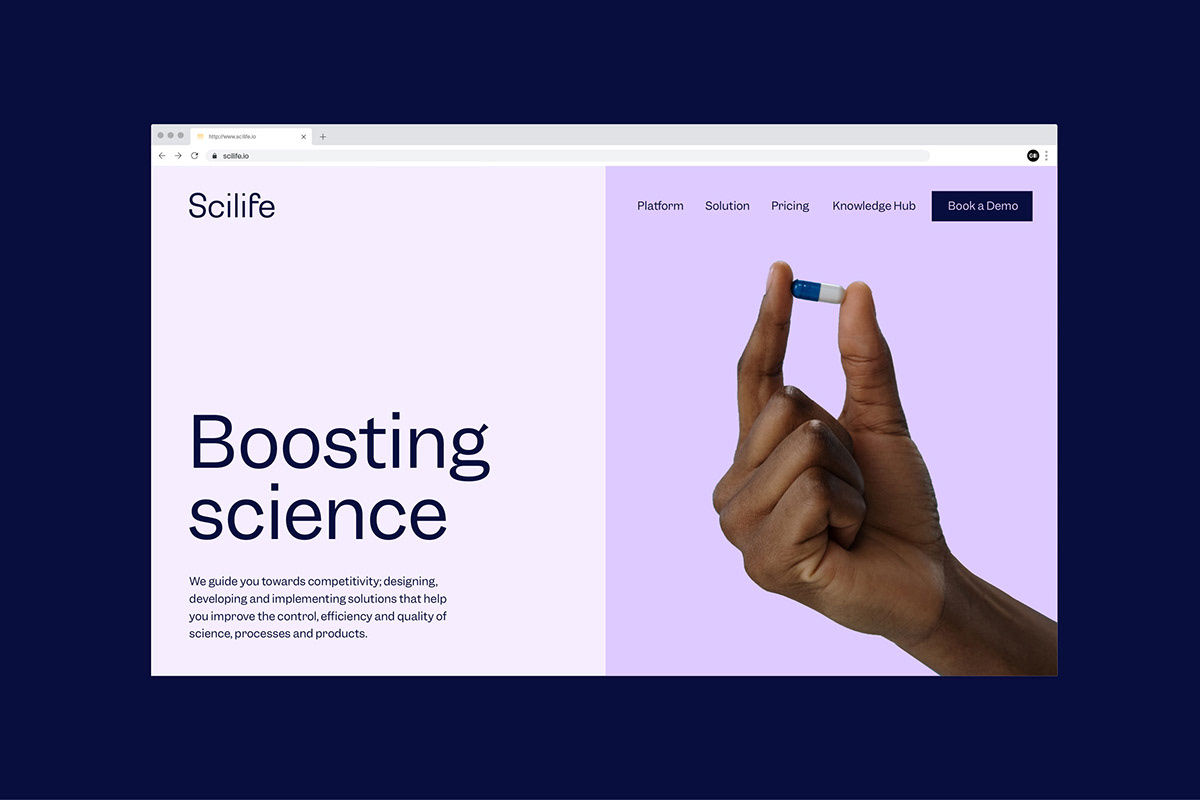
QualityKick went from being a specialist in quality to a specialist in promoting and improving science. From selling software to selling the possibility of doing better science to improve lives. As a result, the name QualityKick no longer made sense as it only conveyed a part of what they did and pigeonholed them without reflecting the new positioning. In search of a name that would help them convey the new spirit of the brand, we came up with Scilife; life and science united. A name that helps them bring to the table all their scientific knowledge and expertise to thrive towards a common goal: improving life.
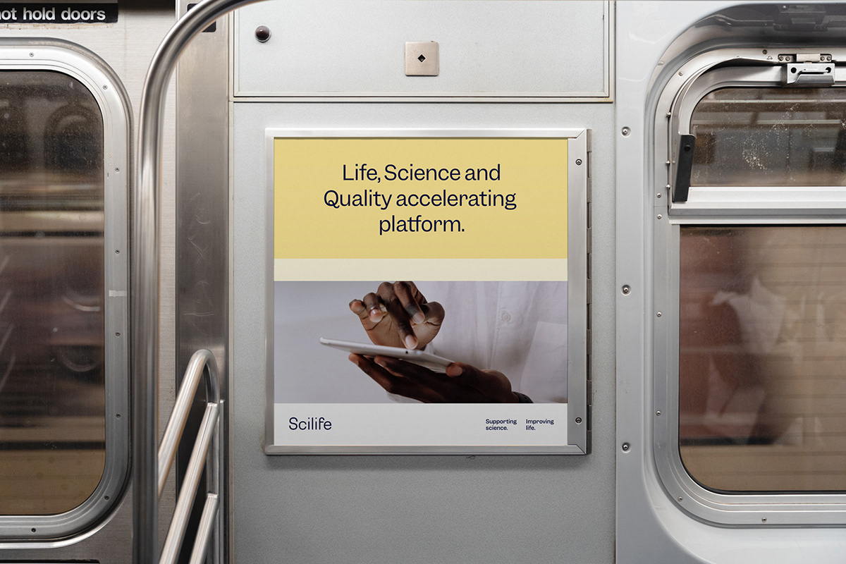
To accompany the new name they needed a Value Proposition that would help them connect with the benefit they bring. With a more rational and technical part that would allow them to be relevant to the more technical industry and another that would impact on the experience of patients, of people, the ultimate goal of Quality, helping them to connect with health-oriented sectors: SUPPORTING SCIENCE. IMPROVING LIFE.
The name, tagline, tone of voice and messaging give the brand personality, connecting with the needs and motivations of life science professionals to achieve their goal: to improve lives, and become their platform for accelerating life, science and quality.


Visual Identity
The technological revolution and digital transformation changed the way we relate to our environment. All our contacts, from family to friends, to our links with certain brands, are carried out through a screen. This feature has facilitated communications, but it has also dehumanised them.


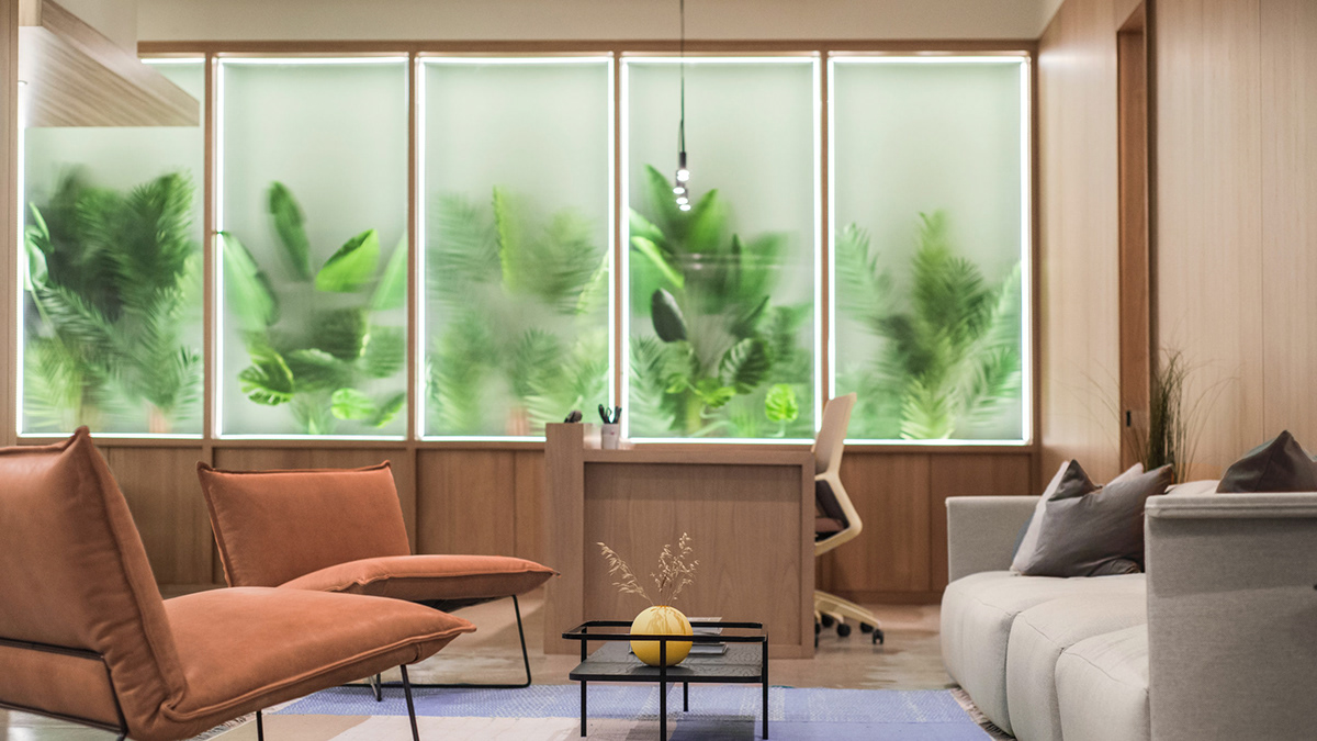
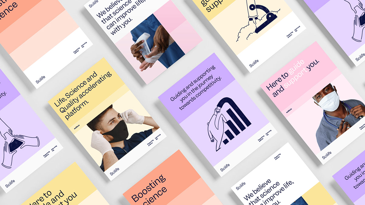
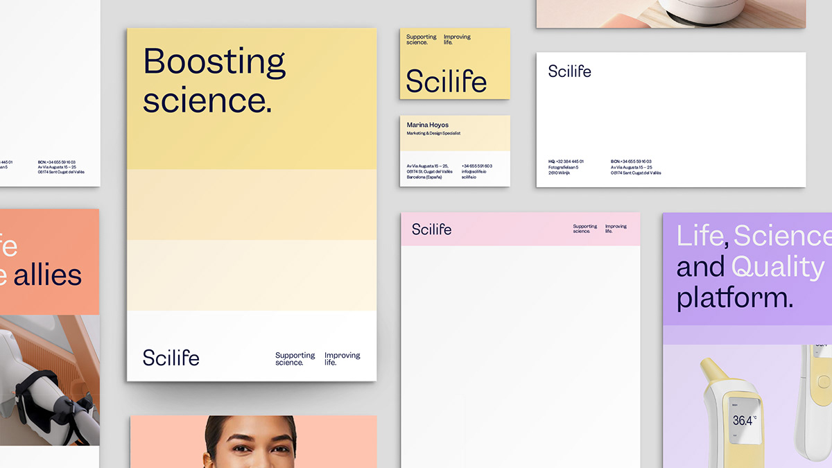
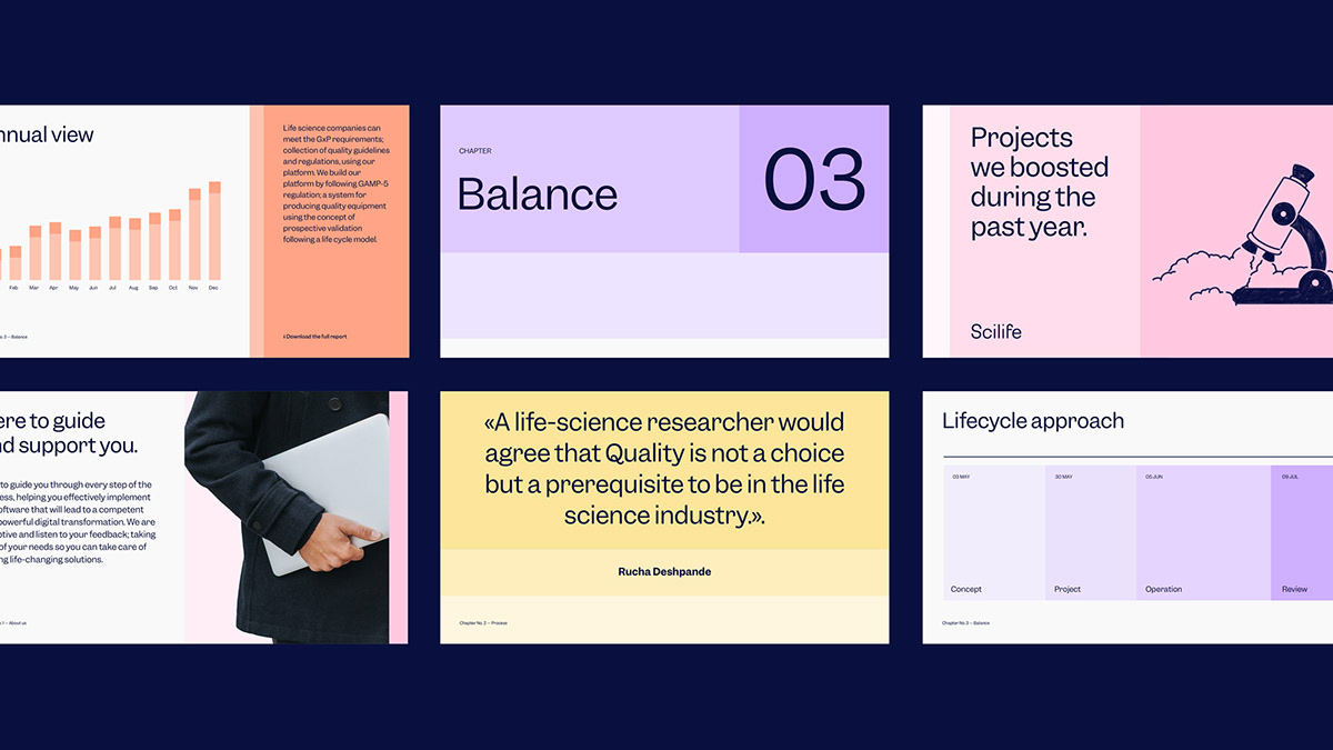
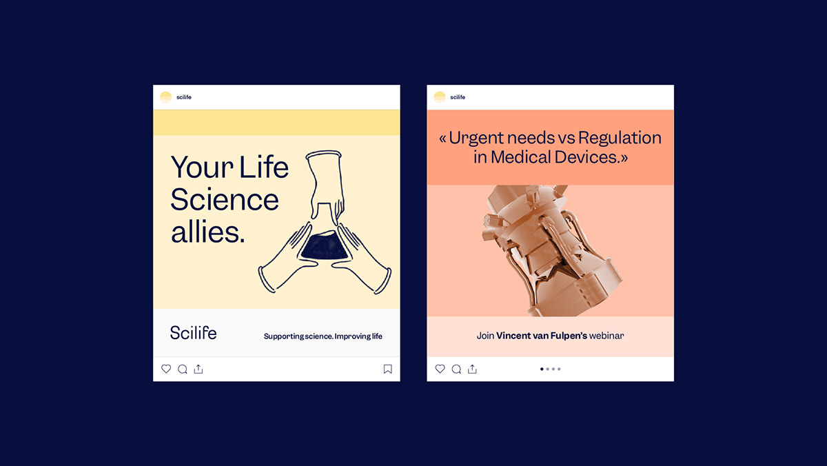
In this context we found the solution to differentiate ourselves, opting for a closer and more personal approach that, supported by the "boosting" concept, allowed us to address all levels of our visual system: chromatic range, typography and layout. Both the colour palette and the photographic system are inspired by biophilic design, bringing the aseptic and technical world of the health, science and technology sector closer to a warm, calm and comfortable universe.
Following the idea of humanising our communication, we collaborated with Xarly Rodríguez to develop a series of evocative illustrations to reflect the necessary tandem between science and life.


Info somosgravita.com
G —


