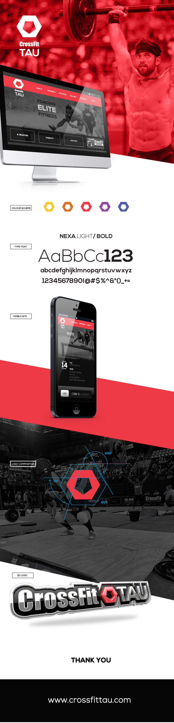
CrossFit TAU owner, Jaco Steyn, requested a logo and visual ID that would support his boxes ideology of pride and strength. The brief said that the logo should contain a lion, CrossFit training equipment, camo and the colour neon cherry. The Word TAU means "lion" in Tswana and Sesotho.
The process was long but eventually I went back to what I believe. I believe that a logo should contain only the essence of the concept and nothing more. The lion's main is its symbol of strength and majestic supperiority.
I would like to thank a special lady for inspiring and supporting me to do my best. You rock!
*images courtesy of CrossFit Inc.