Red Bull Logo Redesign
Out with the bull
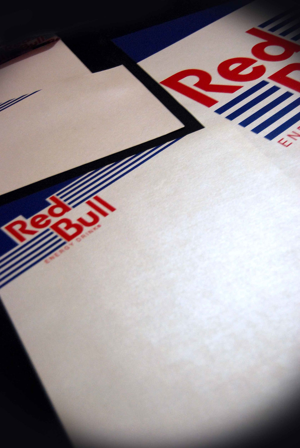
In one opportunity we were given the challenge of redesigning the Red Bull Energy Drink logo. I worked on simplifying the design (getting rid of the fighting bulls) and bring motion / tension / and excitement (the lines on the sides of the words and the angle) to the logo in a different way. My resulted logo is what shows, seems like a throw back logo? Something retro? Still keeps to Red Bull being the different energy drink from the pack!
Please take note that everything shown here was printed on a digital paper with a slight off-white color and shine to it to give the feeling of the can but to not be overpowering. This aspect acted almost like a whole different addition to the design.
The logo on it's own.
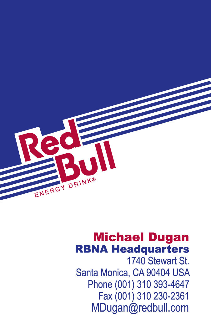
Business card example (front).

Business card example (back).
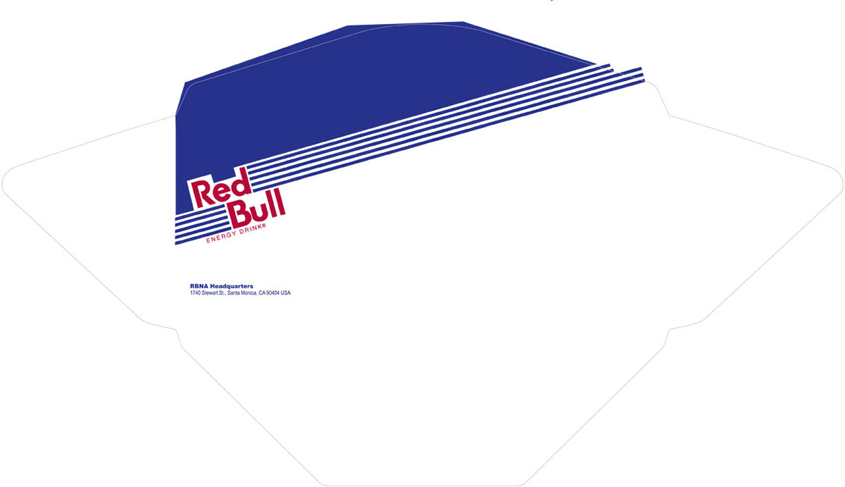
Envelope Design Die Cut.
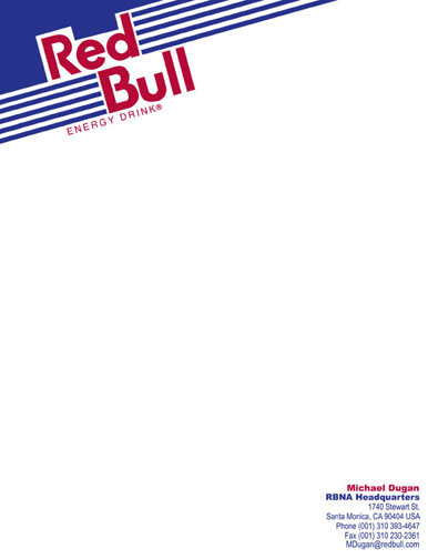
Letter Head (front).

Printed out on metallic finish paper