


Elevating aesthetics in the field
of mapping & surveying.
MAPS
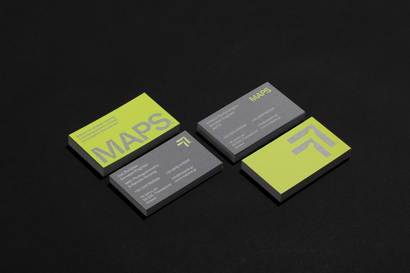
We were commissioned to revisit Maps brand identity, in order to highlight its distinct level of sophistication, its newly acquired equipment and plethora of new fields of exploration.
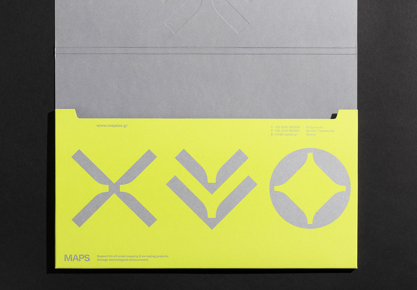
The key concept consists on symbolism. We have developed a system of symbols that convey the brand's main engagement sections, tools of trade and values.
The system also implies (both in form and context) the brand's key visual connotation. Flight, direction, target, measure. The aim was to move away from standard visual convections and introduce a bold, dynamic and flexible system. All applications have been treated with bold typography and our own, custom Fluo PMS color.
Production by: Asterios Goussios printing
Photography by: Stef Tsakiris


www.haveadialogue.gr


